
Mixing fonts inside any design can be a 'dangerous' idea. If the fonts are too similar then the viewer will feel confused, but if the fonts are too different then it will make viewer feel multiple emotions that fight against one another.
A safer idea is to stick to one font/theme and add a graphic or a few different colors that reinforces the brand's singular idea.
For brands that have more than one focus, and for designers who are up to the challenge, mixing fonts can be worth the risk.
Separate the Idea
The two fonts must convey two different ideas. By having one separate idea in each font, this will hopefully split the fonts into a subtle, quiet font and a loud, unique font. If the text of the logo cannot be easily split into multiple portions then it's probably a better idea to stick to one font.
The SuprGlu logo does a great job of using two fonts that are different enough that the text is separated nicely. The "Supr" text has a font that reinforces the idea of strength and the "Glu" looks like it could have been written with a liquid. The "Supr" text has a quieter font so they're not both fighting for the viewer's attention. The two bits of text are nicely tied together by using the same colour and the same drop shadow.

Knothead Bandanas uses a quiet font that blends well with the graphic for the word "Banadanas". It is used to state what the company does so its major goal is to not distract from anything else in the logo.
This logo uses a cute font for the "Tres Bebe" text, but then changes to a more professional font for the word "Photography".
The Mad Adz logo uses a goofy 70's styled font for the "Mad Adz" text but then uses a cleaner, quieter font for the "Productions". This is to remind the viewer's that it is a professional company.
This prototype logo for Cream Productions uses the same technique as Mad Adz for the word "Productions". The goal behind using the word "Productions" like that is to tell the viewer that it is in fact a logo for a company and not just a fancy way of spelling the word "Cream". Although the goal for "Productions" font face is very simple, it can be difficult to pull off without taking anything from the goal of the "Cream" font face.
For the Good Ole' Days logo, using the same font everywhere would have been overwhelming with so much text. The quieter font is still from the same era so this logo works very nicely.
This logo sets Mutant Shark apart from other consulting companies because it looks humourous. The font face used for "Consulting Company" gives the logo a feel of professionalism that is lacking elsewhere.
The Llano Cemetery two font faces used in this logo accurately give a feeling of elegance and professionalism that help sell the cemetery. Using the cursive font to create a branch with a leaf is a neat idea and the color of the leaf does a good job of visually attaching the two words together.

The Ignite Creative logo is neat because it uses the font face of the "ignite" text to show that the company is indeed creative. The 'g' is very clean and unique and the two 'i's are both a tad different but not different enough for anyone to notice, especially since one of them has a little flame as the dot. Just like in the Mad Adz and the Cream logos, the word "Creative" is displayed with a serious/professional font face. As in the Llano logo, the color of the flame and the word "Creative" are the same to tie the two words together.
Just like the Llano Cemetery logo, the Label Interactive logo mixes cursive writing with a non-cursive print. Unlike the Llano Cemetery logo, Label Interactive uses the cursive writing to give a sense of easy-going and fun rather than elegant.
Avoid Conflicts
Although the ideas in both font faces must be completely separate, they can't conflict. If the two ideas are completely opposite of one another, the viewer will get confused and the brand won't be effective. This can be tricky and it's up to the designer to see if the logo is fighting with itself, or if it flows nicely.

The Just Creative Design logo works because the theme of rawness and dirtiness of the large hand-drawn letters doesn't conflict directly with the clean and crisp words written at the bottom. This logo would not work if hand-drawn font was not measured and straight.

I've updated the logo with the font Sketchy Times to show how it now clashes with the font underneath because it lacks the sense of quality and tightness that the former version has. Both fonts end up losing their best qualities and the logo comes off looking very unprofessional and tacky.
The Cycle Sector logo separates the two words by making them two different objects. The word "cycle" is made to look like a bike so the font face has many straight lines. The word "sector" is represented by smoke and a cursive font is used to attach all the letters together. The font choices used are most likely purely based on how similar they look to the objects they're representing so the logo works because any themes that the fonts have are lost.
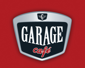
In the Garage Cafe logo, each word is put in a font to represent the word's meaning. The logo is made to look like a car ornament to nicely bind it all together.
Just like Garage Cafe's logo, Wildwood Casino uses a font face that represents the word. "Wildwood" is in a font that looks like a sign from an old western but the word "casino" looks like a modern day casino sign.

Noctorno mixes an elegant/tall font face for the company name with a more general typeface for the sub-title. The font face used for the words "Cafe Bar" is similar to the one used for "Garage Cafe" but the logos are very different.

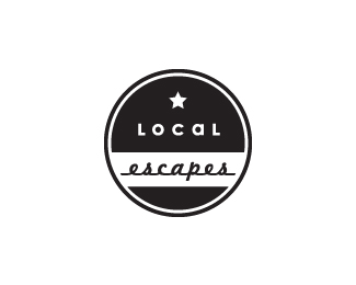
By mixing two font faces from the same era, the fonts used for Local Escapes' logo both have the same message, but their themes merge together rather than conflict against each other to give a feeling of a vintage adventure.
Sub-Brands
Many companies have a number of sub-companies that, while keeping with the branding of the parent company, need to differentiate themselves from other sub-companies. A good example of this is Virgin:

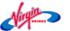

Each one of these logos (and the many other Virgin logos) all use a different font for the sub-company name but they all use the same font for the parent-company name. This ends up giving each sub-company their own unique feel and they can each effectively target their own markets.
Beer breweries frequently use different brandings for all their products to target each one to a different drinker.

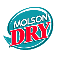
Again, the parent company's name is always displayed in the same font to ensure that it is as recognizable as possible. Although each label is for a beer, they are marketed towards different drinkers and the font, the colors, and the weight all reflect this.
There Are Always Exceptions
When two fonts are both fighting for attention it can create a sense of uncalm. This sense is sometimes exactly what a design needs to get its message across.
The MTV logo's goal is to convey a sense of edgyness and it accomplishes this by using three different fonts. It even gives one font three dimensions to make it stand out more and to make it even more different. By trying to look unprofessional, the logo works extremely well.
Rocket Fitness uses a similar idea as MTV and their logo creates a sense of high-energy. This logo does a great job of inciting excitement.
LG actually uses three different fonts to style the L's and the G's in their logo. Since the fonts are all quite similar, the logo needs to use other methods of distinguishing them. Had LG used the same font for the letters inside the winking face as the "LG" beside it, they would have been more easily seen in the face, but this would have looked awkward and repetitive. The font used for the "Life's Good" text is also subtly different but it gets away with it by using distance, a different color from the gray "LG", and it's also curved to further associate it with the round face.
Use These Ideas Wisely
A brand should never be forced to use multiple font faces, but it's a great technique to use when the time comes. When a logo needs to represent multiple ideas, there are other ways of accomplishing it by using different colors, weights, spacing and alignment, but changing the font face can be just as worthy if it's done right.
Have we missed any interesting logos? Go ahead and let us know by commenting below...


