 What makes a design look coordinated, planned and professional? The answer is: 'color'.
Not every project needs bland corporate blue to look professional. Planning color means creating a framework that describes which colors to use and how to use them.
Color is the slipperiest design element. “Good” color is so closely tied to elusive things like personal taste and intuition, as well as technical considerations such as contrast and monitor calibration.
But color is vital to content. If you consider a website important enough to spend time refining, then readers will likely consider it important enough to spend time reading. Good color choices make that happen.
In this article we'll review some techniques to achieve beautiful color palletes for your web designs.
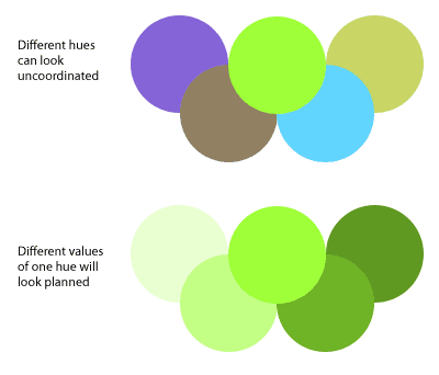
The best way to make a website look unplanned is to choose its colors at random.
Even when visitors skim a website’s home page for the first time, the colors influence their attitude towards the content. Is this website exciting? Reassuring? Daring? Bland? Political? Formal?
Color affects how people interpret what they see as much as typography.
Finding the right colors isn’t easy, but the process can be systematic.
Good design strategy involves a color scheme (i.e. a range of colors selected to communicate a mood or message) and an arrangement of that scheme.
Let’s say you’ve been asked to design a professional website. (And this could very well turn into a drinking game: take a shot every time the client uses the word “professional,” “clean” or “modern.” Two shots for “I like this other website. Copy it.”).
The color scheme will depend on the particular nature of the website. For example, both banks and florists can have professional-looking websites.
But people might be less inclined to buy flowers from a website that is corporate blue and ocean gray. And imagine the Bank of America website in lilac and yellow-green.
A “professional” design tell visitors that they’ve found a website that takes its subject seriously, even if that subject is light-hearted. Whatever the hues and values, “professional” means coordinated, planned and thought out.
Go Grayscale
The best way to work with color is to start with none.
Removing color from a design reveals fundamental problems that should be addressed before worrying about which shade of chartreuse works best. If the design doesn’t feel right in black and white, then it’s time to make changes.
Does each page have a clear purpose? Does the design guide readers through the content? Is the content compelling, inspiring or informative? Are the headings clear? Do the links contrast with the other text? Color improves these effects, but problems in layout, type and organization can’t be solved by color alone.
To do a redesign, first suck out the color. The simple act of washing out over-saturated primaries really shows where a website stands. (Actually, you should really start a redesign by re-evaluating your goals and content, but that’s another story.)
Sometimes removing color is a solution in itself.
I once worked with a Web design company to redesign their own website. The owners were personal about the project and keen to get it right. But if you think designing for yourself is difficult, try doing it by committee. By the end, the three of us were staring at a screenshot of the ninth draft after-hours over a few drinks.
Abruptly, I flattened the Photoshop layers and hit “Desaturate” turning the vibrant copper-and-navy design into shades of gray. To everyone’s surprise, it worked.
By the end of the week, we had a “warm” gray design with red accents. We knew we had a winner when previous clients complimented them on the new look and more calls came in from prospective clients.
Analyze your color scheme with the Photoshop “squint” test:
- Take screenshots of at least three pages from your website. Open them in Photoshop.
- Duplicate the background layer in each screenshot (Layer → Duplicate Layer, or Command + J on a Mac, or Control + J on Windows).
- Apply a Gaussian blur of about 10 pixels to the new layers.
- Go to Image → Adjustments → Posterize. Use 8 to 12 levels or go to Filter → Pixellate → Mosaic. Use 15 to 30 pixels.
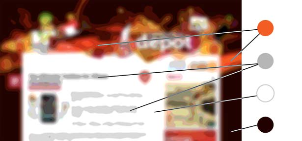
This shows which colors are really dominant. The more dominant the colors, the more heavily the scheme is imprinted in the visitor’s mind.
Once the website’s layout and organization work without color, it’s time to choose a palette. But which one? And how much to use?
Align Your Hues
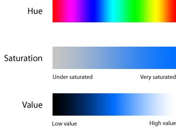
Color has three properties: hue, saturation and value (sometimes called lightness).
Saturation is how rich a hue is: neon colors are very saturated, while pastels are less saturated.
Value denotes how bright (i.e. how close to black or white) a color is.
Hue refers to which part of the rainbow a color belongs to, such as red or green; it’s the property that people trip up on.
Nothing kills a color scheme like clashing hues. A design can have a hundred shades of one hue, from pastel to neon, and still look planned. But if hues are mixed the wrong way, the scheme falls apart.
One way to avoid clashing hues is by separating them with a third color. A buffer of black, gray or white is safest, because grayscale is hue-neutral: you can coordinate any part of the rainbow with black, white and gray.
A second solution is to use the hues in different proportions. If a color scheme has, say, violet and brown, then the design could have many shades of brown with a few bright violet highlights.
Another option is to vary the values. Pure blue and bright cyan make a so-so combination, but dark blue (navy) and light cyan (sky blue) contrast enough to set each other off. Red and violet can be different enough not to clash but close enough not to look intentional. Light red (pink) and a dark violet bring distinction.
Unfortunately, avoiding a bad color combination isn’t the same thing as choosing a good one. A color scheme is successful not when you’re satisfied, but when your audience feels comfortable.
Discover Great Schemes
Where do great color schemes come from? With hundreds of colors and thousands of combinations, how do you decide?
Designers of small static websites should draw color from the content. That usually means photos.
The design of an eight-page website that I recently built was topped with an elaborate metal scaffold set against an indigo sky. Setting Photoshop’s eyedropper tool to a 5x5 average, I sampled the darkest and lightest parts of the sky and gave the sidebar, links, headings and footer those few shades.
When the client asked how we were able to design a website so well—and so quickly—our response was, “This is what we do.” But the color was already there. I just had to look for it.
While stock photos works for quick websites, designers of larger and more dynamic websites should seek inspiration from their audiences.
An excellent indicator of which colors are attractive to your audience is their daily clothing. Find out what your visitors wear, and you’ll know what colors make them comfortable. If your website is about, say, league sports, find out what people wear to games, rather than their day jobs.
If you’re lucky enough to get photos of your target audience, view them en masse; you want an average of the crowd. But if photos aren't available, go shopping.
Clothing designers who are able to stay in business have excellent color sense for every mood and lifestyle. It doesn’t have to be 5th Avenue haute couture. A Google search for "camping stores," "baby clothes," "ski and swimwear" and "casual living" will reveal many good color combinations.
People wear clothes according to their tastes. If you use colors that they like, they’ll feel more comfortable on your website.
Use Textures
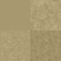
Slight variations in hue, saturation or value create textures.
Monochromatic textures (i.e. textures with only one hue) and patterns provide subtle dimension to most websites without clashing.
Simple texture backgrounds, in particular, are easy to build:
- Take a photo of an interior wall, or something that is bare but feels rough.
- Open it in Photoshop.
- Duplicate the background layer and call it “texture 1.”
- Fill the background layer with colors from your color scheme.
- Set the “texture 1” layer’s blend mode to “”Soft Light” and its opacity to 30%.
- Try it out on your website. If it doesn’t look right, play with the layer’s opacity.
The layer’s name is deliberate. You might play around with more than one photo, but avoid giving the layers names like “wall texture” or “paper texture.” You want to focus on the effect on your website, not where it came from.
Creating a Good Scheme
A good color scheme has certain characteristics. Think of it as a framework or set of guidelines to keep a design consistent. The scheme should:
- List two to five hues that work well together,
- Describe how far a design can vary from those hues,
- Account for shades of each hue,
- Work well against black and white.
Here’s an example:

The designer began by choosing mostly warm hues that felt right. There was no logic, just the vague goal of “autumn” and her intuition.
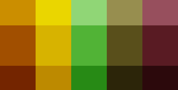
In Photoshop, two layers provided shades of black and white. Each layer’s blend mode was set to “Soft Light.” Pure black was too dark for the right-most color, so the black layer’s opacity was adjusted.
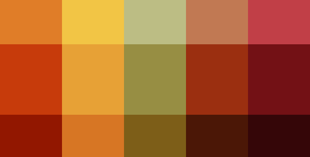
To unify the colors, a new layer was created and filled with pure red. Its blend mode was set to “Color” and its opacity cut to about 40%. (Note: the order of layers is very important. Colors will change if the “tint” layer is set below the black-and-white layers.)
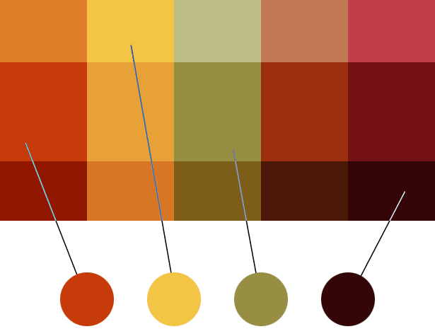
This gave the designer 15 colors to choose from. She picked four that had a range of tones and hues. Here, the colors are set against white.
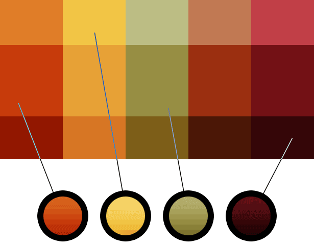
Variations are important, so the designer experimented. What would the colors look like against black? What happens if we shade them slightly?
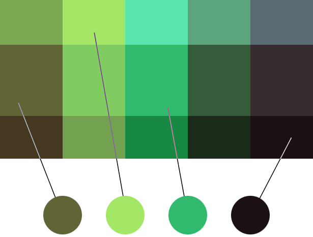
What if we changed them altogether? Using Image → Adjustments → Hue/Saturation on the “tint” layer creates a distinctly un-autumn feel, but the colors are still coordinated. Perhaps that palette can be used for Easter.
The end result is a color scheme: a reference that provides different (but not too different) hues and a range of shades that work well together. Download the sample file.
Use the Framework
Will tomorrow's graphics, photos and icons work with today’s color scheme? What images will a website need in six days, six weeks or six months? It’s hard to say, but content is a part of your color scheme.
You could solve this problem by either making your images follow the color scheme or making the color scheme follow your images.
Enforcing your color scheme, even with photos, is a great way to achieve a unified look across all pages.
The easiest solution is to find images that fit your scheme. Remember that a color scheme allows for wiggle room: as long as an image’s major hues fit, the image should work. Many stock photo websites let you search by color (meaning hue: usually primaries like red, green and blue).
If an image doesn’t fit your color scheme, give it a tint:
- Open the image in Photoshop.
- Create a new layer. Set its blend mode to “Color.”
- Fill that layer with one of the colors from your palette, preferably the one that most closely matches the image.
- Set the color layer’s opacity to 50%.
- Play with the opacity until you get a good balance between the image’s original color and your website’s color palette.
- This technique works for photos, illustrations and icons—anything pixel-based. (If you don't own the image, be sure to obtain permission before altering it. You may be improving its appearance on your website, but you’re still taking liberties with someone else’s art.)
Looking Professional
No set of colors looks "professional" in and of itself. Rather, you have to follow a process to reach a coordinated, planned feel.
No matter what the website is about, the audience will know it takes itself seriously.
Tips
- When you think you have a good color scheme, try it out for at least one week. Evaluating color requires intuition that builds over time. Give yourself time to fully absorb the scheme’s personality.
- When you think you have a good color scheme, don’t let it go stale. Your visitors' tastes, like yours, change over time. Make a note to review the colors after four months. Then ask, are they still appropriate? If not, what has changed? What factors will influence your adjustment?
- Use brilliant colors sparingly. A splash of something iridescent will draw visitors there, but if they see it everywhere, they’ll wander aimlessly.
- Some people think color schemes have a narrow range. Allow some leeway to give your designs added depth.
- Avoid pure primaries such as red, green, blue and yellow. Give them a tinge for real character: red, but slightly violet, blue with a touch of green, “warm” yellow with an orange tint.
- Make sure your colors work when faded. If you choose red, be aware that light red can be feminine and dark red can look like rust or blood. Yellow runs from faded sunlight to dark brown. Dark blue is mysterious, and light blue is tranquil—or electric if you oversaturate it.
- Mac users, set your screen. Go to “System Preferences” and click “Universal Access.” Set your display to “Use grayscale.” This also comes in handy when you’re in the mood for film noir.
- No matter how active you want your website to feel, use a neutral background. Black, white and gray work well with almost every hue.
- If you want small text (say, 14 points or less) to match a large field of color, make the text a few shades darker than normal. This will offset the light counters inside the characters.
- Use more shades of fewer hues.
- What “looks good” is intuitive. But intuition is a battle between your ego, your audience’s pickiness and the authority of the people funding the project.
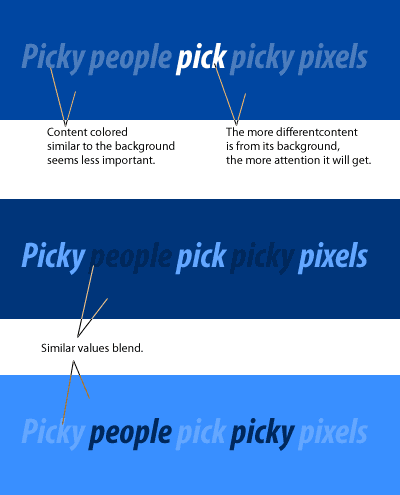
- Use muted backgrounds to make content stand out:
Written exclusively for WDD by Ben Gremillion. He is a freelance web designer who has learned that a deadline’s inflexibility is inversely proportional to the number of features requested at the last minute.
How do you create successful color schemes? What works and what doesn't work for you?


