 As the first thing visitors see, home pages and headers often steal the design spotlight.
But above-the-fold thinking neglects the natural flow of vertical page layout. What happens when people reach the end of a page?
You can bet that a simple copyright statement won’t hold visitors’ attention, but many pages are designed with the expectation that people will find their way... or so we assume.
The bottom of a page is not the end of a website. An informative, compelling footer is the natural place to lead people to more information within the site rather than wandering aimlessly.
Read more about the trends and innovations that follow page content and answer the unspoken question, where to from here?
The ongoing problem of how to hold people’s attention can be addressed in many ways: eye-popping graphics, clever use of negative space, snappy typography and well-written text.
But all too often people are left hanging when they scroll to the bottom of the page. Should they scroll back up? Visit another website? Close the tab?
Where the body content ends, the footer takes over.
The footer is a distinct collection of content that concludes every page of a website. Typically, it contains a copyright statement, a link to the home page and either an email link or a link to the contact page.
Footers almost always span the width of the page. Beyond this, they exhibit a variety of styles.
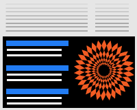
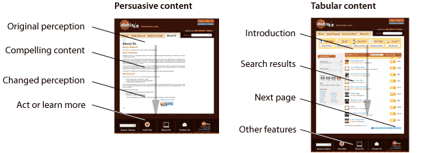
Even though it doesn’t offer many links, Dishizzle makes it hard to miss the large icons at the bottom of its website. With its search box and friendly type, this footer is both legible and useful.

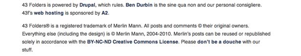
Compare it to the footer on 43 Folders, which takes the opposite approach. A handful of concise sentences explains the website’s purpose, describes its owner and links to its web host. After a thorough copyright statement, the page ends.
Sometimes footers merely repeat the navigation bar. It’s a natural fit: once the reader has read or skimmed the page, they come upon a list of interesting links to other pages, rather than be left to wander.
But those links are often just that: bits of clickable text arranged in a thin, underdeveloped strip. While this may work for websites that have little content, a serious website isn’t complete without a well-planned footer.
A footer is not just an appendage. It’s a good host.
Unsung Stewards
The bottom may seem an unlikely place to put vital information, but footers are ideal real estate for navigation and important features because visitors naturally move in that direction as they scroll down.
Like a good host, an elaborate footer presents different kinds of information that reflect the nature, and content, of the website.
A footer can play many roles on a website. The trick is deciding where guests should go when they’re done with a page. A good host lets their guests enjoy themselves and steps in only when the guests begin to wonder “What’s next?”
Footers as Site Maps
While the header presents links to major sections of the website, the footer can delve into details. Site map-based footers, which are ideal for websites that store content in many sections and sub-sections, reflect the scale and concerns of a website.
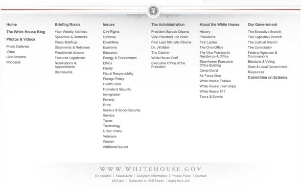
The White House is a good example. Its footer presents the website as six sections, each with as few as 6 and as many as 23 links.
Deliberately simple, the keyword links can be absorbed at a glance by guests scanning for topics of interest. Almost as tall as it is wide, the footer is hard to miss, but its content doesn’t compete with the page above.
Footers as Advertisements
Especially if the website sells something—a product, service or membership—the footer is a second chance to incite visitors to act. The end of the page is a great place to remind guests of the benefits of the product or service being offered. Repeating this same message on every page drives the point home.
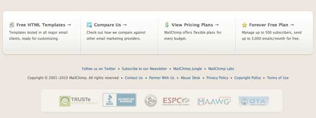
Mail Chimp takes advantage of this space to repeat its sales pitch: 1) free templates, 2) a comparison of its service to that of competitors and 3) flexible pricing.
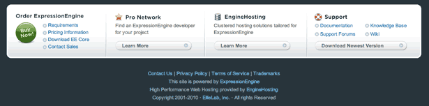
Expression Engine lists some of these things, too, and also links to the help section and other information that prospective customers would want.
Unlike plain site maps, footers that advertise must be more persuasive than informative. They should give guests incentives to buy and lead to pages that enable them to act.
Footers as Character Studies
While a personal website would address topics that interest its owner, the footer could describe the person behind it. Whose website is this? What is he or she like? What else do they do?
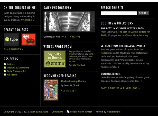
Few websites do this better than the one of graphic designer Jason Santa Maria, whose footer could be a page unto itself.
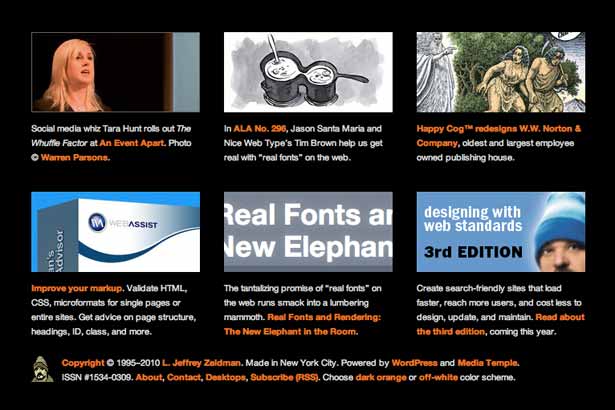
Meanwhile, the footer of standards expert Jeffery Zeldman’s contains visual—and even photographic—snippets of projects he is involved with or interested in.
Footer as Colophon
A footer can contain information about how or why the website was built. It could:
- Reiterate the website’s mission or tagline.
- Say which CMS or ISP is being used.
- Declare that the page has valid (X)HTML and CSS and complies with certain accessibility standards.
Variation Based on Context
The footer should generally stay consistent throughout the website. Page-specific information usually isn’t warranted. But complicated websites can bend the rules.
The playful icons on IBM’s website provide a friendlier, less corporate way to navigate pages. But these icons appear only in the “Smarter Planet” section.

IBM’s regular footer looks like this:

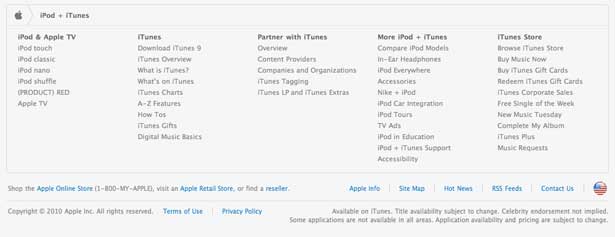
Likewise, the links in Apple’s site map-based footer varies according to the section it appears in.
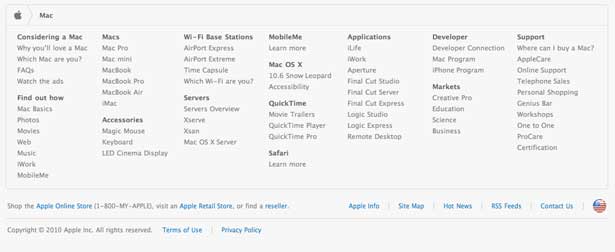
Above, the footer in the Mac section. Below, the one for iPods.
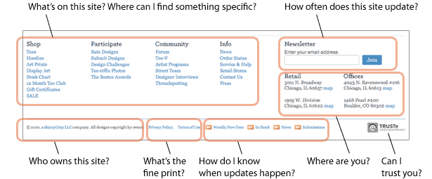
None of these roles are exclusive. Elaborate footers can incorporate site maps, highlights, updates, credentials, search tools and more. Below, BustedTees offers ways to stay current, browse and submit feedback.

Functional doesn’t always translate into compelling, though. CNN’s footer includes a search tool, local weather, a site map, legalese and links to its content in other languages. Useful, but dry. The most interesting visual element is the red strip.

Although it fits the tone of the website, CNN’s footer is merely designed not to compete with the page above.
How to Craft a Useful Footer
Generally, a web page invites people to act or to learn. After reading a news article or blog post, people walk away with a new idea or set of facts. Product pages educate visitors on the items being sold. Pages with weather information affect how people dress. In each case, a person has changed somehow by the time they reach the bottom of the page. And there they find the footer.
So, the end of the page is a natural place to put two things: tools by which visitors can act on what they have just learned; and calls to action.
Footers have a tough job. People ignore them out of habit; they instinctively scroll to the top or click away. That’s why good footers must be designed not as afterthoughts but as if they were pages themselves.
Creating a useful footer begins with asking certain questions:
- What content on my website do I want to emphasize?
A good footer guides guests to those pages. - What else would interest visitors?
A good footer attracts guests with information they would like. Visitors who scroll all the way to the bottom were likely engaged by the page’s content. Links to related information will keep them on the website. - What content would benefit visitors the most?
Like a good host, its job is to be helpful. The footer rewards guests for reaching the end of the page with, if possible, freebies or entertainment or, better yet, frequently requested information. If the website is for a bricks-and-mortar business, the footer could contain a simple map to the location. - What would epitomize the website’s character and style?
Like a good conclusion, the footer sums up the nature of the website: its topic, attitude and theme. In this way, the footer is similar to the header, which introduces the website to newcomers.
T-shirt seller Threadless answers many questions in its keyword-rich footer:
Once you’ve decided what to put in your footer, don’t neglect presentation.
- Make it big.
A token footer is thin, just tall enough to admit one line of text. An attention-grabbing footer is substantial. A rule of thumb is to make the footer’s height at least a quarter of its width. For example, if the page is 960 pixels wide, then the footer should be at least 240 pixels tall. - Set it apart.
Give the footer a distinct boundary, and make sure it spans the width of the page. Guests should see where the body ends and the footer begins. - Give it style.
A footer should carry the theme of the website, in style, color scheme and typography. If possible, it should reuse visual elements from elsewhere on the website. But it shouldn’t detract from the page's content. - Make it worthwhile.
The ideal footer is strong enough to warrant the visitor’s attention. It offers interesting content to peruse in an attractive package—like any important page.
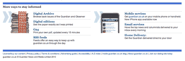
The Guardian isn’t afraid to play up its footer. Eye-catching graphics laid between brand-matching color bars tell visitors that this is content, not just fine print.
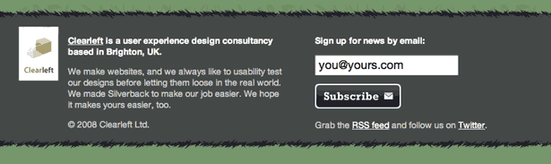
Silverback has few features in its footer but plenty of style. It offers an easy-to-read experience that restates the website’s purpose and encourages visitors to receive updates via its newsletter.
While Travelocity packs 72 links into its footer, a lack of visual hierarchy or clear layout makes it hard to take seriously. More doesn’t always mean better.

All of these criteria may sound like a tall order, but there are two easy approaches to creating a good footer.
Approach #1: Create a Miniature Home Page
The easiest way to create a helpful footer is to recap the website’s purpose and highlights. Look at your home page for inspiration.
Typically, the home page is a cross between a table of contents and a news ticker, giving guests an overview of the website and the latest information.
A footer need not include every element from the home page. If the home page showcases 10 best-selling products and the 3 most recent blog posts, then the footer could highlight the top 5 products and 1 post, with links to more of each. A smaller version of the website’s logo would also be appropriate.
Think of the footer as a table of contents that conveniently appears when visitors need it most: when they’re wondering what’s next.
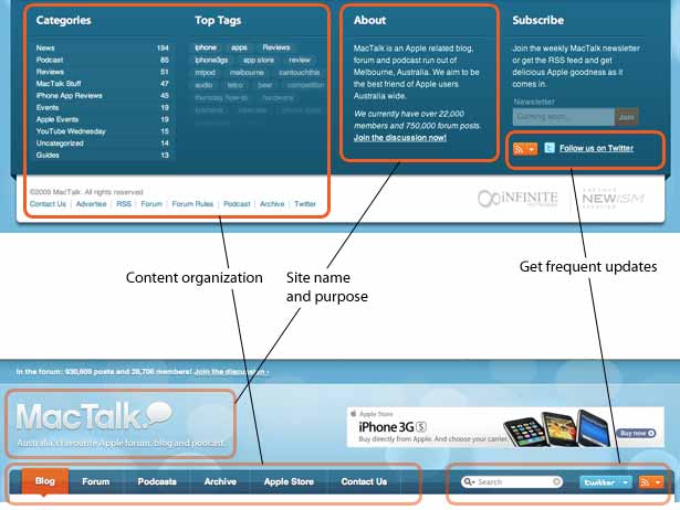
MacTalk Australia has a relatively small header, which leaves more room for content and advertising above the fold. Nearly twice as tall as the header, the content-rich footer expands on the simple header’s navigation and introduction by spelling out how much content each category has and which tags are most popular. Both the header and footer have RSS and Twitter icons, and the footer includes a newsletter sign-up form—plus two other RSS and Twitter links just below the copyright statement.
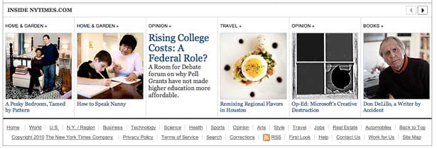
The New York Times footer includes the latest headlines and photos from various sections.
Approach #2: Provide Supplementary Content
Footers can do the opposite of serving as a miniature home page by offering content not found anywhere else on the website.
Bits of supplementary content that can’t fill pages on their own can find a home in the footer. Unlike the miniature home page, a supplementary footer can contain links to other websites, as long as they’re informative or beneficial to the guest.
But don’t treat the footer as a dumping ground for stuff that doesn’t fit anywhere else. Like any proper page, a footer should inform, persuade, entertain or do all three. The key is to find worthwhile information that supports the website’s overall theme, not any one particular page.
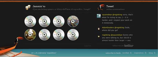
Komodo Media’s footer includes eye-catching links to what the owner is listening to on Last.fm.
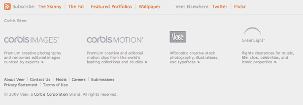
Some websites, such as Veer, point to their family of websites. Corporations can promote their brands simply by cross-linking them to each other.
Other Approaches
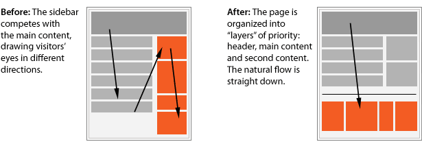
If your website has a substantial sidebar, try rearranging it as a footer. Although this will change the website’s layout drastically, moving secondary information to the bottom of the page might remove distractions from the primary information.
On Your Way
The golden rule of footers is never leave guests to their own devices.
Footers are hosts who present their guests with options. They are natural stepping stones across the website, enticing guests to click to other pages—or related websites.
You can learn a lot about a website’s priorities from the contents of the footer. What’s in your footer right now? You do have one, right? Because a website without a footer is worse than an article without an
Written exclusively for Webdesigner Depot by Ben Gremillion. Ben is a freelance web designer who solves communication problems with better design.
WDD Staff


Read Next

15 Best New Fonts, July 2024

20 Best New Websites, July 2024

Top 7 WordPress Plugins for 2024: Enhance Your Site's Performance

Exciting New Tools for Designers, July 2024

3 Essential Design Trends, July 2024

15 Best New Fonts, June 2024

20 Best New Websites, June 2024

Exciting New Tools for Designers, June 2024

3 Essential Design Trends, June 2024

15 Best New Fonts, May 2024

How to Reduce The Carbon Footprint of Your Website
