 When a web page demands respect from readers, few type treatments give it dignity like “small capitals.”
This treatment makes all letters in a line of text uppercase, but retains hierarchy by making the initial letters of important words noticeably larger.
When used properly, small caps make things look stable and reliable. They can appear official or solemn; stately text is never rushed.
Small caps march to their own deliberate beat. Small caps almost guarantee that text won’t look cheap.
Like any technique, though, this one can be abused or used improperly. Read on for some tips on how to integrate the power of small caps in your designs...
Stroke Weight
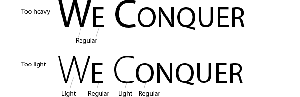
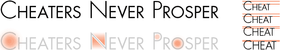
Using small caps to set text isn’t as simple as it may sound. Large letters must both denote the importance of words and draw attention to the letters themselves. It’s a subtle problem, but if the rhythm breaks, then the reader gets distracted. The most common culprit is varying stroke weight: varying size creates inconsistent thickness in letters.
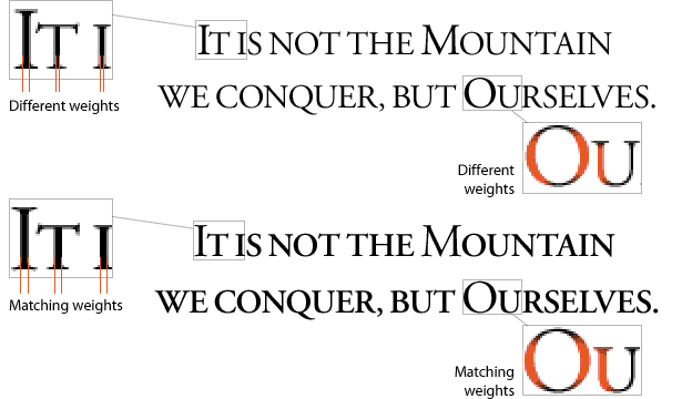
Adobe Garamond, the font, comes in regular, semi-bold and bold weights. Although the first example above technically uses the same weight throughout, it appears to have different weights because of changes in text size. The solution is to use a semi-bold weight for all small letters. Thickening the strokes is a nod to consistency; unfortunately, it’s not a guaranteed solution.
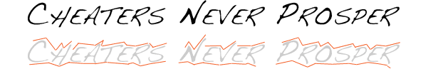
Myriad Pro comes in many variations. Its regular weight is too heavy for the large letters above, but its light version is too light. Working with both is possible, though:
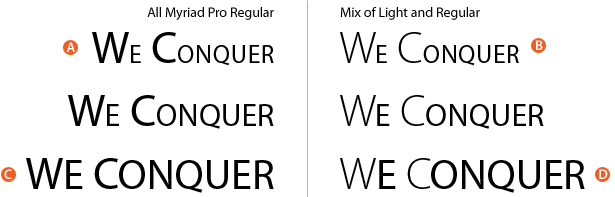
Combining light and regular works for certain sizes. Because the small letters are almost half the height of the large letters, regular with regular (A) looks like a cheat, but light with regular (B) almost works. If varying weights isn’t an option, then the best solution is to make the small letters as large as possible. Slightly larger caps (C) look good at the same weight, and you can still distinguish the important initial letters. When the sizes are similar (D), mixing weights is unnecessary.
Matching weights is not a challenge overcome just by pushing buttons.
Choosing Typefaces
Certain kinds of typefaces work better than others for small caps. The degree of flow through a line of text varies with every typeface. For example:
The straight bars and serifs in Garamond cooperate to maintain a horizontal flow. These built-in rules make the typeface ideal for steady, determined small caps—the words practically form straight lines.
Above, Futura’s geometry creates eye-snagging counters, so attention is drawn to each large letter. The words flow less because the larger small caps give us less of a horizontal line, but it still works.
Script and handwriting typefaces rarely work with all caps or small caps. Calligraphy, formal scripts and handwriting are optimized for internal flow and rely on swoops rather than ruler-straight lines. If your goal is a serious voice and your technique small caps, then a handwritten typeface would work against that.

Monospaced typefaces, by definition, work best at even sizes. Setting Courier in small caps (as above) creates unnaturally weak small letters. That’s acceptable if the goal is to emphasize the large letters: they look almost like acronyms. Otherwise, uniform typefaces generally don’t look good in mixed sizes.
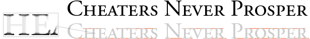
Some fonts—including Garamond, Didot, Gill Sans, Palatino, Trajan and Minion—contain typefaces designed specifically for small caps. Use them if they’re available; they’re better than the fake small caps generated by layout or illustration software.
Rhythm With Tracking
Rhythm is conveyed not by the letters themselves but by the space around them. Adding space between characters can emphasize their natural rhythm. Increased tracking—the spacing between characters in a range—can draw out a phrase by slowing its “pace.”
![]()
The first line in the text above runs well with normal tracking. The words are easy to read—maybe too easy: readers have no reason to take notice. The second line sets the letters in staccato. Readers slow down. Dignity does not hurry.
Extra tracking should be used in moderation. How much is too much? Two rules of thumb dictate when tracking has gone too far. First, too much space turns words into isolated letters:
![]()
These few examples show how different amounts of tracking affect a line of type. The ideal range is between 100% and 200%. When characters are too far apart, the line of text ceases to look like a single unit. When characters are set more than one character-width apart, people notice the letters more than the words—especially if the text has more tracking than leading.
The second sign that tracking has gone too far is that it overpowers the leading (the space between lines):
![]()
The examples above show how lines of text are affected by leading. English is written in horizontal lines from left to right, so distinguishing between lines is more of an issue than distinguishing between words. When it comes to readability, leading trumps tracking.
Choosing Words
Which words should have larger initials? It depends on which, if any, are the most important.
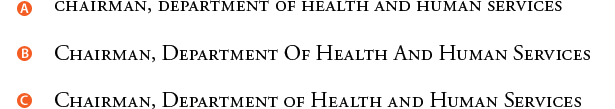
In A, all letters are the same size. So, all words are of equal importance.
In B, all letters have a large initial. So, all words are still of equal importance.
In C, proper nouns and titles are enlarged. Short verbs (such as “is,” “are” and “be”) and conjunctions (such as “or,” “and,” “not” and “but”) are usually left small.
By recognizing that large letters designate importance, we can help readers prioritize the words.
In D, the chairman is less important than the department.
In E, human services is more important than health.
In the case of F, where only the first word has a larger initial, we have some ambiguity: the chairman might be more important, or the initial might be larger just because it belongs to the first word.
In general, the fewer the occurrences of large initials, the more important those words seem. When every word has a large initial—as in line B—none stand out. When a few words have large initials—as in line E—readers assume it’s for a reason (even if they don’t know what it is).
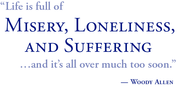
Small caps are universally recognized as carrying a serious tone:
Written exclusively for Webdesigner Depot by Ben Gremillion. Ben is a freelance writer and web designer who solves communication problems with better design.
How do you use small caps in your designs and where do they work best?
WDD Staff


Read Next

15 Best New Fonts, July 2024

20 Best New Websites, July 2024

Top 7 WordPress Plugins for 2024: Enhance Your Site's Performance

Exciting New Tools for Designers, July 2024

3 Essential Design Trends, July 2024

15 Best New Fonts, June 2024

20 Best New Websites, June 2024

Exciting New Tools for Designers, June 2024

3 Essential Design Trends, June 2024

15 Best New Fonts, May 2024

How to Reduce The Carbon Footprint of Your Website
