
 We often complain about the multitude of limitations which we're faced with every day as designers.
From browsers, to screen resolutions, to user interactions, we seem to constantly be struggling to find some way of thinking outside the tiny little box of "best practice" which we're constrained by.
Limitations are abundant but are they really such a bad thing? Is it possible, even, that they actually produce far better results than if we did not have them?
Ikea for example, starts with price and then work backwards. Their main concern is the price of the product to the end user. It's up to the designers to create something appealing which fits within that.
37Signals wrote a whole book about how they operate with similarly heavy restrictions when building web apps; they set a date to launch and then they stick to it, no matter what.
We often complain about the multitude of limitations which we're faced with every day as designers.
From browsers, to screen resolutions, to user interactions, we seem to constantly be struggling to find some way of thinking outside the tiny little box of "best practice" which we're constrained by.
Limitations are abundant but are they really such a bad thing? Is it possible, even, that they actually produce far better results than if we did not have them?
Ikea for example, starts with price and then work backwards. Their main concern is the price of the product to the end user. It's up to the designers to create something appealing which fits within that.
37Signals wrote a whole book about how they operate with similarly heavy restrictions when building web apps; they set a date to launch and then they stick to it, no matter what.
Sometimes Freedom Isn't a Good Thing
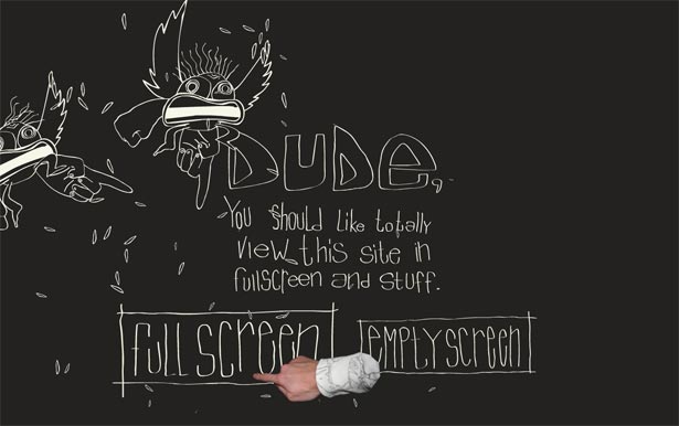 Without constraints, things can get crazy. There is no better way of outlining this than by looking at a platform with generations of unrestricted designs that have been... well.. awful. We are of course talking about our old friend, Adobe Flash.
Now I'm not saying that all Flash sites are bad, or that all people who make them are bad designers. Nothing like that. The fact remains, however, that as a platform Flash has very few design limitations which has lead to some very questionable Flash sites in years gone by.
The sites I'm talking about are the ones which go full screen as soon as they load, have some crazy navigation that involves dragging a carrot over to a bunny rabbit and then waiting for a big animation to complete before the next page loads and you're presented with equally confusing navigation options.
Designers of these types of interfaces often think they're "fun" - but usability case studies frequently prove them to be nothing more than a visual explosion of terminal car accidents. Being able to do so much with Flash with relatively little effort is dangerous. It takes away the mentality of "What should I do?" and instead promotes the mentality of "What can I do?"
An animation, graphic, sound effect, or interaction without purpose isn't design, it's decoration. Unless what you're adding to the design is in some way contributing to the message which you're trying to convey to the user, it isn't worth anything.
The most important part of any design is the message: good design sends the same message to everyone. It should leave no room for interpretation.
Without constraints, things can get crazy. There is no better way of outlining this than by looking at a platform with generations of unrestricted designs that have been... well.. awful. We are of course talking about our old friend, Adobe Flash.
Now I'm not saying that all Flash sites are bad, or that all people who make them are bad designers. Nothing like that. The fact remains, however, that as a platform Flash has very few design limitations which has lead to some very questionable Flash sites in years gone by.
The sites I'm talking about are the ones which go full screen as soon as they load, have some crazy navigation that involves dragging a carrot over to a bunny rabbit and then waiting for a big animation to complete before the next page loads and you're presented with equally confusing navigation options.
Designers of these types of interfaces often think they're "fun" - but usability case studies frequently prove them to be nothing more than a visual explosion of terminal car accidents. Being able to do so much with Flash with relatively little effort is dangerous. It takes away the mentality of "What should I do?" and instead promotes the mentality of "What can I do?"
An animation, graphic, sound effect, or interaction without purpose isn't design, it's decoration. Unless what you're adding to the design is in some way contributing to the message which you're trying to convey to the user, it isn't worth anything.
The most important part of any design is the message: good design sends the same message to everyone. It should leave no room for interpretation.
Limiting Color
 Digging down into specifics, we can look at some key areas where limitations can greatly improve design. The first of these areas is color. Cited by Bill from GoMediaZine as the second rule of becoming a master designer, limiting your color palette is extremely important.
One of the easiest ways to spot an amateur designer is when they use every color under the sun in a single piece. So how far does this go? Well, as Bill puts it "Reducing the number of colors we use in our design will make the piece feel consistent. Basically, everything will look like it goes together. Just like a sports team’s uniform or a company’s branding – we want a uniform over-all look to the colors."
Think about some of the best designers in our industry. Most, if not all, tend to use a small but vibrant palette for all of their designs. This is just one of the ways in which scaling back the number of variables in a design can make it more coherent, succinct and even unique.
Digging down into specifics, we can look at some key areas where limitations can greatly improve design. The first of these areas is color. Cited by Bill from GoMediaZine as the second rule of becoming a master designer, limiting your color palette is extremely important.
One of the easiest ways to spot an amateur designer is when they use every color under the sun in a single piece. So how far does this go? Well, as Bill puts it "Reducing the number of colors we use in our design will make the piece feel consistent. Basically, everything will look like it goes together. Just like a sports team’s uniform or a company’s branding – we want a uniform over-all look to the colors."
Think about some of the best designers in our industry. Most, if not all, tend to use a small but vibrant palette for all of their designs. This is just one of the ways in which scaling back the number of variables in a design can make it more coherent, succinct and even unique.
Limiting Typography
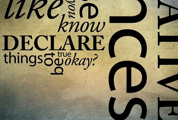 Typography works in a similar way to color, if not on a more extreme scale. Bar a few exceptions, over-using many fonts within a single design can become confusing and even difficult to read. The human eye likes to settle into patterns of recognition, introducing brand new types of type (pun intended) can greatly hinder this and interrupt the flow reading.
Usually a fancy font will work well for large headings and will add to the look and feel of the design as a whole, whereas body-text works best with a fairly standard font that is easily readable at small sizes.
You probably haven't seen any designs using Zapfino for all their body text any time recently for this very reason. Restricting our use of typography, once again, contributes to a better and a stronger overall design.
Typography works in a similar way to color, if not on a more extreme scale. Bar a few exceptions, over-using many fonts within a single design can become confusing and even difficult to read. The human eye likes to settle into patterns of recognition, introducing brand new types of type (pun intended) can greatly hinder this and interrupt the flow reading.
Usually a fancy font will work well for large headings and will add to the look and feel of the design as a whole, whereas body-text works best with a fairly standard font that is easily readable at small sizes.
You probably haven't seen any designs using Zapfino for all their body text any time recently for this very reason. Restricting our use of typography, once again, contributes to a better and a stronger overall design.
Limiting Size
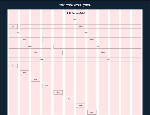 In terms of web design, we're currently at a very interesting point in history. Where are the screen sizes going? Some sites, particularly well known blogs, are starting to move towards the 1200px wide style layouts. There are even adaptations of the 960.gs CSS framework such as 1200.ws which support this move, but is it the right one?
Generally speaking, sites have now gotten to the same sort of width as a printed magazine in screen resolution. There's an important question to ask here before considering making your site much wider and that is: Why are printed magazines not wider? The obvious answer is that they would be annoying to hold and slightly too large to carry around comfortably but there's another important consideration too.
The human eye can only comfortably read a certain distance from one side to another. There comes a point where you have to start turning your head from side to side to be able to look at different segments of a page individually. When was the last time you took in a broadsheet newspaper in its entirity? Chances are that you never do. You fold it or you read it one segment at a time, turning your head in turn to see each area of the paper.
So where does this mean screens are going? Some people think they're going to keep on becoming larger but devices like the iPhone and the iPad would suggest that they aren't going to get bigger, they're just going to get better. It's great being able to fit more stuff into a larger, wider design but don't forget to consider the repercussions. Sometimes size restraints, too, can be good thing.
In terms of web design, we're currently at a very interesting point in history. Where are the screen sizes going? Some sites, particularly well known blogs, are starting to move towards the 1200px wide style layouts. There are even adaptations of the 960.gs CSS framework such as 1200.ws which support this move, but is it the right one?
Generally speaking, sites have now gotten to the same sort of width as a printed magazine in screen resolution. There's an important question to ask here before considering making your site much wider and that is: Why are printed magazines not wider? The obvious answer is that they would be annoying to hold and slightly too large to carry around comfortably but there's another important consideration too.
The human eye can only comfortably read a certain distance from one side to another. There comes a point where you have to start turning your head from side to side to be able to look at different segments of a page individually. When was the last time you took in a broadsheet newspaper in its entirity? Chances are that you never do. You fold it or you read it one segment at a time, turning your head in turn to see each area of the paper.
So where does this mean screens are going? Some people think they're going to keep on becoming larger but devices like the iPhone and the iPad would suggest that they aren't going to get bigger, they're just going to get better. It's great being able to fit more stuff into a larger, wider design but don't forget to consider the repercussions. Sometimes size restraints, too, can be good thing.
Looking at Minimalism
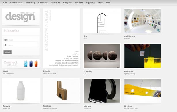 Minimalism is mainly described as using very little of everything, but if you think about it more analytically; minimalism is simply the process of applying an extra layer of limitations to designs. Where you would normally limit yourself to two or three colors for a design, with minimalism you might take that a step further and limit yourself to just black and white. The same can apply to typography, space, contrast, content, and almost any other core element of design.
Apple's products are a great example of this. They limit themselves to about six ports on the sides of their laptops where other laptops might easily have double that.
The iPod and the iPhone have always been noteworthy not because of how much they have, but how little. In a generation of twenty-button MP3 players, Apple introduced something with four buttons and a wheel which went on to be the most successful portable music device of all time.
Minimalism is mainly described as using very little of everything, but if you think about it more analytically; minimalism is simply the process of applying an extra layer of limitations to designs. Where you would normally limit yourself to two or three colors for a design, with minimalism you might take that a step further and limit yourself to just black and white. The same can apply to typography, space, contrast, content, and almost any other core element of design.
Apple's products are a great example of this. They limit themselves to about six ports on the sides of their laptops where other laptops might easily have double that.
The iPod and the iPhone have always been noteworthy not because of how much they have, but how little. In a generation of twenty-button MP3 players, Apple introduced something with four buttons and a wheel which went on to be the most successful portable music device of all time.
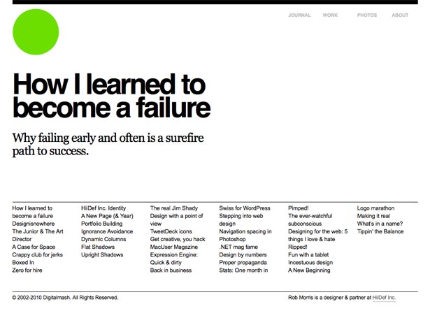
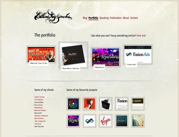 Minimalism doesn't just mean using less of everything however, it means using a few things really, really well. Elliot Jay Stocks for example, doesn't use many overzealous gradients, borders, boxes, bars or any of the other 'standard' layout conventions which we see plastered all over CSS galleries.
The main focus for the design of this site is on spacing and positioning. By cutting out many of the other variables, he uses positioning to the absolute maximum to convey levels of hierarchy and importance. Simple, but extremely effective.
Really good designers are always able to stand out from the crowd because they use these principles and theories as a starting point and then build on top of them. A fundamental understanding of all the different principles of great design is the best way to be able to weave them together into something beautiful.
Minimalism doesn't just mean using less of everything however, it means using a few things really, really well. Elliot Jay Stocks for example, doesn't use many overzealous gradients, borders, boxes, bars or any of the other 'standard' layout conventions which we see plastered all over CSS galleries.
The main focus for the design of this site is on spacing and positioning. By cutting out many of the other variables, he uses positioning to the absolute maximum to convey levels of hierarchy and importance. Simple, but extremely effective.
Really good designers are always able to stand out from the crowd because they use these principles and theories as a starting point and then build on top of them. A fundamental understanding of all the different principles of great design is the best way to be able to weave them together into something beautiful.
Conclusion
Limitations can be a good, no, a great thing for design. Using them to your advantage is a great challenge and the more limitations which you impose upon yourself beyond those which already exist, the more of a challenge this becomes. If you manage to work within tight limitations though, you can create something which is genuinely great and also genuinely unique. When you start out on your next piece of design work, try to put some of these principles into practice. Are there any areas which you can limit much more than you would usually? Try to work within tighter constraints to really push your creativity to the next level. You might just be surprised by what you end up producing. What do you think? Have you used limitations within your work to create better designs? Have you found that limitations are actually a bad thing? Let us know your stories in the comments below...John O’Nolan
Founder at Ghost.org. Writes about Open source, startup life, non-profits & publishing platforms. Travels the world with a bag of kites.


Read Next

15 Best New Fonts, July 2024
Welcome to our monthly roundup of the best fonts we’ve found online in the last four weeks. This month, there are fewer…
By Ben Moss

20 Best New Websites, July 2024
Welcome to July’s round up of websites to inspire you. This month’s collection ranges from the most stripped-back…

Top 7 WordPress Plugins for 2024: Enhance Your Site's Performance
WordPress is a hands-down favorite of website designers and developers. Renowned for its flexibility and ease of use,…
By WDD Staff

Exciting New Tools for Designers, July 2024
Welcome to this July’s collection of tools, gathered from around the web over the past month. We hope you’ll find…

3 Essential Design Trends, July 2024
Add some summer sizzle to your design projects with trendy website elements. Learn what's trending and how to use these…

15 Best New Fonts, June 2024
Welcome to our roundup of the best new fonts we’ve found online in the last month. This month, there are notably fewer…
By Ben Moss

20 Best New Websites, June 2024
Arranging content in an easily accessible way is the backbone of any user-friendly website. A good website will present…

Exciting New Tools for Designers, June 2024
In this month’s roundup of the best tools for web designers and developers, we’ll explore a range of new and noteworthy…

3 Essential Design Trends, June 2024
Summer is off to a fun start with some highly dramatic website design trends showing up in projects. Let's dive in!

15 Best New Fonts, May 2024
In this month’s edition, there are lots of historically-inspired typefaces, more of the growing trend for French…
By Ben Moss

How to Reduce The Carbon Footprint of Your Website
On average, a web page produces 4.61 grams of CO2 for every page view; for whole sites, that amounts to hundreds of KG…
By Simon Sterne

20 Best New Websites, May 2024
Welcome to May’s compilation of the best sites on the web. This month we’re focused on color for younger humans,…