
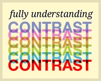
 Usually the subject of contrast is reserved for beginners. Books will say "black and white have contrast, red and orange do not" - but there's so much more to it.
Beginners books usually only touch on color contrast, but what about size and shape contrast? Often the easiest way to tell an amateur designer from a professional one is to look at their use of contrast.
Creating a structure of importance using size, shape and color is what gives a page impact and legibility to the reader.
In this post, we're going to look at contrast in detail, examining big typography, funky shapes, clear divides, imagery, and how they properly fit together using contrast for a good user experience.
Usually the subject of contrast is reserved for beginners. Books will say "black and white have contrast, red and orange do not" - but there's so much more to it.
Beginners books usually only touch on color contrast, but what about size and shape contrast? Often the easiest way to tell an amateur designer from a professional one is to look at their use of contrast.
Creating a structure of importance using size, shape and color is what gives a page impact and legibility to the reader.
In this post, we're going to look at contrast in detail, examining big typography, funky shapes, clear divides, imagery, and how they properly fit together using contrast for a good user experience.
An Introduction to Contrast
Contrast can be defined as "the difference in visual properties that makes an object (or its representation in an image) distinguishable from other objects and the background." In plain English that could be described at its most basic level as "things which look different from one another." For designers in all walks of the practice, but particularly web designers, contrast is at the root of pretty much everything. We are constantly trying to establish hierarchies of importance, draw people to certain areas of a page and communicate a clear and concise message at the very heart of our work. Creating relationships between different elements of a design is just about the most important thing that you can do. You've probably been doing it a great deal already, consciously or not. Obvious examples of contrast are black and white, big and small, fast and slow, thick and thin. Opposites are the easiest way to grasp what contrast is, but when applying contrast to design work it's never quite as black and white. If you were wondering, that's where the saying about a situation being "black and white" comes from, which also leads to the saying of something being a "gray area". In design we are often comparing things which are different but not opposite, for example an H1 and an h1, or an "add to cart" button and a "check out" button. This is where greater levels of contrast come into play. Let's take a look at the different types of contrast and some examples of how they're used in web design.Color Contrast
The most common example of all, this is pretty much where it all starts. If two colors are different to each other (say, black and white) they have high contrast, whereas if they are very similar (red and orange) then they have low contrast.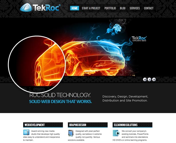 TekRoc use very obvious color contrast here by overlaying bright and vibrant image on top of a very dark background. The bright orange and blue clearly stand out and the eye is immediately drawn to them above all other things on the page.
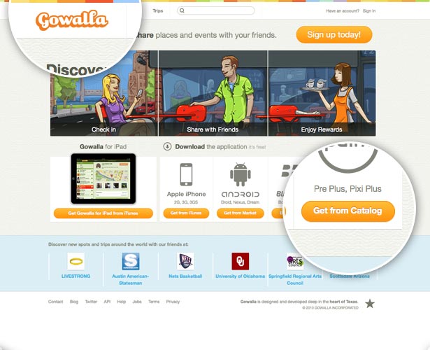 Tim Van Damme makes superb use of color contrast in the GoWalla site design. Not only does the multi-colored border at the top of the page stand out and create visual interest by being different from the pale background, but he has also added extremely subtle 1px drop shadows to the text on buttons. The slightly darker orange really helps to create contrast between the white text and the orange background.
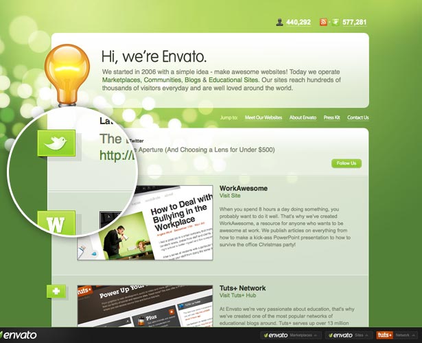 Envato are the masters of subtle contrast and the trend of using 1px borders for this can probably be put down to them more than anyone else. All their sites feature multiple single pixel borders to create contrast between sections. In the screenshot above the two content areas could have been divided by just space, or a single line, however by using two lines (one dark, one light) they create subtle contrast between the two sections which is extremely effective.
Size Contrast
The next most common form of contrast is using size. Something big beside something small generally indicates that the bigger item is far more important. That's right, we're saying that size matters!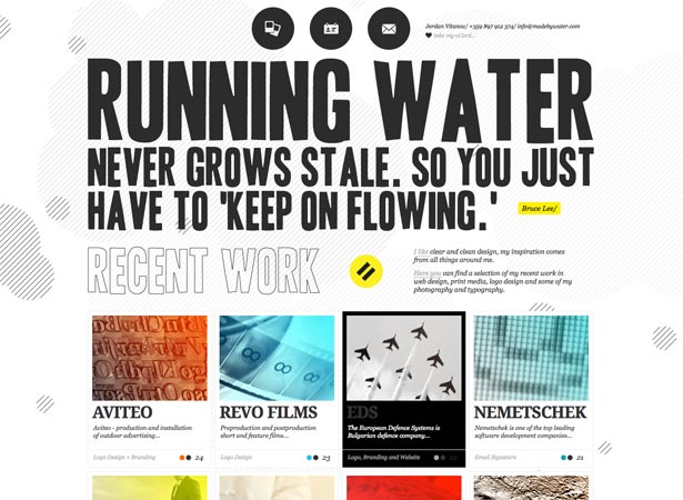 MadeByWater is the design portfolio of Jordan Vitanov. He uses size contrast with extremely large typography to instantly convey a quote by Bruce Lee which defines why he has chosen to brand himself with the MadeByWater name.
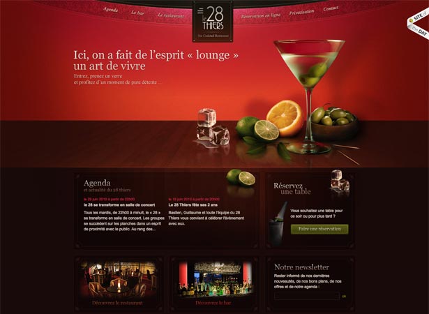 28Thiers is an attractive upmarket bar in France. Their website makes great use of size contrast to draw your attention immediately to the large photograph of the Martini with assorted ingredients surrounding it. It's instantly clear that this is the most important element on the page and the designer wants you to look at that image and be sold on the fact that it is an extremely classy establishment.
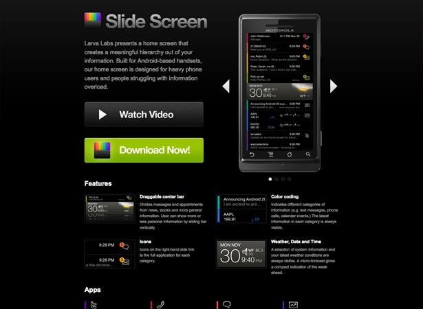 SlideScreen make multiple uses of size contrast in their site. As well as having their product displayed with a large screenshot, they also use very large buttons for their primary calls to action. They want you to watch the video of their product in action, and then they want you to download it. These are the most important elements of the page so they are substantially larger than the other things surrounding them.
Shape Contrast
Shape contrast means making things notable in by their difference in physical shape compared to other things on the page. At its most basic level this can be used in things like adding rounded corners to buttons, but taken to more extreme levels it can attract a lot more attention.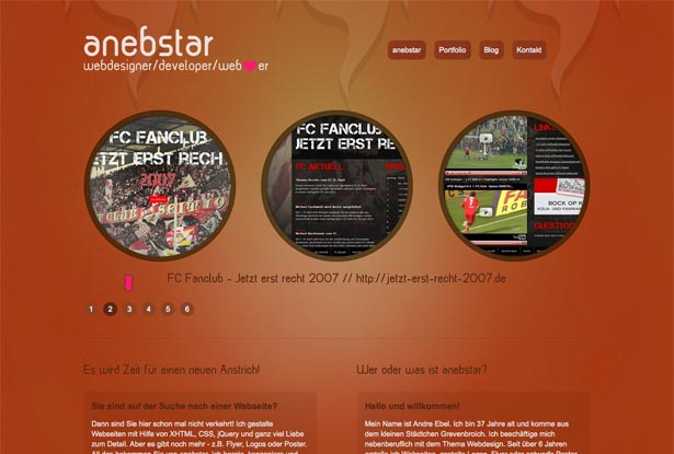 Anebstar uses shape contrast to showcase three important images in the header. Because most things on the web are rectangular, one of the easiest ways to achieve shape contrast is to use a circle. Of course this example also has a little size contrast mixed in as well, but you can clearly see how the circular elements stand out from everything else on the page.
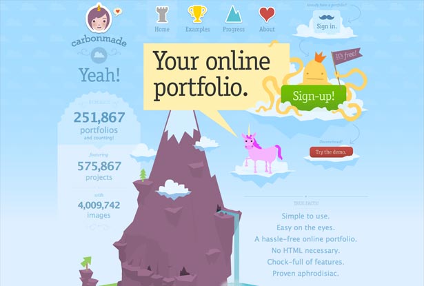 Carbonmade is a stunning site with a real mix of gorgeous illustrations and well presented content. A simple sign-up button here would have worked, but size and colour contrast probably wouldn't have set it apart enough from the busy background. Adding a friendly octopus behind the button really gives it that difference in shape to draw the eye directly to it.
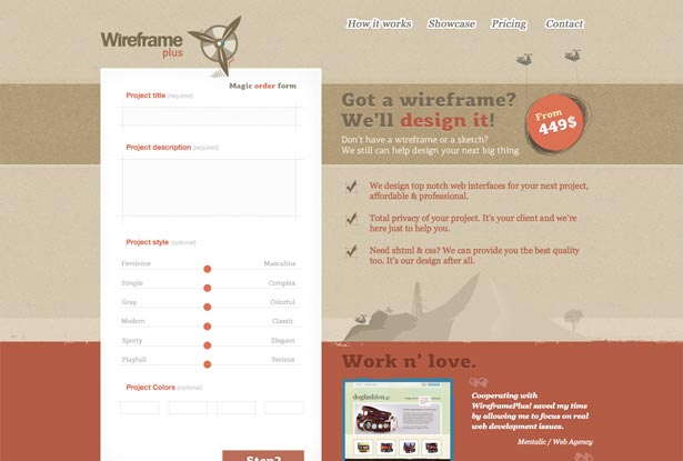 WireframePlus use a simple but extremely effective bit of shape contrast to highlight the price of their services. They want you to read their content but above all they're trying to sell you on their great price by putting a big circle behind it.
Positional Contrast
Creating contrast in positioning is a very neat way to create a hierarchy of elements purely by using different alignments. In recent times this technique has been made popular by people like Elliot Jay Stocks, who used it to the extreme on his most recent portfolio site.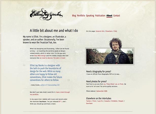 Elliot Jay Stocks uses a detailed grid to define the alignment of all the elements on his site. Attention is called to specific areas by them being indented to the left or the right respectively. In this particular screenshot the introductory paragraph really stands out because it's aligned furthest to the left, where the eye looks first to read something. This type of alignment has "inspired" many other designers in the past twelve months to create designs with positional contrast in the same sort of style.
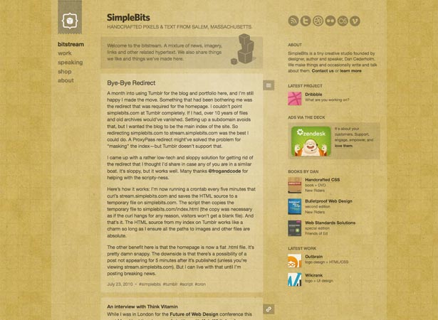 SimpleBits is the brand which Dan Cederholm works under, you may know him from projects such as Dribbble. On first impressions the SimpleBits site doesn't appear to have any positional contrast, however when you start scrolling, all becomes clear. Where some people use a fixed background image to create a neat stylistic effect, Dan has made his logo and navigation completely fixed in position so that regardless of where you scroll to, they always remain in the same place on the screen. This is a great example of non-standard positional contrast.
 SquaredEye is the design shop run by Matthew Smith and the case study pages in his portfolio make fantastic use of positional contrast. You need to see the whole page to really get the idea but essentially Matthew has meticulously created specific positioning for each section of the page. This creates fantastic contrast between sections and creates a great deal of visual interest to the reader without being at all distracting.
Contrast Conclusion
There is so much more to contrast than just "light and dark" - it's one of the most important principles in design and you can almost never have too much of it, provided that you use it properly. Taking your designs to the next level isn't about finding the next band-wagon to hop on using rounded corners and drop shadows for everything, it's about finding better and more efficient ways of communicating the message behind the design. Exploring contrast in detail and using it to its full potential is one of the best ways to do this. What do you think? How much attention do you pay to contrast within your designs? Is it something you think about all the time or is it something that comes naturally?John O’Nolan
Founder at Ghost.org. Writes about Open source, startup life, non-profits & publishing platforms. Travels the world with a bag of kites.


Read Next

15 Best New Fonts, July 2024
Welcome to our monthly roundup of the best fonts we’ve found online in the last four weeks. This month, there are fewer…
By Ben Moss

20 Best New Websites, July 2024
Welcome to July’s round up of websites to inspire you. This month’s collection ranges from the most stripped-back…

Top 7 WordPress Plugins for 2024: Enhance Your Site's Performance
WordPress is a hands-down favorite of website designers and developers. Renowned for its flexibility and ease of use,…
By WDD Staff

Exciting New Tools for Designers, July 2024
Welcome to this July’s collection of tools, gathered from around the web over the past month. We hope you’ll find…

3 Essential Design Trends, July 2024
Add some summer sizzle to your design projects with trendy website elements. Learn what's trending and how to use these…

15 Best New Fonts, June 2024
Welcome to our roundup of the best new fonts we’ve found online in the last month. This month, there are notably fewer…
By Ben Moss

20 Best New Websites, June 2024
Arranging content in an easily accessible way is the backbone of any user-friendly website. A good website will present…

Exciting New Tools for Designers, June 2024
In this month’s roundup of the best tools for web designers and developers, we’ll explore a range of new and noteworthy…

3 Essential Design Trends, June 2024
Summer is off to a fun start with some highly dramatic website design trends showing up in projects. Let's dive in!

15 Best New Fonts, May 2024
In this month’s edition, there are lots of historically-inspired typefaces, more of the growing trend for French…
By Ben Moss

How to Reduce The Carbon Footprint of Your Website
On average, a web page produces 4.61 grams of CO2 for every page view; for whole sites, that amounts to hundreds of KG…
By Simon Sterne

20 Best New Websites, May 2024
Welcome to May’s compilation of the best sites on the web. This month we’re focused on color for younger humans,…