 When designing a web app, functionality is often placed above everything else. For the most part, this is a good thing.
People (mostly) use apps because they're useful, not because they look pretty. But that doesn't mean you can ignore good UI design, or just slap together a generic-looking user interface. Good UI design adds to the overall user satisfaction of any web app.
Good UI design is, in many ways, similar to good web design. Principles of color theory, negative space, and layout all still apply. But UI design requires a bit more thought in many cases due to the interactivity it requires.
Visitors won't just be looking at your site; they'll be interacting with it, sometimes in ways you didn't expect. It's vital that you take the time to really explore UI design prior to embarking on a web app design.
Below are a number of principles and ideas for designing a great user interface.
Consistency is Vital
In user interface design, consistency between pages, functions, and options is vital. Users come to expect certain things as they use your program, and if those things change from one page to the next, it's both confusing and frustrating.
For example, if on the home page for your application users navigate between pages with a top navigation bar, make sure that same top navigation bar appears on subsequent pages, and that the pages linked from it appear in the same order.
Other things that need to be kept consistent include your color scheme and general layout, as well as links to important pages that might not be directly used within the application (such as an account page or an FAQ).
Your Users Will Make Mistakes
Regardless of how carefully you design your user interface and how intuitive it is, your users will make mistakes on occasion. Sometimes it's just because they inadvertently clicked when they didn't mean to. Other times it's because they weren't really paying attention to what they were doing, or weren't reading the page's content.
In either case, it's important that users can easily undo the mistakes they make.
You'll notice on a number of web apps, including Google Docs, that virtually any time you do something, a link appears to undo the last action. On other apps, you might have to use a menu to undo an action, but the best web apps still make it easy and accessible to go back a step or two at any point.
Highlight Changes
When changes are made during the use of a web app, it's useful to your users if you highlight those changes. For example, if your app includes a feed of information from a variety of sources or users, highlighting new content as it appears is a useful feature.
There are a number of ways you can highlight content. One of the most popular is to put a shaded background behind new content.
Other apps use icons to indicate new content. Whatever you decide to do, make sure the new-content indications don't interfere with the readability of the content. It's also important to make these notifications unintrusive, so as not to distract users who aren't currently concerned with changing content.
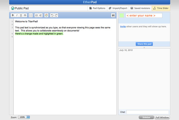
TitanPad uses color coding to indicate changes made by each user.
Enable Keyboard Shortcuts
Not every user out there is going to use keyboard shortcuts, even if you make them available. But for the percentage of users who are used to keyboard shortcuts, not including them can have a disastrous effect on user satisfaction.
Think about the most common actions users will perform on your website and make sure keyboard shortcuts are available for those.
Make sure, too, that whatever keyboard shortcuts you use are logical. Certain shortcuts are already commonly used for certain functions (like Ctrl+Z to undo or Ctrl+V to paste), so make sure those continue to work as they do in other programs.
Choose the keys used in your shortcuts logically, so they're easy to remember for your users. Make sure you also include them in any drop-down menus next to their respective actions.
Use Familiar Standards and Conventions
Widely-used applications have set certain standards for the way things are expected to work in an application. For example, people are used to seeing a folder icon for "Open", or a clipboard for "Paste".
They're also used to having certain options and actions appear under specific application menus (creating a new document or file is almost always located under the "File" menu dropdown; copy and paste are almost always found under the "Edit" menu dropdown).
Think about established apps that do similar things to what your app will do, and look at how they organize actions and what icons they use.
If you see consistencies between various apps, you should seriously consider using the same or similar icons for your own app. It makes it more intuitive for users who are switching from another app to yours and will improve their experience.
Offer Personalization Options
A lot of web apps allow users to make customizations to their account. Some sites let you adjust the color scheme or upload custom graphics. Others let you rearrange the layout or what's shown when you first log in. Still others let you create custom pages or similar content that displays the information you're concerned with.
Think about the possible customizations that would improve both the functionality and the user experience of your apps.
Some apps might not benefit much from customizations, while others are filled with possibilities. Even simple things like allowing users to upload their own logo or change the color scheme or font to suit their personal preferences can have a drastic impact on user experience and satisfaction.
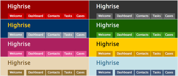
Highrise lets users customize the color scheme of their dashboard. Small customization options like this can greatly add to user satisfaction.
Use Tooltips and Integrated Help Messages
A lot of app developers include extensive documentation for using their apps, which is incredibly helpful to new users. But in many cases, this documentation is kept in its own, separate section on the website. In order to access it, users have to effectively leave the application.
While extensive documentation is still a good idea for complicated apps, incorporating tooltips and integrated help messages in modal windows or in a sidebar within the page increases usability for the majority of users.
It's a seamless way of offering help while someone is actually using your application, which saves them time and makes the entire experience more enjoyable.
Use Tabbed Navigation and Buttons for Actions
Tabbed navigation has a number of advantages over buttons or text links. The most important, though, is the subtle psychological effect it has.
Tabs evoke using a notebook or binder. Each tab denotes a new section or topic. The same is true online. Tabs make people subconsciously think of physically moving to a new section of a site or app.
Buttons, on the other hand, evoke an action. Using buttons for things like submitting a form makes sense psychologically, as people associate pushing a button with doing something. So for optimal user experience, remember tabs = navigation, buttons = action.
Shade Everything Behind a Modal Window
This is one of those really basic things that sometimes gets overlooked. When opening a modal window, make sure you shade out everything in the background behind the window. This makes the window stand out more and eliminates distractions.
A good example of a modal window with a shaded background.
Use Relevant Icons and Labels
A lot of developers opt to use icons in their apps without labeling those icons. Other than the absolute most common icons, this is often a mistake and only confuses the user.
Adding in alt tags that appear when icons are hovered over isn't a good solution to avoid confusion, as it still requires too much effort on the part of the user.
Placing labels next to your icons means they're instantly recognizable. As users become familiar with the meaning of each icon, they'll be able to more quickly find what they're looking for, and until then they can easily see exactly what each icon stands for.
Another option is to make it possible for your users to hide the labels, though make sure the default option is for them to be shown.
Keep Things Simple
The best interfaces are as simple as they can effectively be. Don't add bells and whistles for the sake of adding bells and whistles. If a function has a clear purpose, then add it. If it doesn't, then don't.
The same goes for design elements. If there's a purpose to an element, then it's okay to add it. But avoid adding things that just look pretty. They'll only add visual clutter and confuse your users. Choose the simplest solution that gets the job done.
This doesn't necessarily mean your app needs to be minimalist. But remember that most people use apps for their functionality, not for their design. As long as the design doesn't interfere with their ability to efficiently use your app, then they're unlikely to even pay much attention to the visual elements of the app.
Efficient Workflow
When designing a user interface, you need to consider the workflow of your users. People have predetermined ways they use particular types of software and particular apps, and you'll need to design your interface to conform to those patterns.
For example, if certain actions are generally taken in association with each other, group them together in the same area of the app.
Study the workflow of a number of users to see what seems to be getting in the way of their efficient completion of tasks, and then figure out how to improve the UI to cater to their needs. In some cases, UI alone can't solve these issues, but sometimes it can.
15 Examples of Great User Interfaces
There are hundreds or even thousands of web apps out there with fantastic user interface designs. Here are more than a dozen to give you some ideas.
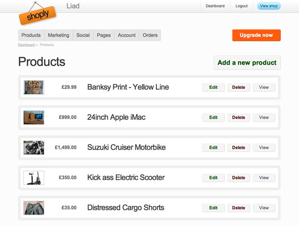
Shoply
Shoply makes it quite easy for users to delete, edit, or view products they've already uploaded, as well as to add new products.
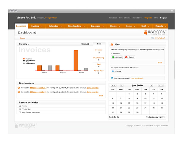
Invoicera
Invoicera uses tabbed navigation and buttons to perform actions. It also keeps a relatively simple and straight-forward layout and color scheme.
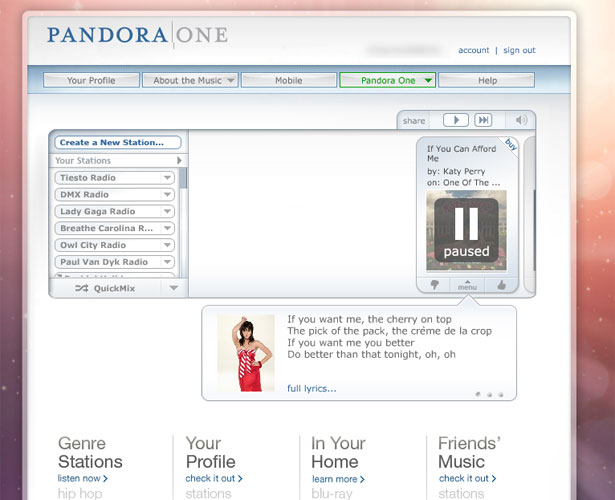
Pandora
It's obvious that the designers behind Pandora took into account the interfaces present on MP3 players and other media devices in designing their user interface. It's an intuitive and easy-to-use design with virtually no learning curve.
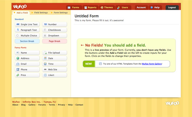
Wufoo
Wufoo's form design interface is about as intuitive as an app can get. Help messages are displayed when you start designing a new form to explain exactly what to do without having to leave the page.
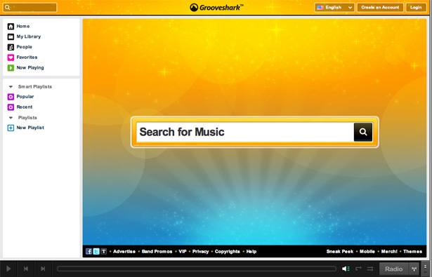
Grooveshark
Grooveshark uses icons to help with navigation and functionality. Commonly recognized icons like the "play" and "skip" buttons aren't labeled, but others, like the Home and Favorites icons, are.
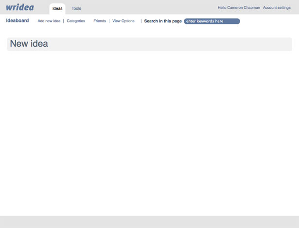
Wridea
Wridea uses an intuitive interface that lets you edit anything just by clicking on it. They also use menus that only expand when you hover over an idea, which reduces visual clutter, and they let users choose between two color schemes.
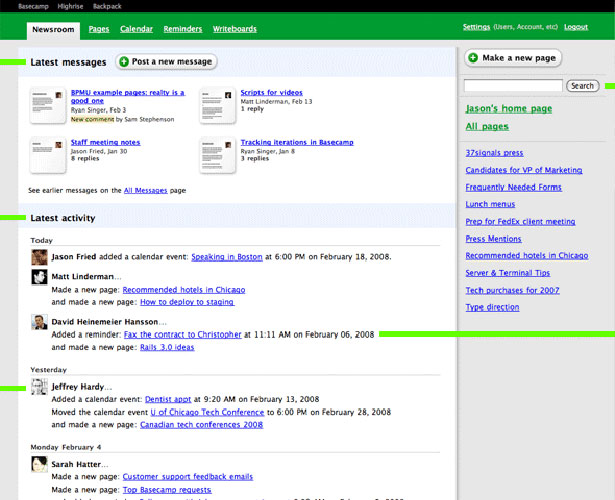
Backpack
Backpack uses buttons for actions and tabs for navigation, making it more intuitive to use.
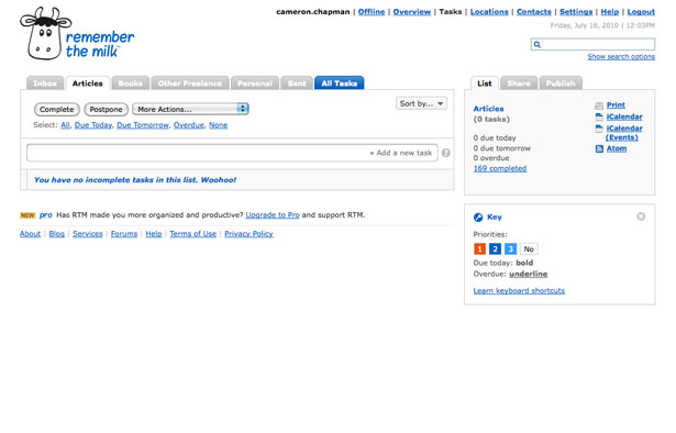
Remember the Milk
Remember the Milk uses tabbed navigation and buttons for actions. They also include helpful notations that mostly negate the need for separate documentation.
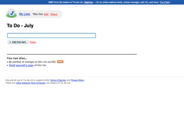
Ta-da List
Ta-da Lists keeps their interface as simple as possible. There's no extra information, just the task at hand. It's incredibly intuitive and makes for an excellent user experience.
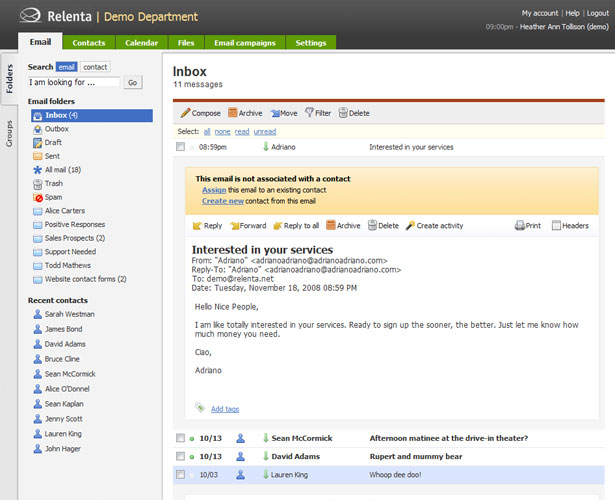
Relenta
Relenta uses tabbed navigation and labeled icons. They also stick to standard conventions for email programs, so there's virtually no learning curve for their users.
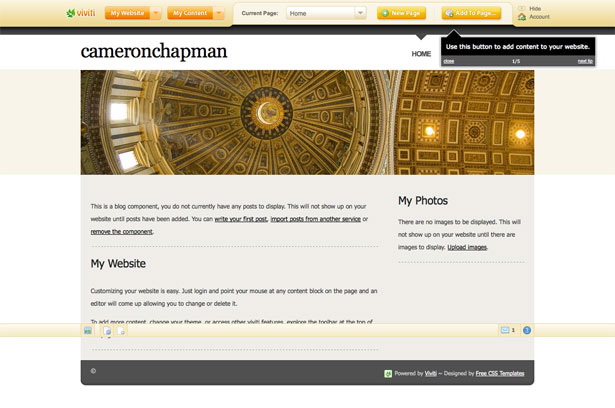
Viviti
Viviti uses an intuitive user interface that takes into account the needs of their non-designer users. Tips are provided whenever you log in, and the documentation is easily accessible and user-friendly, allowing you to choose what type of help you want before actually leaving the page you're working on.
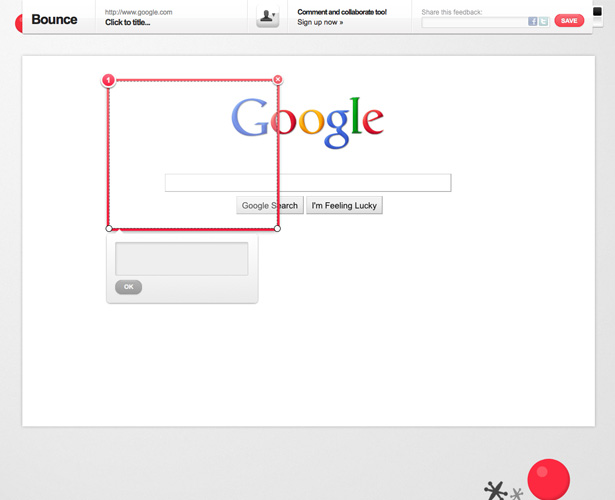
Bounce
Bounce's interface is very straight-forward and simple. The tools available are intuitive (just drag over an area to make a note, write feedback, and then share).
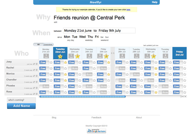
Meetifyr
Meetifyr uses such an intuitive interface that virtually no documentation is needed. Looking over the app, it takes only seconds to instantly recognize both how to use it and what the different icons and color codes mean.
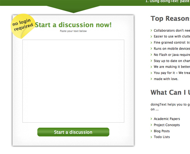
DoingText
DoingText simplifies use by not requiring any type of signup process. Documents are simply URL-based and collaborators only need the URL. It makes collaboration an almost-instantaneous process.
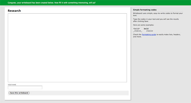
Writeboard
Writeboard includes useful styling help in the sidebar next to the main content area.
Written exclusively for WDD by Cameron Chapman.
What's your favorite UI design? Have any other tips for designing outstanding user interfaces? Please share them in the comments!
WDD Staff


Read Next

15 Best New Fonts, July 2024

20 Best New Websites, July 2024

Top 7 WordPress Plugins for 2024: Enhance Your Site's Performance

Exciting New Tools for Designers, July 2024

3 Essential Design Trends, July 2024

15 Best New Fonts, June 2024

20 Best New Websites, June 2024

Exciting New Tools for Designers, June 2024

3 Essential Design Trends, June 2024

15 Best New Fonts, May 2024

How to Reduce The Carbon Footprint of Your Website
