
 Today's post is a big one and it's most definitely one for your bookmarks menu, because from time to time when speaking with clients it becomes necessary to have material to backup the statements which you are making.
Sometimes clients will suggest things such as forcing all users to register with a six page long form before they can even access the site. They aren't web professionals, it's not their fault for not knowing that this isn't a good idea from a usability perspective.
If you're going to convince them that this is a bad idea, however, then you're going to need some rock solid material to back that up. While an element of trust is always important to a working relationship, you have to respect that sometimes clients will just need to see the facts in front of them to fully understand that what you're saying is correct.
So, what we've done for you today is compiled a list of some of the biggest, most compelling usability articles which address common issues. Hopefully this should help you during tough conversations about what does and doesn't work on a a website.
Bookmark this post, come back to it, use it in meetings and educate your clients on the things which work for other websites, so that they might also work for them.
Today's post is a big one and it's most definitely one for your bookmarks menu, because from time to time when speaking with clients it becomes necessary to have material to backup the statements which you are making.
Sometimes clients will suggest things such as forcing all users to register with a six page long form before they can even access the site. They aren't web professionals, it's not their fault for not knowing that this isn't a good idea from a usability perspective.
If you're going to convince them that this is a bad idea, however, then you're going to need some rock solid material to back that up. While an element of trust is always important to a working relationship, you have to respect that sometimes clients will just need to see the facts in front of them to fully understand that what you're saying is correct.
So, what we've done for you today is compiled a list of some of the biggest, most compelling usability articles which address common issues. Hopefully this should help you during tough conversations about what does and doesn't work on a a website.
Bookmark this post, come back to it, use it in meetings and educate your clients on the things which work for other websites, so that they might also work for them.
How Not Forcing Users to Register Increased Sales by $300million
 A truly fascinating article covering how one ecommerce site removed forced user-registration during the checkout process, with a result of a $300million increase in revenue. Very impressive.
10 Useful Usability Findings and Guidelines
- Form labels work best above the field
- Users focus on faces
- Quality of design is an indicator of credibility
- Most users do know how to scroll
- Blue is the best color for links
- The ideal search box is 27 characters wide
- White space improves comprehension
- Effective user testing doesn't have to be extensive
- Informative product pages stand out
- Most users are blind to advertising
Browser Resolution Stats by Google
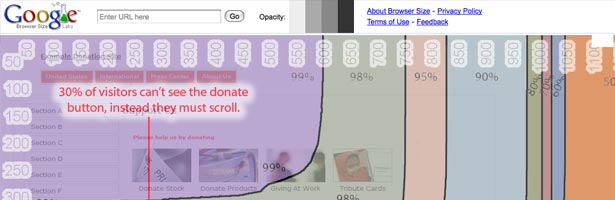 A big diagram by google showing browsers sizes overlaid on top of a web page and where you should place call to actions to ensure that they are immediately visible without the need to scroll.
The myth of the page fold: evidence from user testing
 "People tell us that they don’t mind scrolling and the behaviour we see in user testing backs that up. We see that people are more than comfortable scrolling long, long pages to find what they are looking for. A quick snoop around the web will show you successful brands that are not worrying about the fold either."
247 web usability guidelines
 A massive post of usability articles covering:
- Home page usability: 20 guidelines to evaluate the usability of home pages.
- Task orientation: 44 guidelines to evaluate how well a web site supports the users tasks.
- Navigation and IA: 29 guidelines to evaluate navigation and information architecture.
- Forms and data entry: 23 guidelines to evaluate forms and data entry.
- Trust and credibility: 13 guidelines to evaluate trust and credibility.
- Writing and content quality: 23 guidelines to evaluate writing and content quality.
- Page layout and visual design: 38 guidelines to evaluate page layout and visual design.
- Search usability: 20 guidelines to evaluate search.
- Help, feedback and error tolerance: 37 guidelines to evaluate help, feedback and errors
An Introduction to Using Patterns in Web Design
 A fascinating article covering the use of patterns for usability in web design, or "chunks" as the author calls them!
F-Shaped Pattern For Reading Web Content
 Eye-tracking visualizations show that users often read Web pages in an F-shaped pattern: two horizontal stripes followed by a vertical stripe.
Top Ten Mistakes in Web Design
 The ten most egregious offenses against users. Web design disasters and HTML horrors are legion, though many usability atrocities are less common than they used to be.
Weblog Usability: The Top Ten Design Mistakes
 Blogs are often too internally focused and ignore key usability issues, making it hard for new readers to understand the site and trust the author.
Top-10 Application-Design Mistakes
 Application usability is enhanced when users know how to operate the UI and it guides them through the workflow. Violating common guidelines prevents both.
Mega Drop-Down Navigation Menus Work Well
 Big, two-dimensional drop-down panels group navigation options to eliminate scrolling and use typography, icons, and tooltips to explain the user's choices.
10 Usability Crimes You Really Shouldn’t Commit
 A big post by Chris Spooner covering forms, logo links, link states, alt attributes, background images, content, link text and text alignment.
101 Five-Minute Fixes to Incrementally Improve Your Web Site
 An absolutely huge post covering quick improvements for usability across so many different levels. This is great one for picking out things that your client's site might need to have done to it!
Blasting the Myth of the Fold
 Another article slamming the idea that nothing below the fold ever gets seen. Users know how to scroll. The fold is relevant for a few things, but it is not the be-all and end-all.
UX Myths
 A great site which is regularly updated with a list of (sometimes funny) myths of user experience issues, these include things such as "all pages should be accessible in 3 clicks" and "the home page is your more important one".
Eyetracking points the way to effective news article design
 Real eye tracking tests carried out and showing interesting results with regards to the effectiveness of laying out new articles and blog posts.
Label Placement in Forms
 A detailed case study showing that the optimum placement for label forms is to the top-right of the form field.
12 Standard Screen Patterns
 A great rouncup of some standard screen layouts which may pursuade clients away from spherical invisible navigation, or similar.
"Mad Libs" Style Form Increases Conversion 25-40%
 This interesting article covers how well forms work when arranged as blanks within sentences rather than simple linear pages.
Breadcrumbs In Web Design: Examples And Best Practices
 "On websites that have a lot of pages, breadcrumb navigation can greatly enhance the way users find their way around. In terms of usability, breadcrumbs reduce the number of actions a website visitor needs to take in order to get to a higher-level page, and they improve the findability of website sections and pages."
Inline Validation in Web Forms
 A study by A List Apart on inline validation in forms with live user videos showing the differences between standard forms vs inline validation.
What about you? Do you have any really great articles like these which you think would be a good addition to the list? Drop us a line in the comments below so that everyone can benefit from them!
A study by A List Apart on inline validation in forms with live user videos showing the differences between standard forms vs inline validation.
What about you? Do you have any really great articles like these which you think would be a good addition to the list? Drop us a line in the comments below so that everyone can benefit from them!
John O’Nolan
Founder at Ghost.org. Writes about Open source, startup life, non-profits & publishing platforms. Travels the world with a bag of kites.


Read Next

15 Best New Fonts, July 2024
Welcome to our monthly roundup of the best fonts we’ve found online in the last four weeks. This month, there are fewer…
By Ben Moss

20 Best New Websites, July 2024
Welcome to July’s round up of websites to inspire you. This month’s collection ranges from the most stripped-back…

Top 7 WordPress Plugins for 2024: Enhance Your Site's Performance
WordPress is a hands-down favorite of website designers and developers. Renowned for its flexibility and ease of use,…
By WDD Staff

Exciting New Tools for Designers, July 2024
Welcome to this July’s collection of tools, gathered from around the web over the past month. We hope you’ll find…

3 Essential Design Trends, July 2024
Add some summer sizzle to your design projects with trendy website elements. Learn what's trending and how to use these…

15 Best New Fonts, June 2024
Welcome to our roundup of the best new fonts we’ve found online in the last month. This month, there are notably fewer…
By Ben Moss

20 Best New Websites, June 2024
Arranging content in an easily accessible way is the backbone of any user-friendly website. A good website will present…

Exciting New Tools for Designers, June 2024
In this month’s roundup of the best tools for web designers and developers, we’ll explore a range of new and noteworthy…

3 Essential Design Trends, June 2024
Summer is off to a fun start with some highly dramatic website design trends showing up in projects. Let's dive in!

15 Best New Fonts, May 2024
In this month’s edition, there are lots of historically-inspired typefaces, more of the growing trend for French…
By Ben Moss

How to Reduce The Carbon Footprint of Your Website
On average, a web page produces 4.61 grams of CO2 for every page view; for whole sites, that amounts to hundreds of KG…
By Simon Sterne

20 Best New Websites, May 2024
Welcome to May’s compilation of the best sites on the web. This month we’re focused on color for younger humans,…