 In this post, we'll discuss how a thoughtful, well-designed business card can help your company give a good first impression and send the right message. We'll look at elements to include in your design and the different approaches to take.
We often hear of the importance of first impressions in both our professional and personal lives.
In business, the first impression we make on potential clients and other professionals can affect how much business we get. If we fail to dazzle in the first meeting, we might not be attending the follow-up meeting in which we could raise the bar.
Also, we tend to forget that first impressions often begin with a business card. Let's be honest: in most networking situations, we tend to lead with our cards.
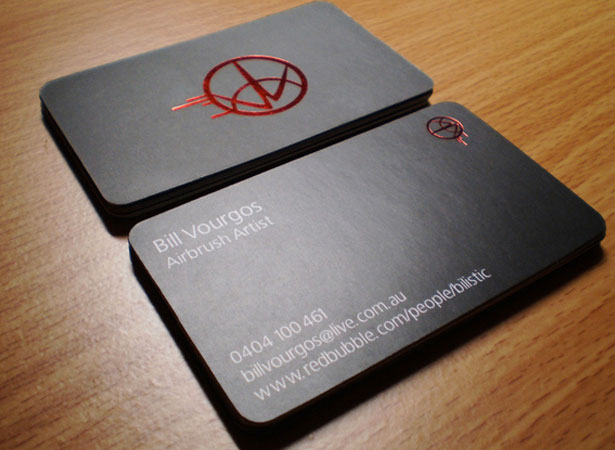
Blink Airbrushing Business Card by Katerina Vourgos
Business cards convey the potential of all branded professionals-especially designers-and you should remember that when designing them. The card's text provides essential information, but the design speaks volumes about your business, so take care to find the perfect look. You know what they say: "A picture is worth a thousand words."
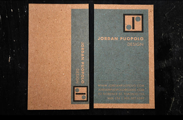
Personal Identity Package by Jordan Puopolo
Now, what does that mean exactly: the "perfect" design? Given the range of businesses and their needs, perfect can be difficult to pin down. What works for one brand will not necessarily work for others. You have to find an inventive take on the standard business card to make an impression that goes above and beyond others in your field. Below is a breakdown of approaches you could take to designing a business card that captures the tone and attitude you want.
The Professional
To convey that you are a super professional, your business card should have a sharp, clean, minimal design. The presentation should be clear, with few distractions; bells and whistles are great sometimes, but you have to pick the right moments, and this isn't one of them. To impress upon your contact that you are strictly business, get in, get your point across and get out. Follow this formula in piecing your design together.
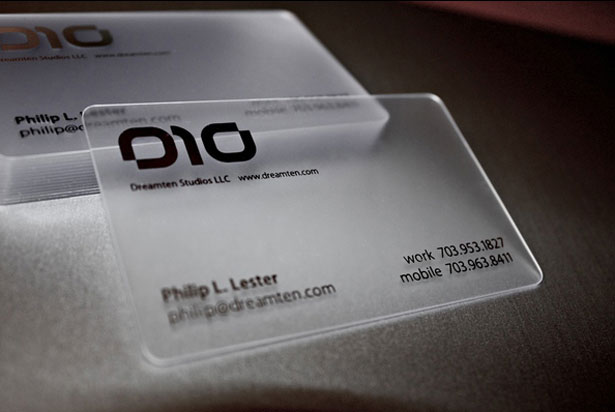
Dreamten Studios Card by Phillip Lester
Elements to Include
Some elements that tend to convey professionalism are sans serif fonts, plenty of white space and perhaps some letterpressing or embossed effects. Sleek is the keyword here, and your font selection should be just that. Sand serifs give a sharp, elegant feel, fitting perfectly with this approach. Make sure the letters are cleanly and evenly kerned. Take advantage of white space as much as possible by letting the text and fonts do most of the talking. Finishing the card off with a nice letterpress effect, or even embossing will sell you as a pro.
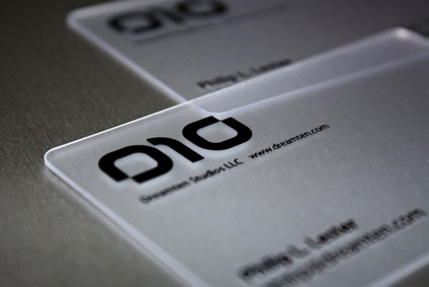
Dreamten Card close-up
Colors to Use
Color is another aspect to consider. Use just one or two colors for a minimalist look; you put a lot of work into the text to make it look simple, so keep it from looking busy by being selective about color. What colors convey professionalism?
- Classic white symbolizes purity and suggests clarity of mission and purpose.
- Brown gives the impression of stability.
- Gray indicates a practical nature.
- Red might also be a good choice; it communicates passion for your brand.
The Playful
Sometimes, we want to stray a little from a strictly professional attitude. We want to be playful. Some people respond to a whimsical approach, and if that suits you and your business, go for it. Make your card colorful and overflowing with imagination. You don't want your card to fit the mold, so hang your creative hat outside the box and keep it there for the duration of this project-originality may need to work overtime.
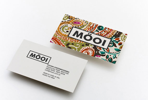
Mooi by SeventhDesign
Elements To Include
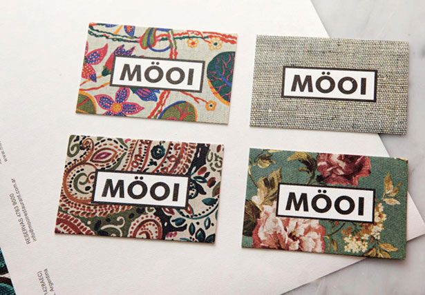
When you're choosing elements for this business card, think energy. Colorful illustrations tend to work well; they add a touch of whimsy and reveal that fun is waiting on the other side of that email address. Allow yourself to be playful with the contact information, too. Try a script font, perhaps. Don't sacrifice legibility, though. If you can't find a script that's playful yet both precise and clear, then consider falling back on a sans-serif selection (anything but Comic Sans!) If you want serifs, lean toward a slab-serif font: their kerning and alignment can be toyed with to your liking. Other effects that might work are die-cutting and letterpressing.
A variety of designs for the card
Colors to Use
When playfulness is called for, splashes of color make the point. Your printer and budget might limit the number of colors you can use, but you can still work with what you have for the desired effect.
- Yellow is a fantastic color to start with, with its happy and energetic feel.
- Orange is also an option. It's generally perceived as fun and flamboyant. It's also one of those colors that people tend to either love or hate, so use it with caution.
- If there are no limits, you might choose soft shades, even pastels.
The Reliable
To convey trustworthiness, design your business card to reflect reliability. A solid reputation does wonders for business, but unless you plan to print customer testimonials on your card, you'll have to be imaginative with this one and keep the information compact. There are a number of ways to communicate reliability in design. With some simple color choices and a few key elements, the quality will come through.
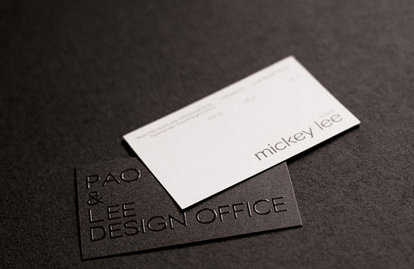
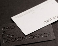
Pao and Lee Design Office by Fizi Pao
Elements To Include
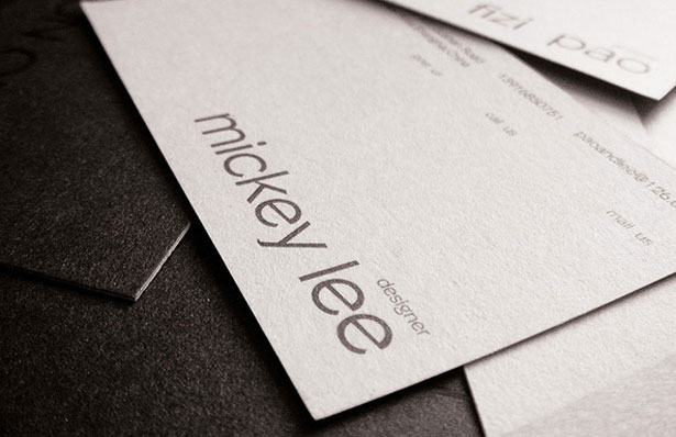
Communicating reliability is tricky. Falling back to a conventional design might work. People are doing a lot of amazing things with business cards these days, but some people see it as nothing but pomp and flash. Going back to basics might demonstrate that you are on solid ground and don't feel the need for glitter to sell your brand. Either a serif or sans-serif font would work, but opt for a bold condensed variation of whatever typeface you choose, which will have a strong presence. Steer clear of many effects (beyond perhaps foil stamping).
Pao and Lee Design Office close-up
Colors to Use
Take a subdued approach to color. Too much color or too many colors will detract from your message, so keep it simple:
- Blue commonly represents trust, so this is a great place to start.
- Many see red as bearing a mark of confidence.
- Brown is generally equated with reliability
- If we're falling back to the basics for a comfortable, dependable look, black and white work just as well.
The Wise
No matter what field we're in, we need to gain our client's trust so that we can effectively guide them through the project. If the client doesn't trust that we are wise and know what we're doing, they will likely be resistant, which will lead to friction and an uncomfortable relationship. Avoid this with a business card that speaks wisdom.
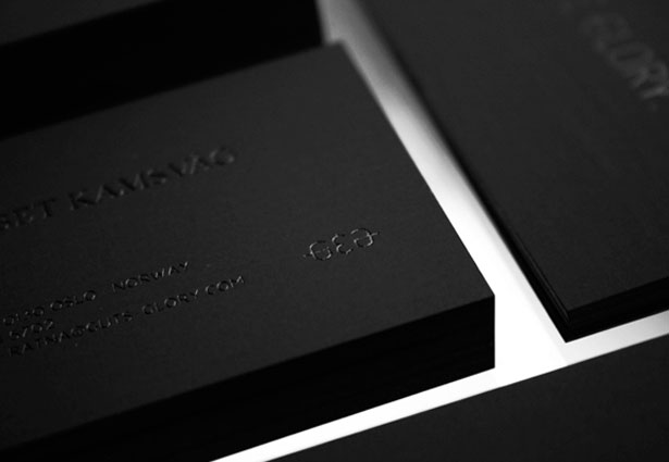
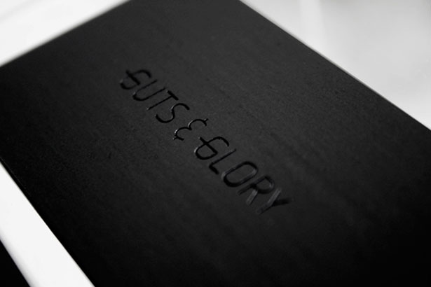
Guts & Glory by Martin Stousland
Elements to Include
You can do a few things to drive home the impression that you're wise. A muted, minimalist approach would work; one would expect a stoic demeanor from a seasoned pro. Knowledge is often gleaned from those who listen and say little, so take a similar approach with your card. Abstract imagery or imagery surrounded by white space would be effective, as would subtle effects-letterpressing or embossing on the text. Stick to thin sans-serif typefaces. The Helvetica Neue ultra-thin variant comes to mind, but its kerning and alignment might need some tweaking.
Guts & Glory close-up
Colors to Use
A simple approach could entail letting the color do most of the talking. Use few colors, perhaps a monochromatic scheme, to sell wisdom. Luckily, you have many options to choose from:
- Purple and gold are classics and have been associated with wisdom for generations.
- Black is seen as authoritative, if you'd like to step off the beaten path.
- Orange stands for vitality and endurance.
- Gray has a timeless feel to it.
- Brown has roots in reliability (which many of us wise ones are believed to possess).
Jack of All Trades
Sometimes we want to portray ourselves as a jack of all trades-especially in the freelance arena, where we want to indicate our many roles to potential clients without having to unload a long list of credentials. Communicating your range of skills quickly-say, with a business card-would do that well. Make no mistake: the jack-of-all-trades card doesn't show a lack of dedication or focus. Rather, it shows a passion for expanding one's areas of expertise. Sure, the saying has a less than flattering ending, but if your design is proficient enough, "master of none" won't occur to your contacts.
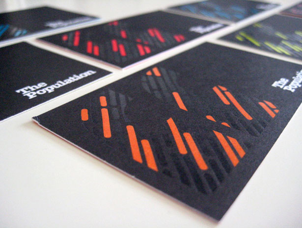
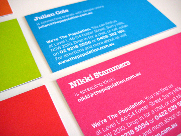
The Population by Greig Anderson
Elements to Include
Pulling off this card and avoiding problems of balance is tricky. To get the right effect, the card needs to be busier than the others mentioned above-but not so busy that the message gets muddled. Use a variety of typefaces or at least a variety of typeface styles. You could also try widening the kerning to create an expansive presence. A combination of styles and elements can help sell this image, but use everything in moderation and with a discerning eye. Don't go too far.
The Population close-up of front
Colors to Use
Color is not always a distinguishing element of the jack-of-all-trades card, but a mixture of two or three colors is a good start. Given that passion drives the Jack, red is a good choice. Red also denotes action, which is appropriate; jacks of all trades don't allow themselves to be bound to one direction or field. Here are other color ideas:
- Purple and gold, with their connotations of wisdom, can help weave the right idea through your design.
- Yellow and blue both represent idealism and can fill out your image as a jack.
Breaking Down the Basics
Who You Gonna Call?
Basic information should be included on every business card. You know, of course, that a name and title are necessary for telling others who you are and what you do is vital. You'll also need to include some contact information. Make sure it's current. Numbers change and titles become outdated as we move up the chain of command. Specialties and directives change, too, so make sure the card you hand out contains current information, and not by scratching out the print and writing in the new info by hand, which would make a poor impression.
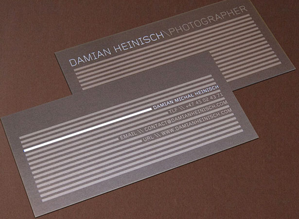
Damian Heinisch by Mission Design
Bonus tip: Phone numbers change, too, so consider making a Google Voice number your main contact number. Then, no matter where you relocate to, you can route the number there and not have to worry about wasting your old cards and reprinting new ones.
Quality Over Quantity
Loading up on too many cards because you found a good deal might not be worth it in the long run. As mentioned, information changes, and if you have hundreds of cards stashed away, they're in danger of going to waste quickly, along with the money you spent on them.
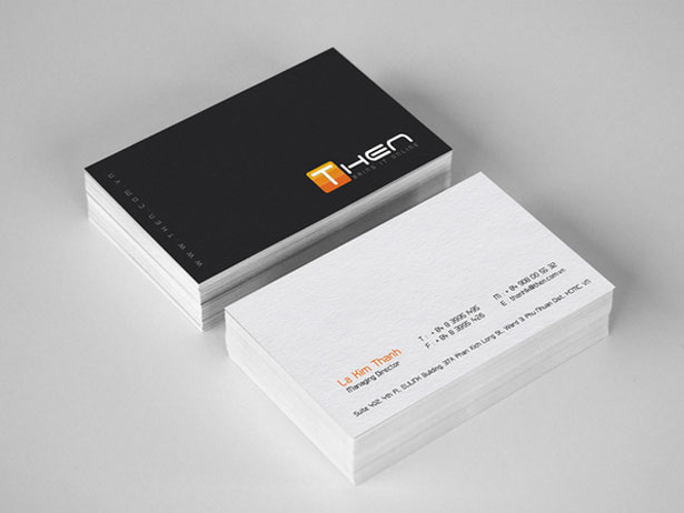
Then Corporate Brand Identity by Jimmi Tuanart
Measure Twice, Cut Once
Get all the measurements right before heading off to the print shop. And make sure that you and the printer see eye to eye on file formats and dimensions. You might also wish to have a second pair of eyes check your wording and, more importantly, spelling; often we naturally correct misspellings in our mind, which can lead to costly errors. Nothing is worse than painstakingly putting a design together and then noticing a mistake after the first run has been printed. Measure twice, cut once!
Written exclusively for WDD by Rob Bowen.
Feel free to leave your thoughts in the comments section below. What other impressions would you want to make on potential clients that could be conveyed on a card? And how would you do it?
Check out BrushLovers.com and find an awesome collection of free photoshop brushes

