 If an organization’s goal is for people to inquire, then its website’s contact page is among its most critical assets.
No matter what the organization promotes, the contact (or sign-up) page is the last step in the sales pitch. This is what the rest of the website, from the home page to the blog to the site map, lead to: enticing people to act.
Yet the contact page gets relatively little attention. The home page usually gets far more. Naturally, the home page is important; it bears the burden of giving a first impression, explaining the website’s purpose and guiding people to the right content—and it has to do it within seconds.
The contact page is a kind of anti-home page: focused, interactive, less persuasive, but more reassuring. Home pages provide information, whereas contact pages provide options.
Problems
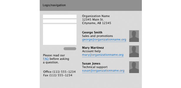
Though worse than usual, the example above borrows elements from the contact pages of several real organizations, such as:
- A contact form
- Email addresses for key staff members
- A map to the office
- A link to the FAQ (with a note to read it before sending an email)
- A mailing address
- Phone and fax numbers
This example contains problems that are common to overachieving contact pages: the intentions are grand, but the result is a mess.
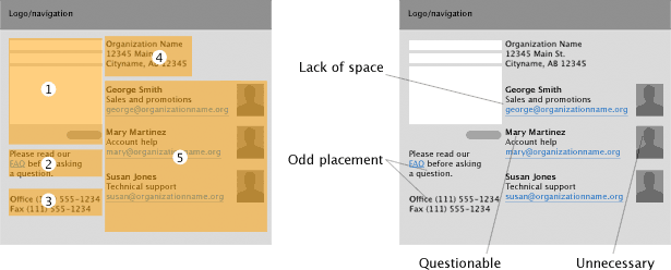
Above, content is organized into five groups, each of which is positioned based on how well it fits a two-column layout. But it’s a tight fit. Positioning is based on size alone. For example:
- The “read our FAQ” message (group 2) is placed after the message form (group 1). This makes the request for people to read the FAQ before using the form pointless.
- The phone numbers (group 3) are separated from the mailing address (group 1). This doesn’t hurt, but it doesn’t help.
- Finally, non-contact information, such as the mug shots in group 5, needlessly clutter the page.
Start With Content That Is Relevant to the User
A contact or sign-up page is more about interaction than information. A rule of thumb: if an element doesn’t help the user send information or choose a contact method, then it doesn’t belong there.
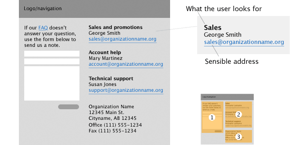
Several changes make the contact form above more useful:
- The FAQ message has been reworked as instructions for the form (group 1). Now people are more likely to see the link before submitting a question.
- Are users looking for a person’s email address or information about a service? A user is more likely to send membership questions to membership@organization.org than georgesmith@organization.org. Using the name of a service rather than a person has a long-term benefit, too: the email address will remain valid even after George leaves the company.
- Remove mug shots unless users are likely to associate a face with a service. For example, people with a technical problem are more likely to want Susan’s help even if they’re friends with Mary.
- The phone and fax numbers have been combined with the mailing address. In this instance, there’s no reason to keep them apart.
Going Deeper
Restricting the contact page to contact information isn’t as simple as it sounds. Like many design goals, this one begins with questions. The key is to think like both a website owner and a user.
Incentives |
|
| Website owner | End user |
|---|---|
| What encourages people to contact us, sign up or otherwise act? | What do I need to ask them? What’s in it for me? |
| What prevents people from contacting us or taking action? | How do I know this will be worth my time and effort? |
| How can we encourage messages or sign-ups? | What are the benefits of this product? |
| What prevents people from acting? | (Case by case.) |
Data collection |
|
| Website owner | End user |
| What information do we want people to provide? | What information am I comfortable sending? |
| What will we do with the information? | How do I know I won’t get spammed? |
| How will we process the information? | How soon can I expect a reply? |
Contact methods |
|
| Website owner | End user |
| How do we want them to take action? | What’s the easiest way to act? |
| What haven’t we thought of? | What are my other options? |
| How can we speed up the process? | How long will this process take? |
Asking questions helps the designer set priorities. For example, “How do I know I won’t get spammed?” is a valid concern.
An easy solution is to link to the privacy policy. Better yet, find room for the policy on the contact page itself to keep users from clicking away.
A synopsis that links to the privacy policy is the best of both solutions (e.g. “We value your membership too much to spam you or sell your personal data. Read our privacy policy for details.”).
As another example, asking “What encourages people to contact us, sign up or otherwise act?” could cast the rest of your website in a new light.
Top-notch graphics, well-written text, the latest web standards and sublime color choice may impress people, but do they entice them to want more?
Best Practices
What makes a contact page work? Certain solutions depend as much on personal taste as on solid code and clear design. But some practices are relevant whatever your style.
- Never trust user-submitted data. Always validate data, checking for spambots, mis-entered data and SQL injection attacks.
- A good “Thank you” page has a friendly message. A better “Thank you” page offers options, rather than leaves the user to wander. While unnecessary, that extra nudge could reward people for participating.
- Not everyone is comfortable with forms and email. Not only do phone numbers and a postal address provide alternative contact methods, they reassure people that this organization is a legitimate entity.
- Long forms discourage users, so contact forms shouldn’t be surveys. Save some questions for follow-up replies.
- Likewise, a membership form should require only the basics—user name, email address, password—to make signing up easy. New members can add more information—name, phone number, avatar, etc.—once they’re committed.
- Don’t make people hunt for ways to act. Obvious links to the sign-up or contact form will encourage people to consider signing up, sending a message or otherwise participating.
- One of the most important elements of a contact page isn’t design-related at all, but rather prompt, helpful replies. A few minutes of customer service is worth hours spent refining CSS. Like design, service is a means to success, not an end in itself.
From large corporations to small non-profits, many organizations rely on the web to facilitate participation from the public.
Pages that call users to action need careful planning. When done well, they make the process easy and reliable for both the organization and its users.
Written exclusively for Webdesigner Depot by Ben Gremillion. Ben is a writer and designer who solves communication problems with better design.
Do you know of any other ways to improve contact forms? Share your thoughts in the comments below.
WDD Staff


Read Next

15 Best New Fonts, July 2024

20 Best New Websites, July 2024

Top 7 WordPress Plugins for 2024: Enhance Your Site's Performance

Exciting New Tools for Designers, July 2024

3 Essential Design Trends, July 2024

15 Best New Fonts, June 2024

20 Best New Websites, June 2024

Exciting New Tools for Designers, June 2024

3 Essential Design Trends, June 2024

15 Best New Fonts, May 2024

How to Reduce The Carbon Footprint of Your Website
