 Many online resources exist for designers to explore, tweak and download great color combinations.
Playing with complementary, analogous, monochromatic and other combinations opens us to exciting possibilities, and there’s no shortage of freebies.
But there’s a difference between a winning color scheme and a winning design that uses it.
Choosing colors is the first step. Adapting them to fit your design requirements is just as important.
What looks good in a swatch may not work well on a web page—but that doesn’t mean you have to return to square one. We’ll explore here new ways to look at color schemes.
Color plays an important role in how people absorb content. Whether a design is reserved or loud, friendly or sinister, warm or cool, visitors to a website are immediately influenced by the tone set by the layout, typography, imagery and, of course, the hues and values that comprise its color scheme.
Choosing colors can be the most subjective job in web design. Some colors work well together; others, not so much. Some combinations appeal to certain people. More than one set of colors can suit the same design.
Fortunately, many resources exist to help. Color palette generators such as Color Scheme Designer, Adobe Kuler, Aviary Toucan and Daily Color Scheme are among the great places to find combinations of color that effectively set a mood. But finding a palette is only the first step. Any color scheme’s potential effectiveness can be compromised by the way it is applied.
The Number of Colors in a Scheme Makes a Difference
A color scheme is a set of colors that have been chosen to work together. Schemes usually have at least four colors and can often be downloaded as simple images and sometimes as ASE files. Let’s work with the following scheme:

The color scheme above is typical of how most schemes are presented: as uniform samples of flat colors. This set could be tagged as such:
- Cheerful
- Friendly
- Contemporary
- Casual
- Primaries
But make one or two colors stand out and different adjectives might come to mind.

The image above has the same scheme that was presented in the swatch, but it’s less casual and more desert-like. This image emphasizes the warm colors. Isolated patches of blue and green draw attention by being sparser. The resulting mood could be described as:
- Sandy
- Bright
- Warm
- Khaki
- Rough
The choice of the dominant color affects how the scheme appears.

Again, here we’re using the same colors, but to a very different end. This image looks something like an abstract world map, with islands of red, green and brown. The image isn’t just cooler—it’s slightly darker, even though it comes from the same palette.
Being able to recognize good color combinations isn’t enough, because colors are rarely applied evenly to a website design. Using the colors wisely and in the right proportion is as important as choosing the right colors.
The Background Sets the Tone
The most obvious place to make an impact with color is in the background. This wide expanse can attract as much attention as the content placed over top of it.
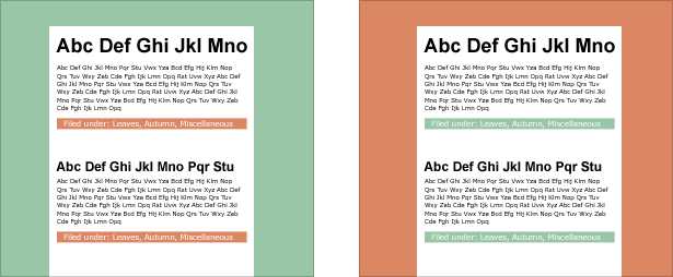
In spite of having identical content, the design on the right is much warmer than the one on the left. But more is happening here than a simple color swap.
The content bars in the green design (i.e. the white text on red) hold their own against the wide green background. But the red background on the right washes out the puny green bars. This is because, in addition to being warmer, this particular shade of red is more saturated. In fact, the only elements with enough visual weight to counter the red background are the large headings. The small body text and faded green bars pale in comparison. That’s not necessarily bad; a powerful background gives the page substantial presence. The green design is cooler and gives the content a more casual surrounding.
Which use of color is better? It depends on your intent. Should visitors regard the content as being relaxed or bold? Do you want to play down the colored bars? Are you concerned that the background will overpower the information? Is one color more important than another in your branding? The answers to these questions will determine which color is “right.” This single color palette presents two different solutions.
Color Behind Text
The interaction of text and background is affected by the size and quantity of each. The effect of text on the page depends as much on the color of the text itself as on the background’s color—despite the general tendency to worry more about the background.
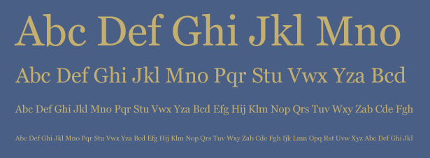
Above, light text against a dark background works better when the type is big. Borrowed from the color scheme we began with, this gold is less appropriate for body text (i.e. about 13 pixels or smaller). The solution is simple:
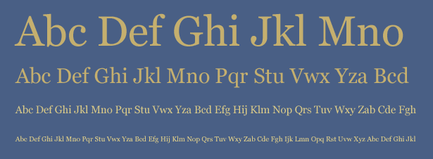
Above, the small text in the last two rows are in a paler shade of gold. It’s not quite white, but much more legible than the two lines in the first image. Added contrast keeps the small text from being overpowered by the background. The key is to use your color scheme as a starting point, not a fixed rule. If a background color threatens to overwhelm smaller elements, then increase the contrast, which will maintain the integrity of the scheme and keep the content legible.
Text on White
Many web pages have either white backgrounds or white content areas. But “white” doesn’t mean “blank.” Large swaths of white affect how color is perceived. For example:

The colors we began with look lighter when used for text.
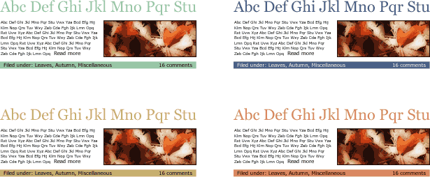
- The relatively dark blue creates enough contrast to make the text legible against white.
- This particular shade of green blends into the background. If the intent is harmony, then the green works.
- Red + white = pink or peach.
- The gold looks almost like a sepia tone.
White tends to brighten everything it touches. If you want to set a light mood, then any of the combinations above might work. For more impact, you could darken the color scheme.
Playing With Color Schemes in Photoshop
If your design doesn’t call for all of the colors in your scheme to be used evenly, then you should test one or two colors for dominance. The trick is to find a scheme with colors that work both with each other and with the dominant color.
Fortunately, we have an easy process to test colors. To see how different measures of color can affect a design, follow these steps in Photoshop.
1. Find or create a color scheme. Our example has five colors, but any number above one will work.
2. Create a new image in Photoshop, 500 x 500 pixels, with a white background.
3. Create four new layers (your background layer will be the fifth). If your scheme has more or fewer than five colors, add or remove layers accordingly.
4. Fill each layer with a different color from your scheme.
5. Add a layer mask to every layer above the background layer. Your layers palette should look like this:
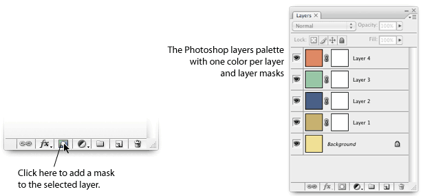
Above, the Photoshop layers palette, with one layer per color and with layer masks applied.
6. Run the “Thresholdizer” action on every layer mask—but not on the layers themselves.
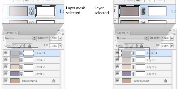
Above, when using the “Thresholdizer” action, be sure to select the layer mask, not the actual layer. If you run the action on the layer by mistake, then be glad for the “Undo” function.
This action mostly creates a random pattern in a layer mask. From here, the designer takes charge: with the “Threshold” control. Slide the Threshold control left to reveal more of a given layer, and right to reveal less. Applying this action to each layer mask will make one color dominate the others in a random pattern.
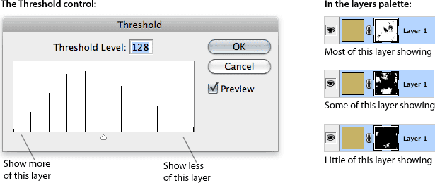
In this case, the Threshold control determines how much of a given layer is visible. A mostly black layer mask hides the layer; mostly white reveals the layer. Running the Thresholdizer action on each layer mask will create a medley of colors like this:
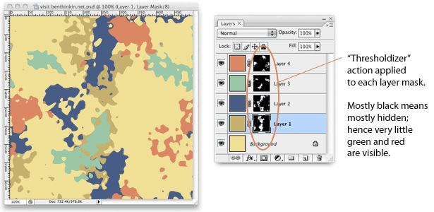
This Photoshop document shows what a design might look like if the yellow was dominant. Adjusting the colors now is a snap: to give a color more (or less) contrast, just use a Photoshop command (such as Image > Adjustments > Hue Saturation).
For example, the shade of green that worked well with blue earlier doesn’t look very good now that blue is not dominant. A few experiments reveal the following:

Here we have two variations of our original color scheme. Variation #1 darkens the green slightly. It almost works. Variation #2 changes everything except the yellow to add contrast and align the hues.
What if our design had mostly blue instead of yellow? This shade of blue is dark enough to contrast with the other colors, but none of them coordinate—they’re all primaries. By choosing a new dominant, we’ve created a new problem.

Variation #1 above replaces the soft red with a darker blue and turns the shade of green into a pale mint. Variation #2 goes the other way, using more red (or burgundy) instead of less.
The merit of any of these variations is subjective. Ideally, you would apply them to the actual design before making a final decision. The key is in the process: get a palette, choose a dominant color and make the others work with it.
About the “Thresholdizer” Action
There’s no mystery to this action. You can get the same effect by applying Filter > Render > Clouds or Filter > Render > Difference Clouds to a layer mask. This action merely refines the process, organizing the Threshold command into deciles.
Please feel free to download the “Thresholdizer” action. Better yet, create your own and share it with everyone by providing a link in the comments below.
Evaluating Color Without the Action
Of course, there are ways to judge color without playing with Threshold. Start by choosing one main color, and then make the others work with it.

Here is our original color scheme, with brown as the primary color.

We’ve toned down the green and saturated the red. Harsher colors stand on their own, as the blue does (which hasn’t been adjusted).

Here, we’ve faded the green, yellow and red. These low-key “accents” blend with the brown background. Darken the blue to create contrast.

The three darker primary colors go well against the medium brown, while the pale yellow serves as an accent color.
Again, the final decision comes when the designer applies these schemes to the actual design. Until then, these are just starting points: useful tools to avoid clashes, handy references to keep designs on theme and a great way to explore combinations.
Color is merely a design element. Color use is a skill one must practice to control mood, to cultivate one’s taste and to become able to see possibilities in a few swatches.
Only one thing is certain: that green has got to go.

Written exclusively for Webdesigner Depot by Ben Gremillion. Ben is a freelance web designer who solves communication problems with better design.
How do you test colors? What are your favorite ways to create color schemes? Share your views in the comments below.


