 Apple.com has undergone some adjustments to its design in the past week or so, changes that, if you weren't paying close enough attention, you may not have even noticed.
Although many reports are referring to this as a "redesign", I think it's difficult to classify it as such. There certainly are some significant changes, but the changes are not exactly a complete overhaul as was the case for CNN.com in late 2009.
Nonetheless, the changes are significant to web designers, so I'll briefly look at them here. If there's anything about the changes that I've neglected to mention, feel free to comment.
A Redesigned Navigation Bar
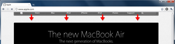
The most significant change (albeit still a somewhat subtle one) is the look of the navigation bar. Apple has one of those navigation bars that, design-wise, everyone loves and envies. It seems impossible that it could be improved. Well, they were somehow able to find ways to make it even better looking and more intuitive.
Here is the old navigation bar:
Here is the new:
Changes include:
- It's darker
- The gradient has been replaced by bolder glossy look
- The logo's appearance is simplified
- The search box is smaller (more on that below)
I think it really takes a great team of designers to make what really are fairly significant changes to the look of a very important UI element, while still giving the impression that nothing has changed. It just goes to show that visual details are often not as important as the overall feel of the design.
The Flexible Search Box (WebKit Only)
Being obviously WebKit-biased, the Apple design team have included some WebKit-only enhancements, one of which is associated with the search box.
In most browsers, clicking into the search box will brighten its background to a more readable white. In Chrome or Safari, the search box animates using CSS3 Transitions to become wider and arguably a little more usable. The screen grab below shows the search box in Chrome after it has animated to become wider:

To accommodate the size of the search box, the other navigation items and the logo resize themselves.
I like this feature; it adds a feeling of intuitiveness. But it has, in my opinion, a small flaw: It doesn't go back to its initial state after you remove focus. Of course, if something was typed into the search box, then you wouldn't want the size to change back, but I think it should return to its normal state if it loses focus and remains empty.
Of course, since it's extremely unlikely that anyone will click into the search box and not type anything, I suppose this is an insignificant omission.
The Navigation Bar's Animated Entry (WebKit Only)
Another small WebKit-only feature is the animated entry of the navigation bar. I don't remember seeing this effect on their site before, so I am assuming this is another new feature. The animated entry only happens on the home page, and only once per browser session. This is good practice and a good lesson for developers adding animated effects to their interfaces.
As visualized in the screen grab above, the navigation bar enters from off-screen, probably using CSS3 keyframe animation, along with JavaScript to control when the animation should or shouldn't occur.
The Animated Product Browsers (WebKit Only)
Another recent addition is the use of animation on some of the product pages. CSS3-based animations are used on the Mac and iPod product browsers, one of which is shown below:
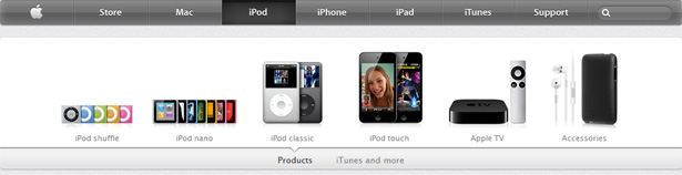
The products animate when you first arrive on the page, and if you switch between sub-categories, the visible products scurry away and new ones jump into their place. This is done via CSS3 keyframe-based code, some of which is shown below:

On non-WebKit browsers, the product browser's animation switches to simple JavaScript-based fading. Although this kind of thing is not ideal in every circumstance (since it essentially amounts to "code forking"), it is a realistic option for developers and designers today who want to code for the best possible browsers and provide less enhanced functionality for the rest.
Search Box Auto-Suggest
[UPDATE] As pointed out by a number of people in the comments, the auto-suggest is not a new feature. Our inclusion of this as a "new feature" was based on another article that reported that the auto-suggest was new. Nonetheless, we'll keep this section because it is a good feature that has the potential to make a website a little more usable, and provides a good example for other developer and designers to follow, if it fits with their project.
The Ajax-driven auto-suggest drop-down appears as you type a search query:
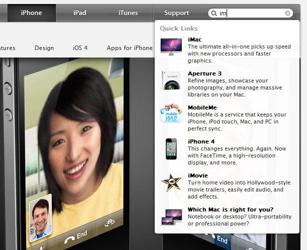
As shown in the screen capture above, not only does the drop-down show search results that match the typed characters, but the results are accompanied by product photos and descriptions. I think the photos are more valuable in this spot than the descriptions, but overall this has the potential to streamline product search and conversions.
Anything Else?
That seems to cover the major changes in the recent re-tooling of the Apple.com design. Are there any other significant changes to the design or code that I haven't mentioned here?
This post was written exclusively for Webdesigner Depot by Louis Lazaris, a freelance writer and web developer. Louis runs Impressive Webs where he posts articles and tutorials on web design. You can follow Louis on Twitter or get in touch with him through his website.
What do you think of the changes to the Apple.com design? Are there any changes that we haven't mentioned here?
WDD Staff


Read Next

15 Best New Fonts, July 2024

20 Best New Websites, July 2024

Top 7 WordPress Plugins for 2024: Enhance Your Site's Performance

Exciting New Tools for Designers, July 2024

3 Essential Design Trends, July 2024

15 Best New Fonts, June 2024

20 Best New Websites, June 2024

Exciting New Tools for Designers, June 2024

3 Essential Design Trends, June 2024

15 Best New Fonts, May 2024

How to Reduce The Carbon Footprint of Your Website
