 Design on the web has come full-circle from its early days.
There's been a revival of simple, understated website designs that put content squarely at the forefront, eschewing the bold graphics and gimmicks of the past decade or so, similar to the way the first websites placed the emphasis on function and content.
But it's likely the web, and the way it's designed, will move in cycles, as most trends do. At some point in the near future, we may once again see sites with more overt "designs", with content pushed down the scale of importance a bit.
You'll notice throughout this article that there are instances where I've put "design" in quotes. Of course, all websites are designed to one extent or another, and design doesn't just mean graphics.
The quotes are there to differentiate between overt, visually-dominating designs and the general practice of design.
In the Beginning...
In the early days of the Internet, there was very little "design" going on. For the most part, web pages were text, with maybe an image or two thrown in for good measure. A lot of this was due to bandwidth limits and concerns about load time (when everyone's on dial-up, every byte counts). And a lot of it was because there weren't really many "design" functions built into web standards.
Add in issues with different browsers displaying things in wildly different ways, and you can see why almost no one bothered with design, beyond a few text styles. Content reigned supreme (alongside the occasional animated GIF).
The web was new, and people approached it much like print design. There weren't many "professional" web designers, and there tended to be more people designing for the web who came from a software background rather than a design background. Because of this, either visual designs were kept minimal, or they were really, really bad.

We should mention here the prevalence of the "starry night" background in early website designs. It's theorized that the prevalence of this outer space styled background is due to the large number of science fiction and video game fans that were online in the early to mid 90s. Sometimes these backgrounds were made up of static tiled images, while other times they had animated flickering or sparkling. In either case, they were incredibly common on early websites.
Blinking text was one of the worst trends of the early days of web design. Rainbow text (especially animated text that changed colors in a constant loop) was another trend that has happily disappeared from professional websites (though it's still sometimes seen on amateur-built sites, immediately harkening back to the mid-90s, though generally with not even a hint of nostalgia). These were the first big attempts at visual "design" on the web.
Frames, Tables, Flash, and the Peak of "Design"
It wasn't long before people figured out they could format their websites using HTML tables. While this did a lot to advance the world of web design, it also resulted in some truly horrible website designs. It also added to the size of websites and to load times, as they required multiple background images to create the design in most cases.
Frames were another way that a lot of website creators formatted their content. One frame would hold navigation elements, while another would hold the main content. The navigation frame would remain static as new content was loaded. Frames were also used to display off-site links while still maintaining the original site's header or other information (this technique is still used by a number of sites today, most notably About.com).
Flash was also coming into its own around the same time, and was used to create fully interactive, animated websites. Load times for Flash sites were longer in many cases, but as broadband internet became more common, load times became less important.
The internet at that time was dominated by "design". Content, in many (most?) cases, took a back seat to visual style. Designers (professionals and hobbyists alike) wanted to show off their design skills, and content and usability suffered. But the web was still relatively young, and it wasn't a part of everyday life for billions of people, like it is now.
Information architecture and usability were still in their early days online, and were largely ignored by a lot of designers. Bells and whistles were the primary focus, regardless of whether they actually improved user experience.
Web 2.0: Balancing Content and Design
With the advent of Web 2.0, blogs, and more user-generated content, content started becoming more important. Bold design was still important, and still given a lot of thought, and in some cases it still took precedence over the content being displayed.
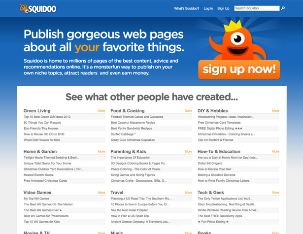
Squidoo is a great example of design styles common to the Web 2.0 era.
There were a few sites during this time that put the focus more squarely on content (Wikipedia would probably be the most prominent of these), but overt design still played a major role in most.
Web 2.0 can be credited with emphasizing content and finally giving function at least as much importance as form. Most Web 2.0 sites were relatively user-friendly and placed an emphasis on user experience. There was still a prominence put on "design" elements and graphics, but generally not at the expense of the site's content and usability.
MySpace Design
Probably the worst thing to come out of the Web 2.0 era is what I'm going to call "MySpace design". Glitter graphics. Rainbows and unicorns. Horrible, unreadable color combinations. Pages with animated everything. And all the generators that allowed people with no design background and no knowledge of HTML or CSS to create profile pages that were more horrible than any amateur "design" ever created in the early days of the web. And to add insult to injury, they were mostly written in poorly-formatted HTML and CSS.
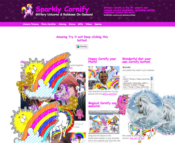
Thankfully, these kinds of completely overdone and overblown sites and pages have mostly fallen by the wayside. Sure, they're still commonly seen on the MySpace profiles of 14-year-old girls (among many other demographics), but luckily they haven't spilled over into the general web very much. With the exception of Cornify, of course.
The Focus is Back on Content
In the past couple of years, there's been a resurgence in simple, clean designs. Even designs that would be considered "grungy" or "Web 2.0"-ish often have a simplicity about them. The focus is put squarely back on the content.
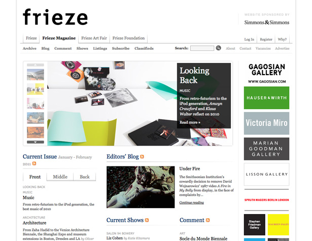
Frieze Magazine has a very clean and simple design, with the emphasis squarely on the content.
One of the reasons driving this trend is the number of people who are browsing the web on smart-phones. Users browsing from an iPhone or other large-screen smart-phone don't necessarily want to view a mobile site. But browsing a site that's overly-complex is a chore on a small screen.
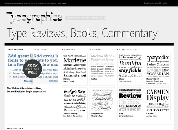
Typographica is another great example of a site that gives the content center stage.
These new designs deliver content while seamlessly disappearing into the background. They make it easy to visitors to browse and find what they're looking for, and enhance the overall experience. But they're not obvious or ostentatious, and most people don't consciously notice them. It's a huge deviation from the designs that have been prominent since the late 90s.
Content vs. Style
Too often, designers and especially their clients look at content and style (or design) separately. They view the two as separate entities that have to somehow be made to work together. Or at least coexist in the same space.
That's the wrong way to approach a project, though. Your content should be enhanced by the visual style of your website. And the visual elements should be created to support the content, and make it more usable for your visitors. Treating content and design as two separate things leads to a final product that is often lacking.
Look at the content your site needs to incorporate, and think about how to best showcase that content within the design. Taking a holistic approach is more likely to result in a design that effortlessly delivers content, without drawing attention to itself.
The Cyclical Nature of Design
While design is constantly evolving, it also moves in fairly regular cycles. We've come full-circle from the early days of web design to where content is the primary focus of websites. And yet, we've grown so much from the early days of the web that no one would confuse a well-designed site from 2010 with one designed in 1995.
Overt, dominating visual design will likely make a comeback in the coming years, but it's likely it will have evolved and improved to the point that it's no longer detrimental to the user experience.
With the prevalence of video and other non-text content combined with the new possibilities presented by CSS3 and HTML5, it only makes sense that graphics will again grab center stage.
Written exclusively for WDD by Cameron Chapman
How do you see the relation between design and content and the life cycles presented on this post? Please share your views below...
WDD Staff


Read Next

15 Best New Fonts, July 2024

20 Best New Websites, July 2024

Top 7 WordPress Plugins for 2024: Enhance Your Site's Performance

Exciting New Tools for Designers, July 2024

3 Essential Design Trends, July 2024

15 Best New Fonts, June 2024

20 Best New Websites, June 2024

Exciting New Tools for Designers, June 2024

3 Essential Design Trends, June 2024

15 Best New Fonts, May 2024

How to Reduce The Carbon Footprint of Your Website
