 The vintage and retro style is becoming more and more popular in today's digital artwork.
The use of retro and vintage themes in design is probably one of the most pervasive trends since the industry went almost completely digital.
In today's post, we'll look at examples of work sourced from the wonderful Dribbble, which helps us focus on snippets of a piece, rather than the entire design or illustration.
From here, it's possible to identify what techniques have been used and to describe how they impact the overall design. You will become familiar with these design trends and be able to replicate them.
To help you, short tutorials are scattered throughout the article. We will also point you to several other useful tutorials and resources to get you started on your own vintage and retro work!
1. Circles and Other Simple Shapes
Simple shapes are commonly used in vintage design. Circles are the most common, especially in branding. The examples below have been carefully selected to show you just how powerful simple shapes can be.
 p
p
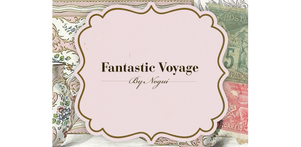
This lovely illustration makes use of elliptical shapes to produce a sun and is finished off nicely with a typographic effect.
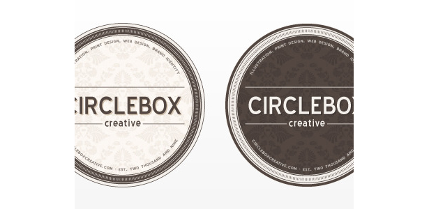
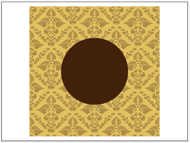
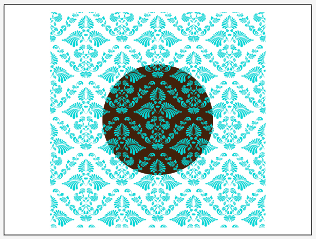
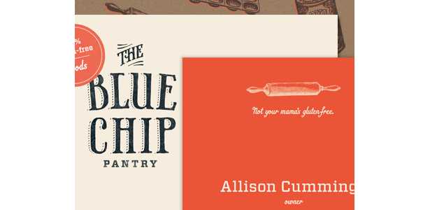
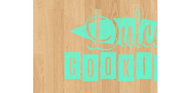
Circlebox Creative's branding is based on a circle and inspired by vintage ink stamps and badges. The design is iced with floral patterns and simple typographic styling.
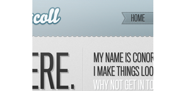
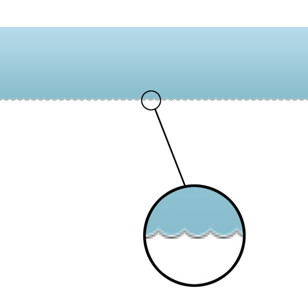
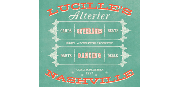
This design is a bit different because it relies heavily on simple shapes to make it pop. The blue bar header uses a long row of small circles to create an interesting bottom edge.

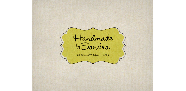
This vintage design, like Circlebox Creative's branding, is inspired by vintage ink stamps and badges. The identity looks like it has actually been stamped onto a piece of paper, unlike Circlebox's smooth and clean lines.
Here's another piece of branding based on a circle. The texture and the blue among all the gray really bring this design to life.
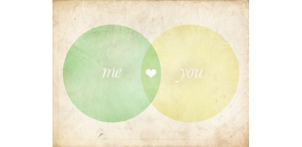
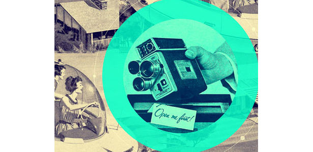
An incredibly simple piece of work consisting of two circles, a texture, some blending styles and clean typography. This piece really demonstrates the power of simple shapes.
Mini-Tutorials
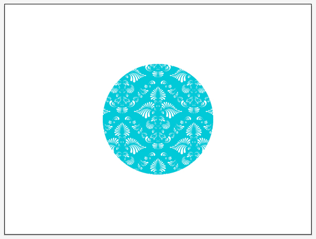
How to Apply a Damask Floral Pattern to a Circle Using Adobe Illustrator
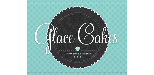
Applying a pattern to a circle in Illustrator is something you will probably do a lot if you explore the retro trend. The technique is similar to what Glace Cakes do for their branding (shown above).
Open Illustrator, and draw a circle. Hold the Shift key while dragging your circle out to keep it round. Insert your damask floral pattern by going to File → Place.
Remove any background and change the color of your newly placed pattern. You can select individual items by using the Direct Selection tool.
Select your pattern using the Selection tool and then go to Window → Pathfinder to open up the Pathfinder window if you haven't already. Hold the Shift key and select your circle to select both of your items at the same time. Click the "Minus Front" button in your Pathfinder window to remove the floral pattern that lies outside your circle. Play with your color choice, and you're done!
Creating a Bubbled Line Using Adobe Photoshop
Let's create a bubble-like line like the one in the example above.
Using the rectangular marquee tool, drag a selection and fill it with black on a new layer. Select the elliptical marquee tool and, while holding the Shift key, drag out a very small selection and fill it with black, again on a new layer.

Position the black circle on the bottom of your black rectangle. Duplicate the layer, and position the new circle next to your original.

Repeat this step until you have something that looks like the following image. You'll have a lot of layers. Select all of them while holding the Shift key, and then go to Layer → Merge Layers to turn them into one.

Now we're going to add some simple layer styles or blending options to make our shape come to life! Right-click on your layer and select "Blending options." The Layer Style window should open up. Apply the following effects to add a gradient, inner shadow and drop-shadow:
And we're done!
2. Two-Toned and Limited Color Schemes
Two-toned color schemes are a big thing in vintage design because producing full-color prints wasn't as easy back in the day as it is now. Below are some recent examples of two-toned and limited color schemes.

This minimalist design gets its visual appeal from the black and white shapes and lines, especially the horizontal dashed line and cut-out shapes from the bottom of the circle.

This branding repeats a few select colors throughout. The colors work incredibly well together. The yellow-orange is the focal color that catches your attention.
This lovely piece of retro design relies solely on color and typography. The subtle one-pixel-wide lines finish it off.
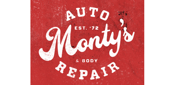
Another two-tone black and white design. This identity is based on a badge and gets a slightly three-dimensional look from simple typography and effects.
This example really shows off how effective color can be. It uses three colors: orange, brown and white. The contrast between the three swatches works very well for the design.
This design (the identity itself, not the background) relies solely on color and typography.
This design combines orange and a nice blue-green with white. The color combination matches the fancy borders and simple typographic effects.
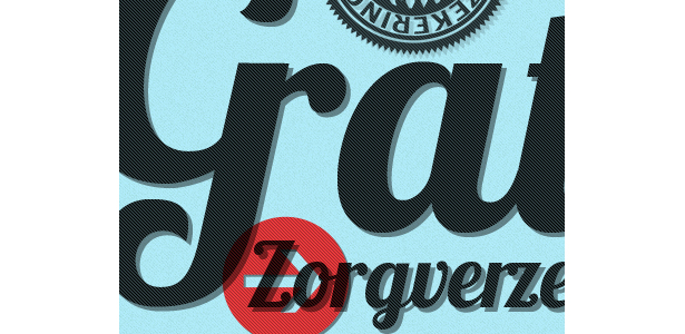
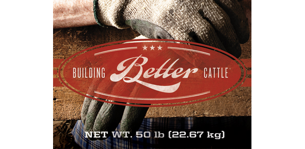
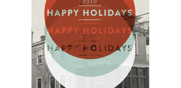
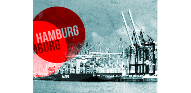
Yet another vintage typographic logo that relies on two colors: white type on red. Notice how the identity is based on a circle.
This identity uses only three colors, an elegant typeface and a nice blending mode to put the icing on the cake.
Color Resources
A bunch of great applications are out there to help you create your own color schemes. This small selection shares several of the best:
- ColourLovers (web app)
A lovely website dedicated to color schemes. Browse existing themes created by the community, or create your own from scratch by uploading photos. - Aviary Toucan (web app)
Another web application, but without a community backing like ColourLovers. This application allows you to create color schemes from scratch or from imported images. - Adobe Kuler (web app)
Yet another color management web application, this time brought to us by the ever-so-loved Adobe. The interface is stunning and easy to use. Kuler hosts a community, and you can browse the highest-rated color schemes. - Color Stream (iPhone app)
This iPhone application enables you to create and store color palettes from scratch or from an imported photo. You can also auto-generate schemes from photos using the built-in color schemer. - Palettes (iPhone app)
Palettes is similar to Color Stream in enabling you to create and store color schemes on the go from scratch or from an image. You can also grab colors from your favorite website.
If you're a newbie, here are a couple of articles worth checking out: "Choosing Color Combinations" and "Color Theory for Designers, Part 3: Create Your Own Color Palettes."
3. Typographic Elements and Trends
Typography is one of the most important elements in retro digital design. There are endless possibilities with type design, a few of which can be found in the examples below.
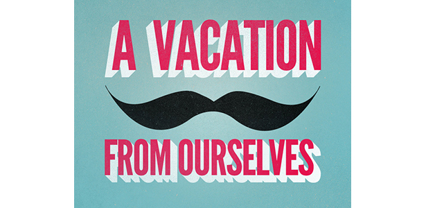
This snippet of type design is packed full of text-effect goodness. The text is finished with a drop-shadow and a simple but really awesome one-pixel diagonal-line pattern.
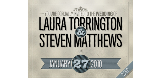
Here's my personal favorite typographic piece in this showcase. It merges some excellent vintage styles with modern techniques. The type is brought to life by the addition of subtle details, such as the one-pixel white stroke on the "You are cordially invited" line, and the ever-so-important drop-shadows on the date type.
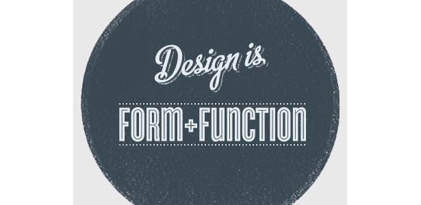
This retro typography reveals surprisingly simple techniques. The "Design is" type is duplicated three times and repositioned. The bottom duplicate is then textured to create a lovely retro style in a matter of minutes.
Yet more typography that uses a simple drop-shadow to add depth to the elegant, decorative typeface.
Simple typography combined with semi-transparent shapes and a subtle texture. The design comes together nicely.
You can't get much simpler than this: a powerful choice of typefaces.
This three-dimensional typography was most likely completed in Illustrator, making use of the 3-D tools there. Subtle noise has been added to the design, which works well with the limited color scheme.
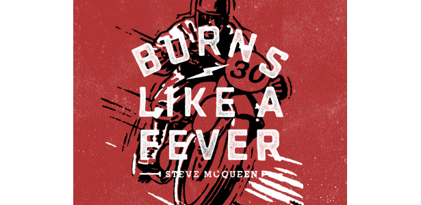
This great little snapshot of digitally-produced retro design combines texture, noise, simple shapes, different blending styles and a great color scheme. The typography, especially the larger type, is brought to life by the sharp drop-shadows.
This impressive piece of vintage-inspired business stationery makes use of hand-drawn elements for its look. The design also has a limited color scheme.
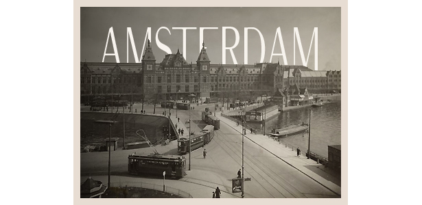
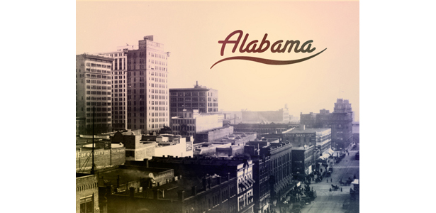
The white typography in this design has been merged with the image as if it were there when the photograph was taken. It works well with the sepia photo.
Mini-Tutorials
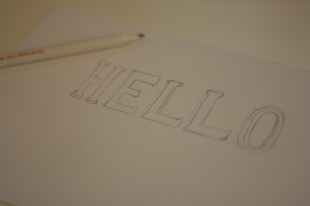
How to Create Hand-Drawn Typography Using Adobe, Photoshop or Illustrator
In this short tutorial, you'll learn how to quickly produce, scan and vectorize your hand-drawn type using Adobe Photoshop and Illustrator.
First of all, sketch some letters:
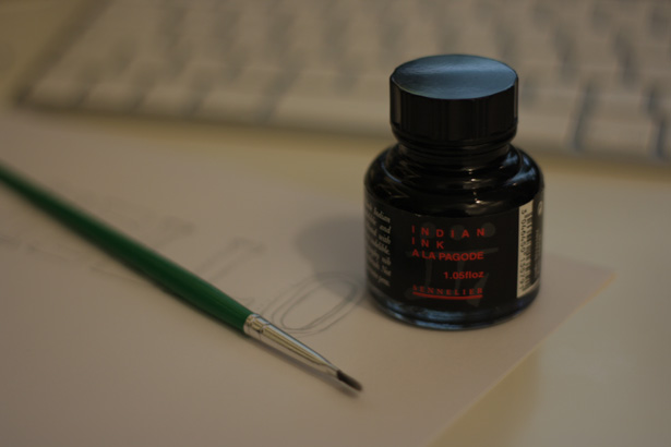
You need to fill in your sketched type somehow. You can do this using paint or a marker. I will use black Indian Ink and a fine paintbrush, which I highly recommend, mainly because it is so pure and bold.
Begin filling in your sketched lines.
You should end up with something that looks like this.
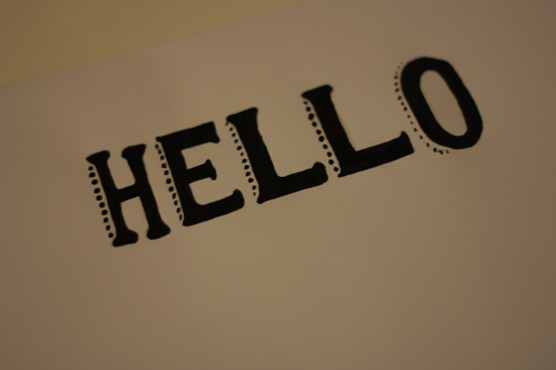
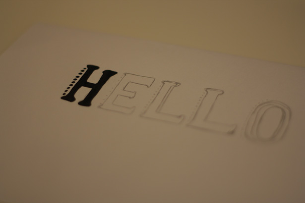
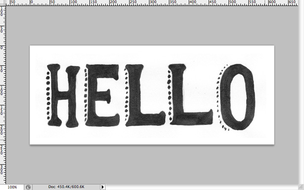
Next, scan your image. If you don't own a scanner, you could just photograph the work-just make sure it's high quality. After the image is scanned or photographed, open a new Photoshop file and go to File → Place; locate the image and place it in your document.
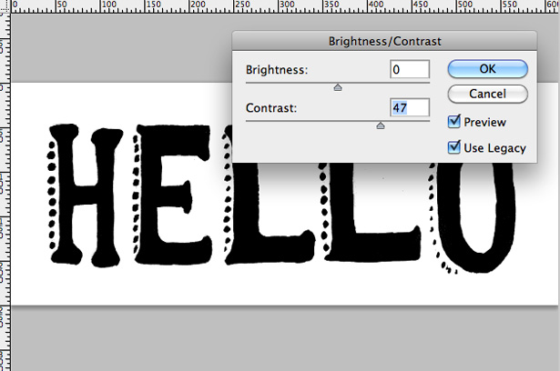
Go to Image → Adjustments → Brightness/Contrast. Raise the contrast level to somewhere around 50. This will darken the black in the image.
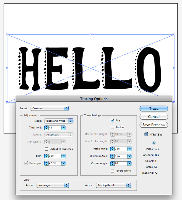
Save your file as an image, and open Adobe Illustrator. Create a new RGB file, and then go to File → Place. Locate your newly saved image and place it on your canvas. In the menu bar at the top of the canvas, select the "Live Trace" option. Your text is now a working vector and can be scaled up or down as you please, to be used in your Photoshop documents.
How to Add Typography to a City Photograph Using Adobe Photoshop
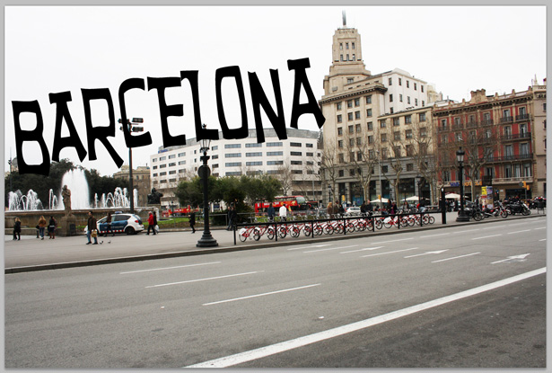
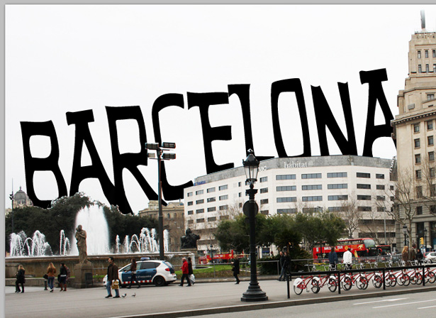
We're going to add typography to a photograph using a technique similar to the one used for the Amsterdam photograph above. For the purpose of this tutorial, we'll use this photograph of Barcelona.
Copy the photograph, and create a new Photoshop document. Paste the photograph in the document. Select the Text tool and type "Barcelona" in the typeface of your choice. Go to Edit → Transform → Rotate, and rotate the typography at an angle so that it roughly lines up with the angle of the buildings.
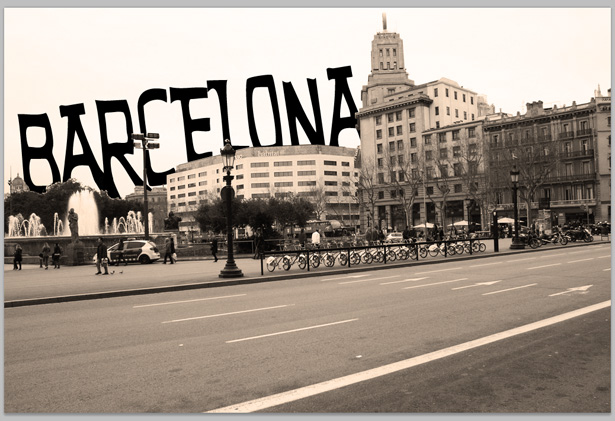
You'll notice that some of the letters don't overlap the buildings. To fix this, select the Pen tool and manually extend the bottom of the letters by drawing new shapes over them. Once you've done this, right-click and select "Fill Path." Fill the selection with black.
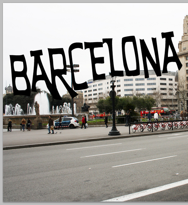
Next, delete the overlapping areas of your type. Once again, use the Pen tool to create a selection. Zoom right into your photograph and trace around the building and tree. Once you've done this, right-click and go to "Make Selection." You should now have a moving dashed line like the one below:
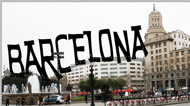
Right-click on your typography layer and select "Rasterize Type." This will turn it from a type layer into a standard layer. Merge your type layer with the custom shapes we made earlier by selecting all of them while holding the Shift key and going to Layer → Merge Layers. The selection we made in the last step with the Pen tool should still be active. With the single type layer now selected, hit the Delete key. This should remove all of the overlapping text.
It's now time for some very simple photo editing to merge your type a little better. Select the background layer (which should be your photograph), and go to Image → Adjustments → Desaturate to turn your photograph to grayscale/black and white. Now go to Image → Adjustments → Photo Filter. Select the sepia option from the drop-down menu and play around with the level slider to set the intensity of the effect. I chose around 60%.
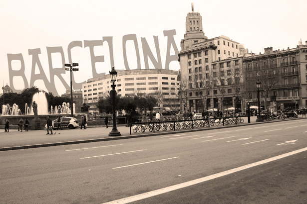
Right-click on your type layer and select "Blending Options" from the menu. Apply a color overlay to your type; I used a light brown. Here is my result:
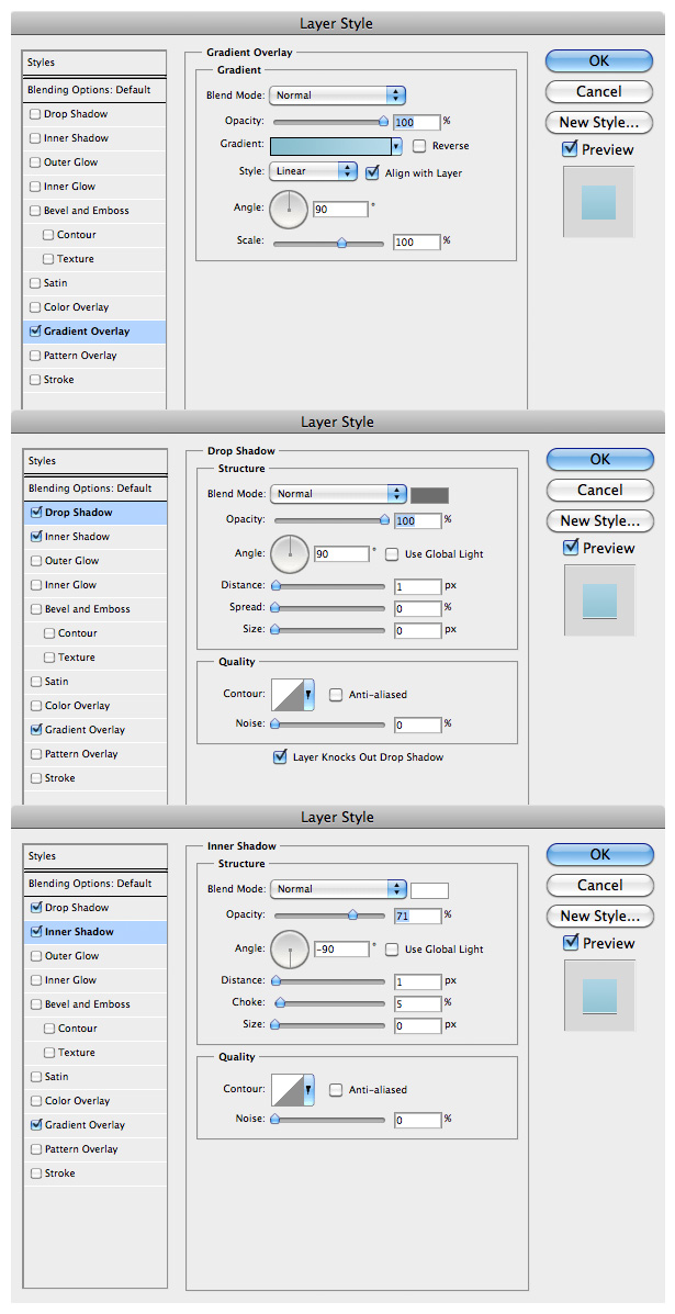
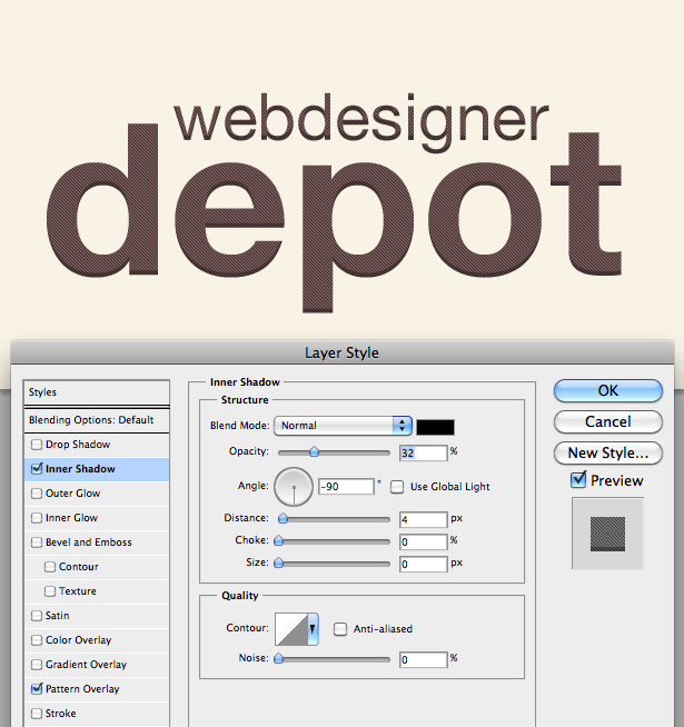
How to Apply a Drop Shadow and Pattern Overlay to Typography Using Adobe Photoshop
In this short tutorial, we'll jazz up a simple piece of typography using built-in Photoshop effects. We'll also create our own pattern.
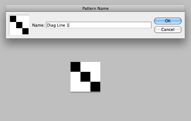
First let's create our simple pattern. Open a new Photoshop document that is 3×3 pixels. Now select the Pencil tool. Zoom right into your canvas, and using black #000000 place three dots diagonally across your canvas, as seen below:
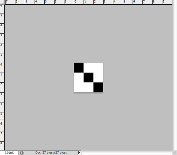
Go to Edit → Define Pattern to bring up the following field box. Call your pattern something suitable (I called mine "Diag Line 1"). Hit the "OK" button. Your pattern is done!
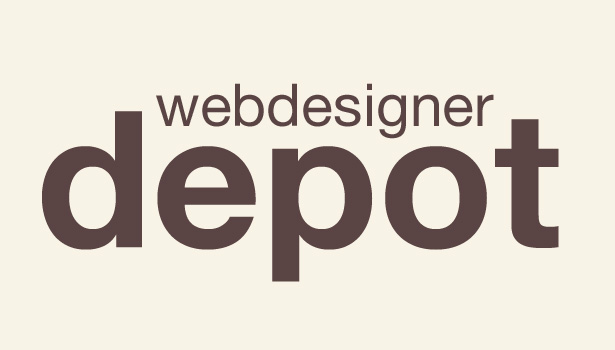
Create another new Photoshop document. Fill the background with a light color of your choice, and add some typography to the canvas. The typefaces I used are Helvetica Neue Medium and Helvetica Neue Bold.
Reselect your text and change its color. Choose something that contrasts well with the background. It is important to set the text color instead of using a color overlay because we'll be using a pattern overlay later and, unfortunately, you can't use both.
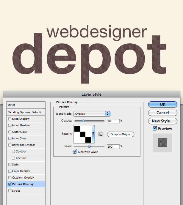
Right-click on your type layer, and select "Blending options" to open up the Layer Style window. Select "Pattern Overlay" and, from the pattern drop-down box, select the pattern we made earlier. Change the blend mode to "Overlay" and the opacity to 30%. Results will vary depending on your color choice, so feel free to experiment.
We're now going to apply an inner shadow. Use the settings seen in the screenshot below:
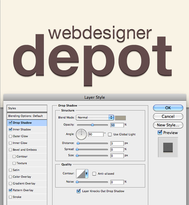
Now apply a very faint but important drop-shadow. Paying attention to small details is always worth it. Use similar settings to those seen in the screenshot below:
To finish off the typography, we duplicate the text entirely. Right-click on the type layer and select "Duplicate layer." Select the Move tool, move the type elsewhere in your document, then reposition it beneath your original type layer. Lower the opacity, and you're done.

4. Blending Styles
Blending Styles (typically known as the Blending Mode in Photoshop and Illustrator) is a great way to add dimension to your work without a lot of effort. It allows you to blend objects and colors together in several different ways. Blending modes are often used with different opacity levels; for example, when applying a photographic texture to an image, which we will discuss later.

It looks like there are three shapes in this branding, but in fact there are only two: a blue and red. A blending mode has been applied to the shapes to allow the textured background to show through, blending the colors and creating a vivid dark purple.
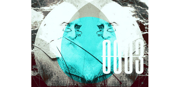
This little piece is packed with various blending modes, textures, photographs and simple shapes, resulting in a powerful work.
This lovely piece of work repeats simple shapes and uses different blending modes to make each shape unique. Blending modes have also been applied to the typography.
The two circles in this design have different blending modes applied to them, one of which projects a red tint onto the image beneath, the other of which changes the image beneath to a dark red, and both of which allow the texture to show through. A vivid red is produced where the two shapes meet.
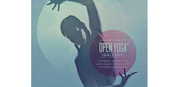
This Open Yoga Gallery piece is one of my favorites in the showcase. It combines a soft and limited color scheme with a photograph, and then adds noise, light texture and stylish typography.
The photograph in this piece might have been produced by overlaying the whole photo with a solid color and changing the blending mode of that layer, making the image beneath it appear washed out and worn.
This piece is packed with texture. A blending mode was applied to each texture to allow the image beneath to show through.
Similar to the photograph of Italy we saw, this photo was manipulated using a layer full of color with a blending mode. The style has a layer of different-colored blobs, most likely with an Overlay blending mode applied to them and a lowered transparency.
The circle in the middle of this piece has a blending mode applied to it, allowing the background to show through.
Mini-Tutorials
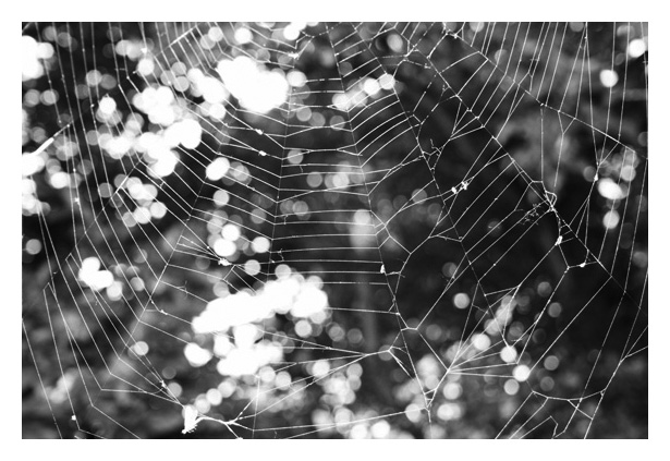
How to Blend Colors With Photographs Using Adobe Photoshop
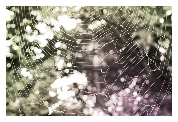
In this mini-tutorial, we will apply color to a black and white photograph using the Brush tool and blending modes. I'll be using this spiderweb photograph.
Open a new Photoshop document, and place the photograph of your choice onto the canvas. I've given mine a white border.
Select a soft brush and light color. I've chosen a yellow pastel. Create a new layer by going to Layer → New Layer. Paint a large splodge of your color onto the new layer, as seen here:

Repeat the process with more colors. You can paint these colors onto the same layer-there is no need to create new layers.
 p
p
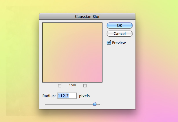
Once you've finished coloring your layer, go to Filter → Blur → Gaussian Blur. Blur the layer to merge those colors a little more. Anything above 100 pixels should be fine, but it depends on the size of your canvas: the bigger the canvas, the more pixels you'll need to blur it by.
We can now change the blending mode of the layer. From the blending mode drop-down menu in the layers palette, select "Overlay."
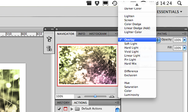
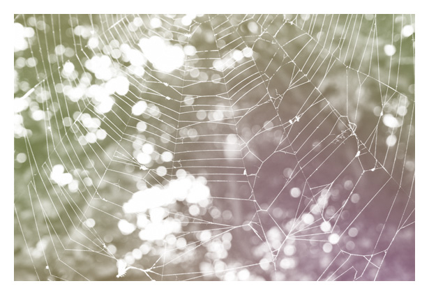
Lower the opacity of your colored layer to around 50%. You should end up with something like this:
Experimentation is key; each blending mode changes the final product, meaning you'll never be able to reproduce a result. The example below uses the blending mode screen, which washes the photograph out and makes it look retro. Experimenting with effects like this is typically how retro Lomo and Holga camera effects are reproduced.
Resources
Below is a small selection of vintage poster tutorials that make use of blending styles:
- Creating a Retro Grunge Poster in Photoshop
- Create an Incredible B-Movie Poster in Photoshop
- Gig Poster Design: The New Sex in Photoshop
- How to Create a Retro Sci-Fi Computer Game Poster in Photoshop
- Design a Colorful Retro Futuristic Poster in Photoshop
5. Texture and Noise
Texture and noise add visual interest to your work. In some cases, a design simply doesn't look right without them. In other cases, the texture and noise can be too much. Below are a few examples of retro designs that work well with texture.
A canvas-style photographed texture is used in this piece, giving the overall design a lovely worn-out look.
This clean texture ultimately produces a clean design. The retro look is achieved with a light grunge brush to remove some areas of the logo and typography.
Paper texture has been used excessively in this piece to produce a worn-out vintage-looking digital piece of work.

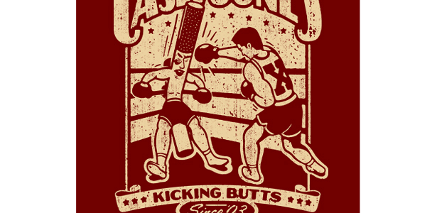
Similar to the last example, a paper texture has been used to make the artwork look like an old poster. A dark texture is also placed over top of the boxer's silhouettes.
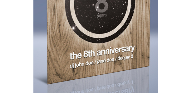
A combination of wood, recycled paper and coffee stain textures have been used here to produce a really awesome effect. A blending mode has been applied to the layer that the character is on, allowing the texture to show through.
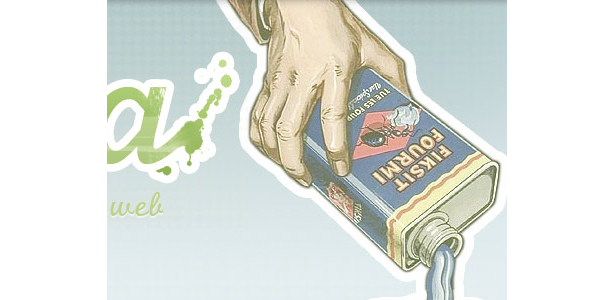
The texture in this web design is minimal and subtle, yet nonetheless it contributes significantly to the visual interest of the overall work.

Texture is used here to liven up the background and typography. The simplest of textures but still so effective.
Texture has been used minimally to liven up this illustration, give it depth and make it more appealing to the eye.
Here's a piece that just wouldn't look the same without texture: the background, illustration and typography are all textured.
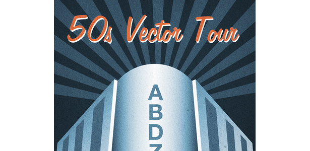
This piece is fairly different from the others in this showcase; the texture isn't a photograph but a vector image.
Resources
The list below contains links to several great websites where you can download textures-both premium and free-to use in your work:
- TextureVault
A premium marketplace especially for downloading individual textures. The price varies depending on the size of texture. - Lost & Taken
A great blog that posts some of the best textures around. Some really high-quality stuff here. You can also view the textures in a gallery. - CG Textures
Probably one of the largest texture galleries around. Thousands of images are available for free. - TextureLovers
TextureLovers is basically a gallery of textures from all over the web. It's a great place to go if you're not sure where to look, because it showcases textures from a variety of websites.
6. Image Cropping and Layer Masks
Image cropping and layer masks are effective for adding extra elements to a work. Why include an entire photograph when you can just show what you need or style it to match the rest of the work? Simplicity is key in retro design.
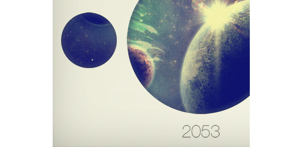
This piece makes great use of texture and typographic effects and cleverly uses a layer mask to round off an image of the galaxy. It looks superb.
This retro piece uses not only retro-masked photographs, but also circles, strokes, blending modes and a limited color scheme-virtually all of the main elements covered in this article.
This piece is ultra-minimalist but looks great. The images are masked into circles and very noisy, giving it a great retro-futuristic look.
Below are a few tutorials on cropping photos and using Photoshop layer masks:
- Cropping Photos to Specific Frame Sizes in Photoshop
- Cropping Images in Illustrator
- Photoshop 101: How to Use Layer Masks
Written exclusively for WDD by Callum Chapman, a designer and illustration trading as Circlebox Creative. He also runs The Inspiration Blog and Picmix Store
Share your vintage and retro designs and illustrations with us, as well as any articles or tutorials that might help your fellow readers.
WDD Staff


Read Next

15 Best New Fonts, July 2024

20 Best New Websites, July 2024

Top 7 WordPress Plugins for 2024: Enhance Your Site's Performance

Exciting New Tools for Designers, July 2024

3 Essential Design Trends, July 2024

15 Best New Fonts, June 2024

20 Best New Websites, June 2024

Exciting New Tools for Designers, June 2024

3 Essential Design Trends, June 2024

15 Best New Fonts, May 2024

How to Reduce The Carbon Footprint of Your Website
