 We've got a lot to thank Bill Gates, Steve Jobs and the computing world's other leaders for. They're responsible for some of the greatest leaps forward in communications and business in the last 30 years-and many of the biggest innovations in design, too.
Without them, our industry wouldn't be what it is today, and many of the world's top designers wouldn't have a platform for their work.
However, there is one reason to resent these giants: their choice of fonts. In releasing mega-popular suites and catering to a broad, design-illiterate audience, leading business applications such as Microsoft Word shocked us with the overused fonts that they include standard in their latest releases.
This isn't a riff on the world's worst fonts, but rather an invitation for amateur designers and business users to stop abusing some of the world's best fonts.
Nothing is particularly wrong with Impact or Comic Sans as fonts per se, but there is a huge deal wrong with using them in every situation. The 10 fonts below are overused and patently annoying, and we give 10 good reasons to stop using all of them.
1. Impact
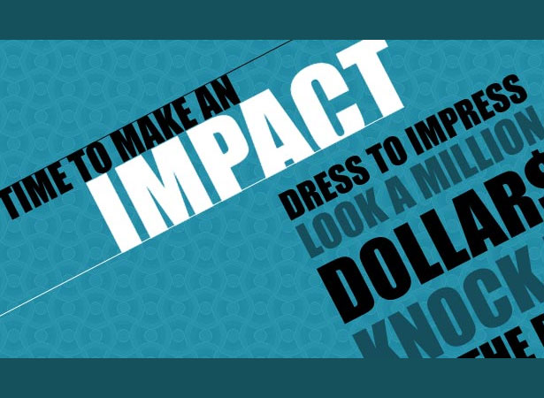
One of the world's most popular header fonts, Impact does have its positives. It's easy to read, rather striking and great for getting attention. However, it has been misused so frequently that few good designers even bother to acknowledge its existence anymore, preferring to use other high-visibility fonts.
Here's why you should not use it: it's too thin, too focused and too amateurish to stand out.
Impact is the standard choice for office handouts and amateur mailing list items, and it should never be used for a professional logo or public document. Avoid it, and opt for a wider font for your headlines.
2. TheSans Basic
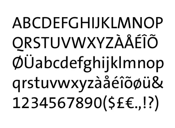
It's hard not to like TheSans. Perfectly spaced and delicately styled, it seems like the perfect font for online body content and short snappy copy.
Unfortunately, it is ruined by the uppercase "Q," which just isn't styled right for such an otherwise generic, versatile and widely usable typeface.
Creativity in typefaces is fantastic: it makes otherwise boring fonts interesting, its flourishes can transform bland documents, and it even allows designers to emphasize certain letters.
But the "Q" here just isn't right. It is style for style's sake, and it looks a bit silly as part of a typeface that's otherwise fairly standard.
3. Trajan
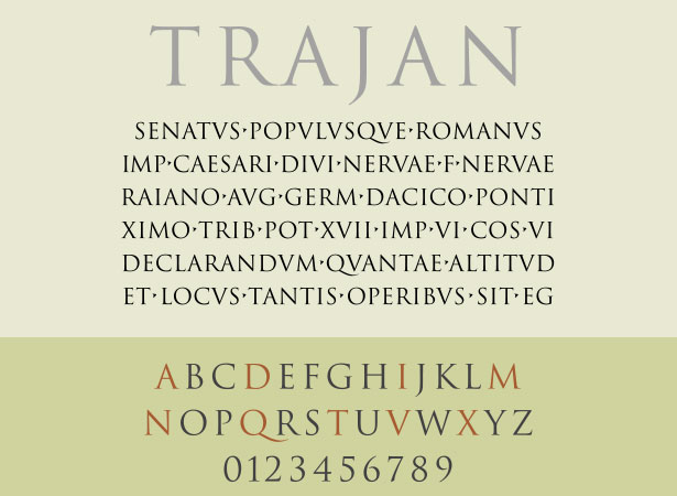
Trajan, along with the "laurel leaves" icon, has become tragically overused in film posters and other movie marketing material.
From fantasy to indie films, marketers have been using this dynamic combo to establish authenticity for some time, and it's beginning to take its toll on an otherwise pretty font.
Here's why: Trajan has shipped with almost every edition of Adobe's Creative Suite, making it one of a handful of fonts available to any designer. It's a great font for occasional titles and small touches, but as an all-purpose font for entertainment and epics, it's getting a little tired.
4. Arial
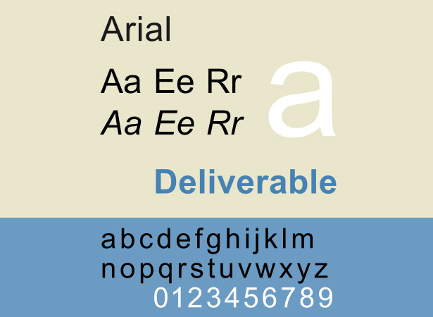
Thankfully, Microsoft replaced Arial with Calibri as the default font in Office 2007. Arial was once the standard font in all Windows applications, making it the go-to font for amateurs and thoughtless designers.
Microsoft originally chose Arial to skirt licensing issues with the older, slightly more popular Helvetica.
By going with Arial, it avoided the licensing fees and got a font that was very similar to Helvetica, with only slight variations, many of which are impossible to spot when the font is used for body text.
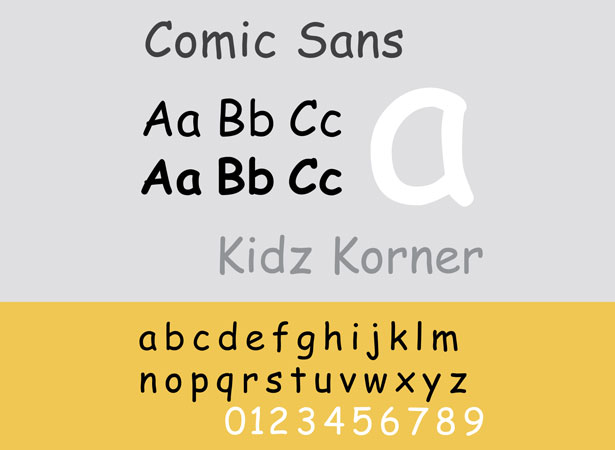
5. Comic Sans
Few fonts are as reviled as Comic Sans. The whimsical font really isn't that bad when used appropriately. Unfortunately, the entire corporate world seems to have chosen it for "Do not enter" signs, product announcements and even scathing sports-related rebukes.
Comic Sans is great for children's products, party invitations and (gasp) comic books. It is not suitable for product announcements, termination notices and funeral invitations.
This is a classic case of a good font gone bad through overuse, outright misuse and sheer stupidity.
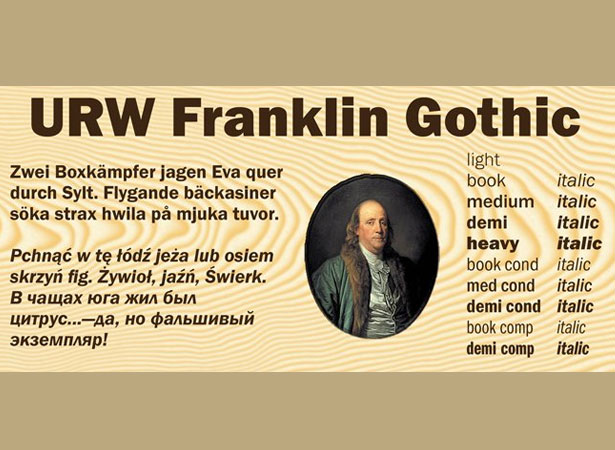
6. Franklin Gothic
We get it: you want your website to look like a newspaper. Franklin Gothic is an iconic font that has the potential to look good, but it is all too often misused by amateur designers who want to give their websites a "classic" look or bloggers who are desperate for credibility.
Franklin Gothic is great for headlines, short leading questions and other minor design elements. It should not be used for an entire website.
While a truly classic offline font, Franklin Gothic is abused too often to be a staple of the web.
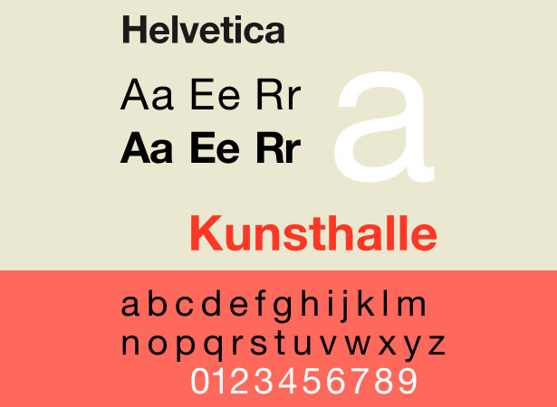
7. Helvetica
Not many designers would put Helvetica on a list like this. Designed in 1957 and used by some of the world's biggest companies (Apple, NASA and BMW are all big fans), Helvetica is one of the most visible sans-serif typefaces in print and advertising.
For most designers, that's a testimony to its versatility and value. But it's also a reason not to use it too much.
Helvetica has become so overused that it has lost its distinction. When you want to grab attention or emphasize a bit of content, Helvetica is no longer your answer. That said, the font is still ideal for ordinary body content.
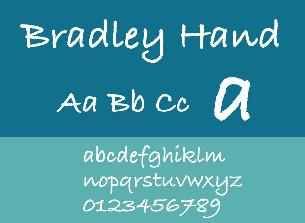
8. Bradley Hand (and Other "Handwritten" Fonts)
The reason that handwritten-style fonts are used is that they convey personality in a way that Arial and other sans-serif fonts cannot.
The reality is that they come off as kitschy and inauthentic, and they end up saying more about your taste than your content.
Bradley Hand is one of the worst offenders: a cheap font that has been used in too many invitations and personal greetings to slip under the radar. But other handwritten fonts are just as annoying, as are the many tacky script-style fonts used in party invitations and gift-shop signage.
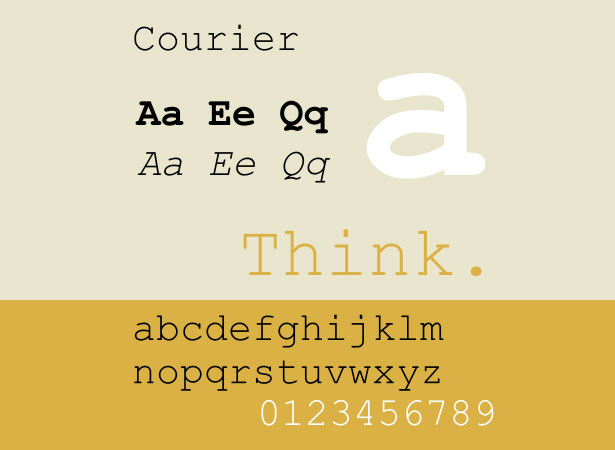
9. Courier and Courier New
Courier makes sense for certain uses: screenplays, code, plain text documents. But its disproportional lettering and typewriter aesthetic makes it unsuitable for web designers.
Don't bother with Courier as a design element, just don't. It's great for text for which readability is paramount, such as code, but on the web it reeks of a 12-year-old's angst-ridden Geocities website-especially when rendered in neon green.
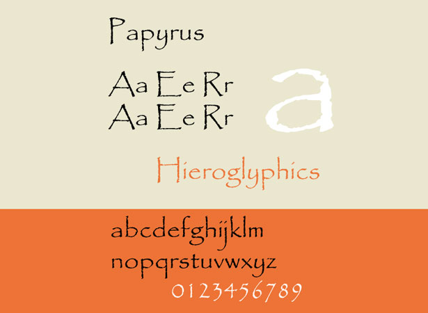
10. Papyrus
Papyrus is the king of bad fonts. Equal parts childish, kitschy and irritating, this ugly piece of typography has found its way into everything from film posters (Avatar, anyone?) to logos for credit unions.
It has become such a universal annoyance that several anti-Papyrus blogs have popped up.
As with Comic Sans, avoid this typeface if you want to be taken seriously. Unlike other reviled typefaces, though, Papyrus isn't bad because it is overused: it's bad because it just doesn't look good. Kitschy, cheap and vile, Papyrus has no place in your designs.
Written exclusively for WDD by Mathew Carpenter. He is an 18-year-old business owner and entrepreneur from Sydney, Australia. Mathew is currently working on Sofa Moolah, a website that teaches you how to make money online. Follow Mathew on Twitter: @matcarpenter. Follow Sofa Moolah on Twitter: @sofamoolah.
Which other iconic fonts should we stop using in our designs? Share your opinion in the comments!

