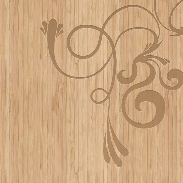
 We all know texture is used a lot in both modern and vintage design, although in many cases of design produced many years ago, noisy and grungy textures were unavoidable.
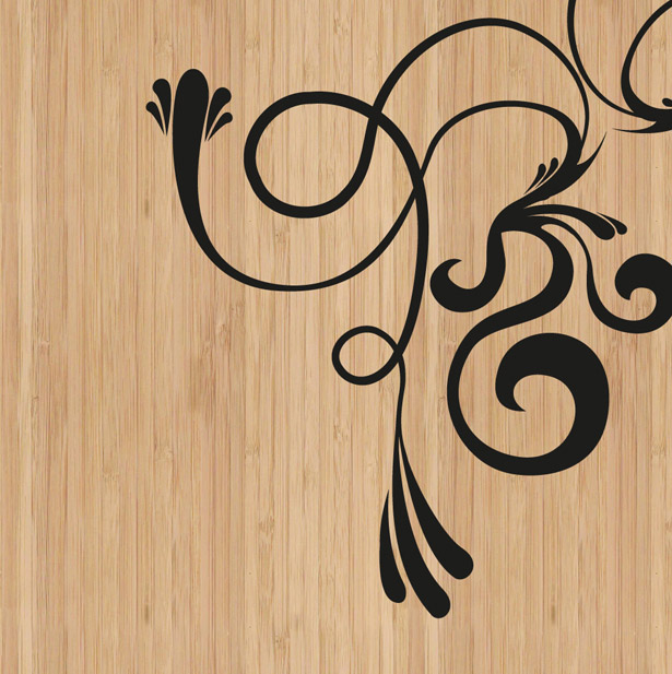
When it comes to wooden texture in design, though, whether in a print product, a web or mobile user interface element, or general layout, it is always used to enhance visual appeal.
In this article, we will look at five common elements in UI design that use wood textures to do just this.
In addition to discussing these elements and admiring some rather sexy user interface designs that I collected from Dribbble, we will also be learning how to reproduce some of these effects by following mini-tutorials right here in this article.
These five common elements in the UI design are:
- Fabric and stitching,
- Paper and shadows,
- Engraved typography and patterns,
- Sleek and modern elements,
- Three-dimensional effects.
1. Fabric and Stitching
Fabric and stitching are elements that tend to fit in perfectly with the wooden texture because both are natural, organic products. (Admittedly, cotton is weaved, cut and dyed, and a lot of the wood in this showcase has been cut, sanded down and treated—but you get what I mean!) Look at the few examples below that combine fabric and stitching elements with wooden textures.
Examples
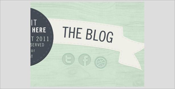
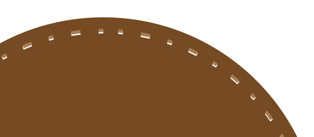
This very light design uses a basic "stitch" (just a dashed stroke link) to make the circle emblem and banner appear as though it has been sewn to the low-opacity and tinted wood-textured background. That little touch works so well for such a simple design.
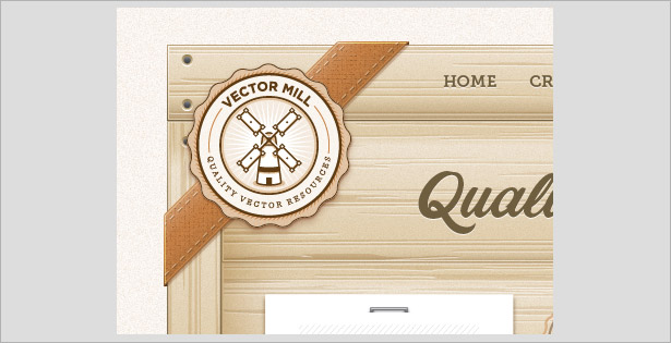
The stitching in this design is a lot more realistic, combining a full-opacity wood-textured background with engraved elements, drop-shadows and real fabric textures. This stitch has a drop-shadow (0 pixels in size and 1 pixel at a 90° distance), allowing the stitch to stand out and match the detail in the rest of the design.
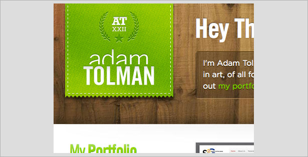
The digitally produced wooden texture makes this design look modern, with its faint gradients and engraved elements that produce a slightly three-dimensional and more realistic appearance. A repeating pattern is used to produce a lovely leather effect for the badge in the top-left corner, which has been stitched using the exact same technique as the one mentioned above (with the 1-pixel drop-shadow).
Mini-Tutorials
Creating a Simple Dashed Line (Illustrator)
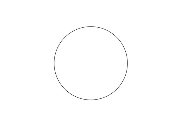
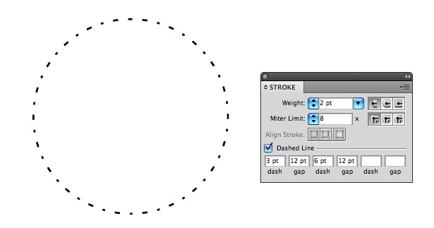
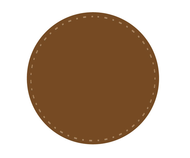
In this mini-tutorial, we will use Illustrator (Ai) to create a simple dash-stroked line to form a circle, as in the first example of this section. Open up Illustrator and select the Ellipse tool. While holding the Shift key to keep your shape in proportion, drag out a circle, as below.
From the Stroke panel (Window → Stroke) apply a 2-point weight stroke with a Miter Limit of 4. Check the "Dashed Line" option, and insert 12 points into your first dash field.

You'll notice that the line on the right side of our shape is actually two 12-point dashes put together. To fix this, let's give our stroke a bit more of a pattern. Change the dash to 3 points and the gap to 12 points, and then double the dash to 6 points and keep the final gap 12 points. You should end up with a stroked line similar to the one below (results will vary depending on the size of your circle).
Duplicate your shape by first selecting it, then choose Edit → Copy (Command + C) and finally Edit → Paste in Place (Command + F). With the new shape still selected, hold the Alt + Shift keys simultaneously and reduce the size of the shape. Holding these two keys at the same time will keep the shape in proportion and decrease or increase the size from the center point, eliminating the need to realign.
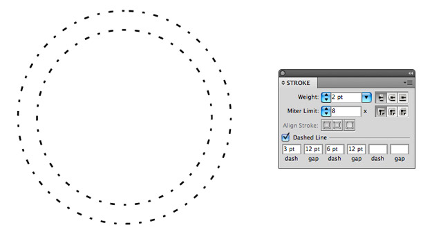
Select the larger of the two circles. Remove the stroke, and change the fill color to a brown (or any other color for that matter). Now, select the smaller of the two circles, and change the stroke color to a lighter brown.
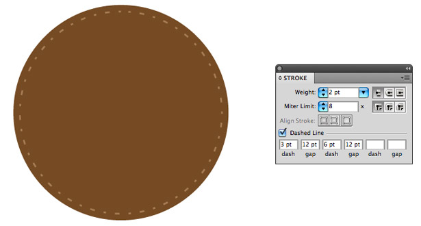
With the smaller of the two circles still selected, duplicate it by copying and pasting in place. Once duplicated, position it beneath your original shape (Command + [), and nudge the shape down one by hitting the down arrow on your keyboard once; then change the stroke color to white.
Reduce the opacity of your white stroke circle to 50% and the opacity of your brown stroke circle to 75%.
Creating a Realistic Stitch (Photoshop)
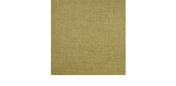
In this mini-tutorial, we'll use a real fabric texture and some of Photoshop's built-in effects to produce a realistic stitch. Open a new Photoshop document, and insert a fabric texture of your choice. Crop the image so that it sits on a white background.
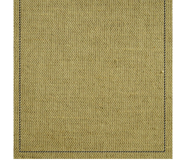
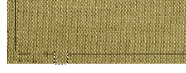
Select the Rectangular Marquee tool, and drag out a selection on the inside of your fabric texture's shape. Create a new layer and rename it "Stitch." Go to Edit → Stroke and apply a 1-pixel black stroke to your shape.
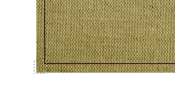
Select the Rectangular Marquee tool again and position it over your stroke. It doesn't matter where you start. With a position chosen, hit the Delete key. Make sure that you remove content from the stroke's layer and not the fabric's layer.
Repeat the process for the rest of the stroked line, as seen below.
There's a high chance that the stitches won't be symmetrical; but that's a good thing, because stitches rarely are!
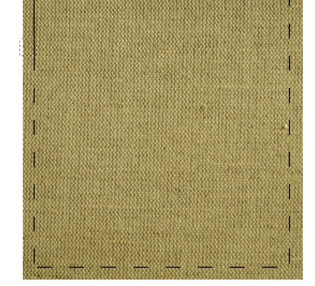
You should end up with something that looks like this:
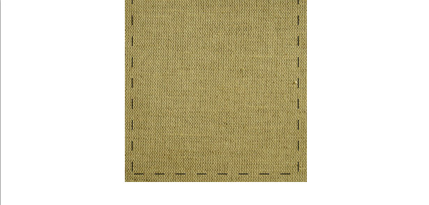
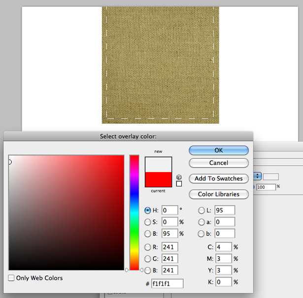
Right-click on your stroked layer and select "Blending Options" to open up the Layer Styles window. Select the Color Overlay tab, and select a light gray (I used #F1F1F1).
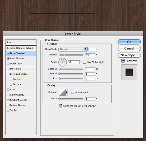
Now select the Drop Shadow tab. Apply a black drop shadow with an angle of 90°, a distance of 1 pixel and a size of 0 pixels. Lower the opacity of the shadow to somewhere between 20 and 60%.
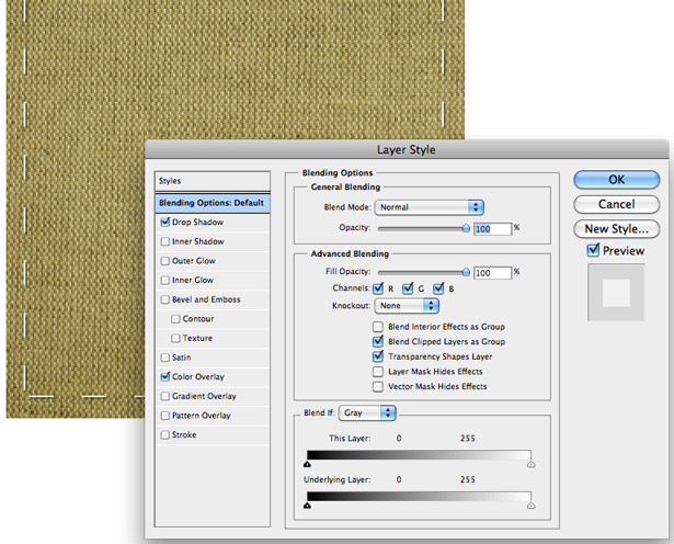
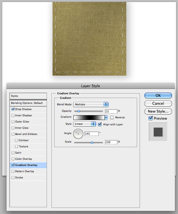
Select the fabric layer, and open up the Layer Styles window. Apply a default Drop Shadow with a distance of 0 pixels, and a Gradient Overlay going from white to black to white. Change the Blending mode of your Gradient Overlay to "Multiply" with an opacity of 15%. Once applied and viewed at 100%, you should end up with something similar to this:
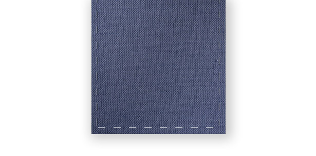
Play around with the colors of your fabric by using the hue and color-balance settings. Here is my result:
2. Paper and Shadows
Paper and shadows are becoming increasingly popular as design styles, but are especially popular in texture-heavy designs, such as ones with wood. The collection of work that follows shows paper and shadows being used in different ways to present small chunks of information or, in some cases, the website's main content.
Examples
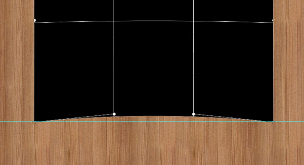
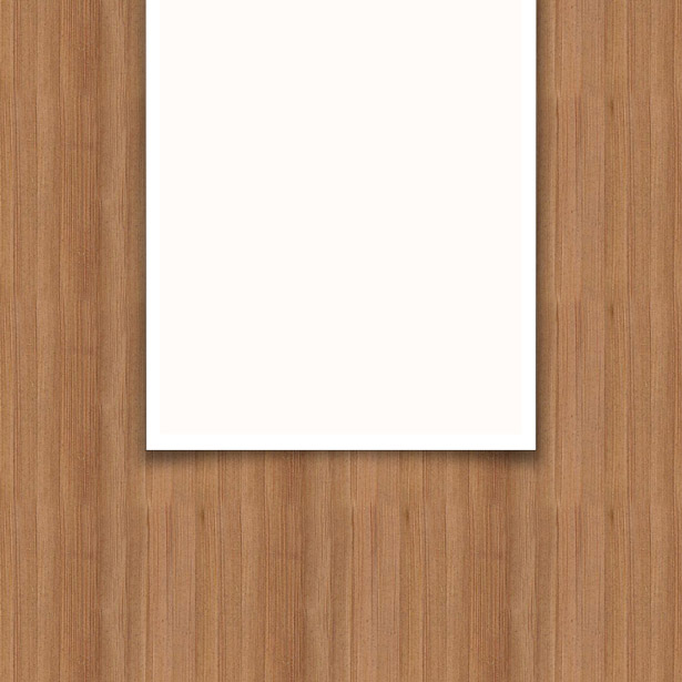
This screenshot, in case you hadn't noticed, comes from a small section of the design we saw at the end of the "Fabric and Stitching" section above. Continuing the theme of digitally produced texture, a simple white shape with a warped custom shadow is used to make the paper look like it is curling.
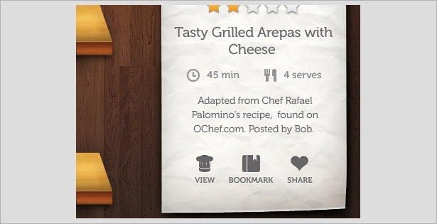
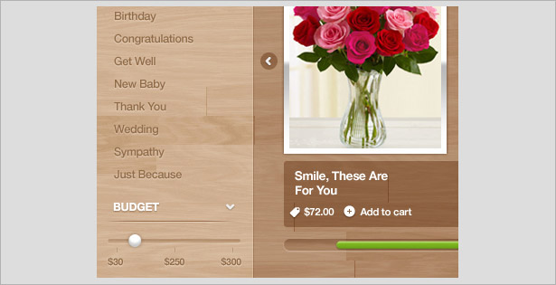
A really nice combination of wooden and crumpled paper textures. The paper in this UI is used to present a snippet of information needed for a recipe, with some lovely silhouette-style icons that allow the user to view, bookmark and share the full recipe.
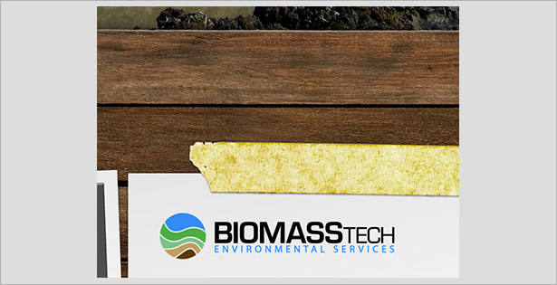
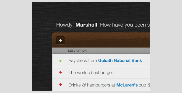
This design is texture-heavy, combining wood, paper and tape textures to produce an appealing user interface. The photographed wood and tape, combined with the digitally produced paper textures and shadows, work well together.
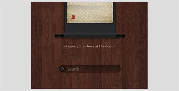
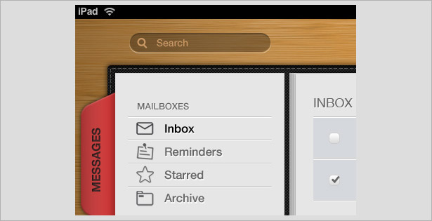
This is one of my favorite UI samples in the post. Purely digital (including the wooden texture), the design uses drop and inner shadows to create a beautiful search field. The design also makes use of the stitches and fabric element. Overall, a very user-friendly interface that looks great!
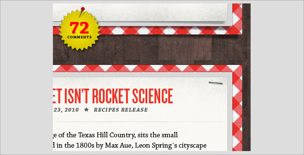
This design seems to be inspired by traditional airmail envelopes with the repeating pattern around the paper. The paper has been (digitally) stapled to the wooden background, making the user interface appear like a pin and notice board rather than a flat web page.
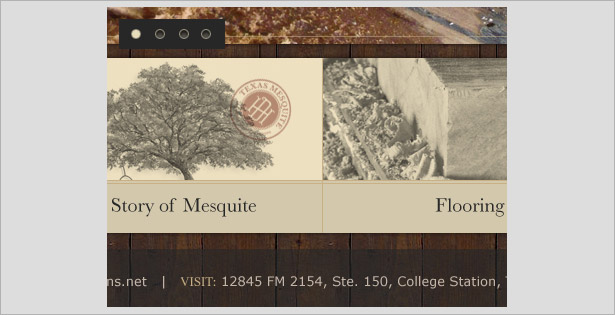
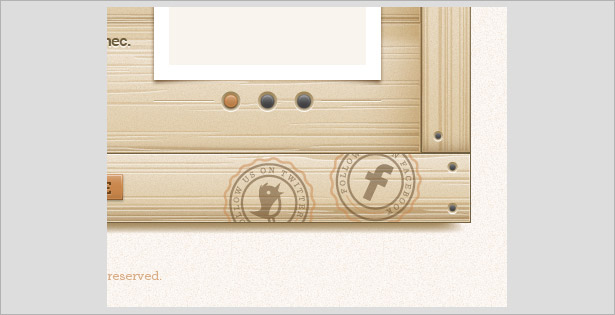
The beige-cream image and navigation background has a fine drop shadow that makes it appear like paper, especially with the stamped badge and the faded sepia-style photographs that look like they have been printed. This fits in wonderfully with the wood-textured background and overall feel of the interface.
Mini-Tutorials
Creating a Simple Digital Paper Effect (Photoshop)
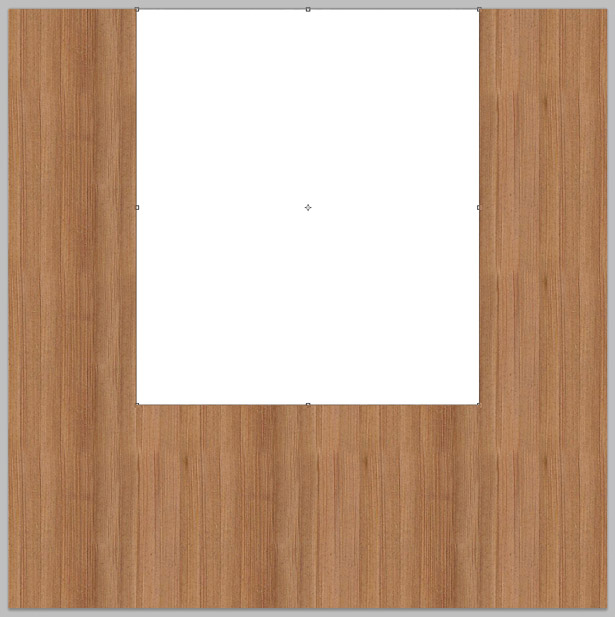
In this mini-tutorial, we will use a wood texture and basic Photoshop tools to create a digital paper effect. Start off with creating a new document with a texture or repeating pattern.
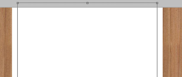
Select the Rectangular Shape tool, and insert a shape similar to the one below, placing it right at the very top of the canvas.
Duplicate the shape, and go to Edit → Free Transform (or press Command + T). Reduce the size of the shape while holding the Alt + Shift keys to keep the shape in proportion, and then decrease the size towards the center.
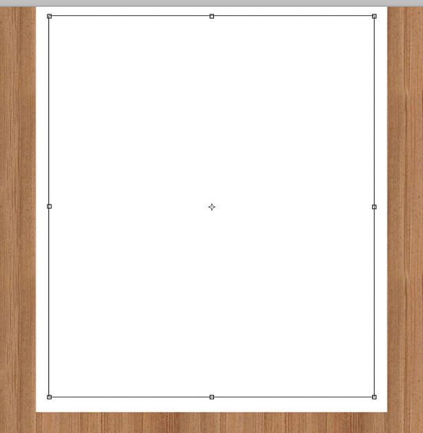
Drag the top anchor point above the top of the canvas so that it overlaps the top of the original shape.
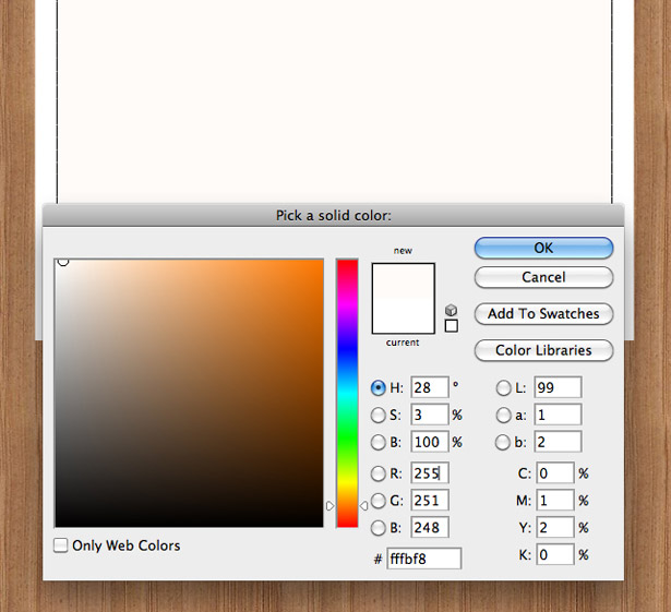
Change the color of your new shape to a very light beige (almost white). I used #FFFBF8.
Duplicate your original shape, and change the color to pure black (#000000).
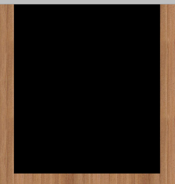
Increase the size of the shape so that it is a couple of pixels larger than the original shape. Create a guide—you can drag a guide out of the ruler (View → Show Rulers, if it's not displayed)—about 10 to 20 pixels beneath your black shape. Go to Edit → Transform → Warp.
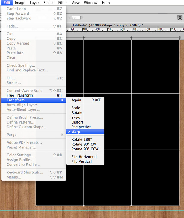
Drag the bottom-left anchor point down towards your guide, and then repeat the step with the bottom-right anchor.
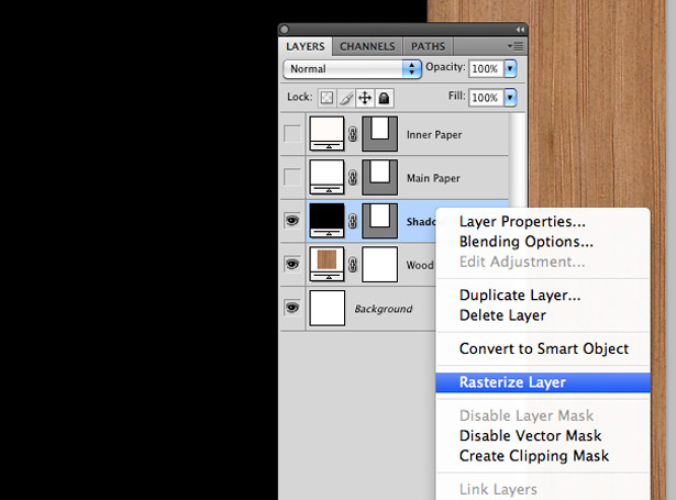
Press Enter to confirm your shape transformation. Right-click on the Shapes Layer tool, and select the "Rasterize Layer" option.
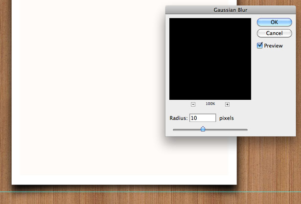
Reposition the black shape layer beneath the other two shapes but above the wood layer. Go to Filter → Blur → Gaussian Blur, and blur the black shape by 10 pixels. Then click "OK."
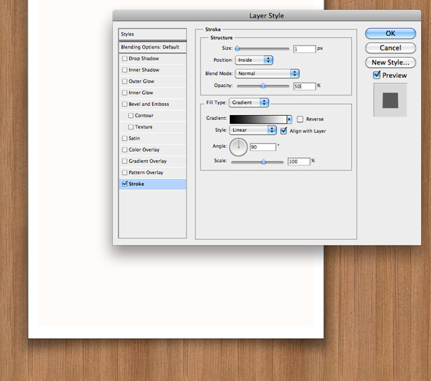
Lower the opacity of the black shape to 50%. Open up the Layer Styles window for your original white shape, and click on the Stroke tab. Apply a 1-pixel stroke to the shape using the gradient fill type, going from black to white with a 90° angle.
With that done, we have our digital paper-on-wood effect! This is a great technique to use for websites.
3. Engraved Typography and Patterns
Engraved typography and patterns is a fairly common technique in advanced web design, and it is becoming ever more popular in everyday design. Below are several examples that use this style well in wood-textured interfaces.
Examples
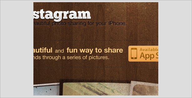
This Instagram application user interface has a grungy wood-textured background and washed-out semi-transparent images to produce a worn vintage look. The typography has several different styles, allowing the lettering to stand out and giving the wooden background an engraved feel.
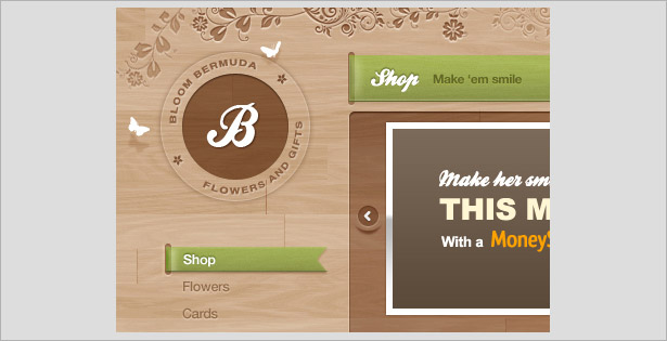
Overall, this is a really clean wooden user interface, with a large and equally great collection of various styles and techniques. One used repeatedly (and very well) is the engraved effect on the typography and patterns—exemplified in the floral patterns at the top of the screenshot.
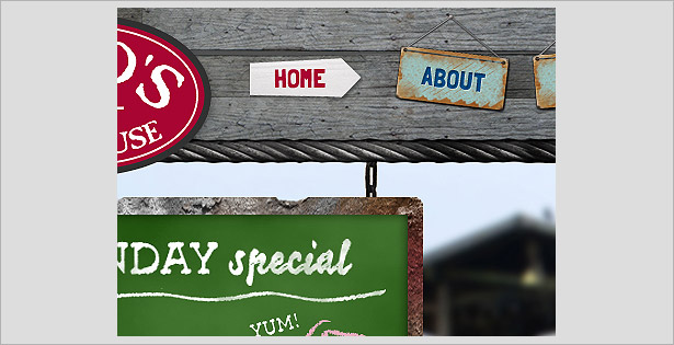
Metal signage is hung on the wood-textured header here to serve as the main navigation. To give the signs a more realistic engraved effect, the designer gave the typography inner and drop shadows.
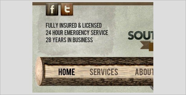
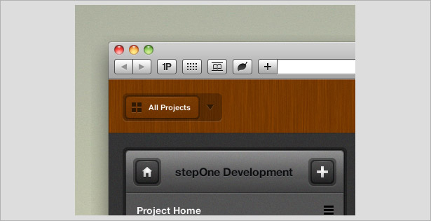
Wood textures are primarily used in this design for the navigation bar (the log, in this case). The engraved typography makes the title appear as though some of the stone has been etched away to show the wooden texture.
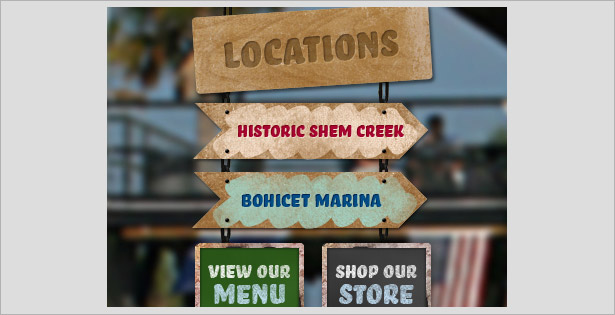
Another example of engraved typography on signs, in this case wood-textured signs instead of metal.
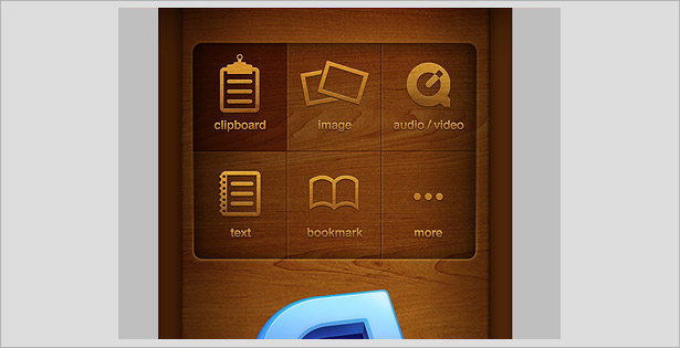
This wooden UI employs sleek and modern elements, making it hard to choose whether to put it in this or the next category. The "Buy" button and the shopping bag icon have a very detailed engraved effect, making them wonderfully clickable!
Mini-Tutorials
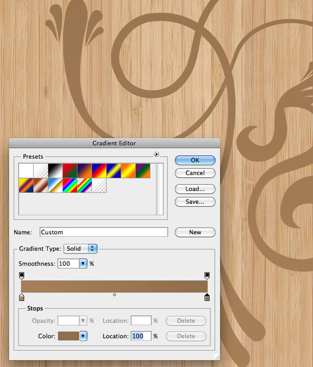
How to Engrave a Pattern Into Wood (Photoshop)
In this mini-tutorial, we'll be creating an etched or engraved wood effect in Photoshop. Open up a new document and insert a wood texture.
Insert one of your own patterns, or use stock vector image.
Once you've positioned the vector correctly, right-click on the layer and select "Rasterize Layer." Right-click on it once more and select the Gradient Overlay tab. Apply a gradient using two colors selected from the wooden background, as seen below.
Select the Drop Shadow tab, and apply a white shadow with a normal Blending mode. Change the angle of the shadow to 90°, and the distance and size to 1 pixel. You can keep the other settings at their default.
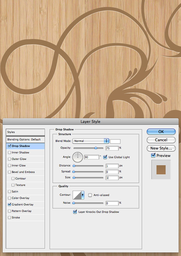
Select the Inner Shadow tab to apply a shadow to the inside of your pattern. This will allow us to create the engraved effect. Drop the opacity of the shadow to 20%, and change the angle to 90°. Change the distance and size of the shadow to 3 pixels each, and keep all the other settings at default.
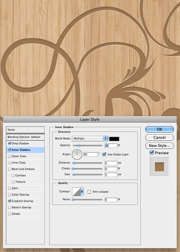
Click "OK," and then lower the opacity of your pattern layer to 80% to allow some of the background texture to shine through in all of its glory. You should end up with this result:
4. Sleek and Modern Elements
Despite wooden textures often being linked to vintage and retro design, if pulled off correctly, they can also be used to complement modern and sleek elements, as you can see from the examples below.
Examples
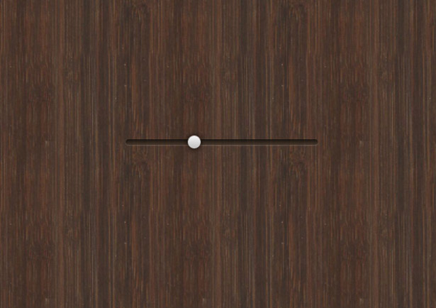
Here's another screenshot of an interface that we saw in the previous category, showing off another completely different styled element. The slider and scroll bars in this design have sleek white-silver and green gradients for a user-friendly interface.
As well as the fabric and stitches and engraved typography techniques, this design has some modern elements, such as 2-pixel gray-white strokes and the minimalist icons, which make for an attractive and usable iPad-like interface.
Another of my favorite interfaces. It combines fabric and wood-textured images with sleek gradients, 2-pixel strokes, simple icons and gorgeous typography to many create points of interest for the user.
A highly detailed interface that merges wooden textures, three-dimensional effects, glows and gloss highlights to produce a result that'll stun its users. One-pixel lines are used to reinforce the 3-D effect.
Glows, shadows and strokes are used to bring this vivid wooden interface to life. The modern icons, though, are the key.
This lovely little interface makes use of the world's natural products and sleek futuristic elements to produce a UI that is attractive and easy to understand. Noise is added to the modern elements, allowing it to fit in with the wood-textured header.
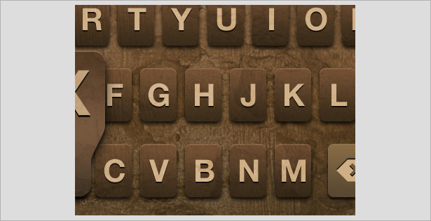
This keypad gives us a wooden texture based on an existing modern element: the default iPhone UIKit. The keypad works in the exact same way as the default keypad and so won't confuse users.
Mini-Tutorials
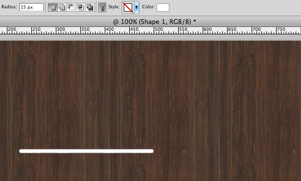
In this mini-tutorial, we'll create a wooden UI slider using a selection of Photoshop's layer effects. Create a new document, and insert a wooden texture or pattern.
Select the Rounded Rectangle tool, and drag out a long narrow shape, similar to the one below. My tool's corner radius is set to 15 pixels.
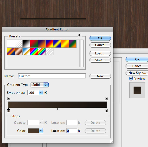
Right-click on the Shapes layer and select "Blending Options." Select the Gradient Overlay tab, and add a gradient color selected from the background, and then a slightly darker color. Then click "OK."
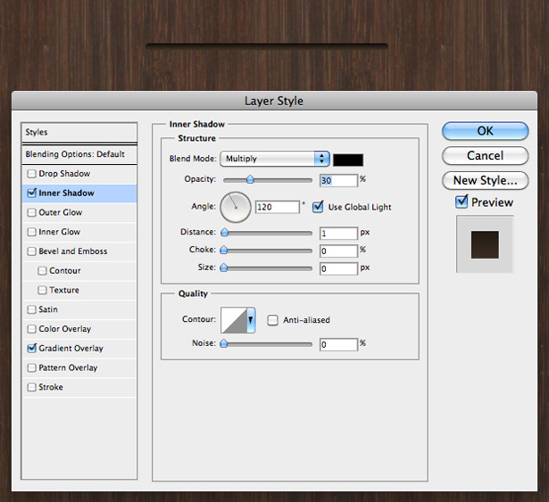
Now, select the Inner Shadow tab, and apply a black shadow with an opacity of 30% and an angle of 120°. Drop the distance to 1 pixel, and drop everything else to 0. This will create a shadow inside our shape, making it look like it was carved from the wooden background.
Select the Drop Shadow tab, and apply a white shadow with a normal Blending mode. Change the angle to 90°, and the distance and size to 1 pixel. Leave everything else at 0 pixels. This will give our shape a highlight along the bottom, making it look more three-dimensional and realistic.
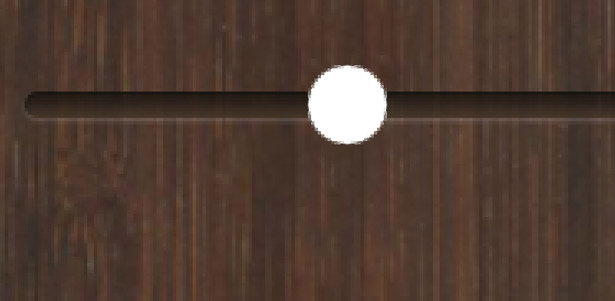
Zoom into your carved line and select the Ellipse tool. While holding the Shift key to keep the shape round, drag out a circle and position it over the slider bar.
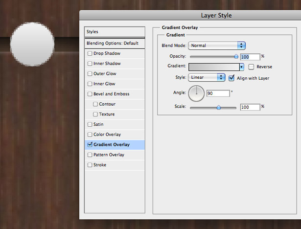
Open up the "Layer Styles" window for your new circle shape. Click on the Gradient Overlay tab, and apply a gradient going from a light-medium to light gray. Give it a 90° angle.
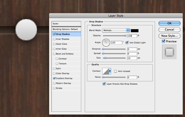
Select the Drop Shadow tab and apply a shadow to your shape. Change the distance to 0 pixels and the size to 10 pixels.
Zoom out to view your slider at 100%. Here is the result:
5. Three-Dimensional Effects
There are no restrictions on three-dimensional design, and it is incredibly effective with wooden textures. This combination is commonly used to produce "shelves," as seen in the iPhone and iPad interfaces—particularly Apple's iBook application.
Examples
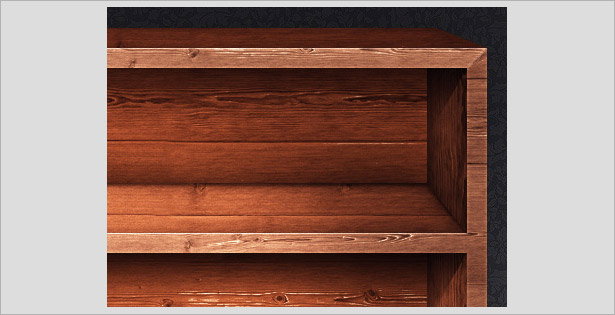
These shelves are highly realistic, and the shadows (such as the one on the inner shelf in the top-right corner) come from a large selection of custom jobs (not built-in Photoshop filters).
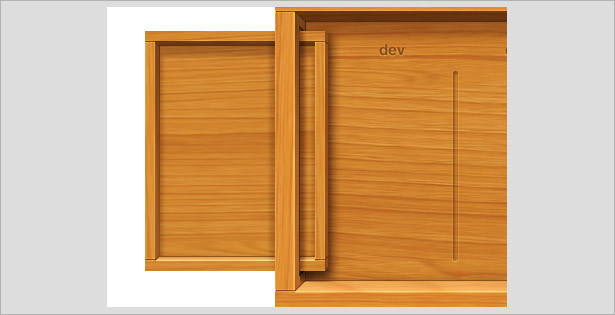
The effects in this design are fairly similar to those in the previous one. This time, the effects bring a cleaner and more modern look, whereas the previous one was meant to look more realistic and "used."
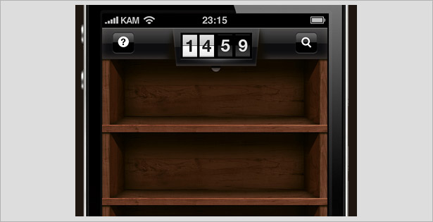
These iPhone shelves present similar techniques. This time, the result is both modern and realistic, perfectly balancing textured photographs with digital effects.
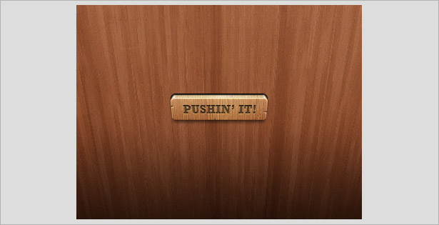
This 3-D button is incredible! With its combination of wooden textures, the design's delicate details come into high focus. If a button like this was in front of you, there's no way you'd be able to resist giving it a push!
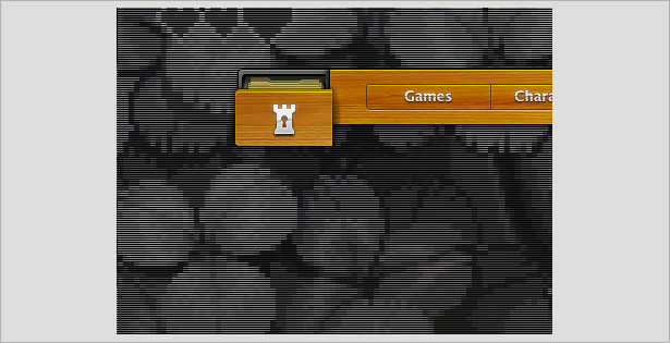
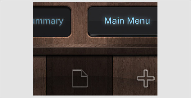
A simple yet effective 3-D effect has been applied to this navigation bar, making the buttons appear as if they are filing drawers. S a cleverly designed element to get the user involved in the interface.
Written exclusively for WDD by Callum Chapman, a designer and illustration trading as Circlebox Creative. He also runs The Inspiration Blog and Picmix Store
Share your wooden UI designs and illustrations with us, as well as any articles or tutorials that might help your fellow readers.
WDD Staff


Read Next

15 Best New Fonts, July 2024

20 Best New Websites, July 2024

Top 7 WordPress Plugins for 2024: Enhance Your Site's Performance

Exciting New Tools for Designers, July 2024

3 Essential Design Trends, July 2024

15 Best New Fonts, June 2024

20 Best New Websites, June 2024

Exciting New Tools for Designers, June 2024

3 Essential Design Trends, June 2024

15 Best New Fonts, May 2024

How to Reduce The Carbon Footprint of Your Website
