 Mobile development is all the rage, and the interactive industry is in great turmoil as countless tablets and smartphones come to market.
Mobile app development gets most of the attention, while the mobile web somewhat quietly creeps along. But the mobile web is making progress every day as more and more developers launch mobile-optimized interfaces.
The great thing about the mobile web is that it is fundamentally built with all of the same tools used in traditional web design and development.
This makes it far more approachable than app development. Also, many users will want to visit a company's website on the go, without necessarily needing a full-blown app.
Building websites optimized for mobile is so similar yet so different then designing for the desktop. Certain factors take on a far more significant role. For example, screen size variations, user attention spans and usability issues are more critical then ever.
These same issues are ever present on the desktop but are sometimes easier to overlook. Here we'll look at some lessons to learn from the optimization that is happening on the mobile web. The lessons can directly inform how we design and how we think about traditional web design and website architecture.
Simplified navigation on mobile websites
One of the first things that becomes evident when digging into mobile websites is the extreme simplification of the navigation. Navigation not only becomes very prominent and central on a mobile website, but is also quite often trimmed down substantially to focus on only the most critical elements.
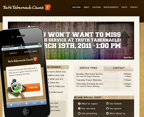
I find it amazing how top-level navigation can be boiled down to two to four items on most mobile websites. Of course, I recognize that the content on a mobile website is quite often optimized for the intended audience. For example, Truth Tabernacle Church has six options in its main navigation, only one of which has made it into the navigation for the mobile version; and the one that made it ("Contact") is the focus of the entire home page.
The content that didn't make it into the mobile version is, of course, still entirely relevant. The mobile interface is intended to catch people trying to find the church or check out the service times or simply contact them. These are the most likely objectives of the mobile surfer. Those hitting the full website on a desktop computer are as likely to want those things as they are to want to research the church to see whether it is the sort of place they would like to visit.
So, what is the lesson to learn? Don't these two interfaces target totally different audiences and have totally different purposes? Perhaps, but we can learn a lot from the extreme focus of the mobile interface. Notice how everything is about the actions you can take? The church has eliminated all of the navigation elements that feel like boxes to check off.
One interesting element is the "About" navigation option on the full website. The mobile website may be optimized for people on the go, but there is no reason to assume that they wouldn't be interested in reading about the church and its beliefs. Someone may have mentioned the church to you in passing, prompting you to look it up on your phone.
So, the navigation option for this element should be changed. What if, instead, it communicated something like, "What you should know about us"? While a bit long, it reflects a more helpful attitude. A general "About" bucket feels like a place to hold all of the information that no one reads. "A visitor's guide to our church" feels a lot more useful and targeted.
The simplicity and focus of the mobile interface shows that everything must have a purpose to earn a slot on the website. If the same were true of the full website, we would be less inclined to fill it with seemingly important content and more inclined to make sure everything has a clear function.
This reflects a very task-oriented mentality. Every option challenges the user to take some active step. It is as though every passive option has been purged and reduced to actionable items on the mobile website. This leads us to the next lesson: be extremely task-oriented.
Mobile websites are task-oriented
With a task-oriented mindset, let's reconsider the full website. While the home page is beautifully designed, the call to action is far less evident. The content is full of bits of information waiting for you to decide to be interested.
For example, the large banner highlighting a coming event fails to call me to some kind of action; very passive. With a task-oriented mentality, we could vastly improve on the "Read more" call to action. This could be as simple as making the call to action much more prominent; for example, a large button in a contrasting orange. Additionally, the call could be changed to "Learn more and sign up."
Another example is the welcome message. I appreciate the intention and the message being communicated here. The message shows that real people are behind the website, and it attempts to make the page feel personal. But again, let's dissect this with a task-oriented mentality. A great follow-up to an introduction like this would be a clear call to action encouraging visitors to take the next step. After all, the only people who will be reading this are newcomers. Current members will skip right past this to things like the event calendar. So, offer a conversion point for users, like "Ask us a hard question" or "What to expect when you visit."
By contrast, the "Special guest" box is fantastic. It addresses key issues and drives people to dig deeper. I only wonder whether it could be a more prominent element of the page. Again, members will get to where they need to go; so focusing on those who are new to the website and the church would go a long way to maximizing the opportunity.
I know I am really beating this website up, but it is not because I dislike it or think that it doesn't serve its function. My goal is only to challenge our thinking and our preconceived notions of what a website should look like and do. I actually commend this church for having a beautiful and functional website, with a mobile extension to boot!
Mobile websites dramatically shrink their content
Another obvious lesson related to paring down the navigation is that mobile websites invariably shrink their content. Not only are the number of options reduced to the core functionality and purpose of the website, but the copy is vastly reduced, too.
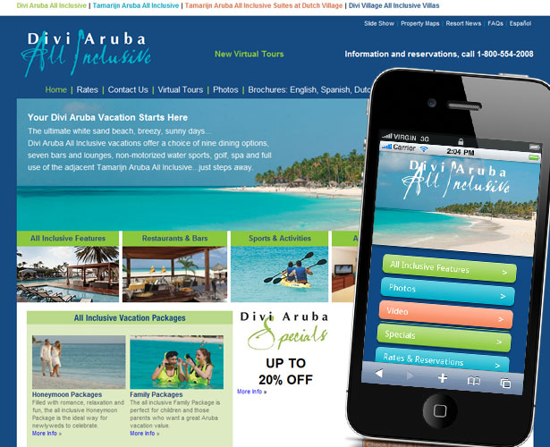
In some cases, much of the copy is eliminated entirely! This begs the question, is this content necessary on the full website if the mobile version functions well without it? Divi Aruba is a great example of this. The alluring marketing speak laid overtop the photo might seem like a must-have element for the home page, but it has been nuked on the micro mobile website.
On the mobile version, the logo is placed on top of the same image, and yet it still conveys the exact same message: if you want to go some place like this, read on. Why not use this prominent spot to drive people to the desired action? Surely the designers know what is the most critical element for converting visitors to customers. Put this information to work, and drive people there with a prominent call to action instead of fluffy marketing speak.
All the good stuff, sans fluff
This leads us to the next lesson: lose the fluff. The next example is a positive demonstration of this. Travel Tex is a travel information website for the state of Texas. It has a clear purpose and audience in mind. Fortunately, the designers have fully embraced the fluffy-less mindset.
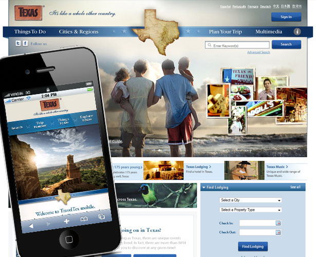
Not only does the mini mobile website focus entirely on the topic at hand and the key actionable items, but so does the full website! What a relief to see almost no fluff at all. Including something dreary like a history of Texas would be all too tempting. If people wanted a history lesson, they wouldn't come this website. You will be hard pressed to find content that is not relevant to this website's singular purpose.
Get into the habit of questioning everything. This is the only way to really boil a website down to its critical elements, which is exactly what happens on a good mobile website. Tough choices are made and otherwise valuable content is cut in order to streamline the website. Call fluff for what it is and nuke it!
Branding is king on the mobile web
I am all about creativity on the web. In fact, many of the greatest changes in the industry have come about as a result of a refusal to stick to the status quo. But there is a time and place for everything. So many designers use their assignments as an excuse to release their creative juices, for no other purpose than to do something creative. This turns the website into a design for the designer, not for the client and their needs. This is one thing the mobile web warns against rather boldly.
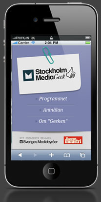
Branding is incredibly consistent on the mobile web, and one of the most consistent parts is the placement of the logo. On mobile websites, you won't find any crazy logos at the bottom with fixed footers. Functionality is king, and logos always appear at the top. Can you imagine hitting a mobile website and not seeing the logo right away? Yet this is commonplace on many full websites.
Here are a few websites that, while minimal and lacking in mind-blowing style, are rich in branding that can't be missed.

The lesson here can have a profound impact on how you approach your work and on the fundamental value you pose to your clients. For every designer who figures out that the client's needs should be their entire purpose for the project, there is another who wants to show the world how creative and original they are.
Like anyone else involved in the production of a website, the web designer should be single-minded in serving the client, helping their business and improving the bottom line. With every element you put on a mobile website, considers its role and the benefit it will bring. Apply this mentality to everything you do, and you will soon find a strong ally in your client.
The more we embrace the needs of the client and do everything we can to bring value to their website, the more we will see a fundamental shift in our work. We will go from building "cool stuff" to looking at everything from the client's perspective. Does this feature stand to increase their profit? How can the design be changed to improve their business? If a byproduct of your work is more money for the client, then you will find opportunity everywhere.
Websites without the gimmicks
One of the greatest achievements of the mobile web is the total lack of gimmicks. To be fair, there is a time and place for gimmicks on the web. In fact, I dedicate whole sections of my books to them. But the lack of gimmicks on mobile websites demonstrates that these seemingly great ideas serve no real purpose.
Everything that goes on a mobile website should go through several filters. Is the content relevant and utterly useful? Is the content critical, and does it serve the core purpose of the website? Is the website easy to use and understand? Is the navigation unconventional? If so, is it critical to the function of the website? The answer may well be yes, but more often than not, it will be a decisive no.
Some gimmicks that are noticeably absent from mobile development are splash screens, unusual navigation, meaningless animations and interactivity, inline scrolling regions, odd layouts and fixed-width layouts. The efficiency of the mobile web is amazing.
Conclusion
As you can see, we have a number of lessons to learn from the mobile web; particularly, its ability to reveal unnecessary elements of a website. As with many things in life, a slight change in perspective often opens our eyes to the true value of things we have long taken for granted.
I am not suggesting that we have lost sight of the purpose of the web. Rather, I am proposing that we adopt a far more strategic mentality.
Patrick McNeil is a freelance writer, developer and designer. In particular, he loves to write about web design, train people on web development and build websites. Patrick's latest book project is The Designer's Web Handbook; it includes many topics along the lines of this article. You can find out more about it on TheWebDesignersIdeaBook.com. Follow Patrick on Twitter @designmeltdown.
This post was brought to you by DudaMobile, a mobile website creation company.
What aspects of mobile design do you try to translate to the desktop? Do you see simplicity and speed in the mobile web yourself?
WDD Staff


Read Next

15 Best New Fonts, July 2024

20 Best New Websites, July 2024

Top 7 WordPress Plugins for 2024: Enhance Your Site's Performance

Exciting New Tools for Designers, July 2024

3 Essential Design Trends, July 2024

15 Best New Fonts, June 2024

20 Best New Websites, June 2024

Exciting New Tools for Designers, June 2024

3 Essential Design Trends, June 2024

15 Best New Fonts, May 2024

How to Reduce The Carbon Footprint of Your Website
