 Over the years, web designs and layouts have increased in complexity. Yet, while our work becomes ever more polished and interactive, moving away from the static boxy layouts that dominated the ’90s, the central goal has not changed.
Visibility is as important to designers today as ever. It’s about our ability to focus the user’s attention on the meaningful content that helps to sell goods and encourage subscribers, and it helps websites gain regular readers.
With people increasingly taking advantage of pre-built solutions, giving websites just enough distinction and personality to cultivate user interest is important.
After all, the whole point of a website is to be unique, not to follow others or to offer a usable yet generic and lifeless layout. With this in mind, let’s examine how the compulsion to overuse certain design conventions and patterns could favorably or adversely affect users.
Saturation and Sensitization
To begin, let’s review the two core variables at work. Saturation, not to be confused with the color-related term, refers to the ubiquity of certain tools, techniques or design implementations across the web. For example, consider how widespread Google Ads are today and how some designers pack them onto their web pages.
Sensitization, on the other hand, refers to the degree to which a user is affected by exposure to tool, technique or implementation. It could be said that we’ve grown so used to seeing ads online that we’ve adapted to filtering them out as irrelevant background noise, and sometimes physically filtering them out.
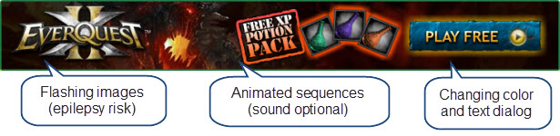
We’re seeing increasingly intrusive adverts that use animation, sound and vivid colors.
While some implementations, such as advertising, could be said to detract from the value of content, others can be of great benefit if used repeatedly and consistently, such as image thumbnails in portfolios. Because both saturation and desensitization can be both good and bad, the essential problem that designers face is figuring out how and when to follow conventions.
Our industry relies heavily on convention. If we’re not using a CMS or template, we’re using frameworks and inspiration websites. Relying on design conventions could stem from a fear that if one doesn’t follow cultural shifts and trends, they will be deemed out of date or their understanding of usability will be called into question. But this is far from the truth.
While duplicating designs or using generic conventions may be easier, it limits one’s potential to connect with users on an emotional level, which is not to be taken lightly.
With so many frameworks and CMS engines, it’s a wonder we need to build anything.
Let’s look at some of the benefits that conventions can bring to a web page and analyze some major pitfalls that could lead you to decide on a particular layout or to rethink a feature.
We’ll also explore a couple of workable solutions to help you avoid making your website look and feel like the millions of layouts that have no real unique selling proposition (USP) or relevance.
The Good Side of Saturation
One primary justification for using saturated elements in a design is the recognition it affords users. Trends and patterns not only provide simple solutions for features we want to implement (such as navigation menus), but they have clear usability benefits because they reassure users with familiar points of reference on the page.
Navigation systems are getting increasingly complex, but they can also be quite elegant.
Saturation can bring educational value to an experience. By providing conventions for users, saturation reduces the learning curve for a website over time.
Consider how we’ve grown accustomed to the drop–down menu; if you had never seen this tool, you might not have realized that hovering over it would roll out a secondary list of items. Such common components may have less empathic value or uniqueness, but they help users accomplish their tasks quickly.
Mystery-meat navigation poses problems for users. Familiarity should precede aesthetics.
We tend to take for granted things we see every day. How often, for example, do you consider the technology behind traffic lights? This phenomenon can also be applied to web design.
As the saturation level of a trend increases, we become more familiar with its function and how it affects us. Consequently, we become able to mentally ignore it until we need to use it. The danger of this is “zombie browsing,” which we’ll discuss later.
Users tend to focus purely on content and may miss the design’s message.
Stability is another common effect of design conventions. When something has been implemented time and time again, it’s likely gone through several iterations of testing, analysis and improvement and, as such, increases in value.
Additionally, because the effectiveness of conventions such as the drop-down menu have been heavily researched, we can build usage scenarios to determine whether and how they would be appropriate for a particular layout.
We know that users expect to be redirected back to a home page when they click on a logo.
The Bad Side of Saturation
While all of these points show that saturation can be beneficial, as with every aspect of design, there is a flip side that should make you think twice before jumping on the bandwagon. The first of these issues is abuse.
For those of you who can remember the Web 2.0 design era, when everything was shiny and beveled, the web was awash with pointless designs, both professional and personal. Everyone copied what they thought was popular, and so the trend became so common that its value was lost in a sea of clones.
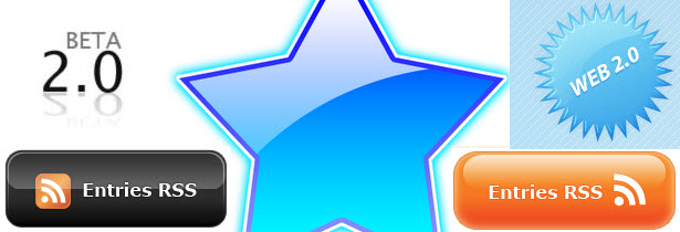
The Web 2.0 design era got out of hand, and layout innovation suffered as a result.
Beyond just the abuse of saturation, another obstacle is the thoughtlessness that sometimes surrounds saturation. When we implement a feature such as a navigation menu, visitors should recognize the many elements of it on the page.
But what happens if the tool doesn’t function as expected? It might seem trivial at first, but trends limit our ability to innovate, and user assumptions can hinder the advancement of the web.
Users expect an action upon clicking a button, so the feature must be reactive.
In addition to these factors, one of the biggest arguments against templates and saturated features is that they don’t target the needs of a specific audience.
One of the defining characteristics of a handcrafted website is that it has been built (hopefully) with the visitor’s requirements at the core. While websites can get away with a generic-looking layout, designs that are beautifully crafted will enhance the value of the website and enrich or supplement the content.
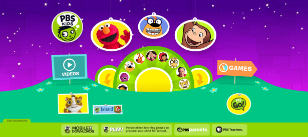
You can clearly tell that this website was built for its target audience: children.
The final issue is the influence that saturation has on visitors. When layouts become routine, users can easily miss new components that they assume existed during their prior visit.
This psychological state, known as “zombie browsing,” manifests when users fail to notice objects that they subconsciously or consciously deem irrelevant. This is especially problematic in advertising; many users block ads with browser extensions or avoid looking at them, even if the ads might be helpful.
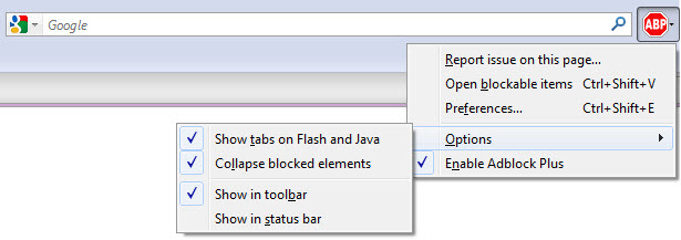
While filtering options can be helpful for users, they can also make things harder to spot.
Solutions for Designers
The first solution, which seems rather obvious, is to innovate, rather than copy what exists.
In some cases, though, the best course of action will be to simply not reinvent the wheel; the availability of inspiration galleries, cut-and-paste scripts, CMS engines and layout templates do tend to foster a preference for fast turnaround design, rather than handcrafted, original workmanship.
Even if you do use a pre-built solution, you can still improve on or personalize it for your audience.
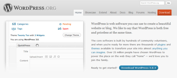
WordPress can (and should be) be highly customized to match the identity of the person or company.
The second solution is to determine whether a generic feature actually serves a particular goal. The idea of designing with purpose has been around for many years, and while users continue to demand increased levels of interactivity and control on a website (a far cry from the static design era), we should include an element on a website only if its usefulness outweighs the costs of it being there; it shouldn’t, for instance, steal attention from other content. Every object should serve a useful purpose, even minor elements such as “Skip” links, which assist screen readers.
Removing unnecessary features remains popular as we all love a clean interface.
Simplicity and the aim of directing the visitor’s eyes to useful content is at the core of good design. To avoid over-saturation, we must exercise caution when adding objects to the page (and especially not do it repeatedly) and not get too enthusiastic with “feature loading.”
We know that overloading users will force them to work harder to progress through the page; and the more distractions that exist, the higher the risk that important content will get missed. Designers must be sensitive to user needs, reduce the learning curve and maximize content visibility.
Good and Bad Examples
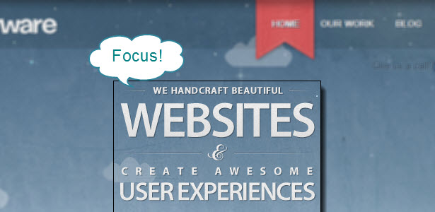
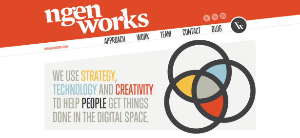
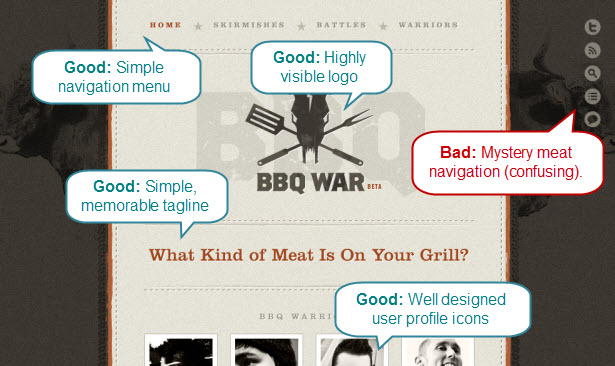
In the first example below, a lot of energy has clearly gone into balancing convention and originality. Notice how the fixed-width layout, the centered and highly visible logo and the familiar elements come together on the page without overloading the user. While scrolling is required, the interface offers a unique spin, with its subtle hover flourishes, typographic choices and carefully organized profile pictures.
The only real downside is that non-savvy users might not be able to easily identify the visual icons. Mystery-meat navigation is always a big risk.
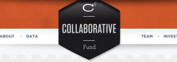
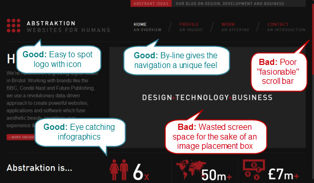
The layout for this second example is perhaps less unique than the first. And yet it still makes for a good experience as a result of the short learning curve for user interaction: the logo and navigation menu are where you expect them to be; the website follows the conventional terms for portfolio elements (although, in this case, screen space is rather wasted); and the eye-catching infographics push users to scroll down the page.
The alternative scroll bar is rather interesting. Many designers seem to adopt one in an attempt to take more control over the website’s aesthetics. But because of the smaller clickable region here, this layout could be very inaccessible for motor-deficient users, and it goes against the common trend of using the browser’s default. It amounts to an anti-pattern, and it is a good example of an inappropriate design choice.
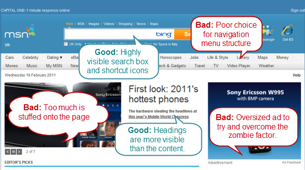
This final website is a real “what not to do” example. As you can see, while it tries to put users at ease, the MSN home page is not original and does not present its content clearly.
The logo, search box and icon links are acceptably rendered, but as the user scrolls down, the page becomes increasingly cluttered as a result of the tightly packed design conventions.
There are far too many navigation menu choices, which leads to confusion; perhaps a drop-down menu would have sufficed. Additionally, advertising occupies one-sixth of the page, thus hijacking the user’s attention. Furthermore, as we move down, the page is scattered with slideshows, tabbed blocks of content and hundreds of overcrowded links. This is over-saturation at its best: too much is being provided with too little originality or purpose.
Saturation and a balance between convention and originality will always figure largely in design.
As the web continues to evolve, new standards and conventions will present themselves. While we want to avoid creating designs that are so different that they confuse users, we must keep an element of uniqueness in our work to avoid pigeonholing our visitors.
Each website will have its own challenges and needs, and the designer’s responsibility will be to push back against the generic “anti-experience” of templates and bring some innovation back into their work.
Exclusively written for WDD by Alexander Dawson. He is a freelance web designer, author and recreational software developer specializing in web standards, accessibility and UX design. As well as running a business called HiTechy and writing, he spends time on Twitter, SitePoint’s forums and other places, helping those in need."]
What do you think of saturation in web design and how do you face these challenges on your own websites? Please share your thoughts below...
WDD Staff


Read Next

15 Best New Fonts, July 2024

20 Best New Websites, July 2024

Top 7 WordPress Plugins for 2024: Enhance Your Site's Performance

Exciting New Tools for Designers, July 2024

3 Essential Design Trends, July 2024

15 Best New Fonts, June 2024

20 Best New Websites, June 2024

Exciting New Tools for Designers, June 2024

3 Essential Design Trends, June 2024

15 Best New Fonts, May 2024

How to Reduce The Carbon Footprint of Your Website
