 As the number and variety of devices from which we access the internet increases, new web design challenges present themselves.
It's no longer simply enough to have a mobile version and a browser version. Now, we have to consider whether the person visiting our site is visiting from a tablet, a smartphone (and whether that smartphone has a high-res screen or not), a netbook, a desktop computer or full-size laptop (and whether it's one with a high-res or low-res screen), or some other device entirely.
And optimizing the experience for all of those different possibilities is becoming more expected among savvy internet users.
A few years ago, a designer would have looked at the list of devices they had to design for and then set about creating individual website designs for each device. But as the number and variety of devices increases, that becomes an impractical, time-consuming proposition.
Instead, designers should create designs that adapt to the needs of each browser, regardless of the device.
A lot of screens keep getting bigger
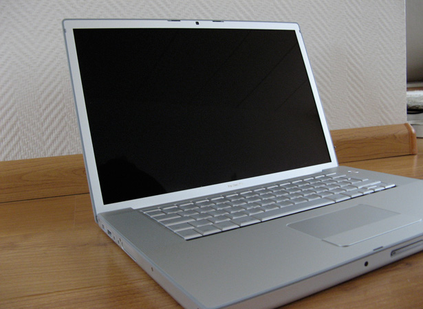
The screen resolutions of desktop and laptop computers keeps getting bigger. Only a couple of years ago, a 1280 x 800 pixel resolution seemed large. Now, that's pretty much the bottom-end of common screen resolutions on laptops, and it's not uncommon for new monitors to have full HD screen resolutions (1920 x 1080 pixels).
We're reaching the upper limits of what's practical for a monitor (with current interface technologies, though future developments may change that), but even designing for 1920 pixel widths is a lot different than designing for a screen that's only 1024 pixels wide. Or at least it should be.

Adding to potential large-screen issues is that a lot of game systems and new TVs now come internet-ready. Some of these actually have very good built-in browsers, so it's entirely possible that some of your website's visitors will be viewing your site on their 55" HD TV.
But then there are mobile devices
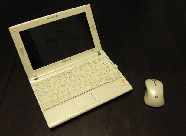
On the opposite end of the spectrum is the huge number of internet users who are now accessing the web primarily from their smartphone, tablet, or netbook. Screens on these devices can range from about 240 x 320 pixels (on some lower-end and older smartphones) to 1024 x 600 or 768 (on some netbooks and tablets).
Obviously, a site designed for a monitor that's 1280+ pixels wide isn't going to look right on a screen that's only 320 pixels wide. Or even one that's 600 or 800 pixels wide. Horizontal scroll, especially on touchscreen devices, is annoying at best.
Designing a mobile site used to be the favored solution to differing screen resolutions. But since now there's a huge range of sizes, rather than just "normal" and "tiny", that's not the best idea anymore. Mobile sites designed for a 240 x 320 pixel screen aren't going to look good on an iPad (or even a new iPhone with the Retina Display). And if you design for the Retina Display or similar higher-res device screens, you're going to alienate a lot of visitors using other smartphones that don't have such high resolution screens.
A flexible foundation
Starting with a flexible foundation is important. A fluid grid alone isn't enough. You also need a grid or layout that can change based on screen resolutions and device types. For simple layouts, that's not such a tall order. But if you'd like something that's a bit more complex, with varying numbers of columns depending on the screen width, there are a few things you have to take into consideration.
Flexible layouts
Creating a fluid grid is a fantastic way to create a more responsive design. The best fluid grids will combine resizing and repositioning content as necessary, as the screen width changes. (Another great tool for creating fluid grids is the Tiny Fluid Grid, which lets you make grids with up to 1200px maximum widths, and is based on the 1kb Grid.)
For example, as long as your screen resolution stays above 800px wide, a 3-column layout would stay 3 columns, simple adjusting the width of each column to best serve the content. But when the screen width drops below 800px, your third column might drop under your second column, so that each column can stay an easily-readable width.
If the screen gets even narrower, let's say 480px (typical on a lot of smartphones), the whole design drops to a single column, with the second and third columns appearing below the main content. If the navigation was contained within one of those columns, it might migrate to the top of the page, so that it's still easily accessible.
Using CSS3 media queries lets us target not only a specific class of devices (such as mobile devices), but also particular specifications within those devices. So we could have separate stylesheets for a number of different sizes of devices.
The beauty of media queries in CSS3, though, is that they can also be used right within the CSS. So if all we need to change is the number of columns, or something similar, we can just define a @media rule within the stylesheet. WebDesignerWall has a great overview of how to use CSS3 Media Queries.
Fluid images
Creating images that adjust to the size of the column or div that they're in is another important aspect of creating a more responsive design within a fluid layout. As columns resize, the images they contain can resize so that they still fit within the constraints of the column.
There are a couple of ways to go about this: you can have your image resize completely on the fly, or you can dynamically crop the image to only show the most important parts. In some cases, using a combination of these two techniques (so that above a certain size, the image just shrinks, but when it gets below that size it starts to crop) can provide the most desirable results.
Unstoppable Robot Ninja has a simple script that automatically resizes your images. If you want to selectively hide parts of your image dynamically (effectively cropping them), Zomigi.com has a great method for doing that. They also have a method for creating sliding composite images that can be useful for fluid designs.
Wider screen considerations
According to StatOwl, over 73% of non-mobile internet users during the past three months were using computers with a resolution higher than 1024 x 768. And if you look at the stats for 1024 x 768 specifically, you'll see that it's losing market share. It's clear that there's already a huge shift to higher screen resolutions—one that designers would be ill-advised to ignore.
Of course, just because there are some users out there who have moved on to wider screen resolutions doesn't mean that every designer out there should jump on the wide-width bandwagon and start pushing redesigns to their clients. Mobile adoption is more important at the moment than wider widths. But since we've hopefully convinced you by now that responsive design is the way to approach new website designs and redesigns, it's important to consider how to make websites work at wider widths.
Who's using wider resolution screens?
Anyone working in design or creative fields likely has a screen resolution of at least 1280 pixels wide (if not much wider). This includes web and graphic designer, filmmakers, photographers, and others. Tech-savvy users are also more likely to be using higher-resolution screens, since they're more likely to upgrade their computer equipment regularly.
Wealthy consumers are another group likely to be using higher resolution monitors. Like with tech-savvy users, this is due to the fact that people with more disposable income are more likely to buy newer computers on a regular basis. Of course, this effect is multiplied with consumers who are both wealthy and tech-savvy.
Mac fans would be another group more likely to be using a higher screen resolution, due to the fact that newer MacBooks, iMacs, and other Apple computers all have screen resolutions of at least 1280 x 800. Of course, this excludes the products they have running on iOS (the iPhone, iPod Touch, and iPad).
Who isn't using wider res screens?
While there are plenty of users out there using higher resolution screens, there are still a lot of internet users who aren't. These fall into a few different groups.
Students are probably one of the largest groups of lower-res users. Schools often have to make do with computers for five or ten years, and in many cases, the computers they have aren't even state-of-the-art when they purchase them. If your website is aimed at educational users (including school faculty and administrators, in addition to students), you're probably looking at a lot of users whose screens are only 1024 pixels wide, and maybe even some who still have monitors set to 800 pixels wide.
Netbook users are another big group that generally has lower-res screens. Most netbooks, especially the lower-end ones, have screen resolutions of 1024 by 600 or 728 pixels or so. The same is true of the iPad (1024x768) and many other tablets on the market, some of which have even lower screen resolutions.
People in less developed countries are likely using older or lower-end computers. If you're targeting users who aren't in North America or Western Europe, or in areas where internet cafes are commonly used for internet access (as is the case in many developing nations), then you're likely looking at a majority of users viewing your site at 1024 by 768 or similar screen resolutions.
Business users often have lower screen resolutions, too. Many non-tech businesses will hang on to computer equipment until it's absolutely obsolete before upgrading. And it makes sense, especially considering the cost of upgrading dozens or hundreds of computers at once. If you're targeting business users, you may want to stick with a design based on the 1024 width.
The last group that is likely to have lower-resolution screens are people who don't value technology. While these people used to not bother with computers at all, many are now seeing the value in having a PC at home. But they're also unlikely to go out and spend more than a few hundred dollars on a PC, or they might get a used computer from a family member or the classified ads. If your website is focused on non-tech consumers, especially those in rural areas, you'll want to carefully consider what the likely screen resolutions are, and design accordingly.
Track your visitors
Everything mentioned above brings us to one of the most important steps to take if you're considering designing for a wider screen resolution: track the visitors who come to your site and look at what screen resolution they're using. Any good analytics program will give you this information, and it's incredibly valuable in making decisions like this.
If you find that the vast majority of your users are coming from computers with higher screen resolutions, then you can probably design your site for those users without seeing too much impact. But if you find that a large number of your visitors are still using screen resolutions of 1024 or narrower, then you may want to reconsider.
Wider widths are important for innovation
I'm sure there are a lot of designers out there who don't really see the point in wider widths. They're happy designing at 960 pixels. They've got systems in place for designing at those widths. They have pre-made CSS files all set for 960 pixels. Why would they want to go wider? Especially when a big chunk of internet users are still working with screens that 1024 pixels wide.
The simple answer is that as long as we keep designing for 1024, there's no incentive for most consumers to upgrade. And that means there's little incentive for manufacturers to create products with higher resolutions.
For example, if 1280 was the standard, and if the majority of websites out there were 1140 pixels wide or wider, it's likely the iPad would have been developed with a resolution of at least 1280. But because 1024 is the standard, the iPad doesn't need to be higher res than that. The same principle applies to netbooks. Since the web is designed around screen widths of 1024 pixels, devices intended primarily for web use don't need to be higher res than that.
By pushing website designs to wider widths, we're encouraging upgrades and innovation. Plus, those extra 180 pixels (the difference between 960 and 1140) can open up new possibilities in the world of user interface design and user experience. Just like the 160 pixels gained when we switched from 800 to 960 made more things possible.
The downsides to wide widths
While there are definite advantages to creating wider designs, there are also definite downsides to the practice. Some of these are easily overcome, but it's important to be aware of what they are if you expect to prevent them.
Wide line lengths decrease readability
It's tempting when creating a wider design to take advantage of all that extra screen real estate to make your main content area wider. This isn't always a good idea, though. Longer line lengths are harder to read, as the eye has to travel further at the end of a line to get to the beginning of the next line, which means the reader can more easily get lost and end up on the wrong line. This is exacerbated by smaller type sizes. It's important to strike a happy medium between line length, font size, and line height.
There are a couple of different methods for calculating the proper line length. The first one is the alphabet-and-a-half rule, which results in a line length of 39 characters (26 letters in the alphabet x 1.5). Adapt your font size so that roughly 39 characters fit on your chosen line length (or vice versa).
The second method of calculating optimal line length is to apply the "points times two" rule. This is a holdover from the world of print, but can be adapted to the web easily enough. With this rule, you take the point size of your font, multiply it by two, and then make your lines that length in picas (which, in print, are 12 points). So, to calculate your line lengths in pixels, you'd take your font size and multiply it by 24 (a 12-point font would have a line length of 288 pixels).
It can be helpful to calculate your line lengths with both of these methods, and then compare. Make your final line lengths somewhere between the two.
Information overload
Wider content areas can easily contribute to making your pages look cluttered and like there's too much going on. It also makes it easier to add extra columns, widgets, or other content that might not really add any value to the page. It's important to keep principles of good content design in mind when creating your site. Ample white space is also helpful in making sure your site doesn't look cluttered.
Wider widths give you more options when it comes to design, but it also multiplies the chances that you'll make poor design decisions. Go too minimalist and it can look boring and empty. Too much going on and it just looks busy and cluttered.
Pay attention to scale, white space, proportion, and hierarchy in your designs to ensure an excellent final product. And be careful that your wider designs don't end up being "too much" in general.
So why isn't everyone doing responsive design?
While responsive design does address a lot of the core issues presented by the wide variety of devices being used to access the internet, it can also create some new problems.
Take mobile devices, for instance. If a person is accessing a movie theater website on their smartphone, it's likely their primary concern is show times, directions to the theater, or maybe the phone number to the theater. They want immediate access to that kind of information. Loading up the entire website, that also includes things like movie reviews and other information, only to hide a good chunk of it from that mobile user is a waste of resources.
So it's important to look at responsive design on a case-by-case basis, to figure out if it's the best solution for a particular website. In many cases, it is, but there are still some instances where a more traditional mobile site might be preferable.
As designers, though, it's important to understand responsive design, and to be able to know when it is the appropriate solution for your projects. Since much of responsive design is built upon creating well-formed, flexible websites, it can serve as a sort of best-practices guide for designers as we move forward with web design and web standards.
More resources for creating responsive designs
- Flurid: Flurid is a fluid grid design that will adapt across a variety of window widths. While not particularly responsive on its own (other than adjusting column widths), it can serve as the backbone for creating a responsive site.
- Fluid Grids: This article from A List Apart discusses the advantages and particulars of working with fluid grids.
- Fluid Grid System: Another fluid grid framework.
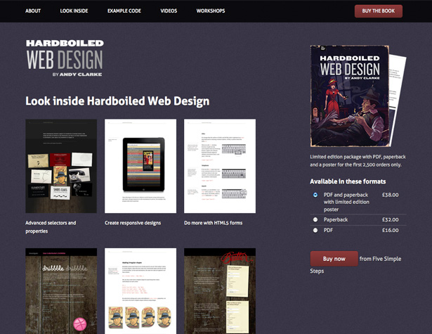
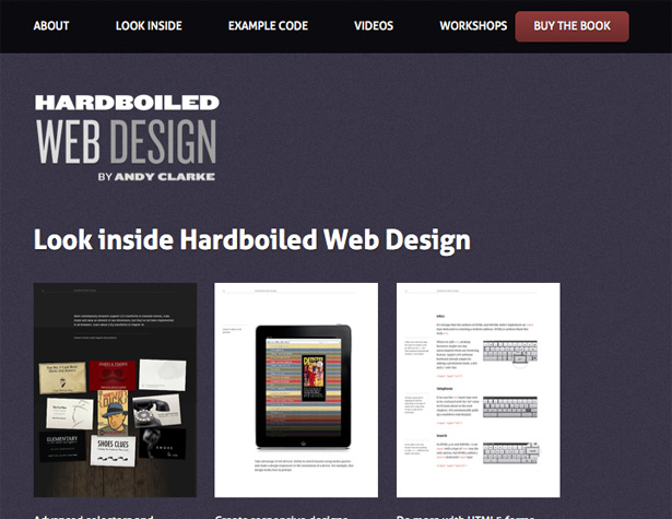
- Hardboiled CSS3 Media Queries: Another great guide to Media Queries.
Examples of responsive website designs
Not all of the designs below adapt right down to mobile sizes, but some do, and they all can give you ideas of how you might adapt your website designs to be more responsive across devices.
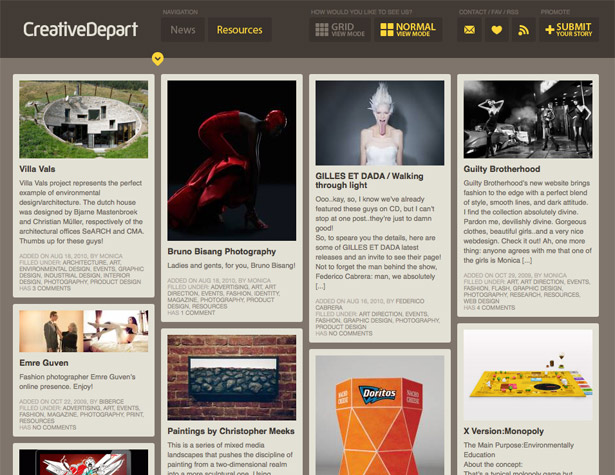
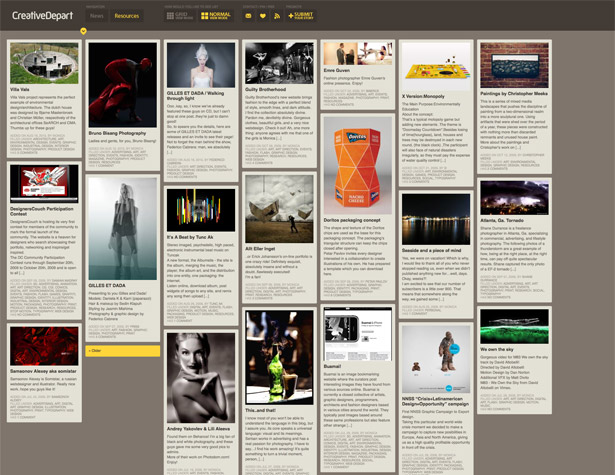
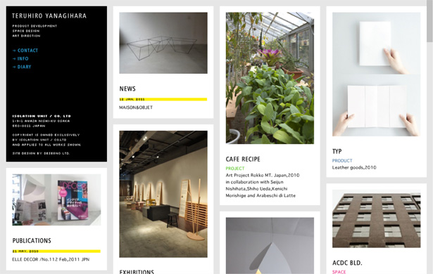
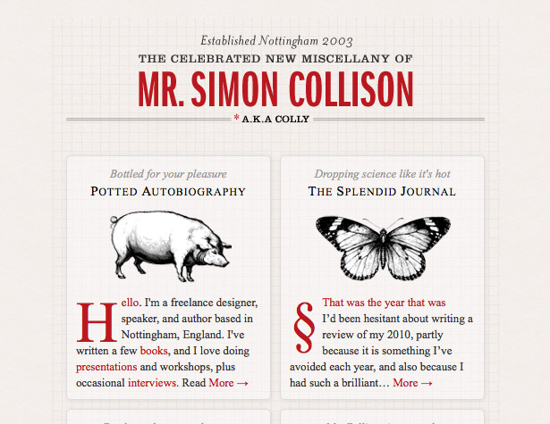
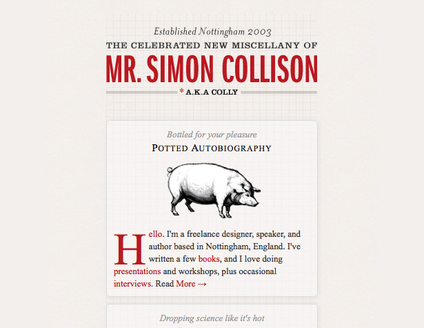
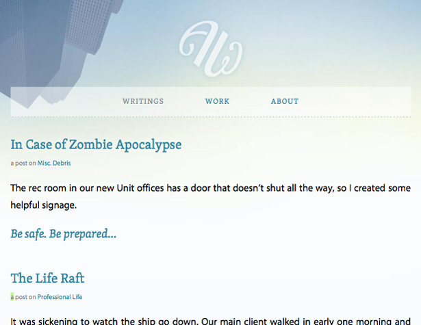
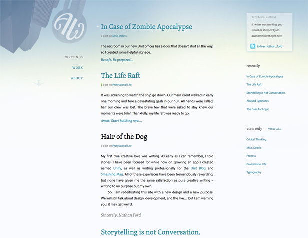
The columns here will stack based on screen width, but are always at least 4-across.
This grid rearranges itself and resizes the columns dynamically to best fit your browser window.
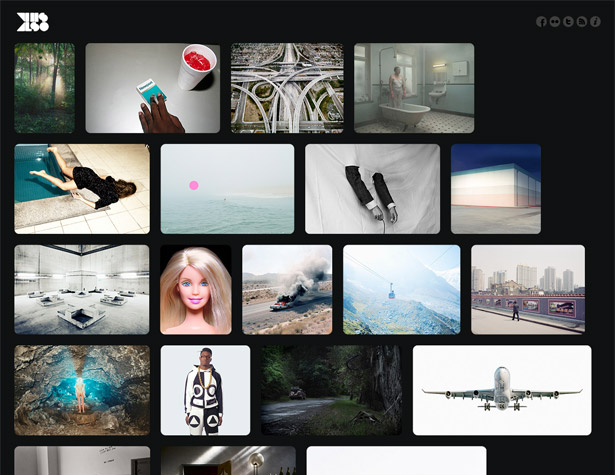
This Also rearranges the images to best fill your browser window.
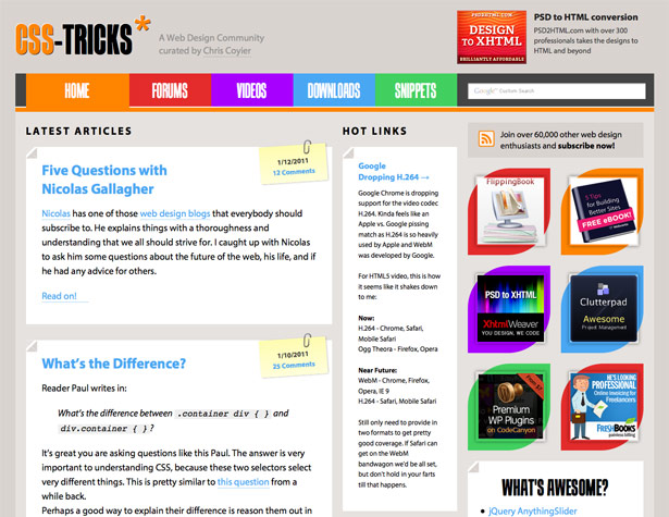
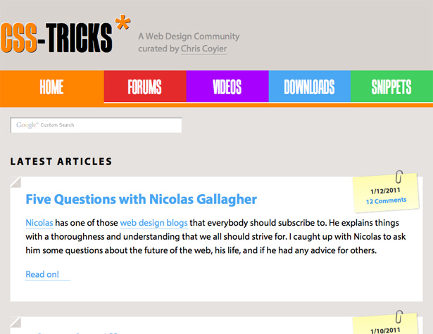
CSS-Tricks adapts to wider screen resolutions, while moving the sidebar under the main content for narrower screens.
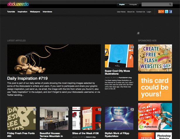
The Abduzeedo shifts the content around on the homepage based on your browser width.
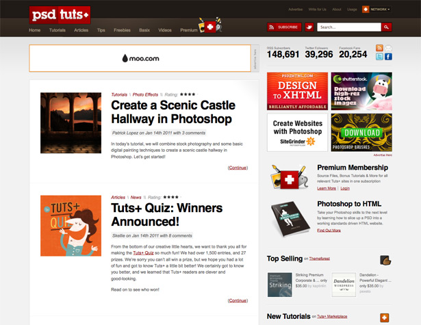
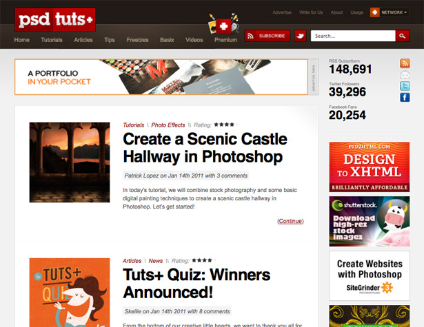
The Psdtuts+ website (along with all the other Tuts+ sites) resizes and restacks their sidebars based on the width of your browser window. They also change the width of the main content column to accommodate different sizes.
The grid here shifts from four columns to two to one based on the screen width.
The layout here adjusts image sizes based on width, as well as shifting columns around for narrower screens.
A great example of a layout where the columns change position for smaller screen resolutions.
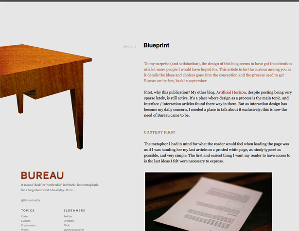
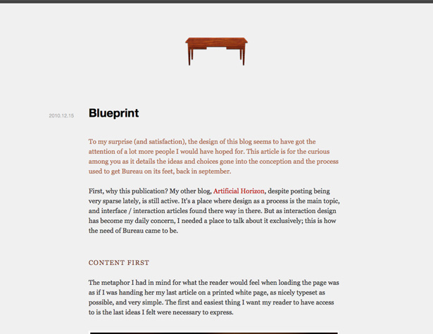
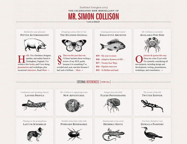
The Bureau design shifts from a fluid-width design with fixed column widths for very wide screens to a fixed-width design for most screen sizes to a different fluid one for narrower widths.
Written exclusively for WDD by Cameron Chapman.
Have your own take on designing for wider screens and responsive design? Share in the comments!
WDD Staff


Read Next

15 Best New Fonts, July 2024

20 Best New Websites, July 2024

Top 7 WordPress Plugins for 2024: Enhance Your Site's Performance

Exciting New Tools for Designers, July 2024

3 Essential Design Trends, July 2024

15 Best New Fonts, June 2024

20 Best New Websites, June 2024

Exciting New Tools for Designers, June 2024

3 Essential Design Trends, June 2024

15 Best New Fonts, May 2024

How to Reduce The Carbon Footprint of Your Website
