 In February, Smashing Magazine officially released their latest print book project, The Smashing Book 2, and they were kind enough to send me a review copy at no charge.
This review is not a paid review, nor is it influenced in any way by Webdesigner Depot or Smashing Magazine.
Although this review does give the book some valuable exposure, this is primarily going to be a discussion of the strengths and weaknesses of the book.
Thus, I won't be reviewing the contents or discussing the improvements from the previous Smashing Book. You can get those details on the book's product page, or on Smashing Magazine's own article that formally announced the book.
A great read away from the computer
Some books naturally lend themselves to being a great reference that you keep by your desk and reach for when you need to solve a specific coding or other development problem. This book is not written for that purpose.
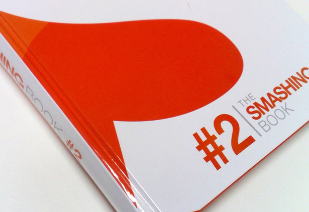
This book is great for people who like to go to the park or sit in a coffee shop and just read something that gets the intellectual and creative juices refreshed. The book's overall binding feels good and comfortable and the glossy pages are of good quality (although some people might prefer a more old-timey feel, which this does not provide).
Because of the wide variety of topics covered in this book, it's great for people who like to separate themselves from their everyday technological spider web, pick a chapter, and just read. For the most part, the authors do a fantastic job of writing in smooth, easy-to-read prose that does not sound too simplistic or overly complex.

Something for everyone
Not everyone will like every chapter of this book. I certainly did not find that each chapter was something that I was particularly interested in reading. Not that the chapters I lacked interest in were necessarily bad; they were just not topics that I cared too much about. And I think most people will feel the same way, because the book is quite unique in the fact that it covers a very diverse array material.
Some might view this as a weakness, but that's not really a fair assessment. The book is not written to be a reference material for a specific subject; it's written to be somewhat similar to what Smashing Magazine accomplishes with their website: A source of useful material for designers and developers with a wide range of skills and experience levels.
In addition, I think there's something in here for even the most experienced developers and designers -- even if it's just some reminders of things that have been forgotten. Overall, the book is great for beginning and intermediate designers and developers, and that seems to be who the book is targeted at, so I think it accomplishes its goal in that regard.
My personal highlights from the book
Here are just a few personal highlights that I enjoyed and that stand out in my mind after reading the Smashing Book 2.
Chapter 1 on graphic design
I'm not an expert graphic designer, but I do consider myself capable in areas of design and design principles. Thus, for someone of my skill level, chapter one was the perfect start to this book. The chapter is written by Matt Ward and Alexander Charchar and it's called "The Principles of Graphic Design".
Matt and Alexander do a fantastic job of covering some very important design principles that I think could benefit designers from beginner to even advanced intermediates. What I really liked about the chapter is that they did not just rely on their own personal views but included literally dozens of footnoted references and a reading list to help establish the authority and influence of their statements.
Chapter 3 on Mobile design
Another chapter that I really liked was chapter 3, by Mike Rundle, called "Designing Mobile User Experiences". Basically, if anyone wants to get into mobile app development and doesn't know where to start, this chapter alone is worth the price of the book.
Chapter 5 on "red flags"
Another chapter that I really liked was chapter 5, by Christian Heilmann, called "Red Flags (Warning Signs) in Web Development". Although I personally didn't learn too much here (I have a lot of experience with front-end code), I think this is an excellent little reference for all beginning front-end coders and Christian does a great job at getting to his points quickly, firmly, and in a real-world fashion.
Although I did mention that this book's purpose is more motivational, and not necessarily a reference, there are portions of it that many developers will want to go back to, and chapter 5 is one of them. I think every front-end developer should have these concepts ingrained if they want to be taken seriously in their chosen profession.
More good stuff on design principles
Two other chapters that I found useful and that stand out in my mind are chapter 2, "Visible vs. Invisible Design", by Francisco Inchauste, and chapter 7, "Applying Game Design Principles to User Experience Design", by Christopher Kolb.
Both of these are subjects that I personally have never given much thought to, and I think many beginning to intermediate designers could benefit from the material these authors present.
The final chapter
Finally, I think it's great that Smashing Magazine's team took the time to write the final chapter, "How to Make a Book (Like This One)", because it is a unique and interesting way to end a book that covers so much ground.
That final chapter might be a little bit out of place, having almost nothing to do with web design or web development, but I think it's very much in line with the transparency and openness of Smashing Magazine's staff, and I personally think they did the right thing to include this chapter.
Some weaknesses
In this particular instance, this being an independently-written, non-paid review, I think it would be important to point out some weaknesses that I personally found in relation to the book's content.
Minor errors
First of all, there were a handful of insignificant typographical and grammatical errors. To be honest, I can't specifically recall any of them -- so that's good, there were no glaring errors. But there were probably more than there should have been, considering the book was reviewed and proofread by five different people in addition to all the individual authors.
Artwork and other stuff
Another couple of weaknesses are things that I personally didn't care for, but that some other readers might actually like, so take these with a grain of salt.
First, at the beginning of each chapter there's an italicized summary of what the chapter contains, usually about one paragraph long. I think these little intros are completely unnecessary and make the book seem a bit amateurish. The fact is, the chapter titles and subheadings should be enough to help a reader get an overall view of the chapter's content.
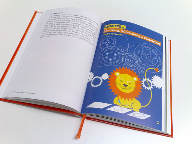
Second, my opinion of the artwork of the book is probably in the minority, but I'm not sure this type of artwork suits a book like this. Don't get me wrong here: The artist of the various illustrations of the book, Yiying Lu, is a fantastic artist and has become, it seems, world renowned -- in particular because of having designed the well-known Twitter Fail Whale.
So this is not a knock against her; I actually think the illustrations are unique, creative, and beautiful. I just think they're a bit out of their element in a book that has so much on web development. But this is probably just a matter of personal taste, as I prefer the more professional looking artwork in the A Book Apart series.
But many people have said they love the artwork, so as I said, I'm probably in the minority in holding this view.

Further on the artwork, I think the page where Smashing Magazine includes the names of nearly 3,000 Smashing Magazine readers is a bit tacky. This is, however, in keeping with Smashing Magazine's philosophy of having a close relationship with their users, so arguments could be made for how this could be beneficial to their overall brand and image.
One last thing about the artwork is the horrible looking hash symbol on the cover. I love the cover design, originally done by Brian Nelson, for the first Smashing Book, but the hash symbol that they've added to Brian's original design (used in the "#2", which Brian had nothing to do with) just kills it. It would have been much nicer if they used something like "No. 2" instead. I have no idea how this got overlooked -- because it really is an eyesore, in my opinion.
Two problem chapters
Two other problems I had with the book were chapters 6 and 8.
Chapter 6, by Vivien Anayian, is called "The Future of Web Typography". This is a great chapter, with great information. But it's overkill. There is way too much information here, and it's written in a somewhat dry news-style tone without much in the way of opinion. It's good to cite sources (and boy does the author do that here; there are more than 60 external references in footnotes) but this style made the chapter stray too far from the style of the rest of the book.
I think Vivien has great research skills, and she really knows her stuff, and she should certainly not be discouraged by my criticism here. I just think this material was too much for such a small chapter, and it's too condensed and too fast-moving to be of much value. In my opinion, this chapter would be much more valuable expanded into a complete book all on its own, just based on the sources and info she provided. And I definitely think Vivien should be the one to write such a book, so my criticism here is more about how the chapter fits in to the rest of the book, not about the material itself.
The other problematic one is chapter 8, by Susan Weinschenk, called "When They Click: Psychology of Web Design and User Behaviour", which provides a unique assessment of user response. I'm not completely on board with the premise of this chapter, but I do find that the conclusions presented are in many cases valid, and can be justified -- just maybe not for the exact reasons stated. It's interesting because I think the information presented in chapter 8 has great value, but the overall premise may be a bit flawed.
I'm not going to get into the details of why I feel the way I do about chapter 8, but I encourage everyone to buy the book and give the chapter a fair chance, and see if you find validity in the statements made.
Inconsistent table of contents?
I found it very odd that the table of contents includes the title of each chapter, the same italicized summary from each chapter's intro, and the page number for each chapter -- but no chapter numbers and no author names.
It seems a little inconsistent with author names and chapter numbers missing, and it feels redundant to have those summaries in the TOC, then repeated at the start of each chapter.
The style of the final chapter
As I mentioned earlier, I love that they included the chapter on "How to Make a Book (Like This One)" but they missed out on a huge opportunity to make this chapter really memorable.
Instead of providing an engrossing story detailing Smashing Magazine's personal journey in creating the Smashing Book 2, they've simply decided to present the information in a somewhat dry and impersonal manner.
Not that this chapter isn't valuable; it definitely is (that's why I included it in the "highlights" section above). But I think this chapter would have been perfect if they had told their personal story, step by step, and incorporated all the technical info into the "plot" of their tale.
Conclusion: highly recommended
Again, I don't think the weaknesses mentioned above harm the book much at all. Not to mention that a lot of what I've said here is my own personal view, so some will certainly disagree.
Overall, I highly recommend that all beginning and intermediate designers and developers get a copy of this book. It definitely provides a slew of information and makes for an overall great read.
I think Smashing Magazine have carved out a nice niche in this industry for putting out valuable and practical information, and this book certainly adds to their reputation in that area.
So, if you haven't done so already, head over to the Smashing Shop and get yourself a copy. Despite any weaknesses I've discussed here, I'm sure that you'll find plenty of value in this book.
This post was written exclusively for Webdesigner Depot by Louis Lazaris, an author, freelance writer, and web developer. Louis is the co-author of HTML5 & CSS3 for the Real World, published by SitePoint, and he writes about front-end web design technologies on Impressive Webs. You can follow Louis on Twitter or contact him through his website.
Have you read the new Smashing Book? Let us know your thoughts below.


