 If you run an online business, drawing customers to your website is vital for your continued success.
While lots of effort tends to be spent on SEO and gaining new visitors, ensuring they return is another matter. Email newsletters are the perfect opportunity to inform your past visitors of reasons to return.
Even if you don't use email newsletters for your own business, you'll likely run into a client who wants to use them sooner or later.
Email is one of the oldest forms of online communication, and one that hasn't evolved much since it's inception due to it's use on a wide variety of devices and a lack of solid formatting standards.
Therefore, it's safe to assume that at least one of your subscribers is going to be viewing your email on a 20-year-old computer running an obsolete operating system and you should take that into account.
Do use tables
Before the days of CSS, tables were the way to place web elements where you wanted them. Most email clients work well with tables, and they allow you to position your design elements in an attractive way without worrying about it being broken by mishandled code on the receiver's end.
Most email readers display emails in a "preview pane" or some other narrow, tall format. Tables let you to constrain the width of your design to fit within this limit and still be able to format your information into columns and rows that can be set with a specified height and width with distinct background colors so that your layout doesn't break if images aren't loaded properly.
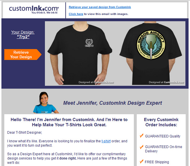
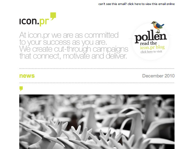
Example
This followup email from Customink.com reminds the customer that they haven't completed their purchase and that it's still waiting for them. Tables allow for an attractive layout with images and text aligned properly.
Don't rely on background images
By default, most email programs don't allow images to load at first. This protects against spammers tracking views by using embedded images in their emails. It also tends to make your email unreadable if not formatted properly.
Using colored text against a colored background image is a perfectly acceptable practice when designing a website. In an email, however, you should assume that the background image will not load. If that happens, your pink text on a brown background image will turn into unreadable pink text on white or grey. Needless to say, an unreadable email is worthless.
Care should be taken to be certain the table your background image is contained in has a background color specified that makes your text readable if your images do not load.
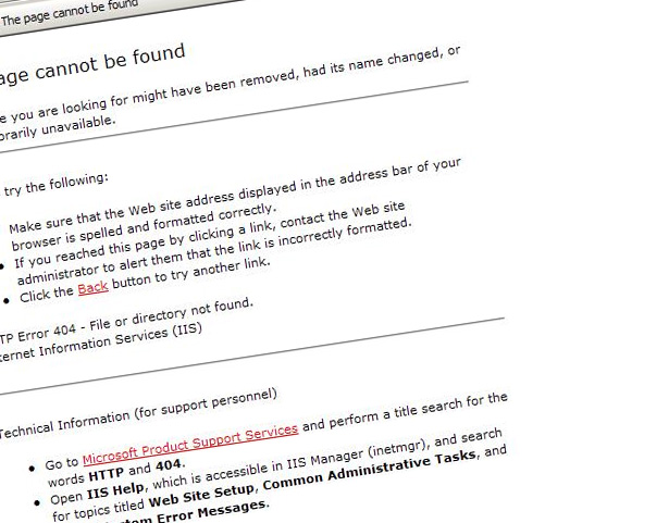
Example
You can see in this example, the blue tables along the right side of this email newsletter normally have a gradient image in the background. However, you can see that the table behind the text is blue so even without the gradient image, the text is readable.
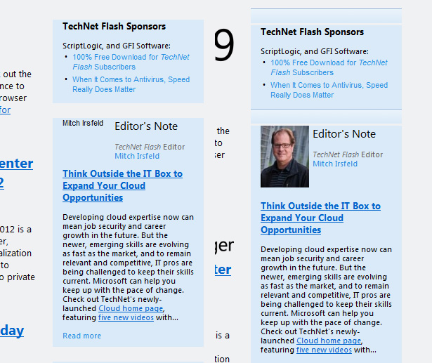
In this example, you can see that without the images loaded, the text is invisible and there is no message.
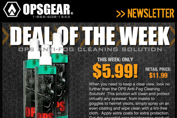
Don't depend on your images loading
Many designers attempt to circumvent the constraints of email layouts by designing a promotional email using only images. While this allows you to do very creative layouts, it also makes your email worthless if your images don't load.
Your viewers are just going to get an email with a bunch of broken image links. Lots of your recipients are going to be viewing email from a cellphone or behind a company firewall or other content-filtering system that may block your images as well. So keep that in mind.
It's also worth mentioning that relying upon an image to take the place of text should be done with care. Alt text should be used in all images. That way your big "20% OFF" promotional image isn't lost in translation. Also, putting a handy "Having Trouble Viewing This Email" link that takes the viewer to an actual webpage with your email content isn't a bad idea either.
Example
This email is constructed of a series of stacked images, however each one has very informative alt-text so the overall message of the email is still clear even without all the fancy pictures.
Don't bother with rich media
It's almost guaranteed that your email with rich media embedded will be blocked as spam. If not, it's not likely that your reader is going to take the time to watch your animation or video as they're going through their emails.
If you have video or flash animation you really want to show, host it on your website and include a link in the email as a little something extra, just make sure the email is not only a link to your rich content. It's unlikely that someone is going to watch a video that is given no context.
Keep in mind that rich media isn't necessarily supported by every email client out there, and may be blocked by default like images are. Also, rich media bulks up the size of your email. Many mobile devices are set to not download emails greater than a certain size so that data usage is minimized. If your email is too big, it might not get looked at.
Example
A video link does not take the place of good textual content. Entice your viewers to come to your website with words, then dazzle them with rich media.
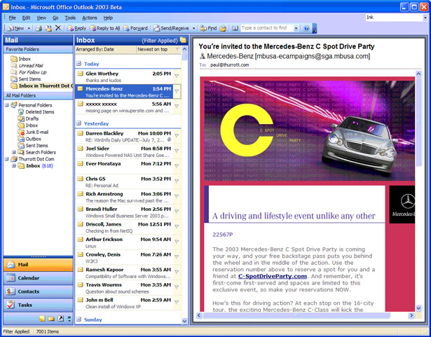
Do keep it narrow
Many people don't actually open their email but view it in the preview pane along the side of their inbox. This gives a very narrow space to work with if you don't want to make someone scroll to see your entire layout.
Keeping your design at 600px wide or less is a good rule of thumb, but even then some email clients are going to only display a narrow portion of your email. Make sure you have your important text on the left side of the email toward the top. That part of the email is sure to be seen and will entice the viewer to either scroll or open your message in a full window.
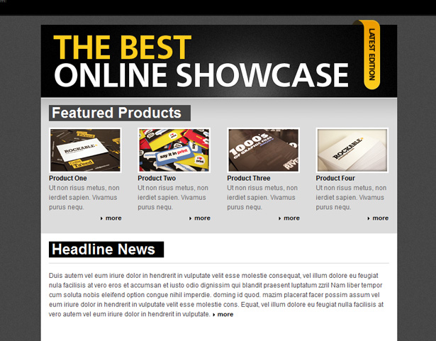
Example
By default, many email clients fill the screen with information, leaving a tiny preview pane.
Do keep it simple
Have a clear and simple call to action. There's no need to include your entire new catalog in one email. An enticing sale item or a quick overview of updates is enough to get a click through. You want to catch their attention before they can make it to the delete button.
You want to focus on scannability. If someone looks at the email for 10 seconds, they should respond to your message. A good way to ensure they click is to offer an "email only" deal. Let them know that this link is special.
Example
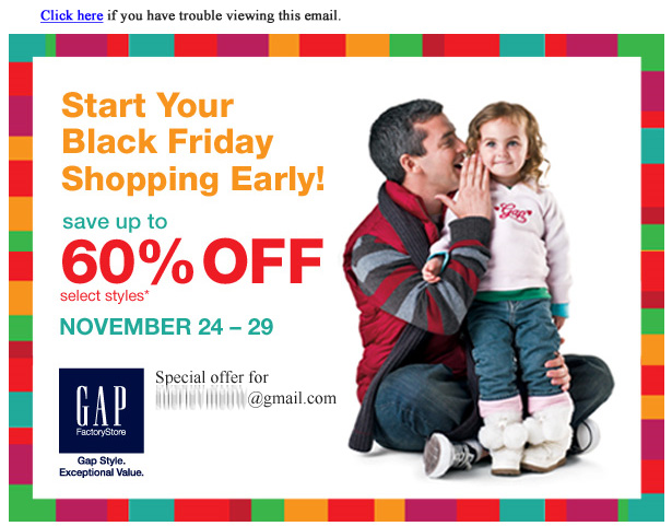
Do include a link to view the email in a browser
You can be as careful as possible in your design, message, planning and execution but you can be sure that for one reason or another a group of subscribers will not be able to see the email properly.
The first thing in your email should be a link to an externally-hosted html version of the email. This ensures that no matter how the email is being viewed, or what elements are not working, there is a way for the subscriber to see your content.
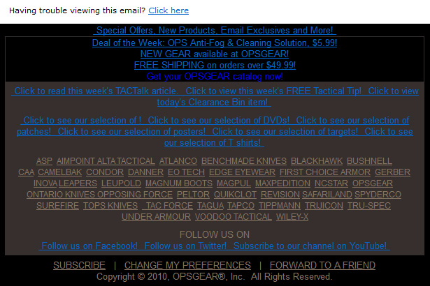
Example
This email layout uses images in lieu of text in a lot of places, which could pose a problem in some viewers. Luckily, the link right at the top lets the subscriber click to view externally.
Do extensive testing
For testing, make sure you set up accounts with all the major web-based email services like Gmail, Hotmail, and Yahoo Mail as well as the common desktop email clients like Outlook, Apple Mail, and Thunderbird as well as the mobile Android and iPhone mail apps.
Check for typos. The last thing you want is to send 100,000 emails that direct your subscribers to a broken link or a misstated price.
You can also use a service such as Litmus to manage your campaign. That will test your emails on a variety of devices and clients to make sure they work properly.
Don't be afraid to use a basic template
Remember, the goal of your email campaign is to quickly update your subscribers to information they may not see if they don't visit your site regularly. It's not necessary to spend a lot of time on the intricacies of your email design. A clear message will go a long way towards achieving your goal.
A basic template will be more likely to work without complications, will be reusable with simple text changes, and save you time by removing the need to test your design each time you create a campaign.
Example
There are a lot of pre-made email templates available that have been tested and proven to work. Find one with a color scheme similar to your website, pop in your logo and you're ready to go.
More examples of great email newsletters and templates
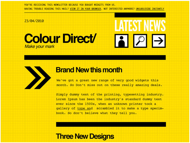
Colour direct by Campaign Monitor templates
A well-styled, easy to read template with high contrast and bold text. The title is clear and an arrow directs you to the important paragraph.
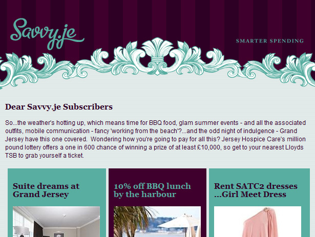
Savvy - Beautiful Emails
Savvy cleverly uses a header image to set up a beautiful design you can use that puts a short intro paragraph above a 3-column teaser above the fold.
Template by CakeMail
A simple, text-based email template with plenty of room for copy and a sidebar to highlight features. Perfect for updating your subscribers about new articles or stories on your site.

Malibu by Aweber
This is a nice template you can use with a clear call to action and spaces for highlighting sale items. Perfect for an online store to use sale items to draw customers back.

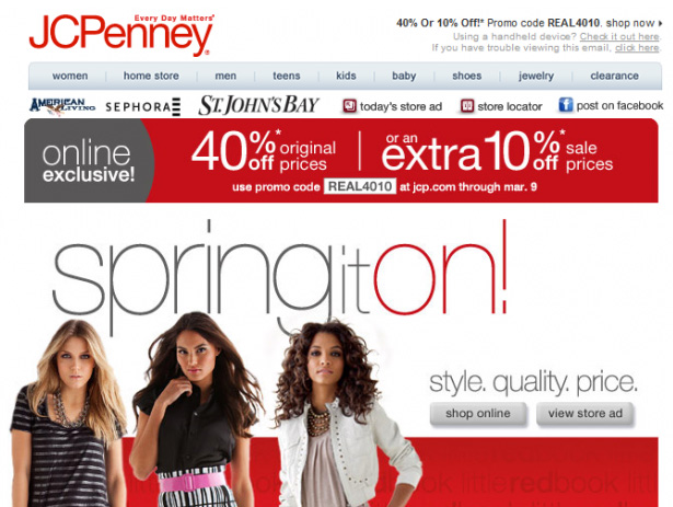
JCPenney
This email example from JCPenney uses a lot of images, but the important message of the 40% discount and promo code is displayed in simple text at the beginning.
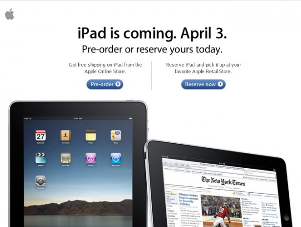
Apple iPad Preorder
Apple never fails to deliver with their signature style. A minimalist textual design with 2 clear calls to action prompt the reader to make a choice followed by images of the product.
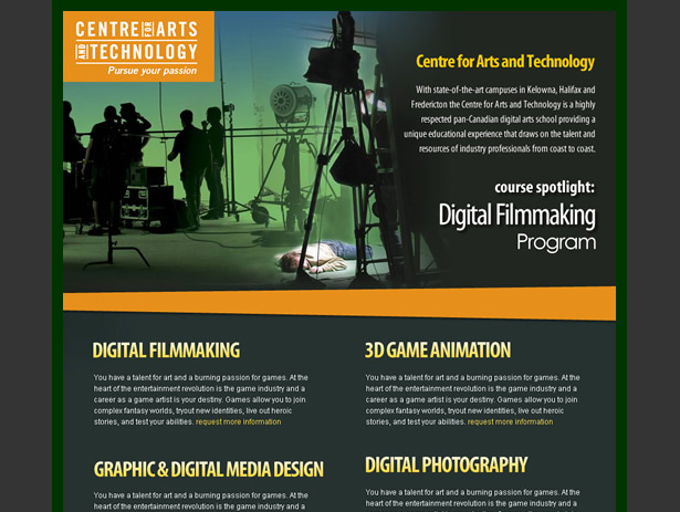
Centre for Arts and Technology
This email uses images to enhance the layout without relying on them to communicate the bulk of the message. This type of layout will degrade well.
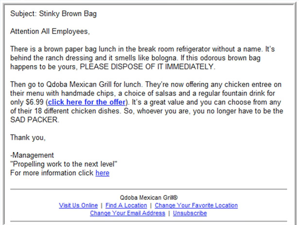
Qdoba Mexican Grill
This is actually a very brilliant design. By starting out looking like a bland, intra-company email, then transitioning into a passive-aggressive message, followed by a pitch. It's sure to get the recipient to read.
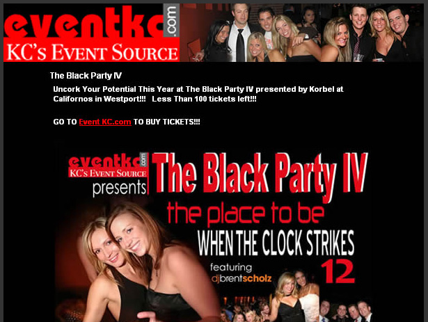
EventKC
This email mirrors the look of the eventkc.com website, while presenting the important information first in text-only and following up with more detailed information with images.
TwongueTwister
By including both an invitation to participate in a contest, plus highlighting an actual contest winner in the email, it encourages competition.

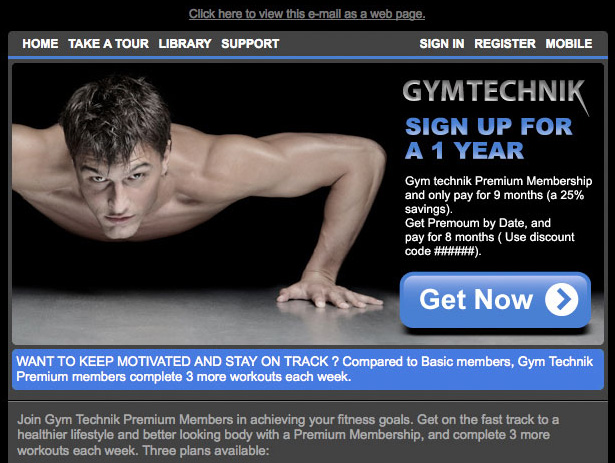
Gymtechnik
This is a very image-heavy email, however a clear link at the beginning directs the user to a webpage if the are unable to view the content.
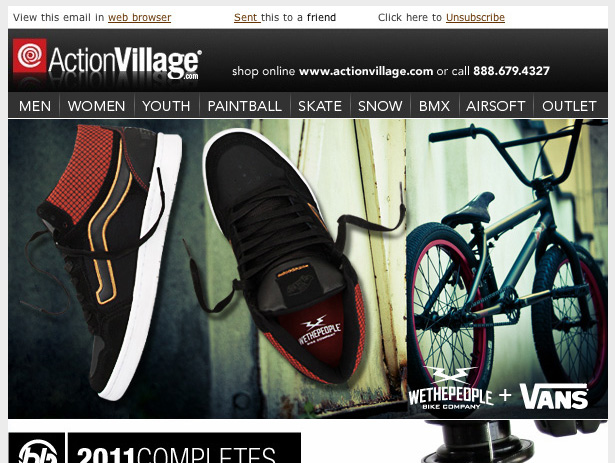
Action Village
If you must use images in your email, use full-width, stacked images with alt text for everything like this campaign from actionvillage.com.
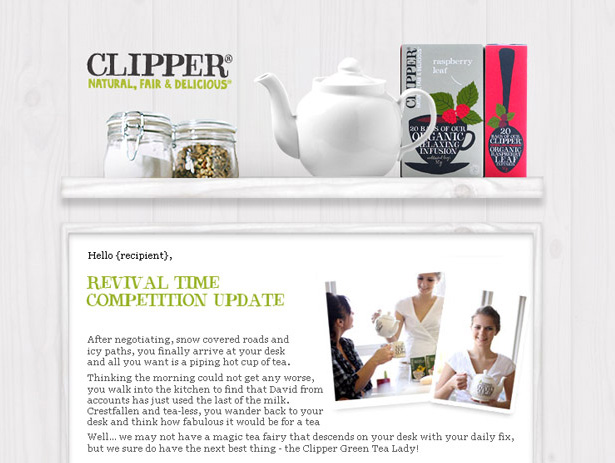
Clipper
Addressing the recipient by name makes the email feel personal. The design reflects the design of the company's website and highlights the product front and center.
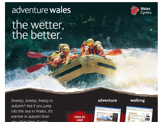
Adventure Wales
This email interchangeably uses images and text to convey the same message. You can tell with a glance if this email is something you're interested in or not whether you're looking at the picture or reading the copy.
Written exclusively for WDD by Cameron Chapman.
Have your own tips for creating email newsletters? Or maybe know of a company that uses great HTML emails? Let us know in the comments!
WDD Staff


Read Next

15 Best New Fonts, July 2024

20 Best New Websites, July 2024

Top 7 WordPress Plugins for 2024: Enhance Your Site's Performance

Exciting New Tools for Designers, July 2024

3 Essential Design Trends, July 2024

15 Best New Fonts, June 2024

20 Best New Websites, June 2024

Exciting New Tools for Designers, June 2024

3 Essential Design Trends, June 2024

15 Best New Fonts, May 2024

How to Reduce The Carbon Footprint of Your Website
