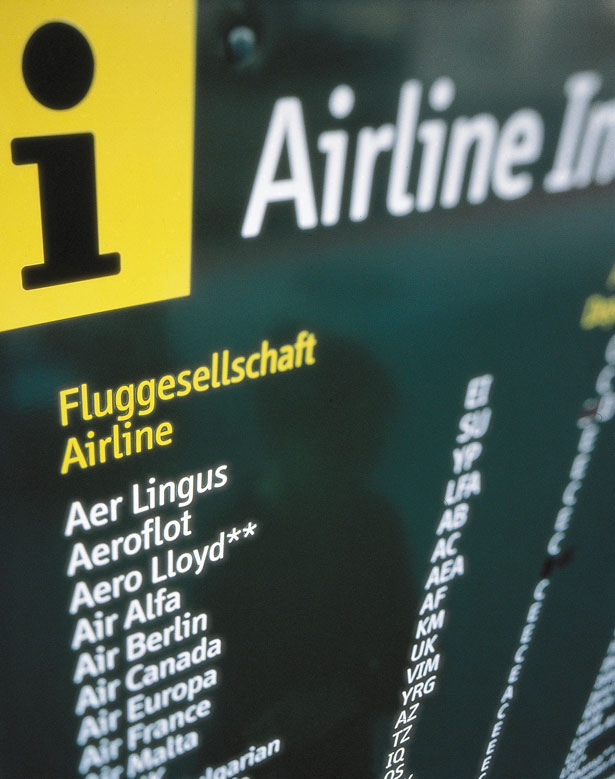
Throughout his illustrious career as a designer and typographer, Erik Spiekermann has created dozens of commercial typefaces (FF Meta, FF MetaSerif, ITC Officina, FF Govan, FF Info, FF Unit, LoType, Berliner Grotesk) and many custom typefaces for world-renowned corporations.
Erik and his wife Joan, revolutionized the world of digital fonts twenty-two years ago when they started FontShop—the first mail-order distributor for digital fonts.
This year, he was awarded the Federal Republic of Germany's 2011 Design Prize for Lifetime Achievements— a most noble accomplishment. The exhibition, Erik Spiekermann, The Face of Type recently took place at the Bauhaus-Archive Museum of Design in Berlin.
Spiekermann is an Honorary Professor at the University of the Arts in Bremen, the author of the Adobe Press title, Stop Stealing Sheep, and the originator of the colorful map for the Berlin metro system.
He recently took time out of his busy schedule to speak to Webdesigner Depot about typeface design and what he sees next in his future. We thank Mr. Spiekermann for speaking with us and invite WDD readers to comment on how his contributions to typeface design have helped shape your work.
What was the first typeface you fell in love with?
Reklameschrift Block. It was what my neighbour gave me with my first little printing machine when I was 12.
Which of your fonts do you feel should be more popular and why?
FF Info Office because it works well on screen and is really cool but nobody has found it behind the larger FF Info Text and Display families.

Being one of the lead font designers in the world, who or what do you learn from in order to keep pushing yourself?
The world out there: technical developments, trends, other designers, other cultures. In other words: by observing what goes on in the visual world.
What are some of your proudest projects ever?
Making the buses and trams in Berlin bright yellow instead of the boring beige they were before. Making it both easy and pleasant to find your way around the Berlin Transit system. And giving Deutsche Bahn (German Railways) their face by designing their corporate design, including all the typefaces which work from the smallest timetable to the largest poster.
What do you think of Apple and their approach to design in general? How does their industrial and web design compare to typeface design?
I bought my first Mac in 1985 and have probably bought every single computer they ever made at one time. I also have a large collection of equipment by BRAUN, most of it designed by Dieter Rams. If you look at the stuff from the 60s now, you see where Apple (i.e. Jon Ives) get their direction. They have learnt to bring objects down to the essentials without making them look boring and purely functional. They know that aesthetics play a big role in function because we do not like to use anything that is ugly. Function also follows form. Perhaps that is the common denominator for my typefaces: I have always designed my faces for a specific purpose, but they always have to look pleasing, whatever purpose they serve.
Can you briefly describe what the current process is like for you to create a new typeface and where do you get your inspiration from?
The question about inspiration is tedious because I work like everybody else. Everything can be inspirational, there is no method or proper process. Like any design process, I look at the brief, take it apart, look at comparable briefs, make analog sketches, discuss with colleagues and the client and then carry on condensing the sketches, at some point digitally.
Please finish this sentence: "In an ideal world, fonts..."
Would be paid for.

What was one of the most challenging typography problems you have ever had to solve?
It is always the same: to find a visual voice for all the communication of a large corporation. It is supposed to express their identity (whatever that may mean), be legible, pleasant to look at, work technically across platforms, and be applicable across the world. I've done that for Nokia, Cisco, Bosch, German Railways, Heidelberg Printing and many smaller brands.
What is the plan for rolling out more web fonts on FontShop?
Rolling out more web fonts.
Where are some of the areas where typography is improving and where do we need to see more growth?
Technology is improving for displaying type properly across media.
What are the challenges today for someone getting started in typeface design versus when you first started in the 1970s?
There is more competition out there. While there are fantastic tools available that I would have killed for, it has also become very difficult to master all of them. We are therefore on the way back to share work between people. Some of us are good at sketching, some at programming, some at using production tools. Not one person can do all of it equally well. That is how type used to be made before desktop computers and that is how type is made again today.
How do you view the state of typefaces in the mobile world?
In flux.
Taking into account small sizes, aliasing and browser font rendering engines, which fonts do you think should be used for body text on the web?
The ones that look good.
What's the most overrated font in the world?
Arial. It totally sucks but has become the standard for many users and even institutions.
Let's talk a little about the creative process and how you work. Can you describe your ideal work environment?
This is a silly question because I have no fixed formula. Every project is different and the work environment is always different as well. I do not work on my own, ever. (See question "Can you briefly describe what the current process...")
Which typefaces' styles do you think will be the most popular in the near future and why?
The ones that express the Zeitgeist, In other words: all the styles that are appropriate, fashionable, legible and cool, how ever that may be defined at the time. We do not have one style or fashion (not even within one culture, let alone globally) anymore but many currents at the same time. Type design has always been eclectic. Type has always mirrored what went on in the visual world. These days it does so as quickly as music does and even more quickly than literature and film because you can design and produce a single typeface in a few days, all on your own. It is only the larger, more professional typographic systems that need weeks and months to complete, but even that is less than what it takes to make a movie.
What's next for Erik Spiekermann?
Share my time between San Francisco, Berlin and London (to a lesser extent), work less for clients and more for myself. Use digital technology to make analog things.


