
 Of all of the types of websites, the portfolio site has to overcome what might be some of the most difficult hurdles. Talk to almost any designer and they will agree, launching your own portfolio site is a painful process. Most frequently, this process includes numerous versions and, often times, a launch out of sheer frustration.
The upside to this in my opinion is that the portfolio site can be a window into the future of web design. I suggest this because when an individual designs their own site they are only under self-imposed limitations. There is no client to dictate things, no committee to destroy the design, and no approval process to drag things out and destroy momentum.
But not all portfolio sites are created equal. Despite the insane amount of sample portfolio sites available, there are surprisingly few that feel distinct and interesting enough to talk about. It is these sites, though, that raise the bar and expose what the future might hold for web design.
Let’s dive into a large set of stunning portfolios and look for some common elements that make them work. Some of these elements expose industry wide trends, while others demonstrate simple and common design flourishes. Not all have huge meaning, but they all add up to fantastic designs that will challenge you to create a truly extraordinary portfolio site.
Of all of the types of websites, the portfolio site has to overcome what might be some of the most difficult hurdles. Talk to almost any designer and they will agree, launching your own portfolio site is a painful process. Most frequently, this process includes numerous versions and, often times, a launch out of sheer frustration.
The upside to this in my opinion is that the portfolio site can be a window into the future of web design. I suggest this because when an individual designs their own site they are only under self-imposed limitations. There is no client to dictate things, no committee to destroy the design, and no approval process to drag things out and destroy momentum.
But not all portfolio sites are created equal. Despite the insane amount of sample portfolio sites available, there are surprisingly few that feel distinct and interesting enough to talk about. It is these sites, though, that raise the bar and expose what the future might hold for web design.
Let’s dive into a large set of stunning portfolios and look for some common elements that make them work. Some of these elements expose industry wide trends, while others demonstrate simple and common design flourishes. Not all have huge meaning, but they all add up to fantastic designs that will challenge you to create a truly extraordinary portfolio site.
Tell a story
One of the most interesting aspects of a modern portfolio site is the effort to create a story telling environment. The idea is to create a flow of content that essentially controls the experience and message to the user. This control creates a flow of content in a desired order. Many sites attempt to do this sort of thing by placing the main navigation in a desirable order. But these sites take the approach to a whole knew level and make it an unavoidable part of the experience.Jan Ploch
The use of a single page site is nothing new, and by its definition forces a user to scroll down the page. This creates a natural flow of content that has been used countless times. On this site though, we find a seldom used approach with an animated background. As you scroll down the page, it is as though the soda in the background is being sucked up the straw. This simple, decorative element does something really powerful; it encourages you to make it all the way down the page. This is fundamentally a critical aspect of the single page site: ensuring users make it to the end of the story. And the end of the story is most typically the conversion point of the site (as it is in this case).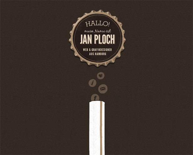
Tam Cai
This individual’s site also demonstrates the single page, storytelling model. What I find interesting about this particular site is that the story is book-ended by two powerful visuals, with all the meat in the middle. The large set of illustrations at the top of the page set a mood, demonstrates the artist’s personality, and generally invites you to dive into his world. The page is then finished off with a contact options (conversion points) and a dramatic photograph of what we would assume is the creator. Certainly not a style for everyone, but when a thematic approach is produced in a way as polished as this the results can be awesome. And while the site might not appeal to all visitors, it will appeal to the right people and help the creator make the kind of connections he will value.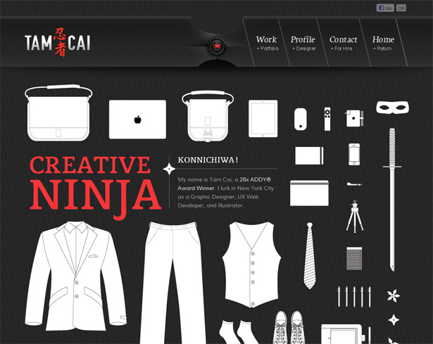
MacMillan Lynch
This example takes a bit of a different approach. The story part of this site is brief, and all contained inside of the main home page graphic. In this case the story is pretty much irrelevant, except that it creates a sense of a mystery to understand. Upon landing on the site I found myself wondering what the heck this person was all about. Sometimes you want to spoon feed your visitors; at other times it can work really well to suck them in with an interesting story or mystery. This also has the benefit of creating a rather distinct and hopefully memorable site.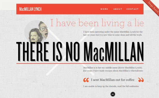
Sallee Design
On the Sallee Design site we find a more typical approach to site structure. Logo in the top left, main navigation across the top, and the standard home page slide show. In many ways this is a very normal site (with a beautiful design applied). What I found interesting though was that their home page slide show wasn’t just an auto-rotating series of Flash images. Instead, the slide show is started by the user and begins with an invitation to begin a tour. Once you dive in you are taken through a series of slides that summarize what you would get if you instead dug through the various pages of the site. And it is all finished off with key stepping off points to the rest of the site. I think this approach is smart. For starters it is refreshing to see an element like the home page slider have a thoroughly planned out purpose. I also love that they get the benefit of a single page sales pitch, and the bonus SEO provided by having a larger number of pages.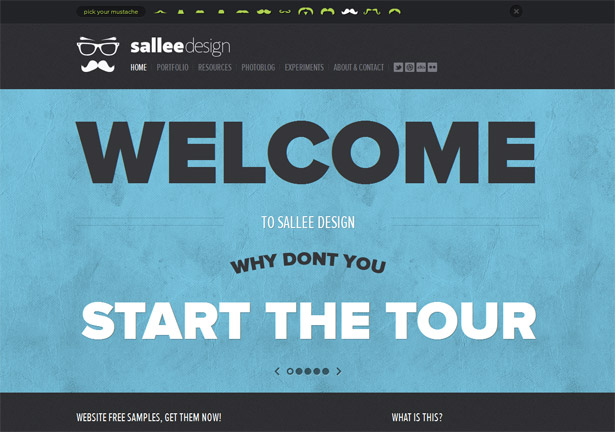
Responsive Design
The topic of responsive web design is, to say the least, an extremely hot topic. So it should come as no surprise to find that this approach can be found in fresh portfolios that are being produced now. Unhindered, these individuals have embraced the new technique. And not surprisingly, all three of the examples here are for portfolio sites of front end developers, exactly the sort of place we should expect to find such a thing.Ryan Taylor
Ryan’s site follows the standard one page formula for a personal portfolio. This approach works great when integrating responsive techniques into the site. With only one page to account for it can be a lot easier to test and build a site like this. But don’t think it is easy. It takes a great deal of effort and planning to create a clean and beautiful site that transforms in this way.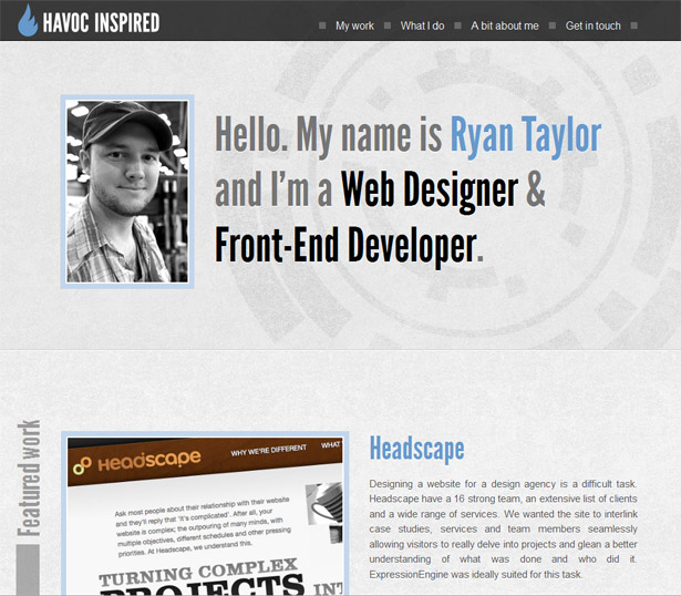
Aaron Shekey
Next up is the portfolio of Aaron Shekey. This beautiful little site embraces many tried and true techniques for a portfolio site. It is semi-minimalistic, has subdued colors to allow the images to pop, and it has a design largely based on typography. As is this site functions beautifully and is extremely efficient at showing off the artist's work. But with the added bonus of a responsive layout the site is guaranteed to look good on a wide range of devices. This ensures the user gets a positive experience, with no frustration of zooming and scanning around.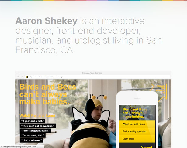
Andrew Cohen
Finally in the responsive category we find the personal site of front end developer Andrew Cohen. Much like the others it has a single page structure with what I would call a background driven design. In this way the background can shift and change without a great need of structural changes. This makes the site a perfect candidate for introducing responsive techniques.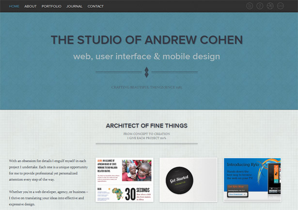
Creative layouts
Sometimes the best way to make an impression is to stand out as unique and different. And what better way to accomplish this than with an unusual layout structure that scoffs at the norms and expectations we all have. To some degree almost every example in this collection demonstrates this particular attribute, but I have selected this small sub set to demonstrate it. And before I dive in I want to point out that these sites don’t make use of creative layouts just for creativity sake. They are still functional sites that are extremely clear and simple to use. Yet they have their own distinct personalities that allow them to stand out. This exactly relates to what a portfolio site should do: help its creator to stand out from the crowd.Krichevtsova Alexandra
What I really love about this example for the topic of creative layouts is that it is not a radically different layout. Yes, the site doesn’t follow the normal logo in the top left, navigation across the top approach. The layout is only a few small steps from there though. I think this demonstrates the point extremely well. The goal is not to invent a layout for the sake of being creative. But rather, to get creative with laying out the page so as to communicate the information in the best way possible. In this case, the flow created by the slightly atypical layout works wonderfully.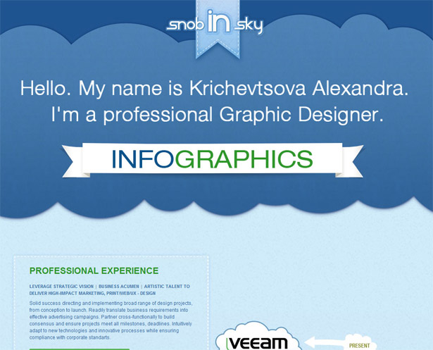
David Desandro
In this case the layout feels completely unusual. On some level it feels incomplete, and yet at the same time feels completely organized and easy to use. Dig into the portfolio and other pages though and you will be easily impressed with the diversity this site presents. It definitely has an appeal to the creative, yet technically minded.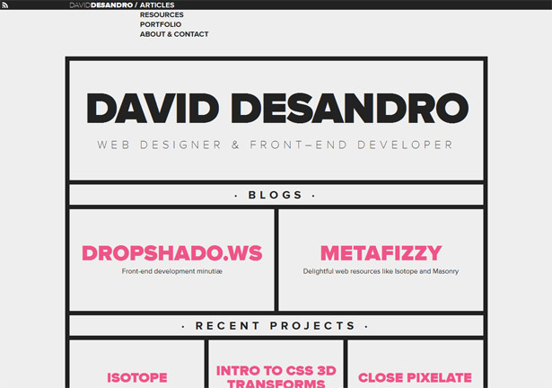
Deidre Bain
This one page scrolling site also breaks the norms of layout structure. In this sample almost the entire design is based on page-specific layouts and illustrations. Typically this is an approach that doesn’t work well and leads to maintenance issues. But in the case of a personal portfolio site it is actually a great way to demonstrate some useful skills. Most particularly there is thoroughness to the site that leaves you expecting this designer to be of the sort that follows through on things. It is these sort of subtle messages that can be extremely powerful to communicate in your own portfolio site.
Siddharth Arun
On first take this site has the feel of one that follows standard protocol. But interact with the site a bit and it feels totally unique. Sometimes coming up with your own creative twist doesn’t mean you have to reinvent everything. Just change enough such that the results are surprising (and functional).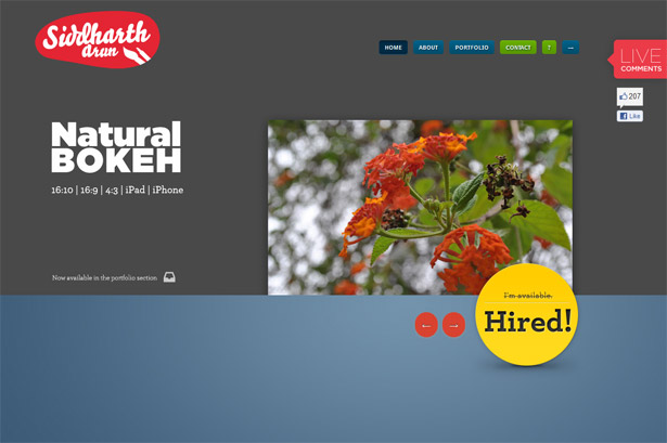
Bold text
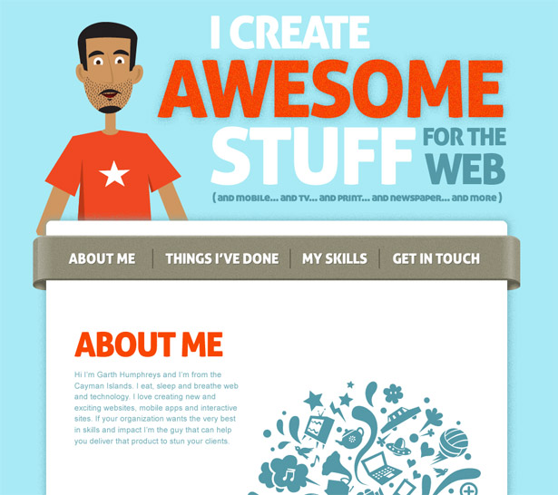
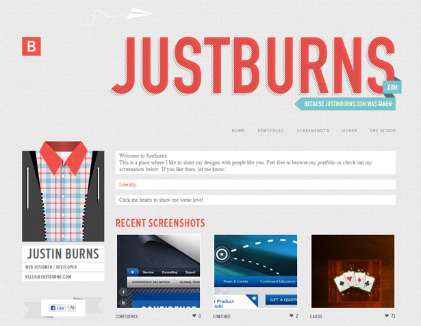
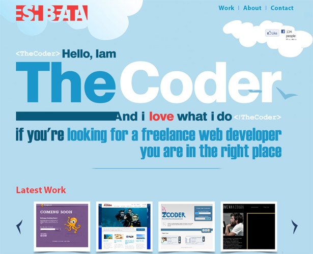
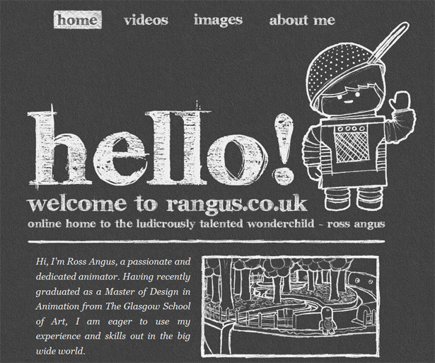
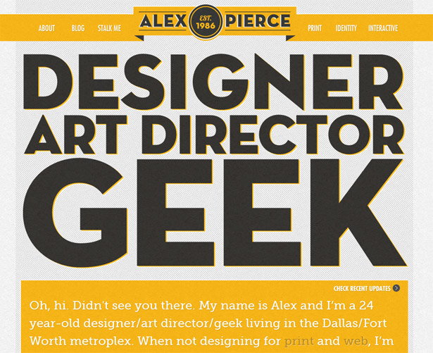
As I observed thumbnails of the sites collected to feature here one thing really stood out: the use of extremely large and bold text. The samples listed below all feature huge text that stands out on the site. The main reason I can come up with for this approach is clarity. This large bold text ensures that at least one primary message is communicated. In some cases it feels more functional than others, but in the end the result is always the same. The user's attention is almost guaranteed to be directed to this jumbo sized copy. Observe the samples and take note of the various ways creatives have put this element to work.Garth Humphrey
Justin Burns
Amman Jordan
Ross Angus
Alex Pierce
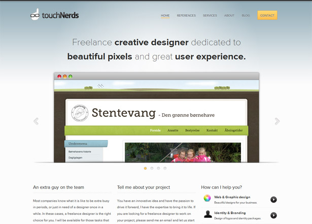
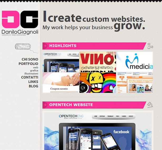
Trim on the top
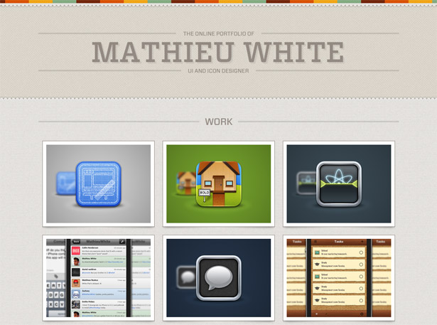
As I mentioned earlier, some of the patterns are far less functional and meaningful than others. In this case I almost feel bad placing the following samples in such a frivolous set. The sites featured below are absolutely gorgeous; please don’t take this classification as any sort of insult at all. In fact two of my favorite sites from this article are found here. Basically the pattern is that some sort of decorative stripe, a solid line or zigzag pattern appears across the top. I limited this set to three sites, but if you scan through some of the other examples you will find the same element at work. Why is such a small detail as this so common? Perhaps with the single page approach it is nice to denote the top of the page. In this way users get a small visual cue as to where the page begins.Mathieu White
Touch Nerds
Danilo Giagnoli
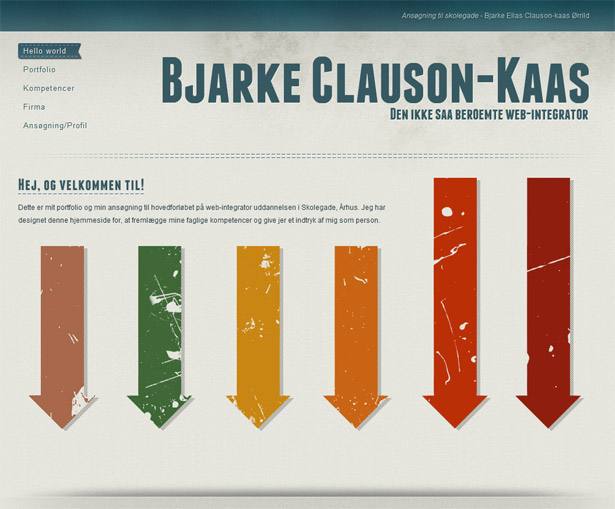
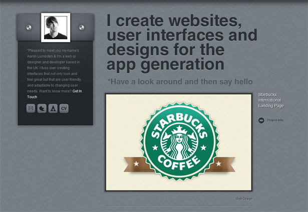
Texture texture texture
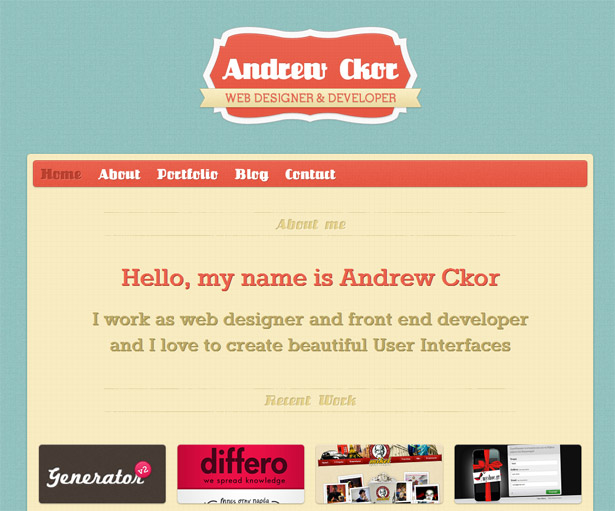
Another visual detail that is extremely common on portfolio sites is texture. This is especially true when it comes to background elements. Part of the current visual style incorporates subtle textures into the background. I find that this element does a great job of incorporating a bit of an organic element into the page that helps remove it from its technical underpinnings. This simple element can add a warm touch that somehow breathes a ton of life into a design. Again, dig through many of the previously covered samples and you will find numerous examples of this element at work. Here are a few samples that do this extremely well.Bjarke Clauson-Kaas
Aaron Lumsden
D. S. Higdon
Andrew Ckor
Additional noteworthy portfolio sites
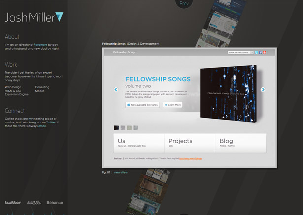
There are countless candidates for this type of collection. It is tempting to include almost too many samples in this case. Instead I have focused on an additional collection of sites that present a rather wide range of styles, structures and overall approaches. One thing you will note is that a few of these sites are not for designers. I found it very interesting to see how other industries have used the web to sell an individual. After all, a portfolio site is intended to do exactly that. So, for the sake of inspiration and fresh ideas, I have included a few outside the web design community.Collin Henderson
Josh Miller
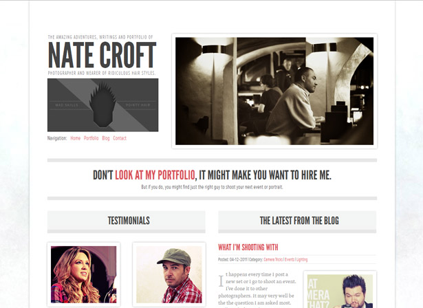
Nate Croft
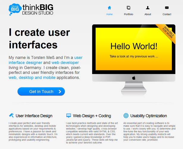
Torsten Meb
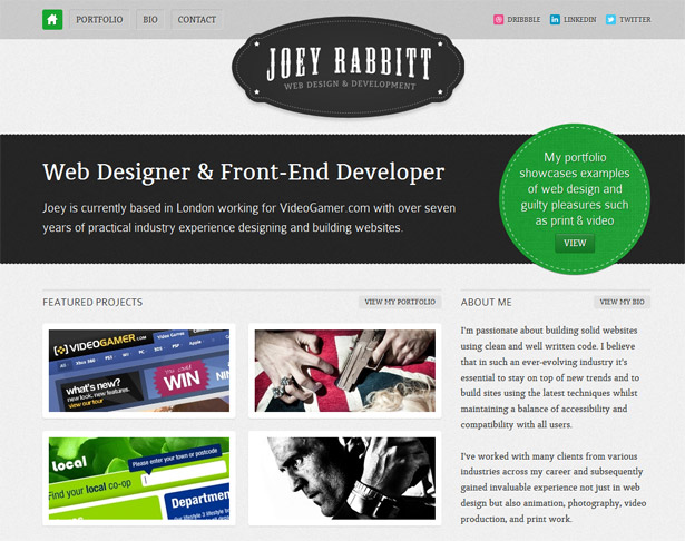
Joey Rabbitt
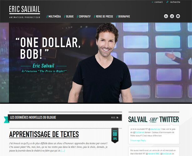
Eric Salvail
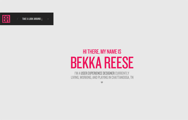
Bekka Reese
Felix Menard
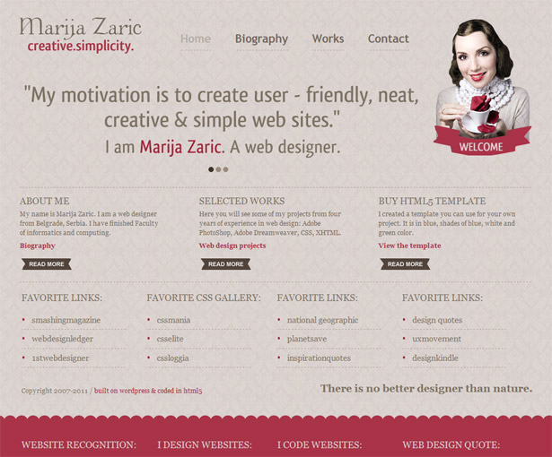
Marija Zaric
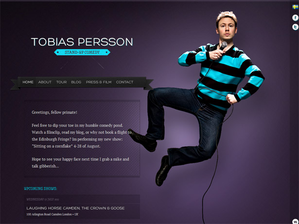
Tobias Persson
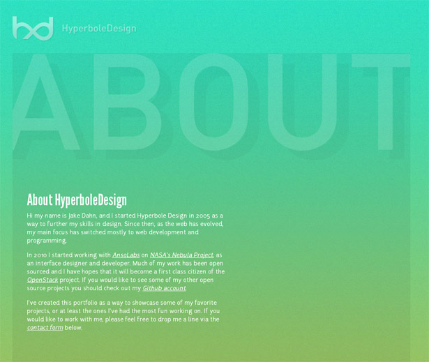
Jake Dahn
Conclusion
Creating a site to represent you online is no small undertaking. Hopefully the sites collected here will inspire and challenge you. Some of the elements presented here represent very intentional mechanisms to control the user experience and sell the individual. Others demonstrate more or less visual design trends. I believe that neither should be disregarded, and neither should single-handedly control things. It is by challenging the norms, embracing functional patterns, and assessing your image online in a new light that can lead to revolutionary ideas that help you stand out. And regarding the topic of standing out, I feel compelled to remind people that the goal here is not to invent the most original interface. Instead, the goal is to think creatively inside the limitations we have. Out of this I always hope that we will find the creative solutions that help us stand out with amazingly functional results. If you look at the samples collected here they are not only beautiful, but they function amazingly well. What are some of the best portfolio sites you've seen? Any other trends you've noticed in designer portfolios recently? Let us know in the comments!Patrick McNeil
Patrick McNeil is a designer, developer and writer; but above all things he is a passionate educator. He is a Professor of Graphic Design at the University of Missouri St. Louis where he focuses on teaching UX Design methods and front end development techniques. Patrick is also the author of the bestselling book series The Web Designer's Idea Book and the curator of DesignMeltdown.com. For more information about Patrick visit his personal site, pmcneil.com, or follow him on Twitter @designmeltdown.


Read Next

15 Best New Fonts, July 2024
Welcome to our monthly roundup of the best fonts we’ve found online in the last four weeks. This month, there are fewer…
By Ben Moss

20 Best New Websites, July 2024
Welcome to July’s round up of websites to inspire you. This month’s collection ranges from the most stripped-back…

Top 7 WordPress Plugins for 2024: Enhance Your Site's Performance
WordPress is a hands-down favorite of website designers and developers. Renowned for its flexibility and ease of use,…
By WDD Staff

Exciting New Tools for Designers, July 2024
Welcome to this July’s collection of tools, gathered from around the web over the past month. We hope you’ll find…

3 Essential Design Trends, July 2024
Add some summer sizzle to your design projects with trendy website elements. Learn what's trending and how to use these…

15 Best New Fonts, June 2024
Welcome to our roundup of the best new fonts we’ve found online in the last month. This month, there are notably fewer…
By Ben Moss

20 Best New Websites, June 2024
Arranging content in an easily accessible way is the backbone of any user-friendly website. A good website will present…

Exciting New Tools for Designers, June 2024
In this month’s roundup of the best tools for web designers and developers, we’ll explore a range of new and noteworthy…

3 Essential Design Trends, June 2024
Summer is off to a fun start with some highly dramatic website design trends showing up in projects. Let's dive in!

15 Best New Fonts, May 2024
In this month’s edition, there are lots of historically-inspired typefaces, more of the growing trend for French…
By Ben Moss

How to Reduce The Carbon Footprint of Your Website
On average, a web page produces 4.61 grams of CO2 for every page view; for whole sites, that amounts to hundreds of KG…
By Simon Sterne

20 Best New Websites, May 2024
Welcome to May’s compilation of the best sites on the web. This month we’re focused on color for younger humans,…