
 Earlier this year, a London, Ontario-based mom noticed that her 5-month old son Emerson got really frightened when she blew her nose. She caught one of his petrified moments on video, and posted it on YouTube to share with a few friends.
Since the video was posted, it's been viewed more than 20 million times — far exceeding her expectations. This has led to both baby and family receiving the proverbial "five minutes of fame" in both Canada and the U.S.
If you haven't seen it yet, you're really missing out. View the video below, and read on. I'd like to point out some things about this video that I feel enhance its side-splitting hilarity, and that can influence designers to continue to look for inspiration in things that have almost nothing to do with design.
Earlier this year, a London, Ontario-based mom noticed that her 5-month old son Emerson got really frightened when she blew her nose. She caught one of his petrified moments on video, and posted it on YouTube to share with a few friends.
Since the video was posted, it's been viewed more than 20 million times — far exceeding her expectations. This has led to both baby and family receiving the proverbial "five minutes of fame" in both Canada and the U.S.
If you haven't seen it yet, you're really missing out. View the video below, and read on. I'd like to point out some things about this video that I feel enhance its side-splitting hilarity, and that can influence designers to continue to look for inspiration in things that have almost nothing to do with design.
Why is the video effective?
First and foremost, this video is almost unrealistically hilarious. The kid is cute, and he reacts to the nose blowing in an almost cartoon-like fashion. I've watched the video literally dozens of times, and it never gets old. It always makes me chuckle. So the main reason the video is effective and popular is because it's just plain funny. But there are a few other things that I feel enhance the experience of watching this kid nearly crap his pants while his mom extricates some mucus from her shnozz.An appropriate color palette
Study the first frame, before the video is even played. The colors surrounding Emerson are eye-catching, and prepare the viewer for what's to come. When discussing the topic of "aesthetic consistency", the book Universal Principles of Design says: "Aesthetic consistency enhances recognition, communicates membership, and sets emotional expectations." The colors that appear in the baby Emerson video contribute to the aesthetic consistency of the candid piece. Here are some of the colors that are prominent in the video: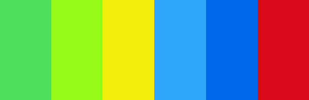
Baby Emerson's eye-catching color palette Do you think you would use those colors on your next web project? Well, likely not — it would depend on the details of that particular project. But in the case of the video of baby Emerson, the color palette is entirely appropriate. The colors are eye-catching, they're befitting of the context and content of the video, and they contribute to the viewer's emotional expectations. The colors also complement each other nicely, solidifying the aesthetic. Of course, the colors work for a video like this because they're part of his toys — which are designed to be appealing to young children. This type of appropriate use of color really inspires me to give greater thought to colors that I choose when going through the initial steps of any design. What else can baby Emerson teach us?
Use of saturated colors
Further on the same topic, the colors in the video are eye-pleasing because they have high saturation levels. Think of the dozens of other funny baby videos or other candid moments made famous on YouTube. Unless they're staged or over-produced, most of them are pretty drab looking. By contrast, the baby Emerson video has significant color saturation. Universal Principles of Design says: "Use saturated colors (pure hues) when attracting attention is the priority. Use desaturated colors when performance and efficiency are the priority." In this case, attracting attention is the priority, and it just so happens that the colors around baby Emerson are doubly effective because of their high saturation levels. Yes, the video would probably still have many millions of views regardless of the colors present in the imagery, but in this case they serve to enhance an already appealing visual.Great storytelling
Again, according to Universal Principles of Design, the elements of a good story include characters, plot, and movement. The character (baby Emerson) is undeniably attractive and interesting. The plot (will baby Emerson overcome his fear?) is rollickingly gripping. And the aforementioned story moves swiftly forward, as his mom repeatedly tests his tolerance to the nose blowing. It's a simple story, but an effective one. Can you imagine someone watching ten seconds of this video, then closing the window out of boredom? The suspense created right from the outset by the look on baby Emerson's face ensures that everyone that views the video watches every second until the end, to see if he will overcome his unreasonable fear.
Will baby Emerson overcome his fear? On the topic of storytelling, Universal Principles further adds: "Use storytelling to engage an audience in a design," and to "evoke a specific emotional response." The Baby Emerson video does that quite nicely and we should all endeavor to see where storytelling can fit into our own designs, where appropriate.
Baby-face bias
The baby-face bias can be analyzed in a number of situations, and is particularly significant when applied to adults. But in this case, it's relevant even in the context of babies. According to the baby-face bias, "things with baby-faced features" are seen as "more naive, helpless, and honest" than things with mature features (Universal Principles of Design). Baby-face features include "round features, large eyes, small noses, high foreheads, shorter chins, and relatively lighter skin and hair." Baby Emerson has most, if not all, of those features. Thus, when viewers catch a glimpse of him, we can't help but feel for him, and the scene thus draws us in visually and emotionally.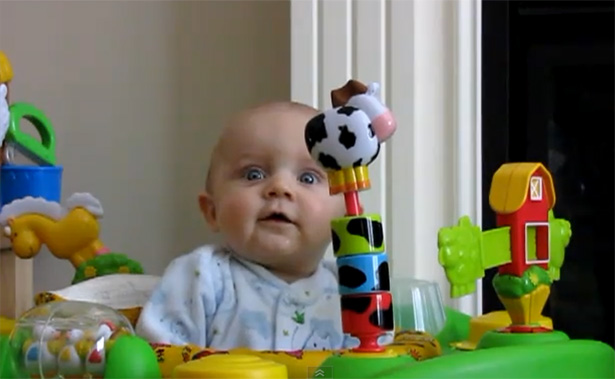
Baby Emerson has virtually all the facial features that suggest naiveté, helplessness, and honesty. This is an important lesson for designers using characters and personalities in their projects. While baby-face features are helpful and preferred in the case of babies, the opposite might be true in the case of adult characters. First, babies that do not have prominent baby-face characteristics are often viewed as less attractive, less likable, and as a result receive less positive attention from adults. In some cases, this might be a good thing, and might actually assist a baby in learning independence and self-sufficiency. But in the case of adults, if a baby-faced adult tries to make an authoritative statement, he is viewed as less authoritative than an adult that does not have baby-face features. For example, a baby-faced actor posing as a doctor in a television commercial would be taken less seriously than an actor with more mature features. So the lesson learned is: Choose your character's facial features wisely, and make sure the character's features match the message being communicated.
Conclusion
In conclusion, I just wanted to make it clear that in no way am I implying that the success of this video has anything to do with the principles discussed here. The baby's reaction to the situation is easily the most important reason for the video's success. But in this case, the video has some visually relevant and memorable features that serve as excellent reminders of some design principles that have stood the test of time. And if nothing else, this article should serve as a reminder that inspiration can be gleaned from almost anything — even from candid and unrehearsed situations, and not just settings that are contrived or planned. Do you see design principles at work in unexpected settings? Share your thoughts below.Louis Lazaris
Louis Lazaris is an author, freelance writer, and web developer. He curates Web Tools Weekly, a newsletter for front-end developers, and he writes about front-end web design technologies on Impressive Webs. You can follow Louis on Twitter or contact him through his website.


Read Next

15 Best New Fonts, July 2024
Welcome to our monthly roundup of the best fonts we’ve found online in the last four weeks. This month, there are fewer…
By Ben Moss

20 Best New Websites, July 2024
Welcome to July’s round up of websites to inspire you. This month’s collection ranges from the most stripped-back…

Top 7 WordPress Plugins for 2024: Enhance Your Site's Performance
WordPress is a hands-down favorite of website designers and developers. Renowned for its flexibility and ease of use,…
By WDD Staff

Exciting New Tools for Designers, July 2024
Welcome to this July’s collection of tools, gathered from around the web over the past month. We hope you’ll find…

3 Essential Design Trends, July 2024
Add some summer sizzle to your design projects with trendy website elements. Learn what's trending and how to use these…

15 Best New Fonts, June 2024
Welcome to our roundup of the best new fonts we’ve found online in the last month. This month, there are notably fewer…
By Ben Moss

20 Best New Websites, June 2024
Arranging content in an easily accessible way is the backbone of any user-friendly website. A good website will present…

Exciting New Tools for Designers, June 2024
In this month’s roundup of the best tools for web designers and developers, we’ll explore a range of new and noteworthy…

3 Essential Design Trends, June 2024
Summer is off to a fun start with some highly dramatic website design trends showing up in projects. Let's dive in!

15 Best New Fonts, May 2024
In this month’s edition, there are lots of historically-inspired typefaces, more of the growing trend for French…
By Ben Moss

How to Reduce The Carbon Footprint of Your Website
On average, a web page produces 4.61 grams of CO2 for every page view; for whole sites, that amounts to hundreds of KG…
By Simon Sterne

20 Best New Websites, May 2024
Welcome to May’s compilation of the best sites on the web. This month we’re focused on color for younger humans,…