
 The usage of fixed position elements has grown in popularity and become a common element on the web.
This technique involves fixing some element in the browser while the rest of the page scrolls. Most often we find this done on header elements including the main navigation for a site. This is also a popular approach on single page sites where the in page navigation needs to be ever present. We also find various elements of web pages locked in place using such techniques.
There are many situations we can find where fixing an element in the page is a good thing, but it all comes back to a single purpose. In almost all of these situations the fixed element keeps a critical part of the page in front of users at all times.
The importance of these elements varies, but to some degree the fundamental goal is to keep some part of the page perpetually in the view port.
As you consider using this technique I highly recommend you carefully consider why and how you do so. Keep in mind that whatever part of your page doesn’t move will automatically draw lots of attention. So be sure you are putting it to work. Let’s dive in!
The usage of fixed position elements has grown in popularity and become a common element on the web.
This technique involves fixing some element in the browser while the rest of the page scrolls. Most often we find this done on header elements including the main navigation for a site. This is also a popular approach on single page sites where the in page navigation needs to be ever present. We also find various elements of web pages locked in place using such techniques.
There are many situations we can find where fixing an element in the page is a good thing, but it all comes back to a single purpose. In almost all of these situations the fixed element keeps a critical part of the page in front of users at all times.
The importance of these elements varies, but to some degree the fundamental goal is to keep some part of the page perpetually in the view port.
As you consider using this technique I highly recommend you carefully consider why and how you do so. Keep in mind that whatever part of your page doesn’t move will automatically draw lots of attention. So be sure you are putting it to work. Let’s dive in!
Fixed headers
Fixed headers are by far the most common fixed position element, so much so in fact I had to start adding to this collection in order to avoid too many samples. Most often the header is fixed in place to ensure that the sites navigation is ever present. As I mentioned before, this is especially true when dealing with a single page web site. There are many subtle variations in how you can handle fixed headers so we will review some samples for various ideas on this approach.Freckles & Handsome
This is what I would consider a classic example of this technique. The header is fixed in place as you scroll through the site. This includes the logo and main navigational elements. Additionally, it is a single page web site. Clicking on the main navigation scrolls you to the appropriate part of the page. In such a case as this the sticky header makes browsing the single page site straight forward. It also avoids one of the more annoying aspects of many single page sites: when the navigation is only at the top of the page, but it scrolls on for ages. As such, the fixed header not only looks nice and keeps the site's main branding front and center, but also ensures the site is easy to use.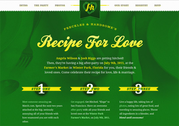
Mapalong
This example uses a fixed header, but with its own minor twist. This site is also a single page layout, but lacks any in page navigation. In this case the fixed header contains the main logo and a sign in button, both very important elements. But, even better than this, when you scroll down the page the main call to action moves to the header as it rolls out of view. As a result, the primary conversion point for the site is always visible. And yet, even better than that, the act of the call to action fading into view calls the user’s attention to it, further emphasizing the conversion point in the design! In my opinion a brilliant use of the approach.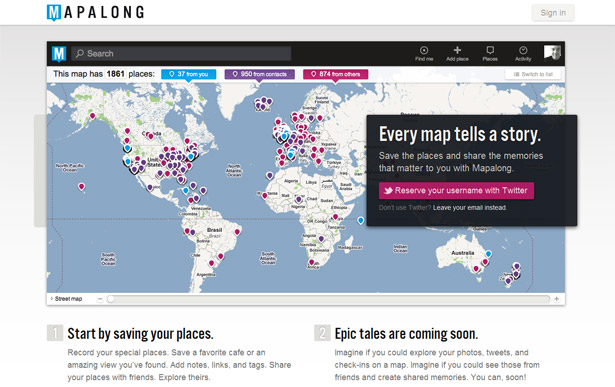
Kisko Labs
Another clever approach to the fixed position header is a technique I call slide and stick. On the Kisko Labs site only part of the header sticks. As you scroll down the page the main navigation scrolls as well. That is until it hits the top of the screen, then it sticks there. Thus, the navigation slides (or scrolls) as normal, then sticks to the top. An extra detail that is really nice here is how the navigation highlights the part of the page that you are currently viewing. Since this is a single page design it is helpful to have the current part of the page identified as you would with the normal “current page” status of any navigation.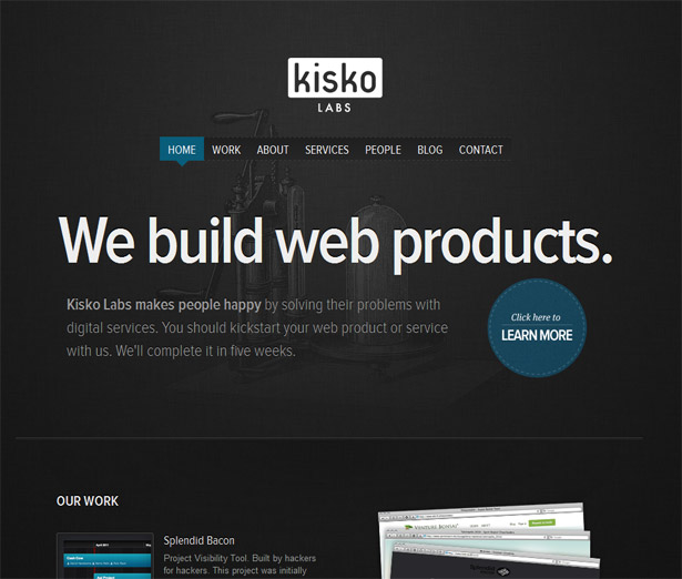
Raise the Roof
A common extension of this style is to incorporate some level of transparency into the sticky layer. In many of the examples you will find here this is done by simply having an uneven edge to the sticky element. Sometimes this is done by having an element protrude from the fixed bar, other times with a jagged edge. On the Raise the Roof site it has been accomplished with a very organic and nearly random border. In this sample we find an interesting visual result. Through the use of overlapping elements the site creates visual depth as the contents scroll behind the header. This is further emphasized by the moon in the background that is also fixed. The end result is three visual layers. Such depth adds a great level of visual interest and can create a visually striking design.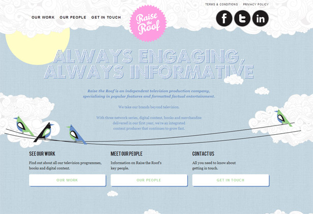
Welcome to the Water
The Welcome to the Water site is a rather unusual creation. Very little about this site fits the norms of web layout and design. Of particular interest for the topic of this article is the fixed header. On this site that fixed element serves as a navigational tool to the site. But in many ways it has more of a toolbar feel to it.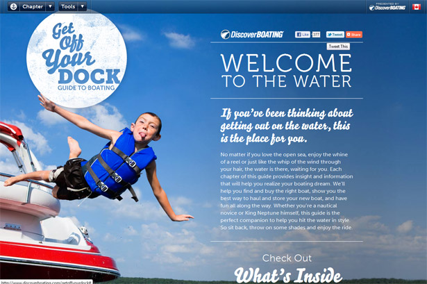
Additional samples of fixed headers
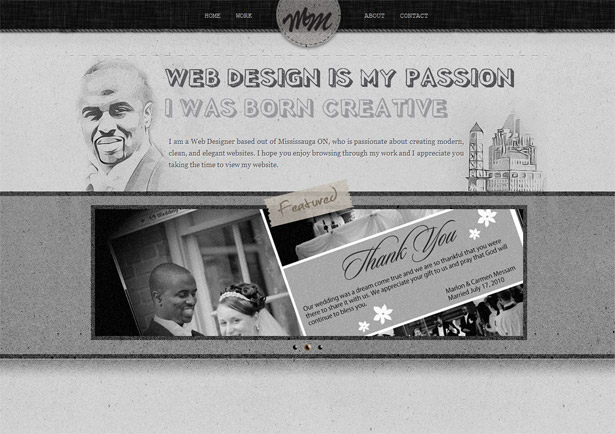
Here are some additional examples of fixed headers. You will find a wide range of styles and subtle variations here. Tam Cai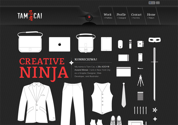 Marlon Messam
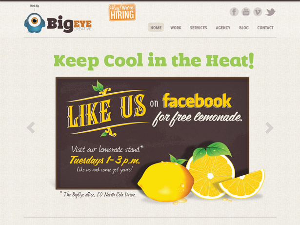
 Big Eye Creative
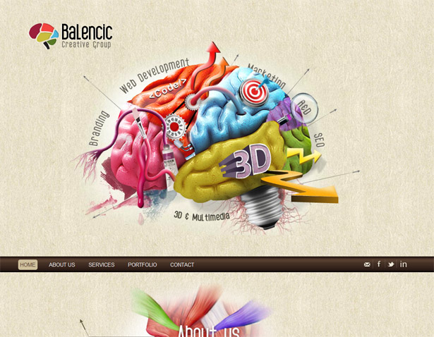
 Balencic Creative Group
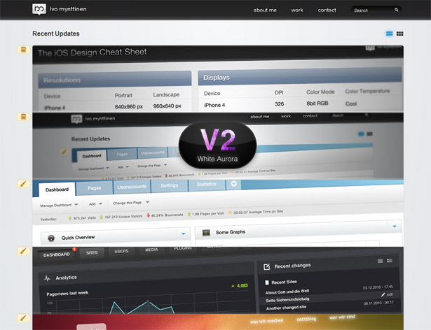
 Ivo Mynttinen
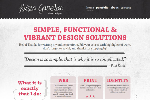
 Krista Ganelon
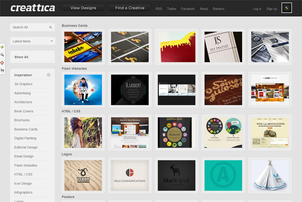
 Creattica
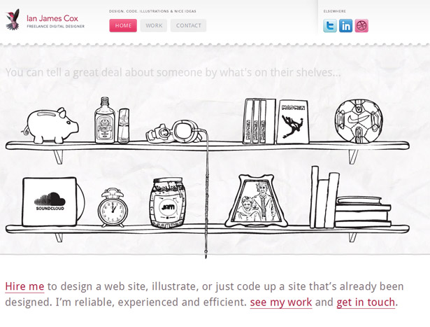
 Ian James Cox
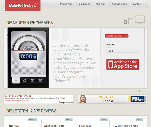
 Make Better Apps
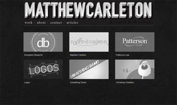
 Matthew Carleton
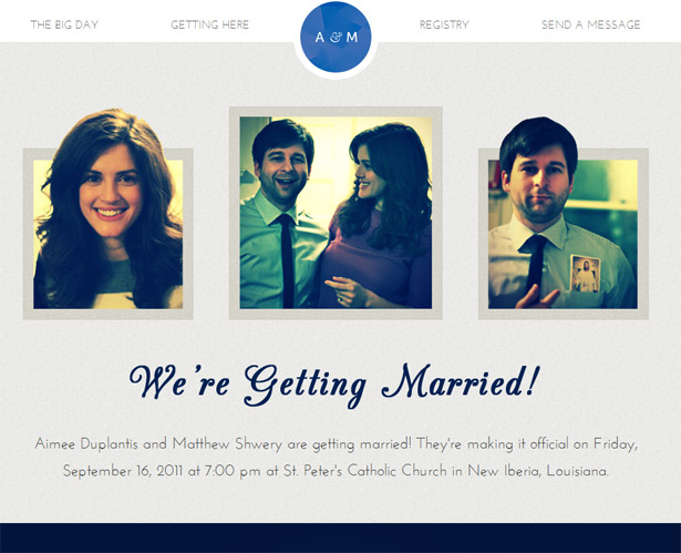
 Shweplantis
 TruQua
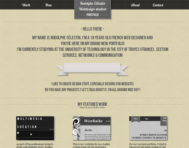
 Rodolphe Celestin
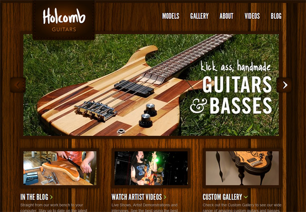
 Holcomb Guitars
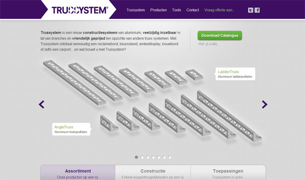
 Trussystem
Fixed Footers
Perhaps the most obvious opposite to the fixed header would be the fixed footer. In such cases the footer of the page is stuck to the bottom of the screen. As the user scrolls, the element stays in place. Much like any other fixed element, creating a focal point is still the primary goal. Interestingly though with footers such as these it is most often about a secondary function that is still a primary goal.Unleaded Group
The Unleaded Group site is a prime example of this. Here the fixed footer contains elements that are action oriented and strike at the core purpose of the site. First note that all of the items in this bar are things a user can do: promote them on social media, place a phone call, or email them. Secondly, they are the primary action items the agency most likely wants you to take. They either want you to promote them, or contact them. These are the primary reasons to have a site such as this. So it makes good sense to fix them in place I a footer where they will get lots of attention.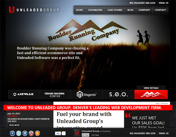
Envato
The Envato site also has a fixed footer. Here the bar contains the site's primary logo, which has interestingly been moved here from the typical top left. Frankly, for a brand like Envato this is not an issue. Also, you will find a series of drop down menus that launch you onto their various web properties. This simple function is their real goal. In fact you might say that this business profile page is not really where they want people to end up. As such, the focus on driving you back to their content sites is prominent and unavoidable.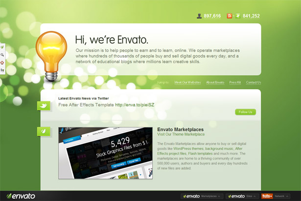
Kiyuco
For many sites such as this one their email marketing programs are of critical importance. As such, having a fixed placed footer that prominently highlights the sign up form can go a long way to grow such mailing lists. Can email marketing help you promote your site over a longer period of time and more effectively pursue clients? If so, perhaps a fixed footer such as this one would be a great tool.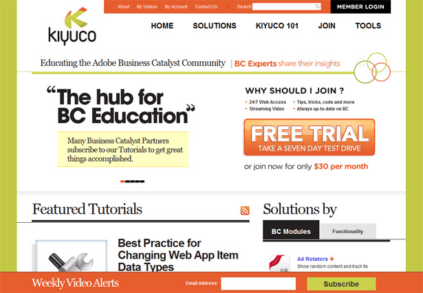
Fixed position sidebars
Locking elements of a web page into place is not something limited to headers and footers, though they might be the most popular. It would seem that a fixed position sidebar is a close second. Fixed place sidebars often contain very similar information to what you would find in a header. This includes things like logos, navigation and social media tools. Here are some samples to consider if you want to use this approach.Jorge Rigabert
This gorgeous site is a perfect example of the style at work. Here the side bar contains the sites primary branding and navigational options. This sidebar type of approach is great because it keeps the navigation in view as the page scrolls, but also because it doesn’t intersect with the content as it moves. Though this might be a subtle distinction, it makes for an incredibly smooth interface. Sites such as this display an elegance that appears simple, but is incredibly difficult to put together.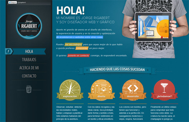
More Hazards More Heroes
I really love the way this site works. The fixed elements in the sidebar are the core functions the site owners want you to take. More than anything they want you to hear the music! As such, the prominent and permanently on screen “play” feature is ready and waiting. I can’t imagine a more critical element to the site, and to have it so prominently displayed just makes good sense. And you have to love that it hasn’t been presented in an obnoxious way; it doesn’t even auto play. Kudos to the designer that controlled that temptation.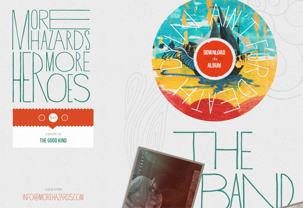
Yowza
Sometimes it is desirable to create a single sticky element that promotes a particular function. We have seen this with various feedback and support services that you can plug into your site. In this case, a Facebook like button has been affixed to the side of the site. It stays in place as you scroll the page. This, of course, draws the user's attention to the element and encourages them to use it. I would say this shows the power and importance of social referrals in a web-based business such as this. As a side note, I love the site's twist on the 10px top border that has become so popular. Here the element simply scrolls by. Not a dramatic animation, but something about it is fun and adds a layer of interest and life to the site.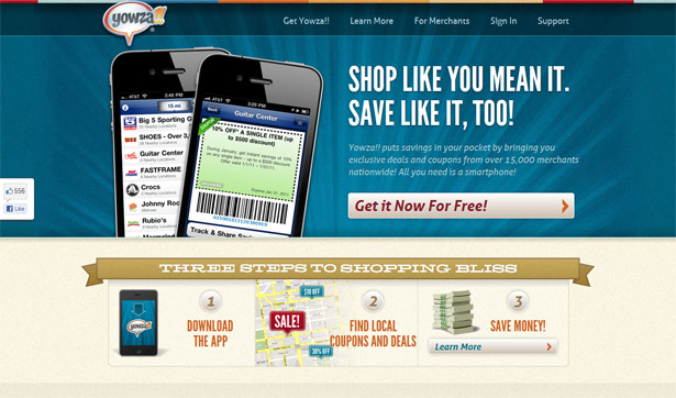
Fat-Man Collective
This site follows all of the patterns we have found in our previous samples. But it stands out in a huge way due to a simple animation. As you scroll down the page the character in the side bar animates and walks. This element single-handedly elevates the site into a unique and memorable category. How is it that something so trivial can have such an impact. It takes this simple site and pumps it full of awesomeness. It shows that the agency behind it loves polishing their work with the types of finishing touches any client is going to die for.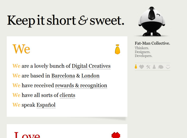
More fixed sidebar elements
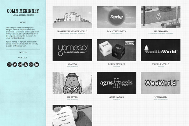
Here are some additional examples of fixed sidebars at work. Silly Poems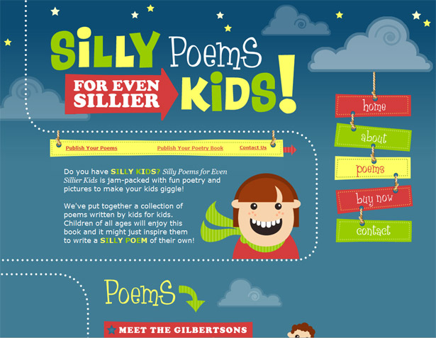 Colin McKinney
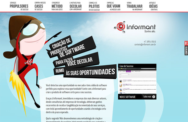
 Informant
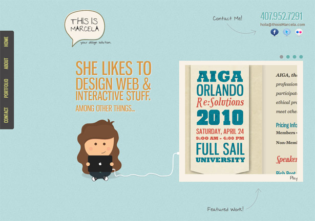
 This is Marcela
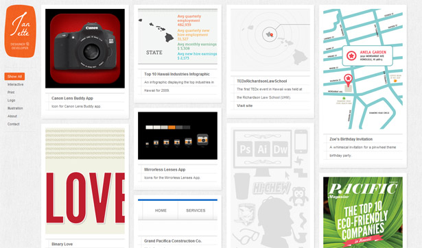
 Janette D. Council
Logo only
An approach that we don’t find all that often is a fixed position logo. In this example the logo has been locked into place even as the page scrolls. This atypical approach keeps the site's name front and center. Designs such as this can be interesting to consider. It is really hard to guess why they might have done this, but one can only assume that the main branding is of critical importance. Perhaps they have lots of similar competition? Perhaps they just want to make sure you remember their name? Regardless, it is an interesting technique worth keeping in mind if it applies to your project.
“Back to top”
When it comes to really long pages a nice feature to add is a link that takes you to the top of the page. And with sticky elements you can create such a link that stays in the same place as you scroll the page. This is exactly what the samples provided here have done. Most frequently such an element is placed just outside the layout. This way it doesn’t interfere with anything else in the design as it traverses the page. You will also notice how these elements frequently have an arrow pointing up—perhaps an obvious element to include, but very important to keep in mind as it informs users quickly as to it’s purpose. This approach somewhat contrasts the notion of a sticky header. In this case the navigation is most often only at the top of the page. So returning there is important as it allows people to quickly bounce around sites contents. In the case of single page sites though this can be a bit of an annoying extra step.Overlapps
This sample demonstrates a nice extra touch in that it doesn’t show the return to top element unless you’re not actually at the top of the page. Perhaps an obvious detail to include, but as you will find it isn’t always the case. Part of the power in this approach is that the very act of it appearing draws attention to it to ensure a user is aware of it.
Two more samples
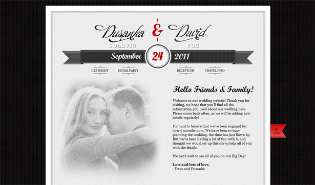
The two following examples both have return to top buttons, though they are visible all of the time. It is interesting to me that this element is most frequently placed in the bottom right corner of the screen. It is not the most prominent part of the design, so perhaps it’s secondary nature is good for such a less important element. You will notice of course though that the element is still highlighted by breaking the borders and with bold colors. I suppose the morale of the story is to consider its importance to the use of your design. If it makes all the difference, make sure it is visible. Wildcard Thinking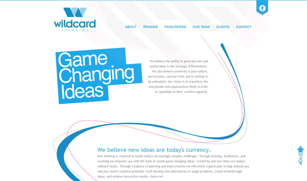 Dusanka & David
Multiple fixed elements
In this final example we will take a look at a site that has many fixed elements in the page. In many ways this site breaks with most of the norms of web design and layout. Except for the logo in the top left corner, almost nothing is in its usual place. We do find some elements we are familiar with based on this article though, such as the fixed side bar. However, you will notice that two others are far from typical. For example, the fixed footer that contains some site wide links. Things like privacy policies and terms & conditions seldom warrant such prominent position in a page. Yet here you find them affixed to the page with some other rather important navigational links. I do really like how they have tacked the user account links to the top right corner. This is where they are frequently placed, though are seldom fixed there regardless of scrolling as in this case. I like this because it ensures you can always quickly gain access to the member’s features of the site; something that perhaps some other apps and web sites could benefit from. All in all this site is far from normal, but something about it works incredibly well and is easy to love. Its unusual layout doesn’t make it hard to use and the end result is a distinct and pleasurable experience.
Resources
Finally, with this round up I would like to include some handy jQuery plugins that address the need of fixing elements to a specific location in a page. They offer different features that will fit various needs you might have, so be sure to explore them all to find the right fit. The great thing is that they are all jQuery plugins and they are super simple to implement. If you do want to produce this style, these will at least make it an easy job.Meerkat
Meerkat is one of my favorite tools for this particular job. It’s ability to be hidden makes it a great tool for displaying promotional content or important features such as email sign up forms.Stickyscroll
Stickyscroll is a plugin that allows you to create elements that scroll with the page until they hit the top, and then they stick in place. This plugin also helps ensure elements don’t scroll into a footer region by giving it a bottom boundary; a nice extra feature for sure.Waypoints
Waypoints allows you to trigger jQuery events when a user scrolls to specific points in a page. This is handy if you would like to highlight or change the navigation to match the user's location in the page. But the fun doesn’t end there as there are countless things you could do to a page or design as a user scrolls and interacts with it.Conclusion
Fixed elements are now a common element designers can put to work. Tools to accomplish such features and full browser support are no longer an issue. As such, it is a great technique to keep in your tool belt and draw out when the time is right. Such approaches are, of course, not the type of thing you use every day, but can be incredibly powerful when used effectively.Patrick McNeil
Patrick McNeil is a designer, developer and writer; but above all things he is a passionate educator. He is a Professor of Graphic Design at the University of Missouri St. Louis where he focuses on teaching UX Design methods and front end development techniques. Patrick is also the author of the bestselling book series The Web Designer's Idea Book and the curator of DesignMeltdown.com. For more information about Patrick visit his personal site, pmcneil.com, or follow him on Twitter @designmeltdown.


Read Next

15 Best New Fonts, July 2024
Welcome to our monthly roundup of the best fonts we’ve found online in the last four weeks. This month, there are fewer…
By Ben Moss

20 Best New Websites, July 2024
Welcome to July’s round up of websites to inspire you. This month’s collection ranges from the most stripped-back…

Top 7 WordPress Plugins for 2024: Enhance Your Site's Performance
WordPress is a hands-down favorite of website designers and developers. Renowned for its flexibility and ease of use,…
By WDD Staff

Exciting New Tools for Designers, July 2024
Welcome to this July’s collection of tools, gathered from around the web over the past month. We hope you’ll find…

3 Essential Design Trends, July 2024
Add some summer sizzle to your design projects with trendy website elements. Learn what's trending and how to use these…

15 Best New Fonts, June 2024
Welcome to our roundup of the best new fonts we’ve found online in the last month. This month, there are notably fewer…
By Ben Moss

20 Best New Websites, June 2024
Arranging content in an easily accessible way is the backbone of any user-friendly website. A good website will present…

Exciting New Tools for Designers, June 2024
In this month’s roundup of the best tools for web designers and developers, we’ll explore a range of new and noteworthy…

3 Essential Design Trends, June 2024
Summer is off to a fun start with some highly dramatic website design trends showing up in projects. Let's dive in!

15 Best New Fonts, May 2024
In this month’s edition, there are lots of historically-inspired typefaces, more of the growing trend for French…
By Ben Moss

How to Reduce The Carbon Footprint of Your Website
On average, a web page produces 4.61 grams of CO2 for every page view; for whole sites, that amounts to hundreds of KG…
By Simon Sterne

20 Best New Websites, May 2024
Welcome to May’s compilation of the best sites on the web. This month we’re focused on color for younger humans,…