Recycling icons with CSS
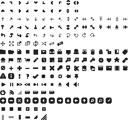
Take a look at this sprite taken from the jQuery UI library. As you browse through, you’ll notice that many of the icons listed here are actually variations on base templates. A single icon could be represented in a dozen different ways, and placed in the same file. Many icons are literally just rotated versions of their parents. The good news is while utilizing CSS we can employ the exact same technique without having to include the variations in the image sprite. From the example above, we can take a single icon and recreate it for our own purposes, say a simple chevron from the second row down. With the transform property, we are able to rotate this chevron 45deg, 90deg, 180deg, obviously and indefinitely to create many different forms from the same template.
Base template (up arrow):
The following code will pull the chevron facing up from the image sprite, and will serve as our base template..icon {
width: 20px;
height: 20px;
display: block;
background: url('sprite.png') no-repeat -20px 0;
}

Create right arrow
Transforming our arrow 90deg will point the arrow to the right, as show below:-webkit-transform: rotate(90deg); -moz-transform: rotate(90deg); transform: rotate(90deg);

Create top-right arrow
Rotate it just 45deg and you get a nice little top-right corner arrow:-webkit-transform: rotate(45deg); -moz-transform: rotate(45deg); transform: rotate(45deg);
 It’s that simple. Using this method, we can start with a simple two icon sprite, and with very little effort create six times as many icons for use in our interface, which of course is just the beginning of what can be done.
A few transforms, some fancy positioning, and our icon family has grown quite a bit!
Adding animation to the mix
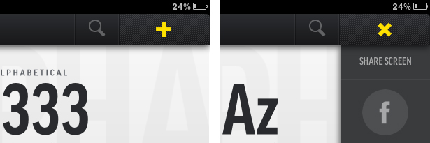
For a killer experience, we can add animation into the mix. Not only will we transform the icons, we’ll transition them to make the transformation visible to the user. Lets take a look at another example, starting with the plus sign seen above..icon {
width: 20px;
height: 20px;
display: block;
background: url('sprite.png') no-repeat 0 0;
}
.icon {
-webkit-transform: rotate(45deg);
 -moz-transform: rotate(45deg);
 transform: rotate(45deg);
}
 It’s stellar. Let’s take a look at how to make this beauty come to life. Start by using our plus icon created above. To animate it, simply add the transition property into your icon. In our transition, we specify the property (transform), the duration (0.2s), and finally what timing function we want to use (linear).
.icon {
 width: 20px;
 height: 20px;
 display: block;
 background: url('sprite.png') no-repeat 0 0;
 -webkit-transition: -webkit-transform 0.2s linear;
 -moz-transition: -moz-transform 0.2s linear;
 transition: transform 0.2s linear;
 cursor: pointer;
 }
Again, it’s that simple. Not only can we create new icons for our library with only CSS, we can animate and give life to any particular element!
Using opacity for more variety
The final piece of icon recycling comes to play in the form of the opacity property. Duplicating your core icons for black and white will allow you to generate an infinite number of shades / variants for use all over your site or application. A four-image variant (as seen below) of the sprite above could easily be used to create a dozen times as many icons, and by increasing or decreasing the opacity you can place them wherever needed, and still have them look great.It’s time to go green: recycle with CSS
As CSS3 has gained traction, my copy of Photoshop CS5 has started to gather dust, and for good reason! This technique of recycling your icons allows you to continuously deploy new versions and variants to your interfaces without having to open up source files and add cumbersome icons to ever-expanding sprites. Maintenance time goes down, and your time spent reading books like the 4 Hour Work Week goes up! It’s all gold. Of course the most obvious downside to all this is browser support, however, with the recent push by, well, everyone to use modern browsers, we will be able to take advantage of new and exciting progressive techniques. Feel free to browse some examples of this technique. What are some other ways you've been able to recycle your website's assets?Caleb Ogden
Caleb Ogden is an accomplished designer with a passion for combining great design with web standards to create stellar experiences online. For more, you can visit his website, and follow him on twitter @calebogden.
Read Next
15 Best New Fonts, July 2024
Welcome to our monthly roundup of the best fonts we’ve found online in the last four weeks. This month, there are fewer…
By Ben Moss
20 Best New Websites, July 2024
Welcome to July’s round up of websites to inspire you. This month’s collection ranges from the most stripped-back…
Top 7 WordPress Plugins for 2024: Enhance Your Site's Performance
WordPress is a hands-down favorite of website designers and developers. Renowned for its flexibility and ease of use,…
By WDD Staff
Exciting New Tools for Designers, July 2024
Welcome to this July’s collection of tools, gathered from around the web over the past month. We hope you’ll find…
3 Essential Design Trends, July 2024
Add some summer sizzle to your design projects with trendy website elements. Learn what's trending and how to use these…
15 Best New Fonts, June 2024
Welcome to our roundup of the best new fonts we’ve found online in the last month. This month, there are notably fewer…
By Ben Moss
20 Best New Websites, June 2024
Arranging content in an easily accessible way is the backbone of any user-friendly website. A good website will present…
Exciting New Tools for Designers, June 2024
In this month’s roundup of the best tools for web designers and developers, we’ll explore a range of new and noteworthy…
3 Essential Design Trends, June 2024
Summer is off to a fun start with some highly dramatic website design trends showing up in projects. Let's dive in!
15 Best New Fonts, May 2024
In this month’s edition, there are lots of historically-inspired typefaces, more of the growing trend for French…
By Ben Moss
How to Reduce The Carbon Footprint of Your Website
On average, a web page produces 4.61 grams of CO2 for every page view; for whole sites, that amounts to hundreds of KG…
By Simon Sterne
20 Best New Websites, May 2024
Welcome to May’s compilation of the best sites on the web. This month we’re focused on color for younger humans,…


