
 In this day and age, if you are not selling your product online or at least making it available online, you are missing out on a ton of money. Unfortunately, the makers of these sites are most interested in making a dollar rather than making sense (did you catch the pun?).
At any rate, some folks get the job down. They understand that design is a way to communicate and get their point across, rather than something that needs to be pushed to the side in order to get people to buy. Good companies understand good design can mean a better bottom line.
If you need inspiration for your upcoming e-commerce site or you just like this type of thing, we've put together some sites that get their audiences moving—not just through pretty decorations and design but through good usability, interfaces and interactions. Not all sites are perfect but you are sure to learn a thing or two from these 30 sites.
In this day and age, if you are not selling your product online or at least making it available online, you are missing out on a ton of money. Unfortunately, the makers of these sites are most interested in making a dollar rather than making sense (did you catch the pun?).
At any rate, some folks get the job down. They understand that design is a way to communicate and get their point across, rather than something that needs to be pushed to the side in order to get people to buy. Good companies understand good design can mean a better bottom line.
If you need inspiration for your upcoming e-commerce site or you just like this type of thing, we've put together some sites that get their audiences moving—not just through pretty decorations and design but through good usability, interfaces and interactions. Not all sites are perfect but you are sure to learn a thing or two from these 30 sites.
1. Soho Fixed
I don't think there are a ton of exciting ways to present bikes (unless it's some super mountain bike) and you're typically only bike shopping if you really want or need a bike. The best part about this site is they didn't try to sell you some rad bike, they're selling quality, most likely to a hipster, but they're selling that nonetheless. It's completely evident in their simple design that focuses on the bike. View Website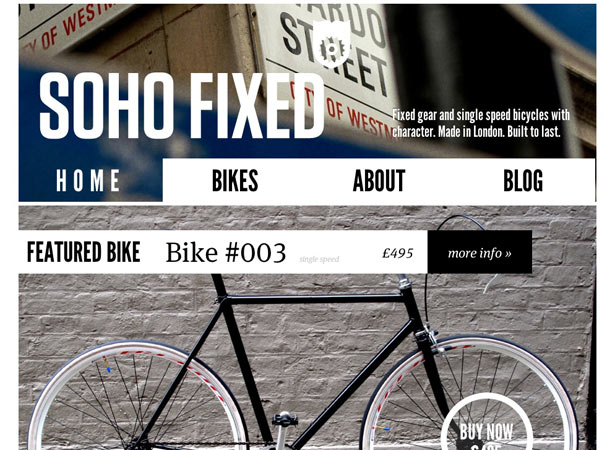
2. Puma
Completely opposite from the first idea of just selling quality, Puma is selling the idea of being a winner and looking pretty sweet while doing so. This site has combined some very busy artistic and design elements very well. It fortunately doesn't bleed into the actual shop—it's pretty easy to navigate around and see all the products. View Website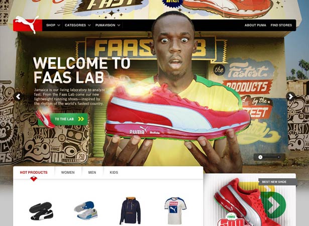
3. Foureleven
They did a great job with their layout. First, it isn't like your typical e-shop set up where you just throw pictures up on the homepage. Second, they did a great job of incorporating a good amount of content on this home page without making it look cluttered. View Website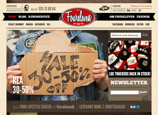
4. Makr Carry Goods
I like this site because it's very clear in what is being sold. An added plus is the size of the thumbnails works very well with the product. Clicking on a product reveals an accordion slider, within the same window which is pretty neat and nifty. It makes it easier to purchase things when fewer clicks are necessary. View Website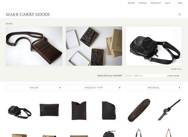
5. Custom Bags HQ
This site has a very good interface to get you started making your own custom bags. The header graphic draws you in easily, with solid call to action buttons. Right under that, you can start browsing bag styles. It doesn't hurt that the color scheme is very solid. View Website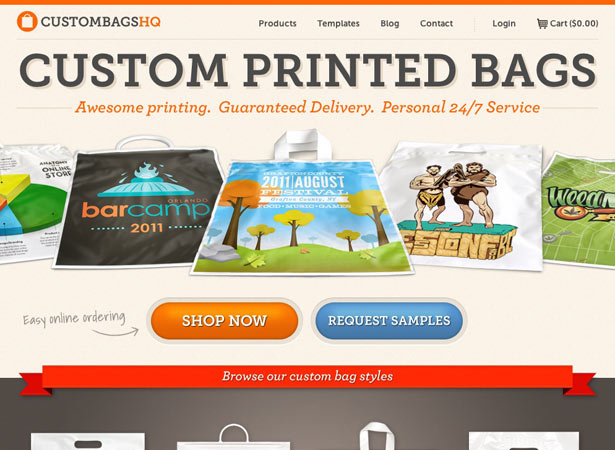
6. Tinkering Monkey
A very crispy clean site with a clear objective. I really like the way the thumbnails and product pictures do not have their own background, but it blends into the site's background. Little things like that show their attention to detail, which probably translates into their products. View Website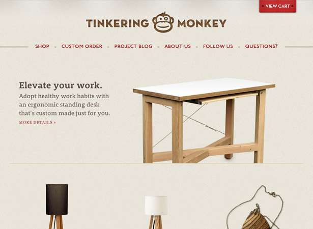
7. BonLook
I'm a glasses wearer and former employee for an eyeglass shop, so seeing this website really blew my mind. The design is absolutely beautiful to me with a nice hipster vibe. The most exciting thing to me however, is the ability for you to "try on" a pair of glasses. They use your webcam and impose a picture of the glasses on your face. Go to BonLook and try it out! It's pretty neat, and removes a lot of the perceived risk ("but how will they actually look when I have them on?") associated with buying something like eyeglasses online. View Website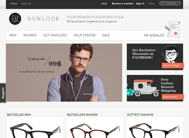
8. Jenier: World of Teas
I think this website does a good job at mixing a modern feel with a bit of a rustic/outdoorsy feel. It isn't necessarily mind-blowing but the site works well together and get its point across clearly. View Website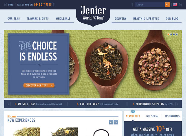
9. Merrell
The design of this website is pretty awesome. We've got a large illustrated background, some great typefaces and a bit of grunge to give us a nice adventurous and rustic feel. The design elements work very well together—they aren't just trying to sell hiking boots, they're also selling great adventure. View Website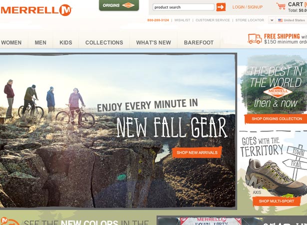
10. Chronicle Books
This is another great example of a website with the ability to put a lot of content on one page without it being too cluttered. The design stirs up a bit of excitement about the different books, but not to a false sense where it's a turn off. View Website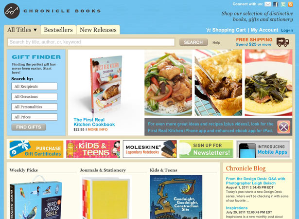
11. Inkefx
If you're only selling a handful of products in your e-shop, this is a great way to do it. Different product shots, info on each product, and a great layout to go with it. Another great thing about this site, is when you go to order a shirt, there's a nifty size availability bar graph. View Website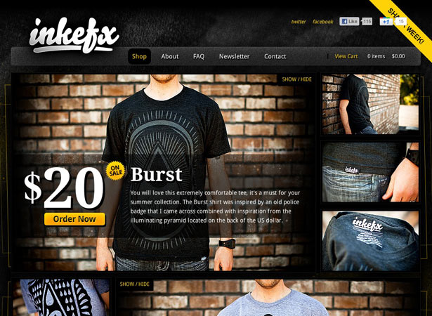
12. Mavic
This website puts great emphasis on a pretty awesome design that responds to the size of the browser window and includes other advanced features. With a very simple visual design, the details in the coding help translate the idea that they're "high end." Play around with the browser window size and the functionality of everything else. Very well put together. View Website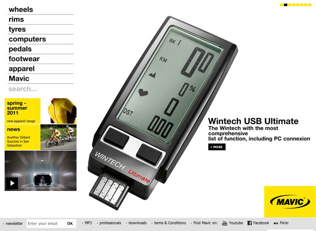
13. IconMonstr
I thought this was a very neat way to sell icons. It almost feels like you're purchasing an item of clothing or something that's absolutely necessary. I hate that there had to be the wiggly lines on the images but I understand it's a precautionary measure. Nice solid, clean, website. View Website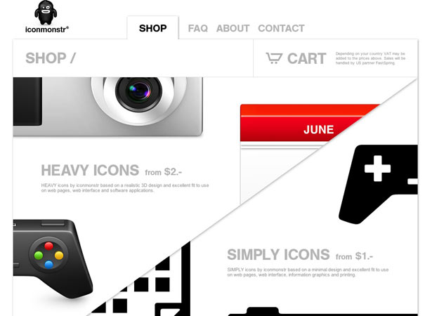
14. The Cassette
This website puts some Flash to very good use—what better way to sell shoes than to show how folks use them? I thought this was very innovative and the layout worked well with everything. Very hip and entertaining/exciting site. View Website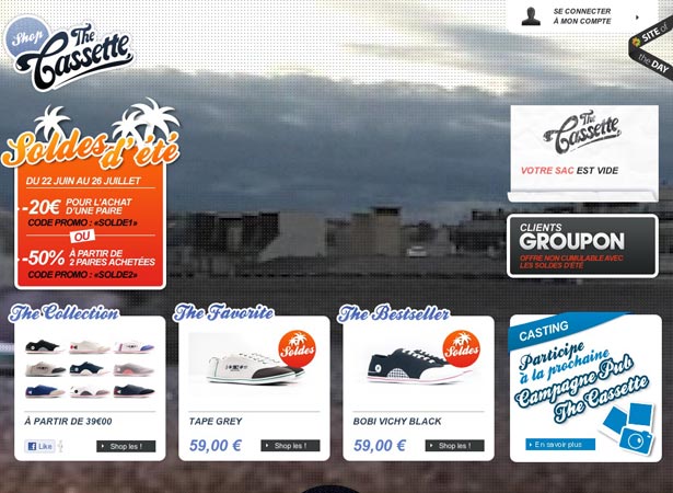
15. Mission Bicycle
Another bicycle shop with a clean site. I didn't know folks paid this much for bikes, but seeing as this is a custom made experience for the rider, I can see the purpose for the expense. There's a good amount of content on the homepage, but it works. I think the 'Build Your Bike' portion to could be a bit more extravagant but all in all it's an effective website. View Website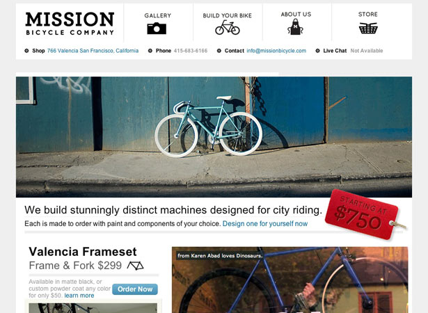
16. Six Minus
For the most part, this site design has a color scheme that draws me in as well as a concept that's a bit interesting. This site has no frills, just good design and domain selling. View Website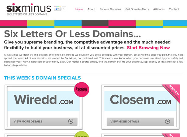
17. Short Hats
Right off the bat, I didn't realize the site was for infants and youth, but I won't totally blame that on the site's design. It isn't really a playful site as far as the color scheme but I think the idea was to go for a more modern look and appeal to the fashion savvy parent. Once you get that in mind, it makes sense. View Website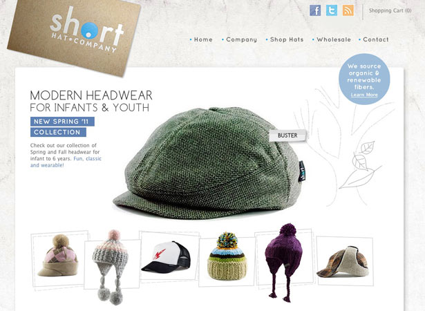
18. Minga Berlin
Socks? Socks! Once again, something new to me, but done very well. It makes me want to purchase some nifty socks. I like the way they're presented when purchased with the color chart. This site is a lot of fun. View Website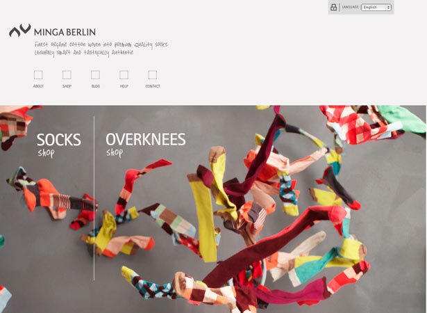
19. Les Galantes
This is another website that kind of makes you think that Flash COULD make a comeback if people tried hard enough. The effects on the site draw you in for sure—unfortunately, I'm not sure what everything says, but the great design breaks down all barriers. View Website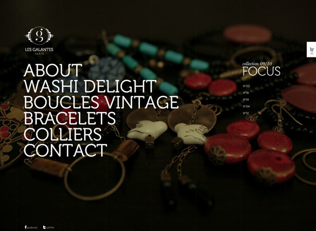
20. Saturdays Surf NYC
A lot of people use photo slide shows to promote a product or sale, but what I liked about this site is that they immediately used the opportunity to sell more a lifestyle than a product. It ended up getting me more interested in their products. Otherwise, it's a pretty solid and simple shop. View Website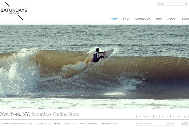
21. Script and Seal
Quite to the point. The border and drop shadow around the pictures of the artistic prints give it a bit more life than a picture of a print. There's really nothing to complain about for this site. View Website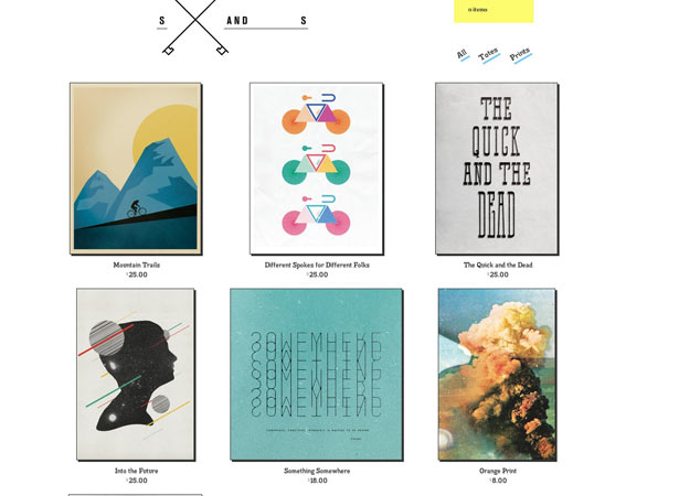
22. Theo
It doesn't hurt that they sell pretty neat items, but the ability to relay design messages is pretty amazing. These are neat looking items that have real uses. The colors and even pictures for this site are quirky and fun, but the layout and functionality are very user-friendly. View Website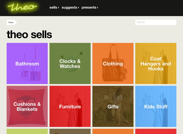
23. Rachel Comey Men
This website kind of takes the idea of The Cassette's website to another level. They use the animation for each photo—once again making some of us believe Flash still lives (especially if it lives with JavaScript). There isn't a lot of copy on the site, but there really isn't a huge need for any. View Website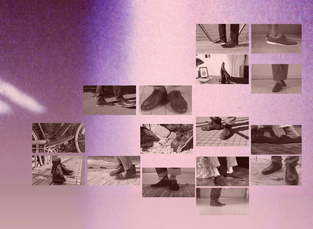
24. Dakine
Having the navigation on top of this store front graphic was pretty well thought out. You've got the active pictures in the back with this bold typography overlaid on it. Not only does it navigate but it really explains the content. View Website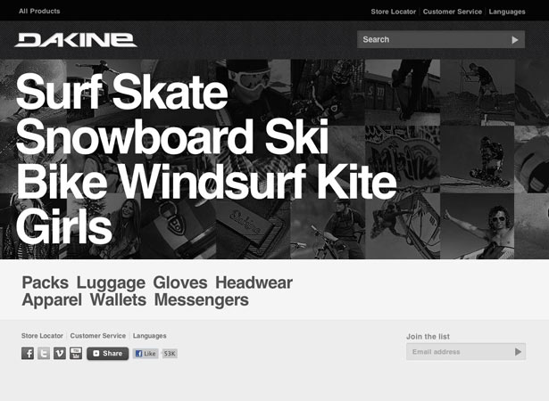
25. Whistles
I really enjoy how the product shots are full body images of women in the clothing. It isn't extremely innovative, but it does give it a modern touch. It's also a fluid grid which is such a great detail. View Website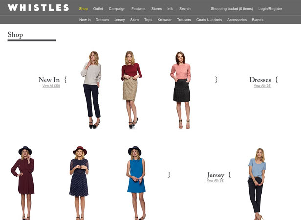
26. Supermarket Sarah
This is an extremely creative way to display your products. I didn't get it right away, but it's a great and playful idea. The support design is rather simple and minimalist. View Website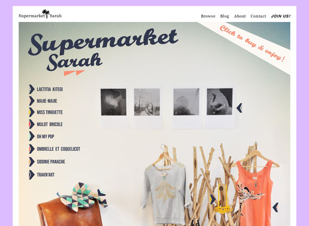
27. Freitag
The interactivity of this site is very good. I like that when you click on a product, it explains to you what the product is. Then you've got some pretty swell Flash integration. It's not totally necessary but it is a nice addition. View Website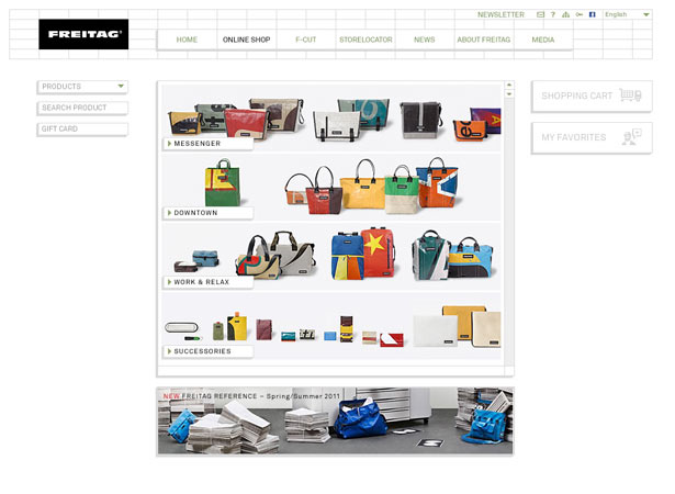
28. Sticker Mule
A super clean site that is easy to navigate and understand. It's a great tool for designers, as well. There isn't much to say other than they hit the nail on the head with their site. View Website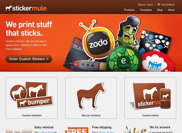
29. Heartbreaker Fashion
Vintage and retro are continued motifs and themes for this site. A retro theme is pretty trendy and popular, but most sites don't necessarily need it. This is a site that attempted and executed very well. View Website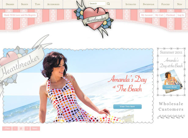
30. Nooka
This is another great example of getting a lot of different content to work together on the same page. The website doesn't have a stunning design, but there are some individual elements worth checking out; I mean, the watches themselves are extremely innovative and inspiring. View Website
Doing your best
Making an ecommerce website is no easy task—there’s a lot more planning involved than a regular informative site. It isn’t about just throwing your products online, but actually designing things to get the right message across to your potential customers. Take the time out to really think about these things and map it all out. Also, think about ways to make your shop unique and ways to integrate social media—so you can hear from your customers! Web shops are hard work but can really end up being rewarding. What are some things you like to see in e-commerce shops?Kendra Gaines
Kendra Gaines is a freelance designer from Virginia, USA. Connect with her.


Read Next

15 Best New Fonts, July 2024
Welcome to our monthly roundup of the best fonts we’ve found online in the last four weeks. This month, there are fewer…
By Ben Moss

20 Best New Websites, July 2024
Welcome to July’s round up of websites to inspire you. This month’s collection ranges from the most stripped-back…

Top 7 WordPress Plugins for 2024: Enhance Your Site's Performance
WordPress is a hands-down favorite of website designers and developers. Renowned for its flexibility and ease of use,…
By WDD Staff

Exciting New Tools for Designers, July 2024
Welcome to this July’s collection of tools, gathered from around the web over the past month. We hope you’ll find…

3 Essential Design Trends, July 2024
Add some summer sizzle to your design projects with trendy website elements. Learn what's trending and how to use these…

15 Best New Fonts, June 2024
Welcome to our roundup of the best new fonts we’ve found online in the last month. This month, there are notably fewer…
By Ben Moss

20 Best New Websites, June 2024
Arranging content in an easily accessible way is the backbone of any user-friendly website. A good website will present…

Exciting New Tools for Designers, June 2024
In this month’s roundup of the best tools for web designers and developers, we’ll explore a range of new and noteworthy…

3 Essential Design Trends, June 2024
Summer is off to a fun start with some highly dramatic website design trends showing up in projects. Let's dive in!

15 Best New Fonts, May 2024
In this month’s edition, there are lots of historically-inspired typefaces, more of the growing trend for French…
By Ben Moss

How to Reduce The Carbon Footprint of Your Website
On average, a web page produces 4.61 grams of CO2 for every page view; for whole sites, that amounts to hundreds of KG…
By Simon Sterne

20 Best New Websites, May 2024
Welcome to May’s compilation of the best sites on the web. This month we’re focused on color for younger humans,…