 Clean, elegant, and beautiful web design is often a matter of personal perspective. I look at hundreds of websites every week, and several of them stand out to me, but not all of them are necessarily effective.
Too often designers boil a concept down too far, producing a final design that is nothing more than text and a grid. While these minimal designs have their aesthetic appeal, particularly when paired with excellent typography, they risk falling short of notice.
Personal opinions aside, there are certain features of a design that allow it to be proudly labeled as clean or modern and enhance its usability and likability on a universal level. Simplicity is not a design trend, but rather an attribute of good design.
Photoshop grants us a versatile set of tools for creating depth and interest, and invites us to integrate subtle detail where we would leave a blank space. You need only a handful of these tools to infuse the qualities of modern design into a layout. By mastering them, you can create clean designs that express functionality clearly and effectively.
1. Space
White space allows for the visual separation of design elements without the use of boxes, lines, or additional graphics and is possibly the most important aspect of modern design. It is essential to content presentation and readability. When used correctly, white space gives your layout its clean and elegant feel. Guides and Grids are available in Photoshop to help you position elements precisely. The grid overlays your entire document whereas the guides can be set manually. Use guidelines early to set invisible borders, margins, and padding used to define your white space. Create a guide by hitting Ctrl+R (Win) or Cmd+R (Mac) to enable the ruler and then click the top or left ruler to drag a guideline to your desired position. Here are some additional shortcuts to help you manage guides while you work:- To move a guideline: Ctrl(Win) or Cmd(Mac) and click the guide
- Show/Hide guides: Hit Ctrl+; (Win) or Cmd+; (Mac)
- Show/Hide the grid: Hit Ctrl+' (Win) or Cmd+' (Mac)
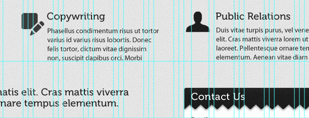 Enable your Smart Guides under View > Show > Smart Guides. Smart Guides appear automatically when you draw a shape, align text, or create a selection or slide and will save you the work of setting up guidelines for these elements in advance.
Aligning objects using guides and grids makes your design easier to digest and will give the overall result a more polished look.
2. Depth
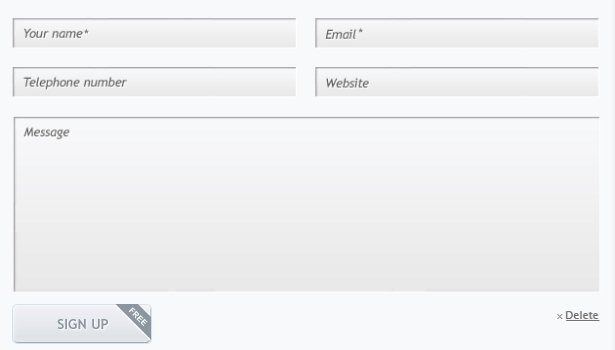
Depth created with light and shadow makes your elements appear crisp and real. Shadow effects can be applied to any object, selection, or text layer, but the trick is to choose a color that matches the background and forgo the default black.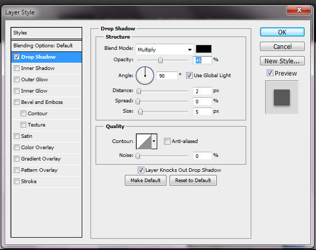 Not all shadows must be dark. Combine the Inner Shadow effect with a white or light-colored Drop Shadow to create a sunken or "letterpress" feel with text or form fields.
3. Detail
Both the gradient tool and the gradient layer effects play a large role in clean and modern design. Gradients are present in every aspect of modern styling, from shadows and highlights to backgrounds and buttons. To access the gradient tool, hit Shift+G. To create a gradient, click the canvas, drag, and release. This tool is best used for large areas such as backgrounds, lights, or radial shadows. When working with individual elements such as sections, buttons, or icons, the Gradient Overlay layer effect is a more efficient means of establishing surface styles or textures. This tool is accessed by double-clicking the element layer and selecting the "Gradient Overlay" checkbox.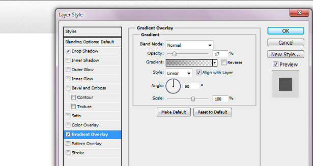 Use this effect to give subtle dimension to your buttons and navigation bars, or to mimic the style and texture of paper or metals.
4. Definition
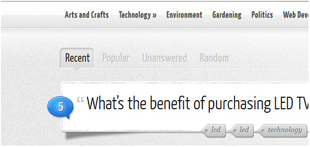
By over-defining edges and borders, you ensure your elements have proper contrast. The Stroke layer effect will outline elements such as text or buttons where you need an equally weighted outline on all sides. Using this effect will free up the Inner and Drop shadows to extend your options. It is tempting to head for the pen tool to draw straight lines and horizontal rules, but if you want to apply gradients or shadows to the line, it is easier to use the Single Row Marquee Tool, which is tucked discreetly behind the Rectangular Marquee Tool. Use the Single Row tool on a new layer and a white or light-colored drop shadow to create highlight lines along section borders or separators where you are not able to apply an effect to the element itself.
5. Interest
Clean and modern does not need to equal boring, white, or minimal. Clever use of texture and pattern will make your design stand out, while communicating style and brand. Use subtle techniques such as adding noise (Filter > Add Noise) or the Texture Overlay layer effect on background areas or interface elements to help set them apart. The more real and clear an element appears, the more enticing it is to the viewer.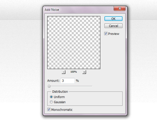

6. Perspective
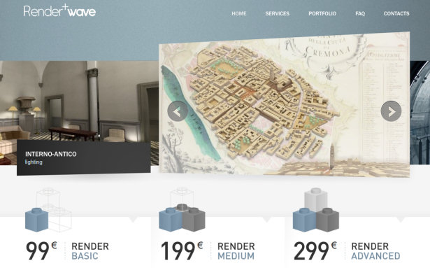
Perspective is the most underused technique in modern web design simply because ongoing trends focus consistently on symmetry and grids. By applying perspective to images and elements in your design, you can introduce depth, dimension, modernism, and interest to your design in one easy step. Perspective can be given to any shape or image by choosing the "Free Transform Path" option in the right-click menu and clicking the "Warp" button located in the tool options bar.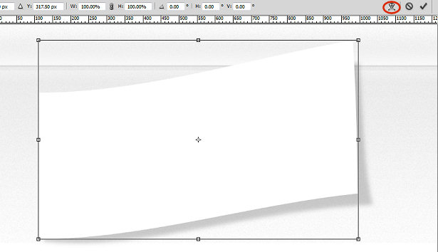 The illusion of perspective can also be produced by creating asymmetrical shapes or frames and using gradients and shadows appropriately to place the objects apart.
7. Readability
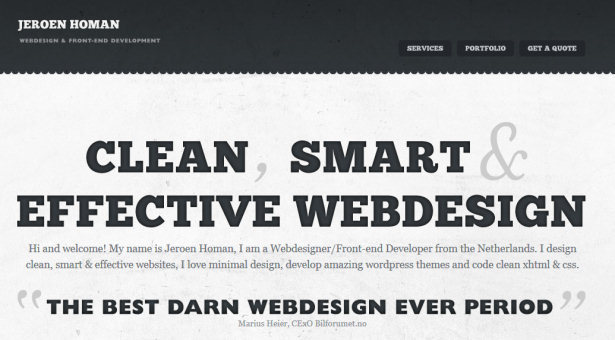
Strong type is well loved in the design community, and an even stronger component of clean design. It can replace imagery and graphics that may otherwise overcomplicate a design and convey the total essence of the above techniques in a simple and straightforward way. To add textures to text, convert your text layer to a Smart Object first by right clicking the layer and choosing "Convert to Smart Object." You are limited to layer effects by default unless your text is rasterized, a practice you want to avoid, even when designing for the screen. Converting to Smart Objects allows you to apply filters and other techniques to the text while preserving your editing capabilities in the event you need to change what the text says later. Remember that you have tracking and kerning options available to you when setting up text elements. Even if your text is destined to be reproduced in CSS, you should experiment with line and letter spacing early on to better visualize how your content will appear within the space you have given it. Also, remember to use "Crisp" or "Sharp" text to retain definition and clarity.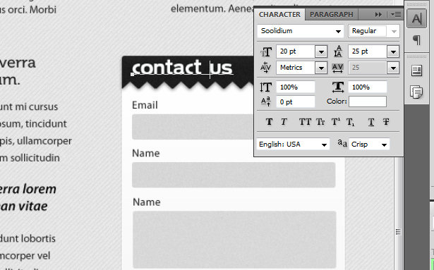 How you present your content in clean design is more important than any other style simply because there is less going on visually to distract the viewer. By using the tips above to space text and objects appropriately, add definition and interest, and set the content apart from the interface, your design will achieve optimal effectiveness.
 What do you think of these tips and do you have others you use on a regular basis? Please share below...
Vail
Vail is a long-time writer, designer and copy editor with a vibrant background in corporate business writing, music journalism and internet media design. Since 1996, her articles and photography have been published in various music magazines, poetry compilations, and business publications. When she is not hard at work designing something, she loves writing for Wix.com, the free website builder.
Read Next
15 Best New Fonts, July 2024
Welcome to our monthly roundup of the best fonts we’ve found online in the last four weeks. This month, there are fewer…
By Ben Moss
20 Best New Websites, July 2024
Welcome to July’s round up of websites to inspire you. This month’s collection ranges from the most stripped-back…
Top 7 WordPress Plugins for 2024: Enhance Your Site's Performance
WordPress is a hands-down favorite of website designers and developers. Renowned for its flexibility and ease of use,…
By WDD Staff
Exciting New Tools for Designers, July 2024
Welcome to this July’s collection of tools, gathered from around the web over the past month. We hope you’ll find…
3 Essential Design Trends, July 2024
Add some summer sizzle to your design projects with trendy website elements. Learn what's trending and how to use these…
15 Best New Fonts, June 2024
Welcome to our roundup of the best new fonts we’ve found online in the last month. This month, there are notably fewer…
By Ben Moss
20 Best New Websites, June 2024
Arranging content in an easily accessible way is the backbone of any user-friendly website. A good website will present…
Exciting New Tools for Designers, June 2024
In this month’s roundup of the best tools for web designers and developers, we’ll explore a range of new and noteworthy…
3 Essential Design Trends, June 2024
Summer is off to a fun start with some highly dramatic website design trends showing up in projects. Let's dive in!
15 Best New Fonts, May 2024
In this month’s edition, there are lots of historically-inspired typefaces, more of the growing trend for French…
By Ben Moss
How to Reduce The Carbon Footprint of Your Website
On average, a web page produces 4.61 grams of CO2 for every page view; for whole sites, that amounts to hundreds of KG…
By Simon Sterne
20 Best New Websites, May 2024
Welcome to May’s compilation of the best sites on the web. This month we’re focused on color for younger humans,…


