 Illustration is an incredibly versatile tool that can find many different uses in design. And when it comes to web design we can find an extremely wide variety of implementations.
Today I want to dig into some key ways that this tool has been put to work so we can draw new ideas to inspire and challenge the designs we produce.
Let’s begin someplace I seldom do, with a basic definition: Illustrated: 1) To make clear; 2) To make clear by giving or by serving as an example or instance; 3) To provide with visual features intended to explain or decorate.
It seems that in the real world of web design, illustration tends to perform both functions at one time. It beautifies while it clarifies. And if it is only doing one of these you might need to ask yourself why. Perhaps by putting illustration to work fulfilling both roles is the way to truly leverage the design element for all it is worth.
This is, of course, not to say that a design can’t be successful if it only handles one or the other; certainly it can. But in order to get the most out of our work I find that challenging our thinking is always helpful. As usual, let’s dig into some groupings of samples to see what can be done with this visual device. Along the way, consider if each approach provides clarity or decoration, or both.
Thematic illustration
The first approach to illustration that I want to cover here is the use of this style to produce an overall thematic approach. In this situation illustrations are put to work to establish an overall theme. Are we climbing mountains, visiting a space station or exploring a company’s office? While this approach doesn’t have to take us to a location, it quite often does. In other situations the style simply establishes an overall motif that the site follows. The reason we are interested in it here though is that it is being used to drive the overall design in a radical way. The illustration is not some small supporting element. Instead, it is the most prominent design element and control the entire layout.Get my boss to North Cape
In this sample the approach could not be clearer. The design of the site clearly echoes its most basic purpose. The illustration provides a visual reference to what the individual will do. And in terms of defining the illustration, the artwork provides decoration and beauty to the page. In this case the theme firmly establishes the site's purpose and helps the user buy in on the concept.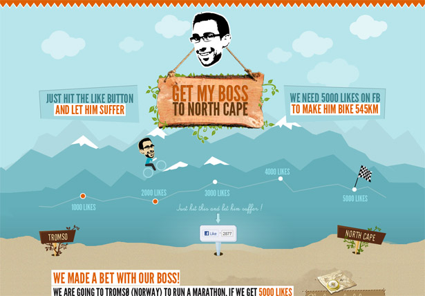
Launch Kit
A thematic approach doesn’t have to be so blunt in a way. Sometimes it can be a more natural part of a more typically structured site. In this case, the site is slightly unique in its layout, and the theme doesn’t force some over-the-top interface based on rocket ships. Instead, the theme is woven into the design in such a way that it communicates its decorative touches without interfering with the content. Here the illustration serves to decorate, but not clarify so much. This is not surprising at all and of course demonstrates that there is no formula to follow.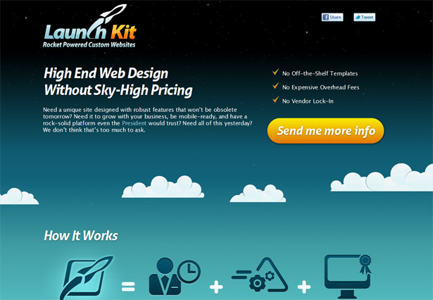
Atelier Anonyme Design
In other situations such as this one, the thematic illustration literally IS the site. It is not a supporting element, but rather completely becomes the design itself. Here the use of illustration clearly plays a decorate role. But I would argue that it also provides a great level of clarity to the visitor. This is a web site for a design agency. The design and nature of this site communicates a great deal to it’s visitors. As such, I am certain it serves as a massive filter to their client base. You will either be drawn in and love their playful and creative approach, or, you will be totally turned off by it. So to this point, I think it provides a great deal of clarity about the agency and their mentality.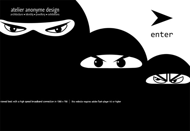
Allure Graphic Design
On this site the use of illustration plays a clear thematic approach as well. Though the site follows some standard layout formulas, the entire design is wrapped in a thematic layout. These elements drive not only the design of the site, but they merge with the main logo and copy used on the site. The theme is immersive and drives the entire message the site presents.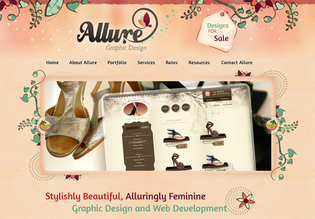
Additional thematic samples
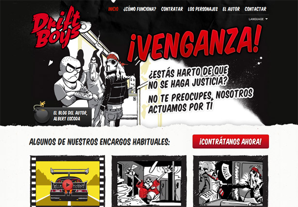
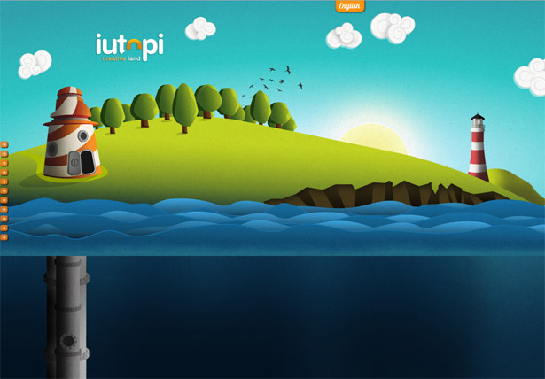
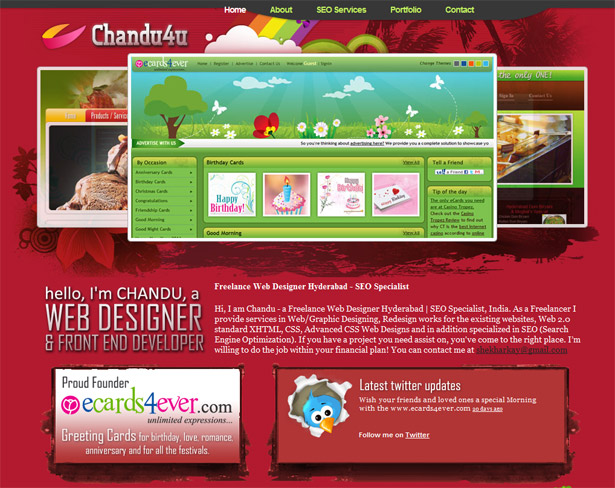
Here are some additional sites that make use of thematic illustrations to establish an environment or theme for a site. Chipmunk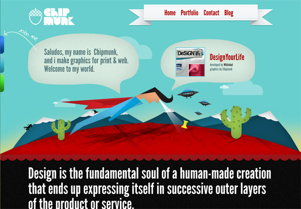 Drift Boys
 Iutopi
 Chandu4u
Mascots
How could I possible cover the idea of using illustrations without reviewing one of the most obvious: mascots? With this visual element the designers tend to personify the site, its product, or purpose with a character. Not only does the implementation of such an element vary, but the power and reasoning behind it does as well.inkFinder
In this design the illustrated mascot plays a rather clear role. Clear in that it echos the name of the product. It not only provides some life for the design, but it puts a face to it. In this way the audience has something a bit more unique to file away in their brain. Hopefully, the mascot helps to make a more memorable and unique experience that will help the product to stand out from the heard. Perhaps that is the most powerful purpose behind a mascot, to help something stand out. The great thing about an illustrated mascot like this is that it can be totally unique and specific to this product. Assuming it was custom made for this design it should be the only place this exact illustration exists.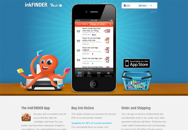
The Evnt
Ironically we find here another illustrated octopus-like mascot (what is a three legged sea creature?). In this case the mascot is obviously a much larger step away from reality: a robot three-legged creature with a brain in a bubble. While it might be an odd choice, it does provide a beautiful distinguishing element for the event. This unique mascot gives a cool visual element to connect with the event. It takes on a life all its own and really connects people with something concrete. I suppose this is exactly the purpose of a mascot. This site's design is beautiful, but consider how dull it would be without this crazy mascot in place. Producing such an element isn’t easy, but it is extremely effective in this situation.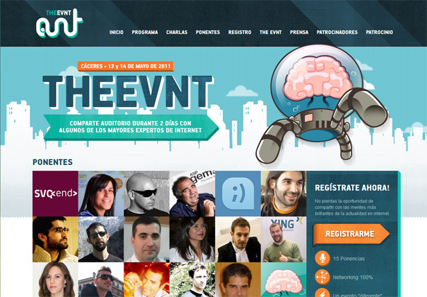
Big Eye Creative
For an example of a non-octopus based mascot take a look at the Big Eye Creative site. Here the mascot doesn’t play as much of a predominant role in the design. It does, however, add a lot of personality to it. Obviously the other illustrations and overall style of the site make for a less formal presentation. But the mascot in the logo is present throughout the site. This ensures their light-hearted style permeates the design.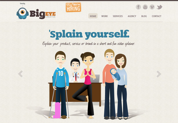
Additional mascot illustrations
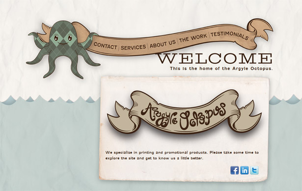
Here are a few extra samples of mascots at work in design. Including yet another octopus one; it would seem that is a popular one to use. Pioneer Records Management Argyle Octopus
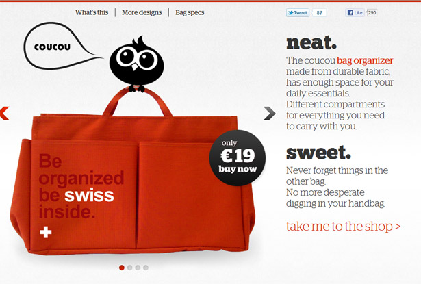
 Coucou
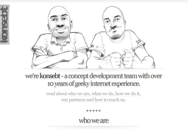
 Konsebt
Illustrated decoration
The next type of usage I would like to consider is what I refer to as thematic decoration. This is when illustration is put to work in a decorative way that doesn’t really provide a specific physical reference. For example, most often illustration includes pictures of people, animals, objects, or places. But in this case the illustration doesn’t so much represent anything real, but rather, it simply provides decoration to beautify the design in a way only illustration can. As always, let’s clarify this through some samples.1000 WP Themes
For our first example, consider the 1000 WP Themes web site. On this site the use of illustration provides an underlying framework and style for the site. But it does so in what is most purely decorative. The overall style feels like an illustration, and yet, it doesn’t have the typical humanistic elements. Now, I want to totally contradict myself. I think the style is predominantly decorative. But I can actually see how we could argue that it does provide a level of clarification for the site. The style the design is using connects with a certain audience. It says something about the style of the site, and the themes they might produce. In so many ways, the quality of the illustrated layout demonstrates the quality of work you might expect to see through this site. In that way, the clarification is perhaps more subtle and less in your face, but present nonetheless.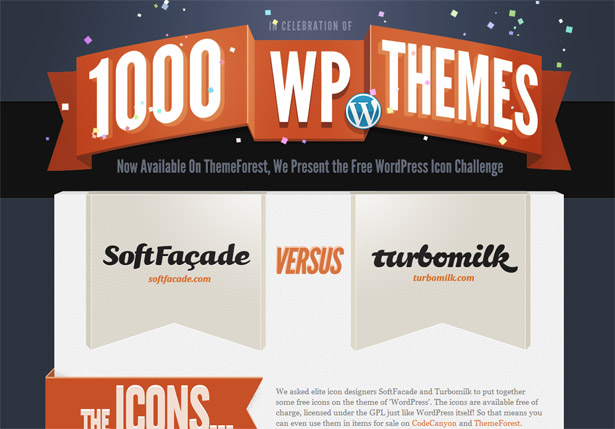
Coca-Cola History
On this web site we find another design driven by illustration. There are some illustrated elements here that demonstrate real things, but most of the thematic approach is established with pure decoration. Not only does this example demonstrate the approach, but it also shows that almost no technique is used in a purist fashion. The reality is that you will likely merge these elements I various ways.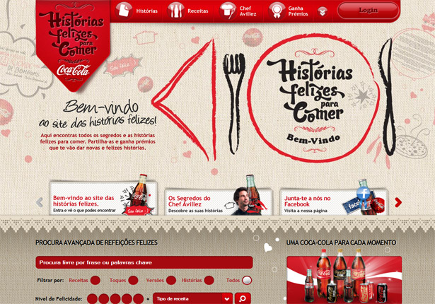
Metaphiziks
In this final example for decorative illustration you find some excellent background elements. Some of these are more tangible than others, but overall they are more about stylistic support elements than anything else. It is remarkable how beautiful such simple line drawings can be when combined with beautiful text, well chosen colors, and simple icons. The end result here is fantastic and remarkably beautiful.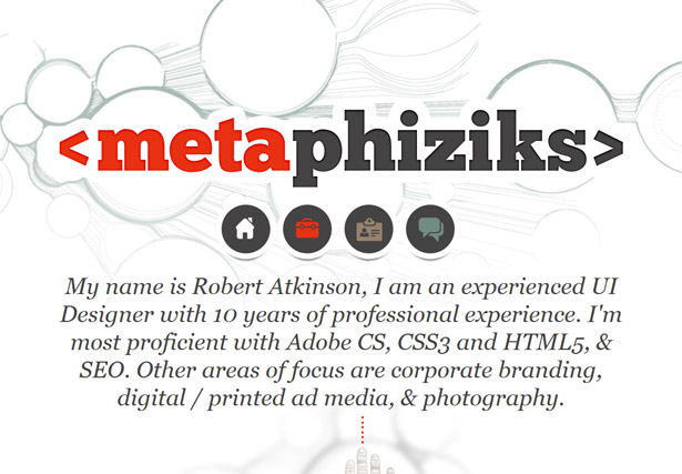
More designs with illustrated decoration
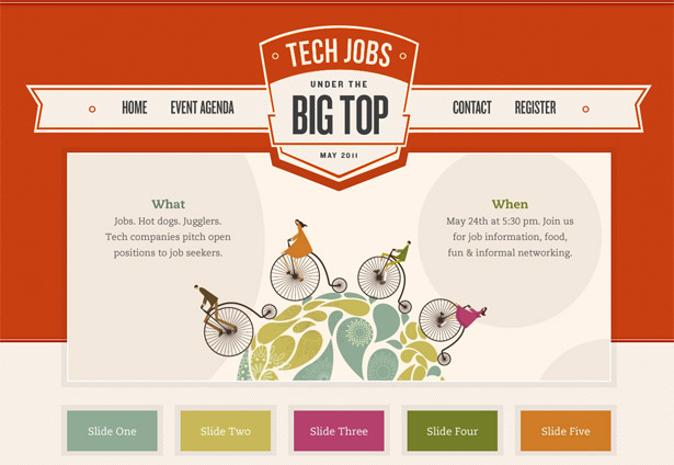
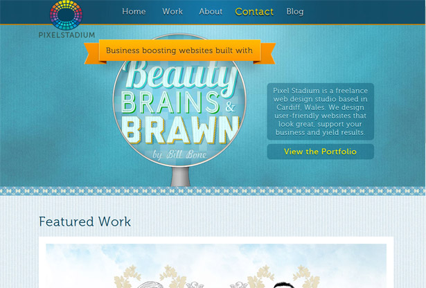
Here are some additional samples to round out this type of illustration in design. Moo’s Cupcakes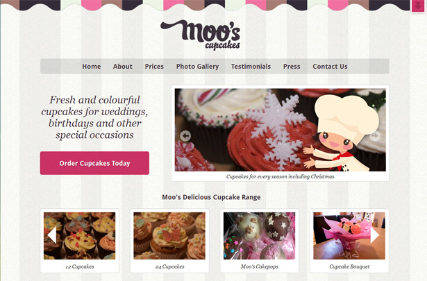 Tech Jobs
 Pixel Stadium
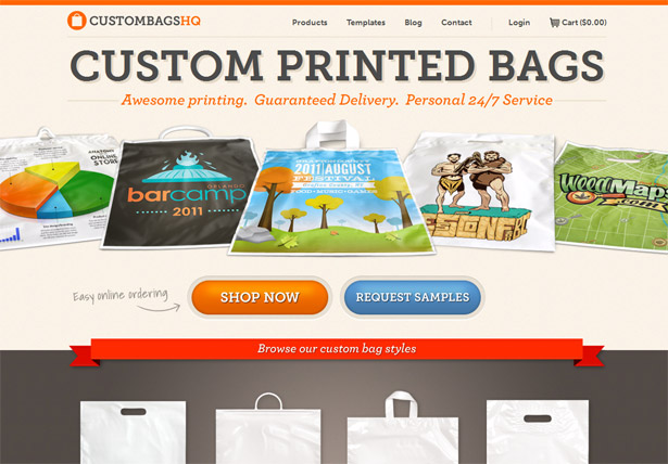
 Custom Bags HQ
Illustrated text
Hand rendered text is certainly not a new concept, and is something I have covered many times before. However, I have never considered such an approach with an illustration perspective. Hand rendering text is one popular variation of illustrated text, and a great solution for many creatives. For one, it is a great way to put all that hands-on art school training to work. Secondly, it’s a great way to produce something unique. After all, if you hand render some text it will be 100% unique. Even if you sketch over an existing typeface, it will still become a distinct creation.Rangus
This is a perfect example of illustrated type. The style is extremely gorgeous, totally unique, and very inviting. But it doesn’t stop there. The hand rendered type actually demonstrates the individuals talents. It shows he creates artwork with his hands and it connects perfectly to his animation skills. I particularly love the fact that it is all based on a chalkboard theme as it really ties the theme and elements together perfectly. In my opinion this site demonstrates how unifying illustration can be with the purpose and message of the site.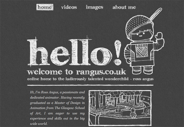
Joey Lomanto
In this case, the illustrated text is far more subtle. Instead of driving the entire direction of the design, it simply plays along nicely. In fact, on first take you might not even notice the hand rendered style of the large home page text. Granted, the text might actually be a font, but it has been used in such a way that it merges perfectly with the style of the site. Regardless, the style is beautifully unified and illustration plays many roles in the overall design.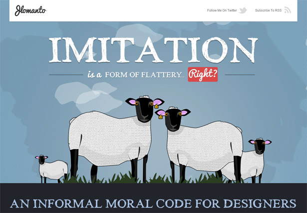
Go Live
Illustrated text need not be hand rendered though. As you will find in this example the text is styled in various ways that turn the text itself into bits of the overall illustration. The beauty of this approach is that it unifies the text with the other illustrations. This avoids a less unified feel where you simply have illustrations over standard web-based text. The latter can work, but in this case the impact of illustrated text is clear.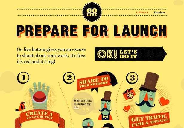
Additional samples of illustrated text
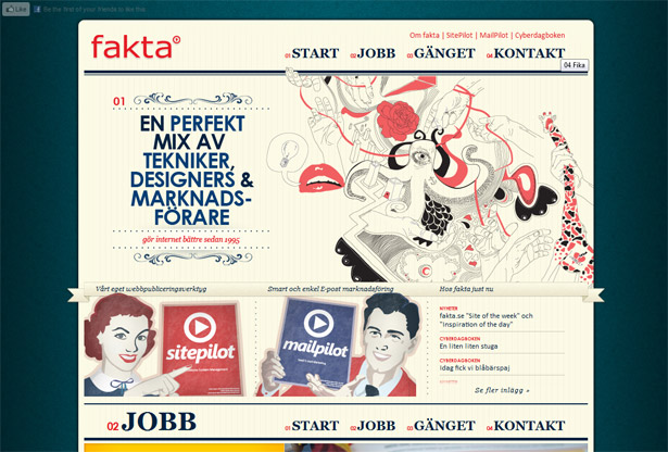
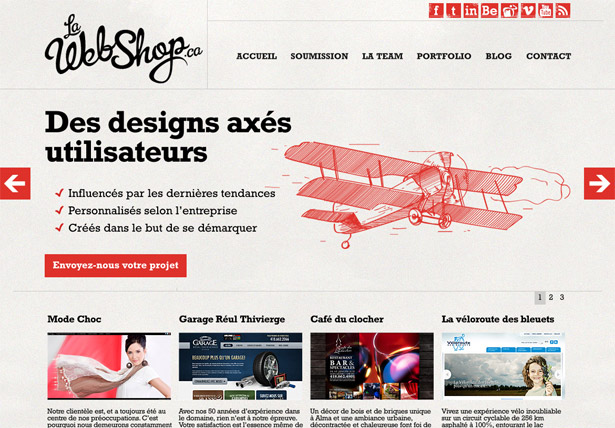
The following examples fit loosely into this category. I say loosely because it is hard to say at times as it is sometimes a subtle thing. In some of these cases the text merely feels like a work of art, so I have placed it into this collection. Contrast Rebellion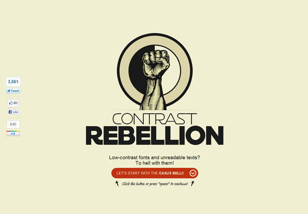 Fakta
Fakta
 La Web Shop
Informative illustrations
By the very definition of illustration, one of its purposes is to clarify and explain. So it is only fitting that we find some examples where the illustrations do this in with extraordinary clarity.Bookish
Let’s begin with the Bookish site. In this unusual layout we find that the illustrations very clearly symbolize the various points of the home page layout. Each block has a visual element that not only beautifies it, but more importantly, explains it. So much so that as a reader I almost don’t even have to read the copy. The devices artwork in the bottom left especially demonstrates this.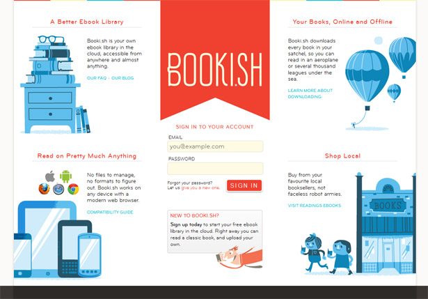
Conferize
In a much less prominent way the illustration in this design proves equally informative. The simple illustration single handedly demonstrates the topic of the site. It might not beat you over the head with its message, but it echoes the site's purpose beautifully.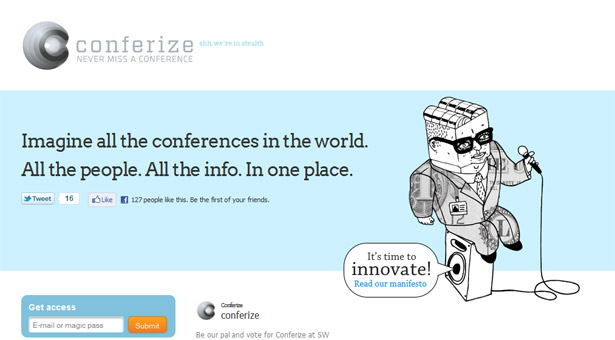
Activate
The illustration in this design not only communicates information about the event it represents, but also echoes the very purpose of the event. This particular event revolves around disconnecting from technology. It is a chance for people inundated with technology to escape it’s clutches. The illustration here shows us what attendees will be doing, so it is informative. And by it’s very nature, the illustration breaks with technology and roots itself in a purely organic feel, a fundamentally great way to communicate the sites purpose.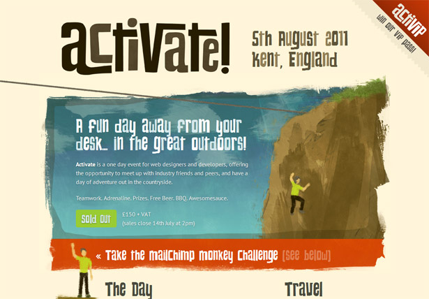
More informative illustrations
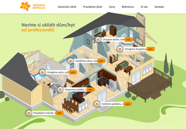
These extra sites also demonstrate the idea of illustrations that inform us. Some are tiny and basic icons, while others are immersive elements that fully define and represent the content. Vitality City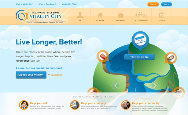 Uklizenodoma.cz
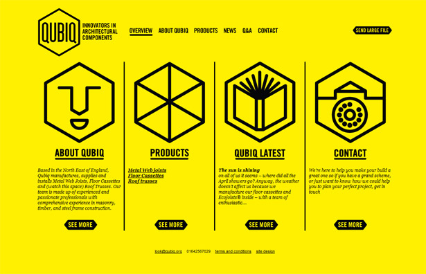
 Qubiq
Qubiq
A technological antidote
With the last example (The Activate site) we stepped into what I want to consider next, the use of illustration to break with the technology oriented feel of things. Sometimes it is necessary to disconnect from the web’s technological underpinnings and demonstrate a very organic feel. Illustration is one of the most powerful tools for accomplishing such an idea.Shipment App
This straightforward coming soon page is nothing short of extraordinary. And clearly how it accomplishes its beauty is radically simple. A single huge illustration single-handedly distracts us from the fact that this is a web page. It feels more like a work of art that happens to have a small interactive element, certainly a great way to make a huge impact on users and establish a memorable image.
Muziekpark
While this site doesn’t make use of quite as radical an approach, the illustration is still large and prominent in the layout. Here the animated imagery breaths life into the page. Combine this with a creative and unusual layout and it feels fully detached from the technology that drives it. Perhaps the fact that it doesn’t look like a normal site plays a powerful role in this as well. Also consider that the illustration in this case really helps to inform us of the theme of the site.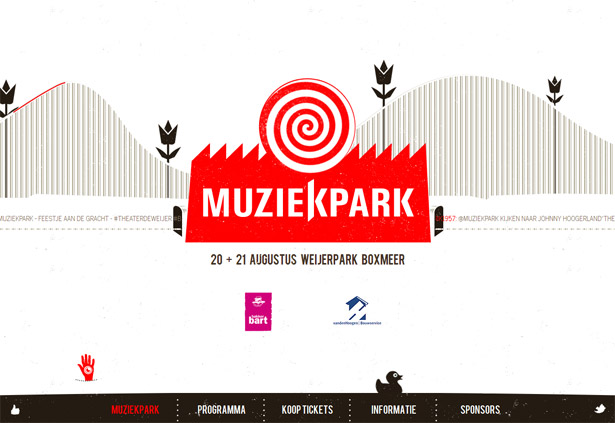
Egopop
In yet another atypical layout we find that illustration has been put to work. Here the artwork not only tells us about the individual the site represents, but they also break us out of the normal web mindset a visitor might have. Again, it feels more like an interactive work of art than a website. If this is your goal and need, then this is a great approach to consider.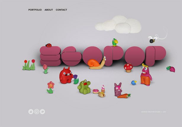
Zaarly
Compared to the previous examples, the Zaarly site stands in stark contrast. Although the design is ruled by a single large illustration, and this illustration serves to set a tone for the site, the underlying function is far more complex than these other samples. This site is an application that is intended to be used. And the illustration helps establish a certain set of expectations. It gives a light-hearted, humanistic feel that is clearly very organic and natural feeling. Imagine this in contrast to semi-minimalistic apps with no personality at all. The design gives the site a sense of approachability and shifts our expectations.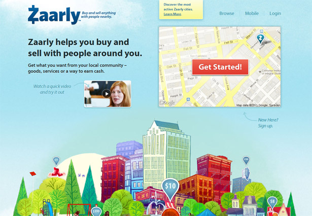
Conclusion
The use of illustration in design is an age-old practice, and its application to the web is clear. As with any design element I enjoy the process of reconsidering its purpose and use. Through such an effort I inevitably find that I gain a better understating of how it works, ways to leverage it for an intended purpose, and, ultimately, some fresh and inspiring ideas. How do you use illustration in web design? Please share your own experiences below....Patrick McNeil
Patrick McNeil is a designer, developer and writer; but above all things he is a passionate educator. He is a Professor of Graphic Design at the University of Missouri St. Louis where he focuses on teaching UX Design methods and front end development techniques. Patrick is also the author of the bestselling book series The Web Designer's Idea Book and the curator of DesignMeltdown.com. For more information about Patrick visit his personal site, pmcneil.com, or follow him on Twitter @designmeltdown.
Read Next
15 Best New Fonts, July 2024
Welcome to our monthly roundup of the best fonts we’ve found online in the last four weeks. This month, there are fewer…
By Ben Moss
20 Best New Websites, July 2024
Welcome to July’s round up of websites to inspire you. This month’s collection ranges from the most stripped-back…
Top 7 WordPress Plugins for 2024: Enhance Your Site's Performance
WordPress is a hands-down favorite of website designers and developers. Renowned for its flexibility and ease of use,…
By WDD Staff
Exciting New Tools for Designers, July 2024
Welcome to this July’s collection of tools, gathered from around the web over the past month. We hope you’ll find…
3 Essential Design Trends, July 2024
Add some summer sizzle to your design projects with trendy website elements. Learn what's trending and how to use these…
15 Best New Fonts, June 2024
Welcome to our roundup of the best new fonts we’ve found online in the last month. This month, there are notably fewer…
By Ben Moss
20 Best New Websites, June 2024
Arranging content in an easily accessible way is the backbone of any user-friendly website. A good website will present…
Exciting New Tools for Designers, June 2024
In this month’s roundup of the best tools for web designers and developers, we’ll explore a range of new and noteworthy…
3 Essential Design Trends, June 2024
Summer is off to a fun start with some highly dramatic website design trends showing up in projects. Let's dive in!
15 Best New Fonts, May 2024
In this month’s edition, there are lots of historically-inspired typefaces, more of the growing trend for French…
By Ben Moss
How to Reduce The Carbon Footprint of Your Website
On average, a web page produces 4.61 grams of CO2 for every page view; for whole sites, that amounts to hundreds of KG…
By Simon Sterne
20 Best New Websites, May 2024
Welcome to May’s compilation of the best sites on the web. This month we’re focused on color for younger humans,…


