 In this article, I'm going to examine the science behind making successful UI icons before teaching you how to make your own embeddable icon font.
From designing the individual icons to converting them for
 @font-face embedding, and even licensing them for distribution, we shall be using only free software and online services. How about that? You will not need to rely on any of the esoteric knowledge required to make successful alphanumeric typefaces; just an eye for designing things that may appear very, very small.
Ultimately, you should go away with a process for making design elements that extends far beyond the manufacture of simple icons.
Before we continue, something should be said about what exactly we are trying to achieve by using icons in our designs in the first place, and what makes one icon more successful than the next. Theory before application. In order to do this, we must consider the icon's role as part of semiology.
What makes a good icon?
Semiology, in the broadest sense, is the study of sign systems, how we contribute to their formation and maintenance, and the impact they have on our understanding of the world within and without us. Whenever you consider a part of your design work from the perspective of what it signifies — what it is saying to your audience or what concepts it is recalling for them — you are considering your design as a semiotician. Although semiology, like linguistics, does cover language, there are many more things on a website that “say” something without words, such as colors, typefaces and the shapes that we call icons. One should be wary that what these things say has a strong cultural dimension. In China, the color red can signify good fortune whereas, in many Western countries, it is used to denote danger. (Based on an image by ell brown)
The term “icon” has a special meaning in the field of semiology. An icon is an artifact that signifies something by resembling it. Take, for instance, a map pin icon. As a shape that resembles a “real” map pin, it is able to signify it. In turn, the real map pin brings to mind all sorts of meaningful concepts. Among these are abstract concepts such as location as well as less abstract concepts, like the map to which the pin might belong.
Some so-called icons are not truly iconic. The ubiquitous RSS icon, with its dot and two concentric circle segments, no more resembles syndication than the words “Really Simple Syndication” resemble it. The configuration of shapes that constitute the RSS icon signify RSS by convention alone; we have agreed that this is what they are for. An RSS icon is more properly called an RSS symbol.
 By now, I hope we have established that successful web icons should meet one or both of the following two criteria:
- A strong resemblance to a real thing, for example a print icon that resembles an actual printer
- Establishment and, therefore, familiarity as a recognizable symbol within the sign system
Icon fonts gaining popularity
Icons have long been considered a good way to enhance UI designs because they provide a visual shorthand that assists the comprehension of an otherwise purely textual message. Sheets of icon images are circulated throughout the web design community like contraband, each set promising to make your design shinier, more enticing and more clickable than the last. Compared with images, the idea of using embedded fonts for icons is a relatively new idea. However, it is one that is gaining considerable traction due to the many inherent advantages over the image (orbackground-image) method. I wrote about some of these advantages on my tiny blog back in early September. Chris Coyier obviously had a similar idea, introducing the idea to a (much, much) larger audience weeks later. Drawing on the two posts and others, I've compiled this comprehensive list of features:
- They are easily resized without degradation (because they are essentially vectors)
- Recoloring the icon is as trivial as recoloring text. For example,
color: orangefor an RSS icon - Many icons are grouped into one file, necessitating just one http request
- As Chris points out, they are shapes that have transparent “knockouts” which work in browsers as early as IE6 (unlike alpha PNGs)
- For icons that should appear adjacent to text, alignment and wrapping are non-issues (because they are text)
- You can apply CSS3 effects via
text-shadowandbackground-clip:textthat respect the shape of the glyph - Unlike with SVG, cross-browser support is easy to achieve
Problems
In Chris's words,using fonts for icons is a good idea, I'm telling you. Nonetheless, the status quo regarding icon font usage is not ideal. Firstly, most of the quality fonts available, called things like Pictos, Fico, Klepto, Cheetos, Ponyo and Sailor Moon (I may have got some of these wrong), are paid-for fonts. In practice this means there are really two problems:
- You might have to part with money
- Whether you have to part with money or not, you'll have to accept somebody else's filthy design work
 Aside from automated crawler programs, I'm assuming that it is mostly web designers who will be reading this article. I'm a designer myself and I don't think I'm alone in resenting the idea of having to compromise my own design by relying on someone else's handiwork. Naturally, I'm even less enamored with the thought of paying for the privilege. I know what icons I want to use and I know precisely how I want to tailor them to my overall design. I want that control.
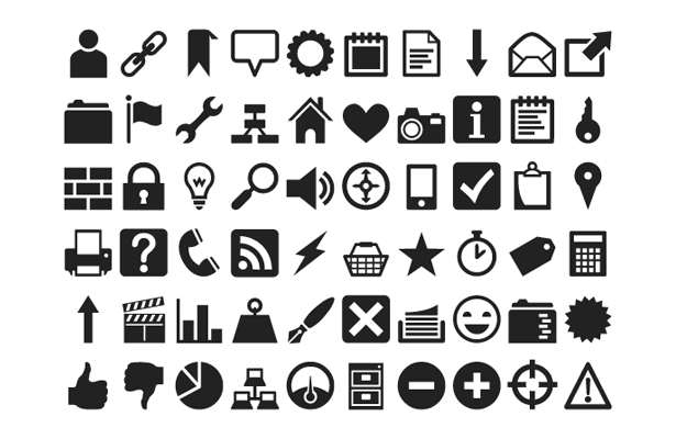
After some searching, I was eventually introduced to the possibilities of Inkscape's SVG Font Editor. With a little practice using Inkscape and the help of an online converter to transform my SVG font into a TTF, I was able to make "Heydings". This font is now included in Simurai's list (as linked to by Coyier's article). I'm not trying to sell you my font (it's free anyway) but I think it makes for a pretty good proof of concept:
Making icon glyphs with Inkscape
Setting up Inkscape
Let's get started by downloading and installing Inkscape. You should also use my icon font starter template, located in the resources folder of this GitHub repository (more on this GitHub project later). Once you've opened this file in your new Inkscape installation you should set up your workspace by opening the following windows from the main menu:- OBJECT → FILL AND STROKE
- OBJECT → ALIGN AND DISTRIBUTE
- TEXT → SVG FONT EDITOR
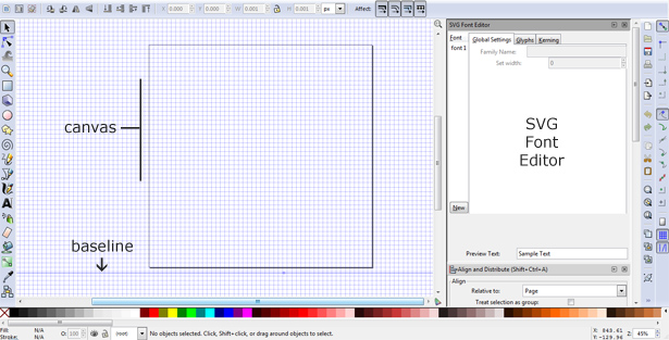 It's worth pointing out that the baseline guide is not below the lower boundary of the canvas by mistake: For reasons best known to somebody else, your icons should very slightly overhang the bottom of the canvas if you wish them to share the same baseline as adjacent typefaces. I've tested this with Georgia, Arial and a number of web fonts.
Making your first glyph
To define the glyph, click on the Glyphs tab in the SVG Font Editor pane, then click the Add Glyph button in the lower portion of the pane. It's not immediately clear on first inspection, but if you click on your glyph (“Glyph 1”) a field will appear which allows you to enter the character to which you'd like to assign your icon. We shall be making a simple star shape first of all, so I recommend you enter the character “s”, “S” or “*”: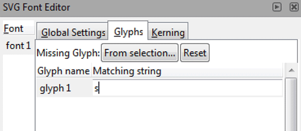 Now that we've defined the glyph's corresponding character, we need to make the glyph itself. Since we are just making a star this time, we should select Inkscape's helpful Stars and Polygons tool from the left toolbar and draw a star in the canvas. You will notice that this tool comes with options that allow you to change the appearance of the star. In my example, I've chosen 5 corners, a spoke ratio of 0.5 and a rounded value of 0.1.
Center the star horizontally using the Align and Distribute panel (which may be hidden below the SVG Font Editor) and drag the shape downwards to meet the baseline. With the grid turned off, the canvas should look something like this:
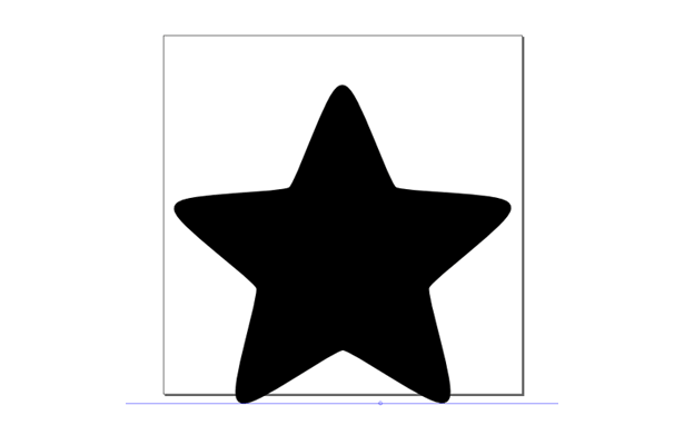 Glyphs in our icon font are just shapes; shapes with no colors, layers or gradients. So, to make our star a legitimate candidate for our font, we must convert it from an object into a path-based shape. To do this, select the star and choose PATH → OBJECT TO PATH from the main menu. Now, with the star selected, we can go to our SVG Font Editor, highlight the applicable “s” glyph and hit the Get curves from selection button:
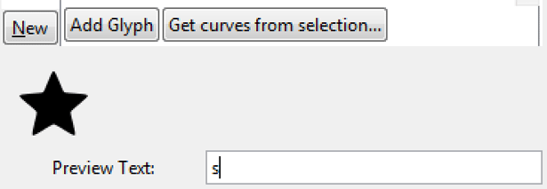
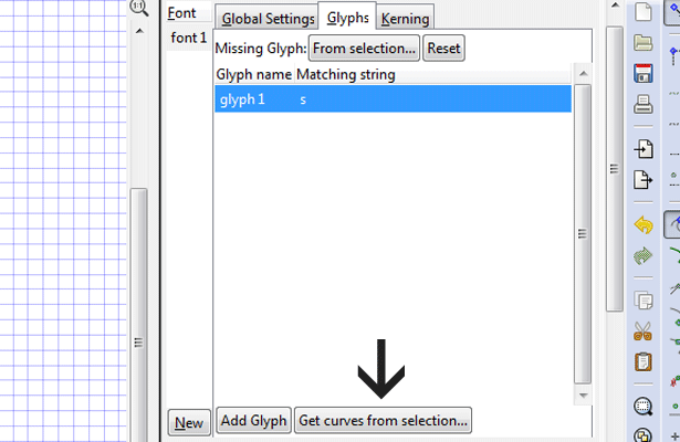 When you enter “s” in the Sample Text field, your star should now appear as a preview, like so:
Making more complex icons
You've now made your first scalable SVG font glyph. By using options from the Fill and Stroke pane, editing path nodes and combining objects and strokes you will be able to make much more ambitious icon designs. I don't want to go into a full Inkscape tutorial because we have a lot more to cover, but following these simple rules will stand you in good stead:- Stick to using black strokes and fills, if only to remind you that the icons are just shapes, not complex vector graphics. Coloring the icon is possible in the final product using CSS.
- All objects and strokes (lines) must be converted to paths using either PATH → OBJECT TO PATH or PATH → STROKE TO PATH
- Multiple objects and/or strokes used to make up one icon glyph should be combined together using PATH → COMBINE (or, in some circumstances, PATH → UNION)
- To cut shapes out of shapes (like using a cookie cutter) place the shape that will create the “knockout” over the main shape, select both and choose PATH → DIFFERENCE. White areas on black that look like “knockouts” will not suffice, as you will discover when you hit Get curves from selection See rule 1.
Preparing your font for embedding
Imagine that you have gone on to create a number of useful icons for your font by repeating the glyph spawning method that I have just described and saved the file as myicons.svg. Now, you'll want to prepare this icon library for use in web pages.Converting the SVG to TTF
The first measure you should take is to convert the SVG font into a more familiar and versatile format. TTF is the pre-eminent format for local installation as well as distribution. It also provides a good base for reconversion to meet@font-face requirements. Online services that allow you to convert fonts between formats include http://onlinefontconverter.com/, http://www.fontconverter.org/ and http://www.font2web.com/. My personal favorite, however, is http://www.freefontconverter.com/ because I don't get queued and I've never known it to return any glitches.
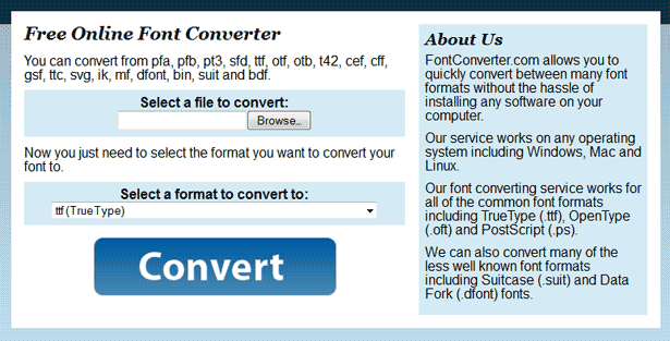 I won't patronize you by explaining how to use this resource. The successive file upload field, select element and gigantic Convert button speak for themselves, really.
Editing the font's meta info
Now that you have the TTF in your hand, I recommend you edit the generated meta data. Renaming, attributing and describing the font to your satisfaction makes it ready for installation, embedding and distribution. It's also a way to show that the font is your own work. Readers running Windows have the option of using the deceptively grand sounding Microsoft Font Properties Editor or the free-for-x-days Typograf. For Apple and Linux users, I implore those better informed than I am to help out in the comments.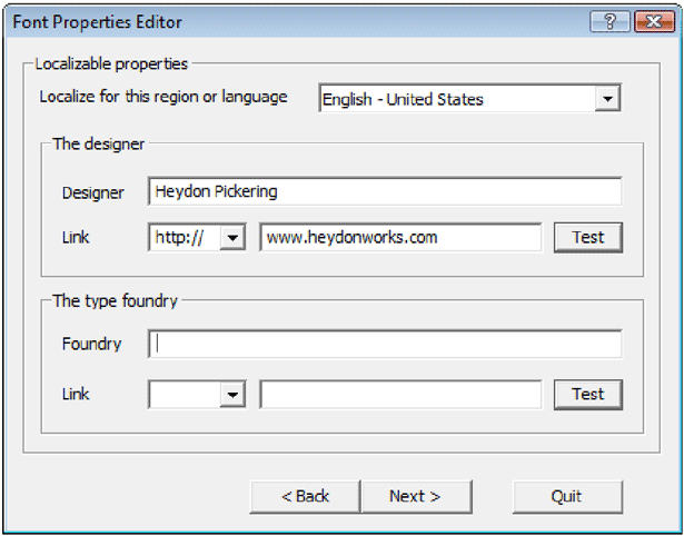 The clunky but serviceable Font Properties Editor
Important note: Although the Microsoft Font Properties Editor allows you to add author, description and license information, it doesn't seem to let you edit basic data such as the font name and postscript name. These fields are disabled. If you're using this particular piece of software, you'll need to locate and edit the prohibited values in the SVG code prior to TTF conversion. Open the original SVG in your favorite text editor (I use Notepad++) and edit the following:
Font Name: Found in tag,
 font-family attribute
Postscript Name: Found in tag, id attribute
Description: You ought to add a description (author, license etc.) in the tag. Please note that this is not equivalent to the TTF description text and will not be preserved through conversion; you'll have to add the TTF description separately.
Making the font embeddable
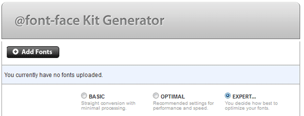 Once you've installed the TTF on your local system and previewed it a little to make sure nothing has gone awry, it's time to run it through Font Squirrel's @font-face generator. To make the outputted code as efficient and effective as possible there are a few options worth noting in the generator's expert mode:
Subsetting: The subsetting option allows you to include only the characters which you've delegated, reducing file size.
Remove kerning: Your icons will almost always appear in isolation, so kerning (added information regarding the proximity of characters to one another) is not necessary. This will, purportedly, reduce file size as well.
WebOnly™: If you're evangelical about people using your font as intended ‐ and not reverting to making images out of the glyphs in Photoshonk ‐ you can select this option. It may also better suit your licensing plan. I'll cover licensing now.
Distributing your font
If you are interested in releasing your font, it is considered good practice to give it a license. Many font websites will not carry your font without one. Since we used free, open source software to make the icons, it is fitting that we should distribute them as such. There are many licensing options available and investigating them is sometimes perplexing. The GNU General Public License is perfectly acceptable, but you may want to consider the SIL Open Font License. The main advantage with this license is the provision of a reserved font name: Other designers are permitted to modify your font, so long as they name it differently. In practice, this means that crimes against icon design cannot be carried out “in your name”. In the case of either license, you should include a version in a text file, as well as inserting the copyright notice and a link to the full license URL in the font's meta. Visit the respective licensing pages (linked above) for more specific instructions.
The end of CSS spriting
Why stop at making generic icons using SVG fonts? With the ability to make icons comes the ability to make more site-specific shapes, branding elements and decorations. Like CSS sprites, all of these visual elements can be kept in one file, reducing server calls to a singular http request. Unlike CSS sprites, the elements are both resizeable and not dependent on positional coordinates (background-position values) to display correctly. This makes them eminently better suited to responsive design.
Let's pretend I chose to use an SVG font to cover some basic design elements in my vaguely steampunk-like blog. A simple HTML table rendering of the component designs would look something like this:
color:maroon, but there's no need to adhere to flat colors; a multitude of CSS3 effects can be employed to add texture and tactility. For a little inspiration to get you started, examine this excellent gallery of CSS3-enhanced webfonts.
A quick note about screen readers
One problem with using fonts to display visual elements in this way is the impact on screen reader output. A visitor to the site who reads visually will see cogs, arrows and the like, but a screen reader will insist on reading out the characters that designate these designs. For uses of SVG font elements that are decorative, I recommend heeding Coyier's suggestion: Assign the vectors to the Supplementary Private Use Area of Unicode. Such characters should not be read out by readers.A collaborative icon webfont
As my JavaScript mentor, Rupert, pointed out to me the other day, using SVG fonts to create icon sets offers an interesting opportunity for collaboration. You see, SVG code ‐ which is a form of XML ‐ is highly standardized and easily human-readable. It is exactly the sort of source code suited to development using a “social coding” service like GitHub. The idea resonated with me for its semiotic implications: If the apprehensibility of an icon is determined by consensus, then surely consensus should also play a role in its formation. By collaborating over our icon “sign system”, only the most archetypal icon designs should emerge. We should be able to create icon vocabularies that truly belong to the communities for whom they should mean something. I have created a public GitHub repository to help foster this idea. Called Community Icon Font, the repository's code base is not complex: A close inspection of the preceding Inkscape tutorial and a quick read of the project page should give you everything you need to get involved. If you are new to GitHub, try looking at their help pages or asking your neighborhood techie (that's what I do).
Heydon Pickering
Written for Web Designer Depot by Heydon Pickering. Heydon likes coding tags for people who like writing words. Twitter: @heydonworks
Read Next
15 Best New Fonts, July 2024
Welcome to our monthly roundup of the best fonts we’ve found online in the last four weeks. This month, there are fewer…
By Ben Moss
20 Best New Websites, July 2024
Welcome to July’s round up of websites to inspire you. This month’s collection ranges from the most stripped-back…
Top 7 WordPress Plugins for 2024: Enhance Your Site's Performance
WordPress is a hands-down favorite of website designers and developers. Renowned for its flexibility and ease of use,…
By WDD Staff
Exciting New Tools for Designers, July 2024
Welcome to this July’s collection of tools, gathered from around the web over the past month. We hope you’ll find…
3 Essential Design Trends, July 2024
Add some summer sizzle to your design projects with trendy website elements. Learn what's trending and how to use these…
15 Best New Fonts, June 2024
Welcome to our roundup of the best new fonts we’ve found online in the last month. This month, there are notably fewer…
By Ben Moss
20 Best New Websites, June 2024
Arranging content in an easily accessible way is the backbone of any user-friendly website. A good website will present…
Exciting New Tools for Designers, June 2024
In this month’s roundup of the best tools for web designers and developers, we’ll explore a range of new and noteworthy…
3 Essential Design Trends, June 2024
Summer is off to a fun start with some highly dramatic website design trends showing up in projects. Let's dive in!
15 Best New Fonts, May 2024
In this month’s edition, there are lots of historically-inspired typefaces, more of the growing trend for French…
By Ben Moss
How to Reduce The Carbon Footprint of Your Website
On average, a web page produces 4.61 grams of CO2 for every page view; for whole sites, that amounts to hundreds of KG…
By Simon Sterne
20 Best New Websites, May 2024
Welcome to May’s compilation of the best sites on the web. This month we’re focused on color for younger humans,…


