
 When you already have a full plate of client work, it can be difficult to get into new technologies. Responsive design is a big buzz-phrase right now, but it’s unnecessary to force it on a client unless their users will see a benefit from it.
At 352 Media Group, we recently saw an opportunity to make a fully responsive site for a client, Purple Communications. They make software for people with hearing loss who would otherwise be unable to make a phone call. Using their computer, phone, videophone, or other electronic device, they can communicate with others using a video relay service.
Purple Communications offers apps for multiple phone platforms, so a substantial part of their web traffic is from mobile devices. Looking at their traffic, it became abundantly clear that the best solution for the client was to make a fully responsive site. Our company has done mobile sites before, but this was the first time that one site would serve both the mobile and desktop users. If you’re interested in incorporating some responsive web design features into your company or client’s website, here are some tips to keep in mind:
When you already have a full plate of client work, it can be difficult to get into new technologies. Responsive design is a big buzz-phrase right now, but it’s unnecessary to force it on a client unless their users will see a benefit from it.
At 352 Media Group, we recently saw an opportunity to make a fully responsive site for a client, Purple Communications. They make software for people with hearing loss who would otherwise be unable to make a phone call. Using their computer, phone, videophone, or other electronic device, they can communicate with others using a video relay service.
Purple Communications offers apps for multiple phone platforms, so a substantial part of their web traffic is from mobile devices. Looking at their traffic, it became abundantly clear that the best solution for the client was to make a fully responsive site. Our company has done mobile sites before, but this was the first time that one site would serve both the mobile and desktop users. If you’re interested in incorporating some responsive web design features into your company or client’s website, here are some tips to keep in mind:
Don't compromise on design
There are designs that lend themselves to a responsive, fluid layout far more than others. A minimalist design with a simple background might only require a few tweaks to become fluid. So it can be very tempting to push this kind of design on the client, as it would make developing the site remarkably easier. One of 352 Media Group’s competitive advantages is our award-winning design. So while initially I was succumbing to the temptation of a minimalist design, I changed my mind and decided to figure out how we could use the design we wanted in a responsive way. There are three different ways to develop a responsive design. I've created names for them so that they'll be easier to discuss:Stepped Layouts
This technique uses media queries to serve different stylesheets at set resolutions. Traditionally you would create three different designs – one for desktops, one for tablets, and one for phones. This method was very appealing because of my decision to design a site that would potentially be quite complicated to make fluid. Essentially, we could take our existing process of developing a site and just multiple it by three. We could even use server-side detection to make sure you only got the CSS file you needed for your resolution. The trouble with this technique is you have to pick which resolutions you’re going to optimize your site for. Most people use numbers based on the iOS devices—768px for the tablet design and 320px for the mobile design. But with all of the different smart phones and tablets available, there are tons of different resolutions. Because the apps Purple Communications makes are available for many different phones, we wanted to make sure every user would have an optimal experience. So while I think this technique would be perfect for an iPhone app website, it wasn’t going to fit our needs for this project.Fluid Grid
Another way to make your site responsive is by using percentage widths so that everything will scale with the viewport all the way down to 0. With this method, you set up your percentage-based grid that will do the main legwork. Past that, you utilize media queries to tweak things for different screens. This method has a distinct advantage over the stepped method because the site will be optimized for every single resolution, as opposed to just a handful. The disadvantage here is that certain designs can be exponentially more difficult to develop. I considered this method for a long time, trying to figure out how to code troublesome areas. We utilize a common method referred to as the sliding doors technique that can allow you to use a single image to make a fluid width container with intricate edges. If you aren’t using it, definitely look that tutorial over because it’s a fantastic technique. But even with that and a few other things in our arsenal, it still would have been quite difficult to pull off.Fluid/Stepped Hybrid
In the end, I decided on a combination of the two methods. We would utilize the stepped technique to make one design for desktop, and then one big step down to a fluid design under 960px wide. This meant that for desktop, our process was nearly the same as a normal project. We support resolutions 1024x768 and up for desktop, so we make our sites at the standard 960px width (which allows for a vertical scrollbar and other browser and OS chrome). Any viewport under that width would normally just show a scrollbar. Instead of trying to pick which resolution made the most sense for a tablet size, we just set it up where anything under the site width of 960px would trigger the fluid layout. That way no one would ever get the dreaded horizontal scrollbar.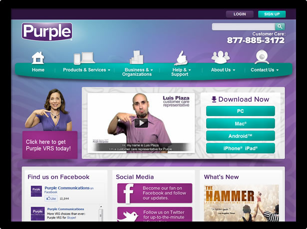 As a little added bonus, a tablet (that’s at least 960px wide) viewing the site in landscape mode gets the full desktop version. Keep in mind that you will probably want to do some small tweaks with media queries to make links and buttons easier to touch.
Mobile first
If you’ve done any research on responsive design, you have surely heard the mantra of developing for mobile first, which is definitely something you should be keeping in mind. Since we’ve all been in the mindset of developing sites for desktop computers for so long, it’s very easy to look at media queries the wrong way. You might think, “All I need to do is make some new images and put some new CSS in a media query, and my site will work on phones as well.” While this is true, it’s also completely backwards. As amazing as smartphones have become, they’re still not as powerful as desktop computers. In addition, content is frequently consumed on the go. But by following our earlier logic, we’re optimizing a site for less-powerful devices on slower connections by adding CSS and images. Once you think that through, you realize that you have to alter your workflow. The hardest part is making this work forimg tags. If you’re following best practices, you’ll have optimized images for different resolutions. The challenging part is making sure that you only download the image you need. This issue could be an article all on its own, but fortunately Jason Grigsby has already compiled a list of responsive image methods and their pros and cons.
Past that, all we have to get working is the CSS. With our “mobile first” mentality, we’re going to make a mobile.css file that contains all of the CSS that mobile needs. This will be the only file that phones download. Then, we’ll make a second file called desktop.css that will build upon and overwrite the base styles established in the mobile.css. In order to make sure that phones/tablets get mobile.css only and desktops get both mobile.css and desktop.css, our links look like this:
<link id="uxCSSMobileFiles" runat="server" type="text/css" href="css/mobile.css" rel="stylesheet" />
<link id="uxCSSFiles" runat="server" type="text/css" media="screen and (min-width: 960px)" href="css/desktop.css" rel="stylesheet" />
This combination has worked so far for everything that I’ve tested except for versions of Internet Explorer before 9. Because our company standard is to support IE7+, we had to make one last tweak. You’ll notice my code above is running at server. On the backend, we’re checking for the version of IE, and if it’s less than 9, we change the media attribute to “screen, projection”. This worked the best for us, but if you aren’t running anything server side, you could use respond.js instead. This does mean that our desktop CSS won’t be as optimized as it would be on a normal site. But, the only sacrifice we’re making is downloading a lightweight CSS file that we then overwrite where we need to. We needed to compromise somewhere, and because we keep chanting, “mobile first,” we know this is better than the alternative.
Still offering the client control
At 352 Media Group, we believe in giving the client full control over their site. After we finish development, we hand over all of the source code. We also provide a custom-built CMS that lets the client manage the pages, navigation, and site map. Like design, this is a standard that we didn’t want to compromise on, so we had a few additional hurdles. One of the hardest interfaces to transfer over to mobile is the navigation. This is an issue because it’s also one of the most important interfaces on a site. The first question you have to ask is whether mobile users need quick access to the entire navigation, or if they are only interested in a key few. If they need all of the navigation, and there are more than four main-level items, I think that one of the best solutions is to group them in a<select> element. This will utilize the phone’s OS for an optimized interface that the user is already used to.
On Purple Communications, there were only two main-level items that mobile users primarily looked at: Products & Services, and About Us. So on phones, we only show those two items, and then group the rest into a “More” dropdown.
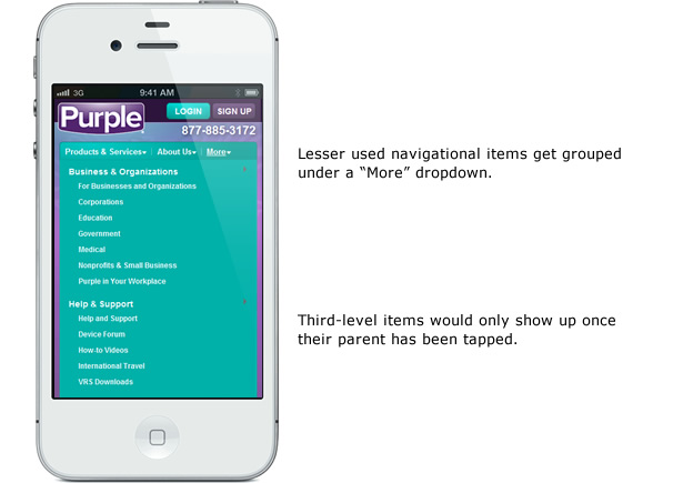 But one of the things that we offer the client is control over their navigation. For this site, the only thing they wouldn’t have control over was which items collapsed into the menu, so we made sure to clear that with them first. But past that, they can add any items or sub items that they want. To accomplish this, we used a second copy of the navigation nested in the last item named “More.” We hide it on desktops, and on mobile we’re hiding the top-level items we don’t want displayed. In the nested list, we’re then hiding “Products & Services” and “About” so users don’t see those twice. This gives our client full control without having to manage a separate mobile navigation (which would become a chore with duplicate items).
For the content areas, we provided training to the client so they would know the best ways to structure their content. We also set up a few classes that they could use on things like YouTube videos, buttons, and calls to action, which ensured things they added would be optimized for all resolutions.
But one of the things that we offer the client is control over their navigation. For this site, the only thing they wouldn’t have control over was which items collapsed into the menu, so we made sure to clear that with them first. But past that, they can add any items or sub items that they want. To accomplish this, we used a second copy of the navigation nested in the last item named “More.” We hide it on desktops, and on mobile we’re hiding the top-level items we don’t want displayed. In the nested list, we’re then hiding “Products & Services” and “About” so users don’t see those twice. This gives our client full control without having to manage a separate mobile navigation (which would become a chore with duplicate items).
For the content areas, we provided training to the client so they would know the best ways to structure their content. We also set up a few classes that they could use on things like YouTube videos, buttons, and calls to action, which ensured things they added would be optimized for all resolutions.
Creating a reusable framework
The last thing to keep in mind when exploring new technologies like responsive design is to make sure your company will be better prepared for the future. You’ll want everyone working on the project to not only be thinking about the client and their users, but also about what lessons can be applied to other projects. Always be on the lookout for projects like this that can get your foot into the door of new areas so your company will keep advancing along with the industry. At 352 Media Group, we already have established frameworks for both our programmers and our front-end developers. For instance, we split all of our CSS into multiple files to compartmentalize components and keep everyone organized. We have separate files for structure, typography, forms, widgets, etc. When you’re moving into new technologies, you can take what looks like the easy road and just abandon things that don’t seem to fit and create new things for the future. But by doing so, you’re abandoning years of experience that have been working well for you so far. I oversimplified our code earlier that links the CSS files. We could have required that responsive sites used those two new CSS files instead of the normal framework. But instead, with a little creativity, we figured out which files should be applied to mobile, which should be applied to desktop, and which should be split across the two. We were able to adapt what we already had working into something that will work well for us in the future.Brent Walbolt
Brent Walbolt is an interactive designer at web design company 352 Media Group and an admitted nerd. His responsibilities include establishing the company standards for front-end development, researching new technologies, and teaching interns and new hires.


Read Next

15 Best New Fonts, July 2024
Welcome to our monthly roundup of the best fonts we’ve found online in the last four weeks. This month, there are fewer…
By Ben Moss

20 Best New Websites, July 2024
Welcome to July’s round up of websites to inspire you. This month’s collection ranges from the most stripped-back…

Top 7 WordPress Plugins for 2024: Enhance Your Site's Performance
WordPress is a hands-down favorite of website designers and developers. Renowned for its flexibility and ease of use,…
By WDD Staff

Exciting New Tools for Designers, July 2024
Welcome to this July’s collection of tools, gathered from around the web over the past month. We hope you’ll find…

3 Essential Design Trends, July 2024
Add some summer sizzle to your design projects with trendy website elements. Learn what's trending and how to use these…

15 Best New Fonts, June 2024
Welcome to our roundup of the best new fonts we’ve found online in the last month. This month, there are notably fewer…
By Ben Moss

20 Best New Websites, June 2024
Arranging content in an easily accessible way is the backbone of any user-friendly website. A good website will present…

Exciting New Tools for Designers, June 2024
In this month’s roundup of the best tools for web designers and developers, we’ll explore a range of new and noteworthy…

3 Essential Design Trends, June 2024
Summer is off to a fun start with some highly dramatic website design trends showing up in projects. Let's dive in!

15 Best New Fonts, May 2024
In this month’s edition, there are lots of historically-inspired typefaces, more of the growing trend for French…
By Ben Moss

How to Reduce The Carbon Footprint of Your Website
On average, a web page produces 4.61 grams of CO2 for every page view; for whole sites, that amounts to hundreds of KG…
By Simon Sterne

20 Best New Websites, May 2024
Welcome to May’s compilation of the best sites on the web. This month we’re focused on color for younger humans,…