 Blogs can often be left out in the cold when it comes to design. A lot of us discount the need for intensive design when it comes to our blogs—whether for our companies, or ourselves.
But it is important that we realize every aspect of our identity online should be designed in a clean and intuitive way with whatever style you prefer. This elusive aspect of web work is something we should constantly strive for. And yes, that includes the time we spend working with blogs.
A lot of the time blogs get lost in the shuffle because we think of them as massive 'text dumps' when it comes to information architecture, and that certainly is one aspect to their identity, but they have more potential than that.
Some blogs, when designed properly, are great for displaying our stream of thoughts as well as some portfolio information, while others are great for displaying both news and photography.
The point is, a blog can be a great holding tank for a variety of topics and the display of which comes down to the specific design choices you make throughout. In the past five years a lot of things have come along to make the world of blogging much easier than it used to be. For instance, WordPress is great and themes do a lot of the design work for us, but if you'd like to spice it up then there are a few things you need to keep in mind.
Similarly, if you want to edit the theme's navigation or layout then there are also some things you want to be aware of. That goes for almost any blogging engine, or when working on your own. Here are several of my thoughts on what I think those important bits are.
Working with shadow-based text effects
Text effects are great ways to present header titles, navigation bars, or content introductions on your blog provided that they're used sparingly. Let's go over a few of the more common effects that we see overused on the web, and how to use them properly.Retro text
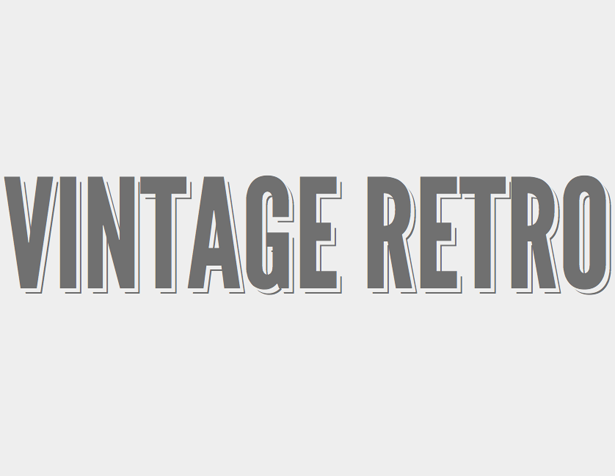 It's often a pain to work with, but it seems to have been making the rounds the past year and a half despite that fact. And with the advent of CSS3 it is much easier to manipulate and find that perfect shading. I have an example here to help us understand how to create this effect properly, then I will go over when to and when not to use it. The name of the game with retro effects is no blur radius, and using dual shadows. So let's say we are working with a dark colored font (#707070I), we want to use a dual text-shadow to achieve this. It would look something like this:
That should give you a nice double border effect, with a very 70's look to it. Of course, to get that true 70's vibe you may have to add all kinds of color manipulation, but at least we have the base effect down. Remember though, don't go too crazy with the coloring - and definitely don't go too crazy with the x and y offset for the text shadows (as it could turn out to be unreadable very fast). When it comes to using a retro effect, the best use is in header titles. This is not an effect that would work well with small size text, or descriptive information. Best to let it stick on the top of your blog and leave it alone.text-shadow: 5px 5px 0px #eee, 7px 7px 0px #707070;
Letterpress & inset text
Another popular feature that CSS3 shadow's offer are an inset type of styling, otherwise known as 'letterpress'. This is definitely a hot topic in the world of CSS3 text effects, so let's go over how to do them properly. An inset styling is typically achieved by offsetting the Y-axis a tiny amount to give the impression of a subtle highlight within the immediate background of the text. Often times you will see it being used as an opposite to the background contrast (light vs. dark) so that the effect has more of an impact on the reader. Let's run down an example.
Light background, dark text:
body { background-color: #888; text-shadow: 0px 2px 3px #666;}
Dark background, light text
body {background-color: #666; text-shadow: 0px 2px 3px #888;}
That will give off a really nice layered/inset effect that can be used for headers, or blog titles. Use it sparingly though throughout the site, because nothing is worse than someone overusing text-effects. In this case, it would be okay to use in various sub headers or with various sidebars or footer elements - but just make sure you don't use this on an descriptive information. Again, any shadow based text effects should not be used for such a thing.
Working with images on your blog
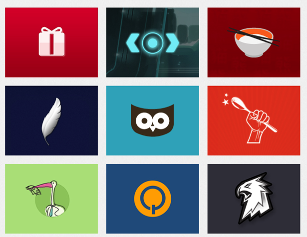 Let's face it, as web designers we love to show off our work. We love it so much that even our personal blogs can become riddled with portfolio images, and captions strewn about. So why not consolidate those two? The best way to work with caption information is to contain relevant info within the image itself, and the best way to do that is to implement a CSS3 effect directly on the image.
If you are curious as to why I think this is such an important aspect of working with images, just head on over to the Google Chrome web store (add-ons). They are able to display thousands of images without any text around them at all, and yet still give us enough information on said image to know whether we want to click on it or not. That is brilliant, and a lot more of us should be implementing such a technique to not only clean up unnecessary caption text, but also to give a boost in user experience.
So let's re-create that for your personal blog, but with your own touch, so that you can display client info for website images that you have worked on:
 First we need to create a container for the image, and then inside of that we need to create another container for the text that we want to use. In this case, we will be using a sub-header, a bit of text, and a link. then inside that create a container for the text and links to the client's website we are displaying.
Next comes the CSS styling for the image boxes, and the basic bootstrapped styles we are going to use before the text effects come into play. This is pretty standard, and is completely down to your personal preference, so I won't go into what to do with the plain ole' CSS. Just use whatever you prefer. Now comes the important part, the styling for the way that the text is going to be displayed within the image itself. There are a number of ways to do this, but personally I like to keep things simple and use an "ease-in-out" method to work with text inside of images. Getting really fancy with text transitions is nice in some cases, but in a lot of cases it is better to keep it as simple as possible. Something to consider though, is what sort of blog you are writing for. Is it a fashion blog? Or is it an adventure blog? Because if so you may want to customize the transition technique you use to what you think best represents said theme. In this case though (as we said earlier), we are going to work from the point of view of a web designer who wants to have some descriptive text move or transition over his portfolio images. So let's dive in to how we do this transition and then we will go over what is happening.<div><img src="portfolio_image.png" alt="" /> <div> <h2>Website Title</h2> <p>Some descriptive text about the project</p> <a href="#">Read More</a> </div> </div>
.image_container img { transition: all 0.3s ease-in-out; }
 .image_container .text_container { background-color: (whatever you want);
 transform: translateX(-300px); opacity: 1; transition: all 0.4s ease-in-out; }
In this section, what we are doing is getting the actual image to transition out, and prepping for the text to transition in. We are also identifying that we want the image to leave along the X axis and not the Y axis, so that means we will have a sliding door type of effect.
Now we will set up the mouse hover-over effect, and get the transition to start upon this event.
.image_container:hover .text_container { transform: translateX(0px);}
 .image_container:hover img { transform: translateX(300px);
 transition-delay: 0.1s;}
 .image_container:hover p { opacity: 1; transition-delay: 0.4s; }
As you can see here, what we did was similar to what we did above for the image. We simply brought in the text after the image left, and gave it a + 0.1s delay to make sure it goes smoothly. And that's about it.
There are a bunch of other ways that you can customize this, and definitely a ton of other transition effects you can use. Remember though, if working with more advanced transitions don't use them in such a repetitive manner as you would with something as simple as this. They are best used sparingly to emphasize key images.
Working with creative layouts
Often, as web designers, we will see the overly used trends that have been abused year in and year out, and want to be a voice for change regarding them. But going against the grain can be a risky practice, especially if you aren't doing it properly (as a note—I am not saying that you have to be creative in the 'right way' because there is no 'right way' to be creative). I mentioned that because I think being creative is by its very definition the unbinding of ourselves from constraints or creative norms, and in fact I would encourage that, but I also think we should be wary of the reason such norms have been ingrained in our web design themes and what we can do to be innovative with them, with that in mind.Unique text alignment
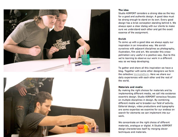 When working with text in creative or unique ways (ie not 12pt Arial center-aligned) it is really important to remember that your text is not the main content on the page anymore. It has been relegated to a supporting element, albeit an important one.
One question to always ask yourself when working with text is, "Does this balance well with the rest of the page?" It may be adjacent to some portfolio work, some random image, or perhaps just various other columns of text on either side of the page.
But regardless of what it is adjacent or perpendicular to you need to try and balance it out as best you can. Think of grid lines, and study the grid systems out there if you have to (960 grid system is what I'd recommend). Study where they have placed the grid layout on the page, and then ask yourself why—then deduce if yours is equally as balanced as that. Imagine that you are laying your content along the grid system itself, and try to think of what it would look like in that case—then replicate that in CSS.
Creative footers
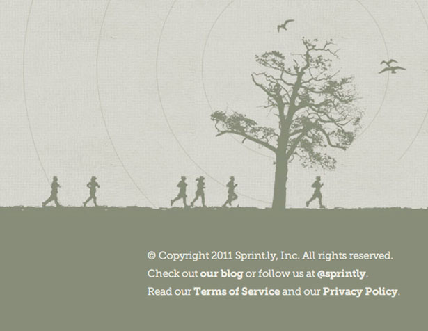 Creative footers can really add a lot of personality to a blog or website, and it seems sort of counter-intuitive to think so. Whether we are talking about jQuery scrolling that lands us in a beautiful footer themed in an 'under-the-Earth' style, or just for the bottom of a company's website or blog, it is a very minute part of a website but one that can have a very powerful impact. Opinions are divided on to what extent this is the case, and why it might be. I have my own theory: when we read a webpage we start at the top and move to the bottom, and it is at the foot of the page that we draw our conclusions about what we've read.
When working with a creative footer there are a few things you want to keep in mind, and a few best practices I have noticed being used in the footers that I love the most. For me the most important part of using a footer in this manner is to use the same color scheme as your website, but with a different contrast. This is incredibly important, and you can of course pump the contrast up or down on the font color with respect to the contrast you are working with for the overall theme on the footer in the first place.
The important thing to remember is that you want to have a nice deep style-set for this section. It gives a nice sense of completion to the site. When using this technique you can make the footer as tall as you'd like, within reason, because with the contrasted color scheme it is obvious that this is indeed a footer section.
As far as content goes, in the world of the new-footer it can be appropriate to add your logo illustration and blog name, your social network images or links, your latest tweet, and even a nice simplistic contact form. This can of course vary based on your personal preferences, but my point with showing all those options is to illustrate the evolution from past to present in what is appropriate to display at the bottom of a website or blog.
jQuery scrolling
This is one of my favorite ways to do navigation on a website, and I also think it is specifically applicable to navigating posts on a blog. There are a few different ways to work with jQuery for this, so here I will go over what is one of my favorite (and easiest) ways to do some smooth scrolling and then go through what is happening and how to implement it.
This is code for vertical scrolling, as horizontal scrolling isn't as desirable.
$(function() {
 $('ul.nav a').bind('click',function(event){
 var $anchor = $(this);

$('html, body').stop().animate({
 scrollTop: $($anchor.attr('href')).offset().top
 }, 1000);

event.preventDefault();
 });
 });
What is going on here may look complicated, but it is actually pretty simple. We are opening a function on the ".class" of the navigation element that we are going to be clicking on (we call this a click-event). So the most important part here is to title the class of the list(ul) to "nav". Or replace the "nav" in the code with whatever you have named that class. And that is pretty much it for a functioning jQuery scroll, just toss that into your website and link to the minified jQuery (preferable) and you are all ready to go.
As far as usage goes with a vertical scroll like this, it is pretty unlimited. A lot of people enjoy not having to scroll down manually, they really enjoy the page doing it for them, and it also is a brilliant way to move from post to post on a website, especially if those posts are large. I often will use it to move to various portfolio sub-sections within my blogs or through categories on websites. It is also a perfect technique if you are theming your site such as doing a day to night theme, or themes for your categories or blog topics.
I hope some of these techniques were helpful for you all in trying to apply various design aesthetics on your blog. Remember, use them sparingly and try to make sure you act with your best judgement when using flashy effects. We have an obligation to create an internet that's not as ugly as certain aspects of the outside world have become. Though it is a large and overwhelming task, it is one that we can accomplish if we just take it one design at a time and one day at a time. Keep it simple, keep it honest, keep it real, and always put passion in what you do— as it will always shine through.
What are your best blog design tips? What makes for a really great blog design? Let us know in the comments!
Dain Miller
Dain Miller is a former Presidential Innovation Fellow at The White House, and mentor for developers at starthere.fm. He now works to lead engineering teams at a distributed media company. You can find him on Twitter @dainmiller or at his website
Read Next
15 Best New Fonts, July 2024
Welcome to our monthly roundup of the best fonts we’ve found online in the last four weeks. This month, there are fewer…
By Ben Moss
20 Best New Websites, July 2024
Welcome to July’s round up of websites to inspire you. This month’s collection ranges from the most stripped-back…
Top 7 WordPress Plugins for 2024: Enhance Your Site's Performance
WordPress is a hands-down favorite of website designers and developers. Renowned for its flexibility and ease of use,…
By WDD Staff
Exciting New Tools for Designers, July 2024
Welcome to this July’s collection of tools, gathered from around the web over the past month. We hope you’ll find…
3 Essential Design Trends, July 2024
Add some summer sizzle to your design projects with trendy website elements. Learn what's trending and how to use these…
15 Best New Fonts, June 2024
Welcome to our roundup of the best new fonts we’ve found online in the last month. This month, there are notably fewer…
By Ben Moss
20 Best New Websites, June 2024
Arranging content in an easily accessible way is the backbone of any user-friendly website. A good website will present…
Exciting New Tools for Designers, June 2024
In this month’s roundup of the best tools for web designers and developers, we’ll explore a range of new and noteworthy…
3 Essential Design Trends, June 2024
Summer is off to a fun start with some highly dramatic website design trends showing up in projects. Let's dive in!
15 Best New Fonts, May 2024
In this month’s edition, there are lots of historically-inspired typefaces, more of the growing trend for French…
By Ben Moss
How to Reduce The Carbon Footprint of Your Website
On average, a web page produces 4.61 grams of CO2 for every page view; for whole sites, that amounts to hundreds of KG…
By Simon Sterne
20 Best New Websites, May 2024
Welcome to May’s compilation of the best sites on the web. This month we’re focused on color for younger humans,…


