 It’s not uncommon for a designer in today’s world to pay little attention to how type is laid out, especially with the ever-so-convenient default settings of heading tags and web safe fonts found universally on the web.
If we as interactive designers we’re able to take a little more time when it came to typography, than the results would show a unique, well thought of design as oppose to a “run of the mill” creation.
There is a good chance that the majority of designers and designs you admire showcase good examples of typography.
I’ll show you a few steps I take in tweaking set type to be more appealing than those default scenarios of 24px H1 tags along with 13px set in Times New Roman.
Don't settle for default settings, everyone is doing it.
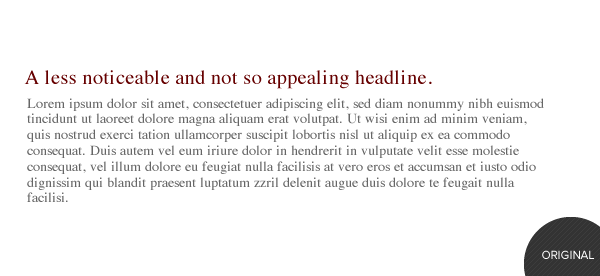
Here we have the ever- so- common look of a heading along with a chunk of body copy to follow. This doesn’t exactly pull you in or set itself apart from all the other samples just like it, right? So to make the text sample more visually appealing, first, we’re going to make a few changes with our font selection.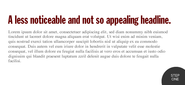
Choose a font that will have more visual weight with your headline
Although font selection is not exactly “typography,” it is in fact a quintessential component to help the type on a page distinguish itself from other elements. With the onset of @font-face, massive amounts of choices are available to designers anywhere. Here I’ve used an Extra Condensed Gothic Style font that can easily be found on a free font site like FontSquirrel.com. If we stop and think about it, the name “Condensed” should mean something, because it is in fact more dense than it’s normal book style family member, which is exactly what we want out of a headline:, something that pulls the user in and truly sets itself apart from the body copy. It certainly succeeds in grabbing your attention better than the original but there are a few things we could do to further improve the text.
Make it more appealing with two lines of CSS
The immediate change is in the letters; they’re all capitalized now but they also now have negative kerning between each of the letters (a technique carried over from newspaper design). Both of these characteristics can easily be accomplished through CSS, {text-transform:uppercase; and letter-spacing:-Xpx;}. By making these two lines worth of coding changes, it results in a major improvement in visual weight, especially over the original .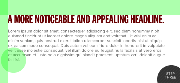
Work out any last little tweaks
In the next step, the font used in the body paragraph has in fact changed to a cleaner sans-serif, which better compliments the headline text. We’re getting closer to a much more visually appealing design, but there are a few changes we can make to clean it up even more. As the green indicators show, there are unequal margins and what typographers like to call an “orphan.” Which is a single word that falls to the last line of the paragraph. It creates a very unequal weight visually as compared to the rest of the text, and this issue can be solved easily by rewording the text slightly. When it comes to margins, there is no rule that all must be equal. However, if you are starting a young web design career, it’s good practice to have equal margins throughout until you experience and learn techniques that allow you to extend beyond the guidelines of typesetting and still accomplish your goal visually.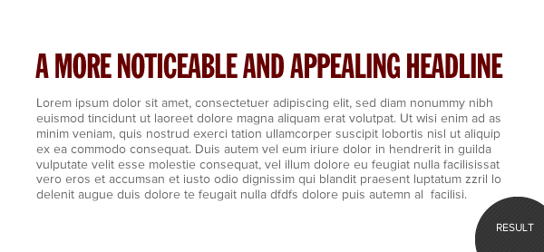 After creating a more balanced visual canvas by removing the orphan and adjusting the margins you can see the end result, a well set type sample that’s comfortable where it lays.
What are your best tips for web typography? Let us know in the comments!
After creating a more balanced visual canvas by removing the orphan and adjusting the margins you can see the end result, a well set type sample that’s comfortable where it lays.
What are your best tips for web typography? Let us know in the comments!Dallas
Dallas is an Interactive Designer at 352 Media Group, a digital marketing and web design company.
Read Next
15 Best New Fonts, July 2024
Welcome to our monthly roundup of the best fonts we’ve found online in the last four weeks. This month, there are fewer…
By Ben Moss
20 Best New Websites, July 2024
Welcome to July’s round up of websites to inspire you. This month’s collection ranges from the most stripped-back…
Top 7 WordPress Plugins for 2024: Enhance Your Site's Performance
WordPress is a hands-down favorite of website designers and developers. Renowned for its flexibility and ease of use,…
By WDD Staff
Exciting New Tools for Designers, July 2024
Welcome to this July’s collection of tools, gathered from around the web over the past month. We hope you’ll find…
3 Essential Design Trends, July 2024
Add some summer sizzle to your design projects with trendy website elements. Learn what's trending and how to use these…
15 Best New Fonts, June 2024
Welcome to our roundup of the best new fonts we’ve found online in the last month. This month, there are notably fewer…
By Ben Moss
20 Best New Websites, June 2024
Arranging content in an easily accessible way is the backbone of any user-friendly website. A good website will present…
Exciting New Tools for Designers, June 2024
In this month’s roundup of the best tools for web designers and developers, we’ll explore a range of new and noteworthy…
3 Essential Design Trends, June 2024
Summer is off to a fun start with some highly dramatic website design trends showing up in projects. Let's dive in!
15 Best New Fonts, May 2024
In this month’s edition, there are lots of historically-inspired typefaces, more of the growing trend for French…
By Ben Moss
How to Reduce The Carbon Footprint of Your Website
On average, a web page produces 4.61 grams of CO2 for every page view; for whole sites, that amounts to hundreds of KG…
By Simon Sterne
20 Best New Websites, May 2024
Welcome to May’s compilation of the best sites on the web. This month we’re focused on color for younger humans,…


