 Choosing fonts for design projects can be a daunting task because there's thousands of fonts out there all over the web that you could use.
Whether you're looking to create a big, bold logo for your business or work on a poster for an event here's a collection of inspiring fonts that are perfect for use whatever your project may be.
The collection covers a variety of themes from vintage to clean and simple.
Remember to check the license before using any of these fonts commercially and any restrictions on use.
Neo Deco
Neo Deco is a beautiful, professional font that works well for logos. It's clean, simple typography in action with a real sense of style.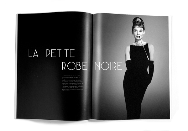
PLSTK
PLSTK is a completely unique font. Its mechanical approach to each letter makes it stand out from the crowd. The effort that has gone into each of the glyphs is evident to see making this one of my favourite fonts for when you need to create something different.
ACCENT
Accent is another unique font, it's thin, sharp and looks great on posters (like above). What I particularly like is the use of space within each glyph that makes Accent so good for poster work where you want an image behind the typography to be present.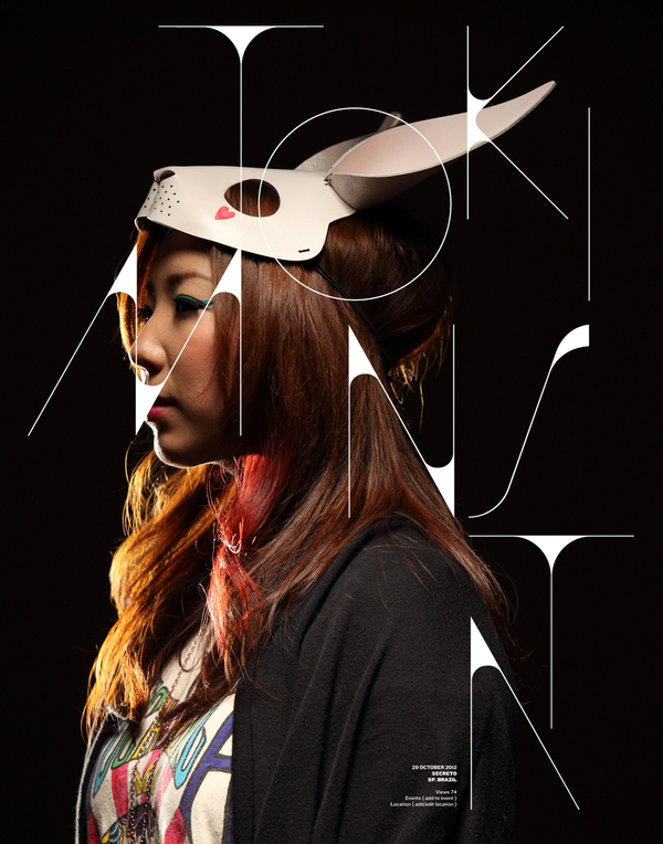
Kabel
Kabel is a well designed, interesting font. It looks best when used in conjunction with lighting effects and colour overlays, as can be seen in the example above.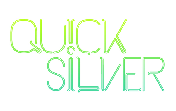
Kilogram
Kilogram is a solid, bold and headline font. It's perfect for use for big headlines that need to make an impact.
CODE
Code is a very nice, simple and clean font. It's light glyphs make it an attractive font useful when you require a clean, professional look.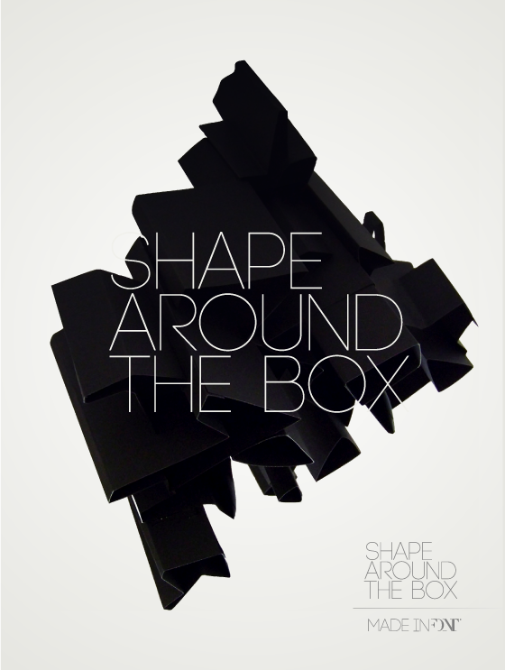
TELEFONO
Another unique font, Telefono, has loads of added detail to each glyph. Works really well for poster work and logos too with the extra detail making it stand out from the crowd.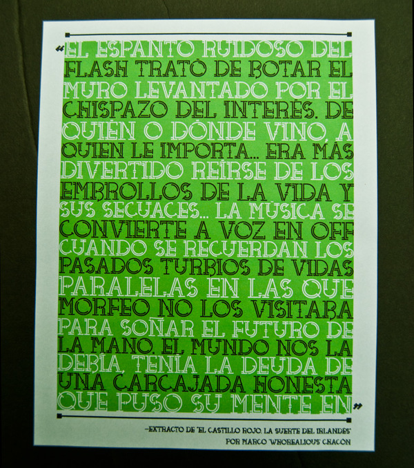
Novecento
Novocento is another clean font featuring a variety of sets from ultralight to ultrabold making it versatile for use for headlines, logos and more general text, perhaps on posters for print.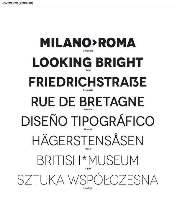
Hagin
Looking for a headline font that stands out? Hagin could be the right choice. Its got serifs, it's bold and it's very attractive.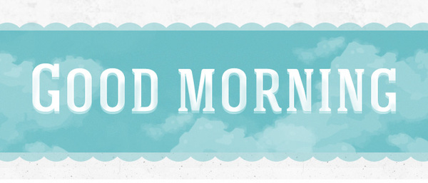
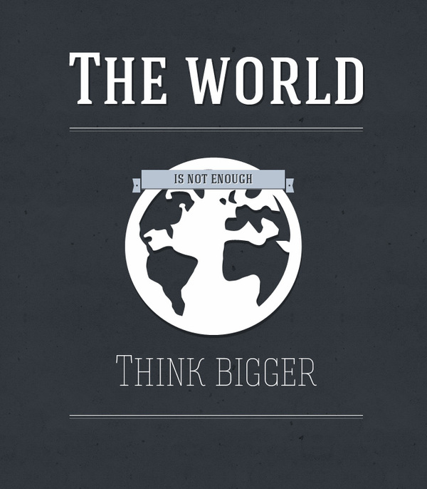
MOLESK
Molesk is a big 3D font. It's got serifs and lots of character to it. Not as clean as some of the other fonts which makes it great for making a distinctive impact on your designs.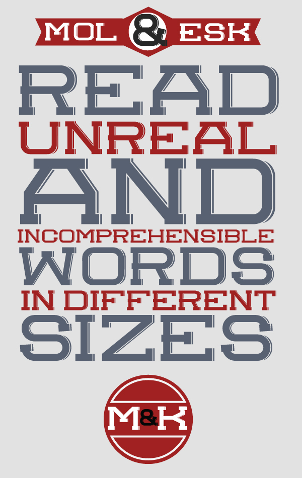
Paranoid
Definitely one of my favourite fonts; Paranoid is a totally unique, beautifully designed font perfect for making designs that stand out from the rest. It's not the easiest font to read so it's more suited to titles than information text.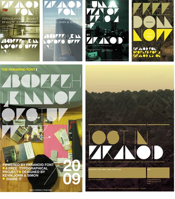
VAL
VAL is a fun font that looks great. There's a few things to remember when using it; use all capitals or all lowercase to get the leaning glyphs to look right and it doesn't work well at small sizes. Perfect for logos typographic art, just like the picture above.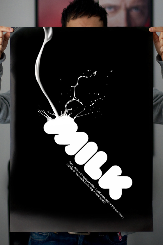
Absinthe
Feeling the need for a vintage font? Absinthe may just be exactly what you're after. It's a great vintage font that has a very unique set of glyphs that really add to the vintage effect.
TETRA
I can see Tetra working on posters for festivals and events. It's fun with the added bonus of a 3D component making it useful for all kinds of situations.
INTRO
Intro is a great, clean font. Perfect for sharp, attractive logos. Well crafted and looks great!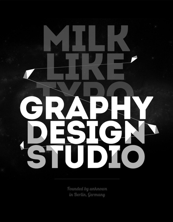
LAVANDERIA
Lavanderia is a beautiful handwritten font that is lavish and sophisticated; perfect for use when a handwritten approach is needed.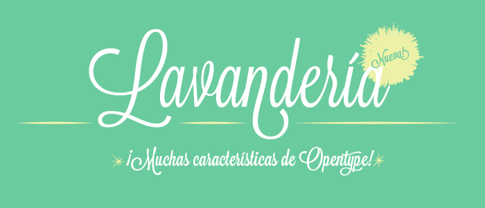
RBNo2
RBN02 is a clean font that takes a more square approach that's more Courier New than Helvetica. It works really well on the above mock poster.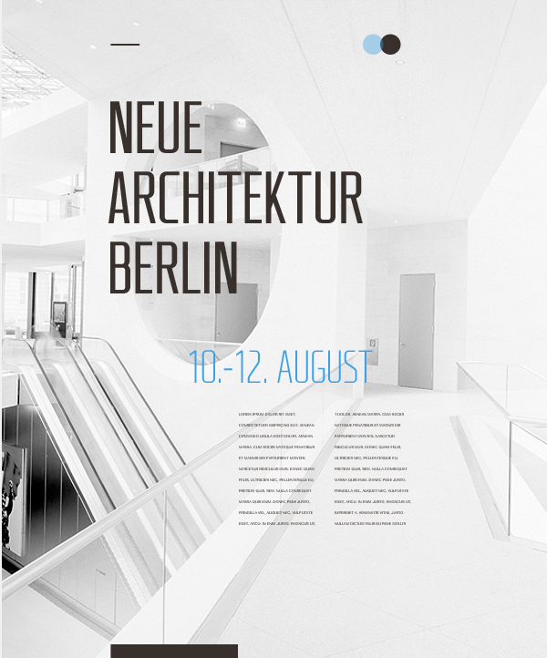
Nomed
Looking for something completely different? Nomed has to be your chosen font. For creating unique logos and titles that are like nothing else, Nomed is the best font to use.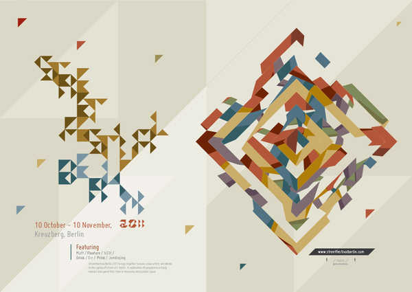
HOMESTEAD
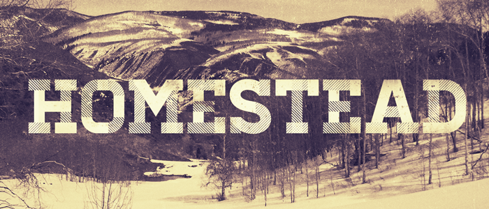
Homestead is a well crafted, textured font that can be used to create all kinds of great designs. The textured element really adds to the feel of the font and, as seen below, can be used to your advantage.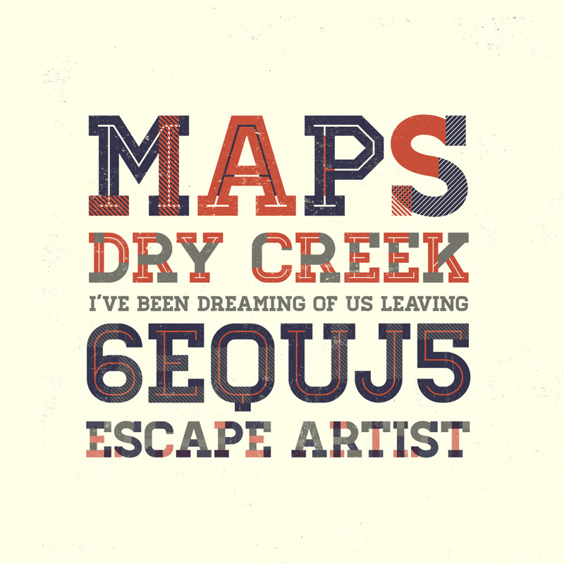
Satellite
Satellite is a smart, simple, clean font that looks really fresh.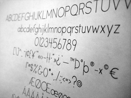
Ananda Namaste
Ananda Namaste is font I really like. The smooth strokes and curves of the font make it stand out. Definitely one of my favourites.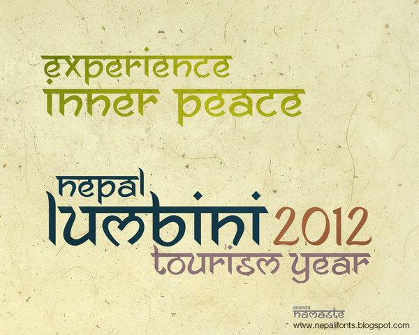
Mosaic Leaf
Mosaic Leaf is an amazing font that looks really good. It's a unique way of creating glyphs but one that works really well. Fits perfectly with the design above.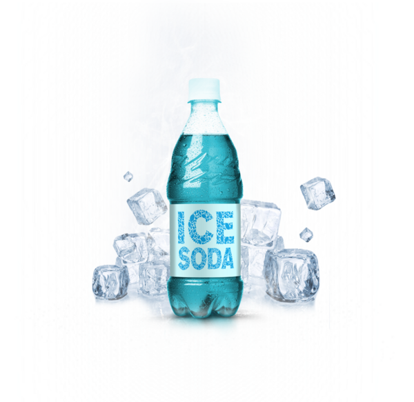
Ribbon
A font similar to Tetra that has a unique feel, Ribbon looks great in print work like the book above and has a unique character.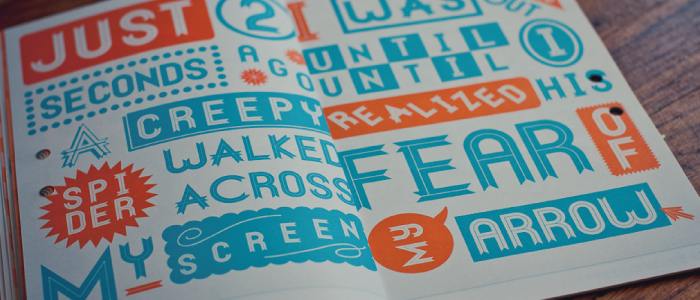
Nevis
Finally, Nevis, a perfect headline font. Bold and proud, Nevis is a great font. Got any favorite fonts to share? Which font here is your favourite?
David Pickett
David Pickett is a musician and web designer from the UK. Follow him on twitter.
Read Next
15 Best New Fonts, July 2024
Welcome to our monthly roundup of the best fonts we’ve found online in the last four weeks. This month, there are fewer…
By Ben Moss
20 Best New Websites, July 2024
Welcome to July’s round up of websites to inspire you. This month’s collection ranges from the most stripped-back…
Top 7 WordPress Plugins for 2024: Enhance Your Site's Performance
WordPress is a hands-down favorite of website designers and developers. Renowned for its flexibility and ease of use,…
By WDD Staff
Exciting New Tools for Designers, July 2024
Welcome to this July’s collection of tools, gathered from around the web over the past month. We hope you’ll find…
3 Essential Design Trends, July 2024
Add some summer sizzle to your design projects with trendy website elements. Learn what's trending and how to use these…
15 Best New Fonts, June 2024
Welcome to our roundup of the best new fonts we’ve found online in the last month. This month, there are notably fewer…
By Ben Moss
20 Best New Websites, June 2024
Arranging content in an easily accessible way is the backbone of any user-friendly website. A good website will present…
Exciting New Tools for Designers, June 2024
In this month’s roundup of the best tools for web designers and developers, we’ll explore a range of new and noteworthy…
3 Essential Design Trends, June 2024
Summer is off to a fun start with some highly dramatic website design trends showing up in projects. Let's dive in!
15 Best New Fonts, May 2024
In this month’s edition, there are lots of historically-inspired typefaces, more of the growing trend for French…
By Ben Moss
How to Reduce The Carbon Footprint of Your Website
On average, a web page produces 4.61 grams of CO2 for every page view; for whole sites, that amounts to hundreds of KG…
By Simon Sterne
20 Best New Websites, May 2024
Welcome to May’s compilation of the best sites on the web. This month we’re focused on color for younger humans,…


