
 If you're primarily a designer and have recently started learning CSS, you've probably started to incorporate some of the new CSS features that have been added to the language in CSS3.
But if you don't have a lot of experience with CSS, then you're probably trying to figure out what is the best way to handle some of the challenges that arise from using multiple vendor prefixes, dealing with older versions of Internet Explorer, and other CSS3-specific dilemmas.
In this article, I'll try to cover some of the important things to remember when dealing with these issues. Keep in mind that nothing here is set in stone but these should just be guidelines to help you write more effective, easier to maintain, and future-proof code.
If you're primarily a designer and have recently started learning CSS, you've probably started to incorporate some of the new CSS features that have been added to the language in CSS3.
But if you don't have a lot of experience with CSS, then you're probably trying to figure out what is the best way to handle some of the challenges that arise from using multiple vendor prefixes, dealing with older versions of Internet Explorer, and other CSS3-specific dilemmas.
In this article, I'll try to cover some of the important things to remember when dealing with these issues. Keep in mind that nothing here is set in stone but these should just be guidelines to help you write more effective, easier to maintain, and future-proof code.
Know your support charts
You probably won't have to memorize which features work in which browsers. In most cases, CSS3 features will not work in all in-use browsers. And in some instances, even the most recent versions of browsers don't have full support. So the first thing you should do is understand where support is lacking. The primary resource you should use is the When can I use... site, which includes charts for CSS3, HTML5, and tons more. You can even do side-by-side comparisons with different browsers, as shown in the screenshot below that compares CSS3 support in Firefox 3.6 vs. IE9: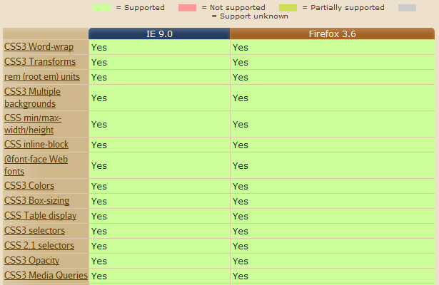 Although When can I use... is probably the only support chart source you'll need, here are a few other options to consider:
- CSS3 Click Chart
- CSS contents and browsers compatibility
- CSS Compatibility and Internet Explorer
- Comparison of Layout Engines (CSS)
Don't overuse polyfills
Due to client or agency pressure, or just the fact that you want everything to look and function the same everywhere, you might be tempted to use the many CSS Polyfills. But many of these scripts can slow your pages down considerably -- especially if you use more than one. There are many studies and sources that show the importance of a website's speed, so any polyfills should be considered carefully and with your site or app's overall best interests in mind. To help you decide what to polyfill and what to just allow to degrade to a lesser experience, use the HTML5 Please site. As shown in the example screenshot below, HTML5 Please will often recommend avoiding polyfills for certain features: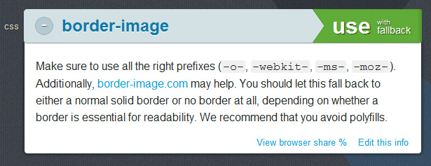
Test how features degrade
If you're avoiding a lot of polyfills, then naturally you're going to have to allow many CSS3 features to degrade to a more primitive experience in older browsers (usually IE6-8). But don't assume this will happen automatically. In many cases (for example, when using multiple backgrounds), you'll have to declare a property that gets overwritten by the CSS3 feature, but that will still show up in older browsers. For example, for multiple backgrounds, you might do this:.element {
background: url(images/fallback.jpg) no-repeat;
background: url(images/example.png) center center no-repeat,
url(images/example-2.png) top left repeat;
}
Notice the single background image declared before the multiple background images line. Non-supporting browsers will display the single image but will ignore the 2nd line. Supporting browsers will read both lines, but the first line will be overwritten by the second.
Some other CSS3 features that could benefit from this type of fallback are RGBA colors, HSLA colors, and gradients.
To help you see how CSS3 feature degrade in older browsers, you can use a bookmarklet called deCSS3.
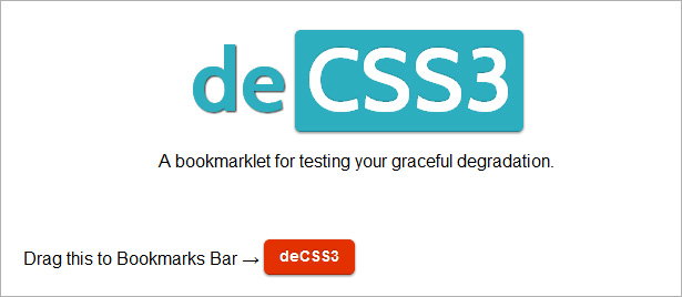 It currently only works in Chrome and Safari, but just drag the link to your bookmarks bar and then click the link on any site that you want to 'de-CSS3' and it will show you the site with text shadows, rounded corners and other new stuff removed. Of course, this is no replacement for actual browser testing, but can serve as a useful guide for faster development before you do your final testing towards the project's end.
Another tool to aid in dealing with fallbacks is the Modernizr JavaScript library. But if you're intimidated by libraries, don't be. Modernizr is not difficult to deal with from a CSS perspective. Check out this tutorial for a pain-free introduction.
It currently only works in Chrome and Safari, but just drag the link to your bookmarks bar and then click the link on any site that you want to 'de-CSS3' and it will show you the site with text shadows, rounded corners and other new stuff removed. Of course, this is no replacement for actual browser testing, but can serve as a useful guide for faster development before you do your final testing towards the project's end.
Another tool to aid in dealing with fallbacks is the Modernizr JavaScript library. But if you're intimidated by libraries, don't be. Modernizr is not difficult to deal with from a CSS perspective. Check out this tutorial for a pain-free introduction.
Dealing with vendor prefixes
One of the messy parts of CSS3 is having to deal with all the different vendor prefixes. Maintaining code that uses all the prefixes is tedious and in some cases you don't need all of them. Who can possibly remember when to include "-o-" or "-ms-" and when not to? Well, as mentioned, using the support charts will help. But here are a few other suggestions to help deal with vendor prefixes.Use a CSS preprocessor
Preprocessors are all the rage right now. But CSS beginners and designers who aren't hardcore developers or programmers may have a hard time dealing with these new tools. So although preprocessors are certainly not for everybody, they are definitely worth considering, because they can seriously improve your production and maintenance time. An extensive discussion of preprocessors is certainly beyond this article, but here are some links to get you started: And if you find that stuff too heavy, Chris Coyier of CSS-Tricks has some thoughts on preprocessors that might help you get an overall view. And here's a post on Nettuts+ that covers some of the features and benefits of using a few of the most popular CSS preprocessors.Be consistent in your code
If you choose not to preprocess your CSS using one of the aforementioned technologies, then you'll have to deal with maintaining all the vendor prefixes. So make sure you pick a style and order for your vendor prefixes and stick with it. This way, your code will be easier to read and maintain. For example, some CSS developers put their vendor prefix lines in alphabetical order, and use indenting so that the values all line up, like this:.element {
-moz-transition: background-color linear .8s;
-ms-transition: background-color linear .8s;
-o-transition: background-color linear .8s;
-webkit-transition: background-color linear .8s;
transition: background-color linear .8s;
}
That's just one way to do it. But whatever method you choose, just be consistent throughout your code. This would be especially important if you work on a team where others have to read and/or maintain your code.
Of course, not all CSS3 features are this easy to organize (for example, the code for keyframe animations is much more complicated), but for most features you should be able to have a consistent style that makes development and maintenance smoother.
What about the standard property?
You'll notice in the example in the previous section, the last property declared after the vendor lines is the standard version of the property. If you're going to include the standard property, this is definitely how you should do it. So always include it last when you add it. This is to ensure that the vendor implementation of the feature is overwritten by the standard implementation. But there's a caution here. For some complex animations and interactions, it is conceivable that the implementation could change so much that when the browser starts supporting the standard property, it could have undesirable effects. So in some cases, you might be better off leaving out the standard property altogether. I wrote about this topic more in-depth on my blog, so check that out if you want a more comprehensive discussion of this issue.Use Prefixr
One of the easiest ways to deal with all the cross-browser vendor weirdness is to use a handy little tool called Prefixr. With Prefixr, you just develop your code as always, and you could just use a single vendor prefix (for example, only "-moz-") for all your CSS3. Then, when you're done testing in that one browser and have everything working the way you want, just throw your code into Prefixr and it will generate all the extra vendor code for you. Prefixr also can be integrated automatically with your text editor, and includes support for lengthy keyframe animations code. As an alternative, you can also try out a tool I created called Animation Fill Code that adds the extra vendor code for keyframe animations.Test thoroughly
The last suggestion I'll give here is to test thoroughly in all the browsers you're supporting. You can use dozens of tools and libraries to assist you with your CSS3 development, but nothing can replace thorough tests in real browser environments. And this advice would be especially important if you're dealing with a lot of responsive design-related CSS3 (e.g. media queries), and heavy use of typographic features. You want your content to be usable and readable in all browsers, even if the CSS3 features aren't available.Louis Lazaris
Louis Lazaris is an author, freelance writer, and web developer. He curates Web Tools Weekly, a newsletter for front-end developers, and he writes about front-end web design technologies on Impressive Webs. You can follow Louis on Twitter or contact him through his website.


Read Next

15 Best New Fonts, July 2024
Welcome to our monthly roundup of the best fonts we’ve found online in the last four weeks. This month, there are fewer…
By Ben Moss

20 Best New Websites, July 2024
Welcome to July’s round up of websites to inspire you. This month’s collection ranges from the most stripped-back…

Top 7 WordPress Plugins for 2024: Enhance Your Site's Performance
WordPress is a hands-down favorite of website designers and developers. Renowned for its flexibility and ease of use,…
By WDD Staff

Exciting New Tools for Designers, July 2024
Welcome to this July’s collection of tools, gathered from around the web over the past month. We hope you’ll find…

3 Essential Design Trends, July 2024
Add some summer sizzle to your design projects with trendy website elements. Learn what's trending and how to use these…

15 Best New Fonts, June 2024
Welcome to our roundup of the best new fonts we’ve found online in the last month. This month, there are notably fewer…
By Ben Moss

20 Best New Websites, June 2024
Arranging content in an easily accessible way is the backbone of any user-friendly website. A good website will present…

Exciting New Tools for Designers, June 2024
In this month’s roundup of the best tools for web designers and developers, we’ll explore a range of new and noteworthy…

3 Essential Design Trends, June 2024
Summer is off to a fun start with some highly dramatic website design trends showing up in projects. Let's dive in!

15 Best New Fonts, May 2024
In this month’s edition, there are lots of historically-inspired typefaces, more of the growing trend for French…
By Ben Moss

How to Reduce The Carbon Footprint of Your Website
On average, a web page produces 4.61 grams of CO2 for every page view; for whole sites, that amounts to hundreds of KG…
By Simon Sterne

20 Best New Websites, May 2024
Welcome to May’s compilation of the best sites on the web. This month we’re focused on color for younger humans,…