 A key component to any website design is type. Selecting fonts, sizes and colors can be a big part of how you outline your site. Just as important as the letterforms themselves, is the spacing around those letters and particularly the leading used in blocks of text.
The more type you use, the more important leading becomes. Behind font and size, it is one of the key factors to consider when you are looking at how readable type is.
The leading specs you use for a logo or splash screen may be very different than the leading used for the type in a blog post.
Other design elements also have an impact on how you should use leading. The size of type, width of columns, and even background color can help you make wise leading choices.
How you use leading most notably comes into play for large blocks of text.
What is leading?
Leading — pronounced ledding — is the spacing between lines of type. Leading was traditionally measured in points (just like fonts). The term originated with old-style letter presses, when type was set by hand. Lead strips were placed between lines of type to keep everything in perfect alignment. Since the advent of digital publishing, leading has frequently been confused with line-height. Line height is all of the space from one baseline — the imaginary plane on which letters such as 'a', 'x' and 'n' sit — to the next. Leading, by contrast, is the space from the bottom of a letter on one line, to the top of a letter on the next: it is literally the line height minus the text height. In digital typography, particularly web typography, the terms leading and line height are often used interchangeably. In CSS for example, there is no leading value, we use line-height instead. Whereas leading was once a physical, measurable value, it is now most commonly used as a concept: the visual impression of space between two lines. How leading is used in a block of text can affect readability. There is a fine line between type being too close together and too far apart. Either extreme can be tough on a reader’s eyes. Leading is all about altering the density of type. The key is understanding what message you intend for your type to convey and matching the leading accordingly.No perfect solution
 There is no perfect, magic formula for determining how much leading you will need. A combination of factors are involved – type size, color, desired effect and most importantly readability.
As a general rule, the starting point for leading is usually the same as the point size of the font you are using. Some software, particularly web browsers, take it a bit further and set the default leading a little higher than the point size, commonly using a default of 120 percent. So blocks that include 10-point text would have 12-point leading.
This philosophy works great for large blocks of text, such as blog posts, that use common typefaces without extravagant ascenders, descenders or ligatures on pale, neutral colored backgrounds (think black type on white or beige). You maintain a sense that all of the lines of text go together while adding in just enough space that it is easy on the eyes.
Blocks of text are easiest to read when the leading is wider than word spacing. This proportion will help the eye move across the page and then down, following the natural flow of spacing from dark to light.
This “normal” line height will also feel appropriate for things that require a lot of reading. It is the standard used by many websites and print publications.
Keep it tight
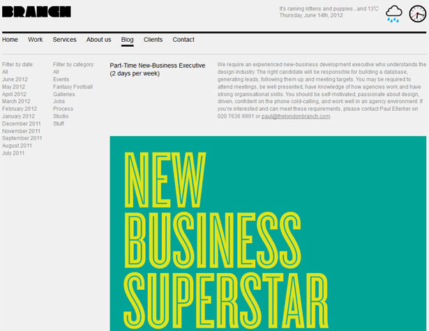 Tight, or negative, leading occurs when lines of type are closer than the point size of the type. For example, if your type is sized at 14 points, any leading below 14 points would be considered tight, even if it does not appear too closely spaced on the screen.
Tight leading can create a feeling of constraint. It can also be used to create chaos. On the other hand, tighter leading can be used as a method to bring together bits of type or to create a distinct sense of organization. For many years in print and online, news organizations have used some of the tightest leading specifications for body type. In print, this was to conserve space; online it is to maintain the sense of credibility and the look associated with the organizations and their print partners.
 Think about case and letters that sit above and below the x-height when setting line-height specifications. When working in all caps there are no ascenders or descenders, so you might find it necessary to tighten the line spacing, such as the technique used by Regenerate Music Co. The same is true of fonts that have shorter ascenders and descenders.
Type used in larger sizes, such as headlines or logos, can sometimes benefit from tighter leading as well.
Loosen up
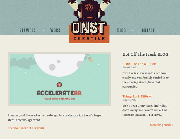 Loose, or positive, leading is adding spacing so that the leading is greater than the point size used for type. For example, if your type is sized at 14 points, any space of 15 points or more would be considered loose. With some typefaces, the spacing may not look loose on the screen even though it is classified that way.
Loose leading can make a page feel light and airy. It is a time-tested trick for designers to just add leading when type feels too chunky or heavy on the page. Leading that is too loose though can be difficult to read and follow if lots of text is used; it is best reserved for few words.
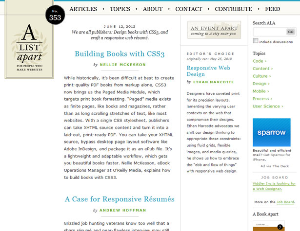 Most designers are trending toward using looser leading for the main body type on blogs and for other large blocks of text. Loose, but not too loose, leading can be easy to read and follow. It can make smaller text appear somewhat larger than it is and help balance extremely long lines of text. Note the use of leading on the A List Apart blog, the larger typeface for the body uses one spec while the smaller type in the right sidebar is much looser, making the smaller type easier to follow and balancing it with the other elements on the page.
Many designers also opt for looser leading when using sans serif typefaces. It can be an especially good option when working with fonts with exaggerated flourishes or ligatures. The extra space allows letters room to breathe without overlapping.
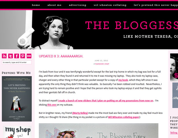 Loose leading is also an important consideration if you plan to use lots of bold, colored type, or fonts with heavy weights. The Bloggess blog uses a combination of color, bold and caps throughout the site, making positive leading a necessary readability tool. In this instance, loose leading also helps draw the eye to the important parts of the text, which are in color and bold.
Background colors and leading
Color and contrast are especially important when choosing a line height. On dark backgrounds, you may want to use slightly more leading than you might on a lighter background to help alleviate a feeling of mass. Dark colors can add weight to your design as can tight leading, but choosing to use just one or the other you can create more balance. The same is true when using type of a color. Colors, other than black and dark grays, can add different amounts of weight to your design. Depending on the background color, some text can even have the appearance of bleeding onto the background — this happens for some people especially when reading red lettering on a white background. The addition of leading can help make these types of text more readable.Changing widths and leading
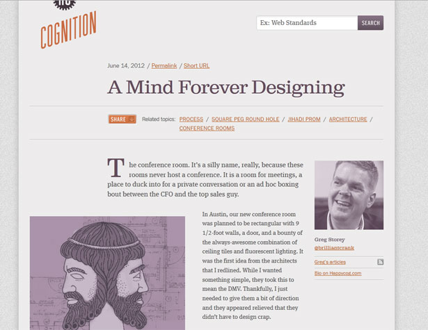 Responsive design makes understanding leading (and type in general) even more important.
With varying screen resolutions and shapes, type specs must adjust accordingly to ensure a site remains readable. As the text shrinks (or grows) on the screen, the leading must adjust accordingly.
Remember to keep line height proportions in mind when making these adjustments. Because type will be smaller for mobile and other small-screen devices. Consider increasing the line height by 20 percent over what you used for the full-scale design. The increased leading should help readability when paired with smaller type.
So when you are determining leading specs for your site you will need several sets of thresholds: One for your basic web site design, one for mid-sized devices such as the iPad and other tablets, and one for mobile phones. Each may have a different set of proportions used for text to line height.
Conclusion
Now that you are armed with a variety of leading tips and tools, where do you start? There is no checklist. Your best bet is to take a look at the type and see how it feels (use the good old-fashioned eye test). Let it sit for a while and come back to it again later. Do you still feel the same way about the text? Does the feeling you get match the feeling you have in mind for your site design? Note that this is most effective when the text block contains actual copy rather than placeholder text. You want to get a realistic view and placeholder options sometimes contain odd numbers of letters that aren’t used all that often in real copy. Play with it. Show your text design to someone else for extra opinions. Ask them how they feel about it. Also make sure to pair your text block with the rest of the elements in the design. This may not be the first step but sometimes putting it all together can create unintended effects. Make sure it passes the eye test again.Carrie Cousins
Carrie Cousins is a freelance writer with more than 10 years of experience in the communications industry, including writing for print and online publications, and design and editing. You can connect with Carrie on Twitter @carriecousins.
Read Next
15 Best New Fonts, July 2024
Welcome to our monthly roundup of the best fonts we’ve found online in the last four weeks. This month, there are fewer…
By Ben Moss
20 Best New Websites, July 2024
Welcome to July’s round up of websites to inspire you. This month’s collection ranges from the most stripped-back…
Top 7 WordPress Plugins for 2024: Enhance Your Site's Performance
WordPress is a hands-down favorite of website designers and developers. Renowned for its flexibility and ease of use,…
By WDD Staff
Exciting New Tools for Designers, July 2024
Welcome to this July’s collection of tools, gathered from around the web over the past month. We hope you’ll find…
3 Essential Design Trends, July 2024
Add some summer sizzle to your design projects with trendy website elements. Learn what's trending and how to use these…
15 Best New Fonts, June 2024
Welcome to our roundup of the best new fonts we’ve found online in the last month. This month, there are notably fewer…
By Ben Moss
20 Best New Websites, June 2024
Arranging content in an easily accessible way is the backbone of any user-friendly website. A good website will present…
Exciting New Tools for Designers, June 2024
In this month’s roundup of the best tools for web designers and developers, we’ll explore a range of new and noteworthy…
3 Essential Design Trends, June 2024
Summer is off to a fun start with some highly dramatic website design trends showing up in projects. Let's dive in!
15 Best New Fonts, May 2024
In this month’s edition, there are lots of historically-inspired typefaces, more of the growing trend for French…
By Ben Moss
How to Reduce The Carbon Footprint of Your Website
On average, a web page produces 4.61 grams of CO2 for every page view; for whole sites, that amounts to hundreds of KG…
By Simon Sterne
20 Best New Websites, May 2024
Welcome to May’s compilation of the best sites on the web. This month we’re focused on color for younger humans,…


