 A lot of design work is shifting to mobile. More and more people are accessing the web on mobile devices, and designers should adapt accordingly.
One element of that, is optimizing images for mobile devices. Sure, there are the technical aspects such as resolution and reducing file size, but what about the actual aspect ratio and content of the images themselves?
Well, sometimes the best inspiration can come from somewhere unrelated to your field. In this case, album covers — specifically ones designed for portable music players, mobile devices, online stores, streaming music services, and more.
Read on to find out what album covers can teach about optimizing images for mobile devices.
No clutter
 The biggest difference between mobile design and web design is size (obviously). Thus, not only is there much less room for images, but the images themselves will appear much smaller. As a result, your images will look best with no clutter.
Little details, multiple elements, and so forth can look fine in a large image (like a full-width image viewed on a laptop). But they won't be very visible in a small image. It will just look like clutter. So if you make sure your images don't have clutter, your images will look cleaner.
For an immediate example, do an image search for something. In the grid of thumbnails, see which images look good at that smaller size and which look like a mess. All of the images will look fine at full size, but the ones with no clutter also look good small. On mobile devices, most of your images will look that size. So if you want to optimize your images for mobile devices, make sure your images don't have clutter.
Looking good as thumbnails is exactly what album covers designed for the small mobile screens, online stores, and music streaming services focus on; you should focus on that too if you want your images to look good on mobile devices
Focus on one element
Have an image feature just a single main element. Similar to how you won't be able to easily see details in a small image, having multiple elements in the image will make it harder to figure out what the image is. As a full size image on a laptop, you can easily make out multiple elements, but a thumbnail-size image, not so much. For example, instead having an image of a person kicking a ball into a goal (too many elements: head-to-toe person, ball, goal), crop the image so that it's only a zoomed in shot of the foot kicking a ball (one main element: ball being kicked). The same idea is expressed (kicking a goal, scoring, winning, etc.) but is a lot easier to see and comprehend the image on a mobile device.Use subtle textures (or solid colors)
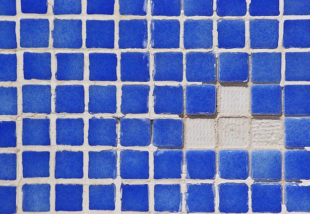
 Busy textures are like clutter: they distract from the main element. While they can work on a large screen — you can still clearly see the main element — on a small mobile screen they distract. The reason is that there's less space between each element in a busy texture, so when the image is smaller the texture looks akin to a patio screen door (a bunch of small squares squeezed together) rather than a tiled wall (which is easy on the eyes and each element easily discernible).
When a texture is subtle, it will still have the same problem as a busy texture but will be barely noticeable, which doesn't make it distracting when viewing on a mobile screen. Think white-and-gray large square pattern background instead of a black-and-white thin striped background. Or a few light clouds instead of a large-cloud sunrise. On a small screen, it almost disappears, so the texture becomes irrelevant and keeps the focus on the main element.
Of course, an even better image choice is one with mostly solid colors. Then you eliminate the problem altogether. Large, small, laptop, mobile device; it doesn't matter what size the image is, a solid color will look the same and won't distract. Going back to the sky example, it'd be a clear blue sky instead of one with a few sprinkled clouds. The clear sky background looks the most clean and not distracting at all on a mobile screen.
This doesn't just apply to the background but any elements. A person wearing a shirt, the pattern on an object, and anything else. The more subtle textures (or the more solid colors are featured instead) the cleaner and more discernible the image will look small on a mobile device.
Contrast
 If textures are the micro of the image, this deals with the macro, the entire picture. While the micro shouldn't distract, the macro should be as clearly visible as possible. And that usually means a higher contrast for your images. Make sure the main element is easily visible and pops out of the image.
It's hard for a dark gray object to stand out from a light gray background. Again, when viewed on a large screen, you can discern the object, but as a small image on a mobile device, not so much.
Try to feature images with natural contrast. Two contrasting colors. A colorful element against a gray background (or any element against a white background). A white ball on a green lawn. Basically, the main element is the focal point, and a higher contrast strengthens that by making that main element much more obvious and visible - which is important when viewing a small image on a mobile device.
If you don't have much natural contrast in your image, you can at least bump up the contrast of the image using your image editor. Using the aforementioned gray-on-gray example, the light gray object will become lighter, the dark gray background darker, and the object will pop out of the image more. The integrity of the image should remain intact of course, but increasing the contrast will let the main element be more discernible on a mobile device. Since that's ultimately what a person is looking at, not the background, which should remain, well, in the back.
Be square
 This one is directly taken from album covers, which are square, keep your images as square as possible. It's obviously fine if slightly rectangular horizontally or vertically, but the point is to strive for your images to be as close to a square as possible.
The reason? On mobile devices, especially portrait-oriented ones where people usually view vertically, you don't have the luxury of assuming people will be viewing in a nice full widescreen. If a image is too wide, it'll look like a horizontal sliver on a small screen that's vertically-aligned. The same goes for tall rectangular images - a person will have to scroll to see it fully.
When you keep your images as square as possible, you're maximizing their versatility. It won't matter if a person is zooming in on a mobile device, zoomed out all the way, or whatever, the image will be fully visible and maximizing the preciously-little screen real estate on a mobile device.
By being square, album covers were a natural fit for mobile devices, online stores, and music streaming services. Easily browsable, fully visible at any size, and easy for UI designers to place the image wherever on the screen. If your images are as square as possible, they will have the same versatility on mobile devices.
Optimizing images for mobile devices
Mobile will only continue to become more and more prevalent, so it's important to have images — which is a very prominent thing people will see — optimized for mobile devices. Hopefully these lessons from mobile-optimized album covers provide some useful insights. Make sure your images don't have clutter via a bunch of small details, that the image focuses on one element, that the textures are subtle or that there's simply solid colors, that the contrast is higher, and that the image aspect ratio is as square as possible so that it's as mobile-viewing friendly as possible. With that in hand, make your images look great on mobile devices. Written exclusively for WDD by Oleg Mokhov, the world's most mobile electronic musician and web + visual design enthusiast. He makes music that's a cross between Four Tet and Aphex Twin. Connect with him Do you think about mobile devices when choosing images for your designs? Do you start with mobile, or adjust desktop-friendly images to suit devices? Let us know in the comments below.Oleg Mokhov
Oleg Mokhov is the world's most mobile electronic musician and web + visual design enthusiast. He makes music that's a cross between Four Tet and Aphex Twin. Connect with him
Read Next
15 Best New Fonts, July 2024
Welcome to our monthly roundup of the best fonts we’ve found online in the last four weeks. This month, there are fewer…
By Ben Moss
20 Best New Websites, July 2024
Welcome to July’s round up of websites to inspire you. This month’s collection ranges from the most stripped-back…
Top 7 WordPress Plugins for 2024: Enhance Your Site's Performance
WordPress is a hands-down favorite of website designers and developers. Renowned for its flexibility and ease of use,…
By WDD Staff
Exciting New Tools for Designers, July 2024
Welcome to this July’s collection of tools, gathered from around the web over the past month. We hope you’ll find…
3 Essential Design Trends, July 2024
Add some summer sizzle to your design projects with trendy website elements. Learn what's trending and how to use these…
15 Best New Fonts, June 2024
Welcome to our roundup of the best new fonts we’ve found online in the last month. This month, there are notably fewer…
By Ben Moss
20 Best New Websites, June 2024
Arranging content in an easily accessible way is the backbone of any user-friendly website. A good website will present…
Exciting New Tools for Designers, June 2024
In this month’s roundup of the best tools for web designers and developers, we’ll explore a range of new and noteworthy…
3 Essential Design Trends, June 2024
Summer is off to a fun start with some highly dramatic website design trends showing up in projects. Let's dive in!
15 Best New Fonts, May 2024
In this month’s edition, there are lots of historically-inspired typefaces, more of the growing trend for French…
By Ben Moss
How to Reduce The Carbon Footprint of Your Website
On average, a web page produces 4.61 grams of CO2 for every page view; for whole sites, that amounts to hundreds of KG…
By Simon Sterne
20 Best New Websites, May 2024
Welcome to May’s compilation of the best sites on the web. This month we’re focused on color for younger humans,…


