 You already have a great app idea and are working furiously to build and launch it. Or you're developing a mobile site, to compliment a desktop build. Or perhaps you're refining a desktop design to scale responsively on devices.
Whatever your goal for mobile development, before you launch, let’s take a quick break from that process to make sure you aren’t making a few of the most common mobile design mistakes.
Trust me, it’s worth the time and your clients will thank you.
1. Not refining the feature set
When building software it is easy to get carried away by adding all these great features. "Wouldn't it be cool if..." is a dangerous phrase when it comes to meeting deadlines and delivering quality software.
If you try to implement too many features, both the quality of the experience and design will suffer, not to mention what will happen to your deadlines.
At the same time you don't want to focus so narrowly that you miss potentially great ideas. That's where this phrase comes in: "Dream big, implement small."
In the planning stage put every idea down on paper, no matter how grandiose or ridiculous it sounds. Record and consider it. Dream big. Then you can be sure you didn't pass over any great ideas.
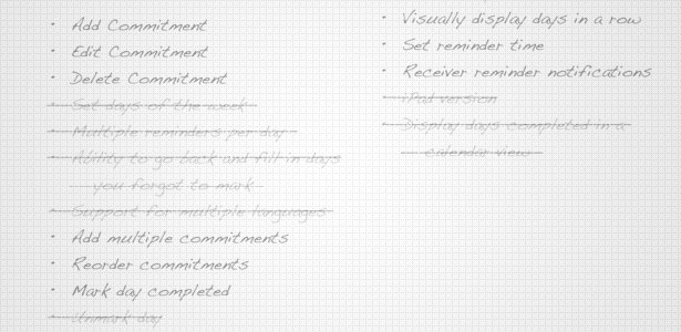
Then, when you decide what to build, select only a few things. Of that entire list which one or two things could you release on their own? Be ruthless when cutting out features. In order to be successful you need to start small.
Once you've selected the one or two features you are going to build, focus everything on building a quality experience. Set the bar for the experience as high as possible. Your goal should be to start with a simple application that is a joy to use.
With that as a starting point you can release sooner and find out if anyone actually cares about the problem you've solved. Then you can gradually add more features, but only when you can maintain the high standard you've already set for the quality of the application. If you can't find a way to design a feature with that level of quality, don't add it.
Never sacrifice experience for another feature.
So, dream big, implement small and you'll be on your way.
(Thanks to Dan Cederholm of Dribbble for introducing me to this phrase).
2. Poor alignment and spacing
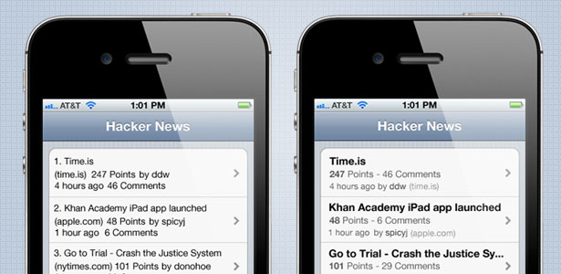
Developers often complain to me that design is hard. If only it could be analytical like programming they would find it easier. Well, you’re in luck. I want you to use analytical precision to make sure all the elements in your design are properly aligned. By that I don’t mean they have to follow some fancy design technique. I just mean that everything aligned to the left edge should be the same distance. If your margins are 10px, use that throughout.
Elements should be spaced consistently from each other and have plenty of padding between each element. I know you’ve been told to add more white space before, but it truly is important.
3. Not using finger-sized tap targets
When trying to fit everything into a mobile screen it can be tempting to decrease the size of your buttons. The minimum recommended touch size is 44 pixels square.
Fingers and thumbs come in all different sizes, so what works well for small hands may not work for someone with large hands. By keeping tap targets larger than this minimum you will avoid frustrating users.
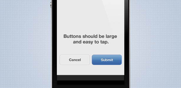
Just because your tap target needs to be 44 pixels square doesn’t mean that the button outline itself has to be. You can increase the target area larger than the button itself to help inaccurate taps still trigger the button. If your button isn’t right next to other elements with tap actions then the button can actually be quite a bit larger without changing the visual desig
4. Using breadcrumbs in navigation
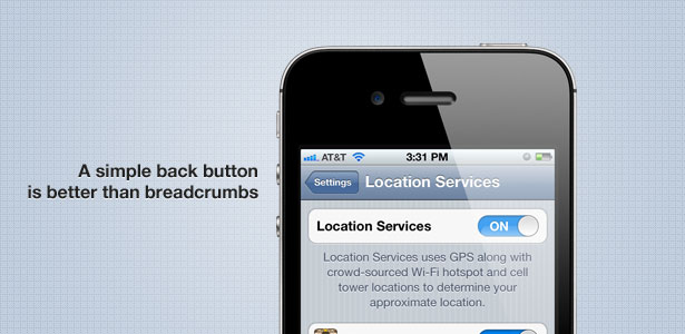
Imagine that you are browsing an app and have worked your way 4 levels deep. After reading that content you want to go up one level, but accidentally tap the “Home” level in the breadcrumbs. Ouch. That’s like a reset button for your previous work browsing to that section. We’ve already established that because of small tap targets, users often accidentally tap the wrong elements.
A simple “Back” button is recommended in an app title bar (not necessary on Android devices with a hardware back button). Many developers think they are making things easier for their users by adding breadcrumb-style navigation to the header, allowing users to jump back to any level they want.
It is preferable that the Back button changes its label based on the page it will take you to. So it could read “Settings” or “Users” depending on what that previous view was.
5. Logos in title bars
In an effort to more clearly brand an application, designers often place the company logo prominently in the title bar, replacing the name of the page in the process. This is fine for the first page where the user may not need context. But on subsequent pages you want to reserve the title bar space for the page title. This helps give the user context and informs them of the content they should expect to find further down the page.
The Twitter app for iPhone handles this well, placing a simple logo in the title bar of the first page, but on all subsequent pages replacing it with the standard title text.
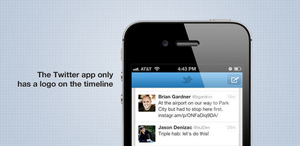
If your design needs stronger branding you should revisit your color schemes and styles, rather than just forcing larger logos into the interface.
6. Not doing usability testing
You are not in a position to accurately judge the usability of projects that you are working closely on. Concepts that may seem complicated at first come naturally to you now that you’ve been immersed in them for months. What happens is, we look through and test our own software, not realizing our own biases. Not getting outside opinions is a huge mistake. You do not want the first time you find out that a screen is not intuitive to be when an irate client phones up to complain.
Usability testing is critical to the design process. So why do so many people avoid it? Simple: they don’t realize how easy it is to do. When I talk about usability testing I don’t mean hiring a firm in white coats to do a week long study where they closely analyze your design.
Instead just find a friend who has never heard of your site before. Start by giving them just a tiny bit of context like, “What do you think of this to-do list app?” You don’t even have to tell them it is yours (the feedback may be more blunt). The next step is easy: just watch them use it. Pay attention to what screens they got stuck on, when they stop to read the text and when they just start tapping buttons. You will quickly discover areas that aren’t as intuitive as they could be.
Often tiny changes will make a huge difference. A well placed tooltip may be enough to explain a concept and show the user where to tap next. Keep your testing informal, and try it with 3-5 people. You will learn a lot.
Conclusion
There are plenty of mistakes you could be making, but this short list will get you started. The two most important concepts are refining your feature set and doing usability testing. Get those right and everything else will fall into place.
If this post described parts of your mobile experience, don’t worry. They are all easy mistakes to make. But if you avoid them your mobile experience will be much more clean and focused.
Have you been making any, or perhaps all, of these mistakes? What no-nos would you add for mobile design? Let us know in the comments below.

