When pages are not paper: the designer's guide to layout code
 InDesign boxes are as simple as click-and-drag. Photoshop’s layers let painters color pixels anywhere they please. But layout with HTML and CSS is a game of nudging and cascading.
It happens every day: Photoshop-savvy art directors mock up designs, honing their spacing, carefully choosing appropriate typefaces and colors. They hand off their work to an eager HTML developer, who announces that the design will likely take days to turn into working HTML/CSS. Worse, they’ll make changes to account for different screen sizes. Timing is a mystery to both parties. Will it take the developer an hour or a week to turn their PSD into working HTML/CSS?
The fundamentals of web layout — the possible, the practical, the possibilities — are easy to grasp. Like design itself, understanding the principles will help any designer produce better designs and expedite the process of building a site.
Block elements stack, inline elements flow
Everything on a web page, from paragraphs to images to links to bold text, resides in invisible boxes. These boxes come in two varieties: block and inline. The difference between inline and block lies in their behavior.
- Block elements are rectangles. They love to fill horizontal space.
- Inline elements are rectangular, except that they may wrap.
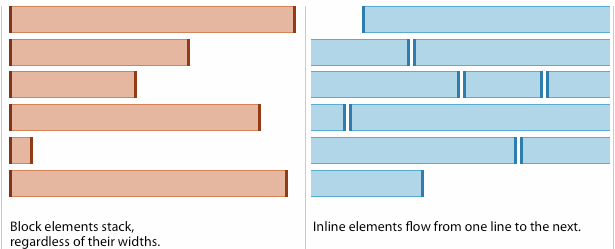
Block elements stack on top of each other. Unless told otherwise, they occupy as much horizontal space as possible, pushing everything around them up or down. For design, block elements are the primary layout tool.
Inline elements are based on text formatting. They don’t break the flow of text, and their dimensions expand to fit their contents. Telling an inline element to keep a width of 200 pixels won’t work. Filling it with text will.
By default, every element in the <body> is either an inline or block element. Designers can change their nature with a little CSS — say, turning a stack of list items (natively blocks) into a row, or a series of horizontal links (natively inline) into a vertical stack. That means any visible element may be used for layout. Whether they should depends on the layout in question.
Native block elements include:
- Divisions
<div> - Paragraphs
<p> - Lists
<ul> - Items in a list
<li> - Headings
<h1>–<h6> - Tables
<table> - Block quotes
<blockquote> - Organizers in HTML5
<section>,<aside>,<nav>,<header>, and<footer> - The body itself
<body>
Inline elements include:
- Anchors (hyperlinks)
<a> - Bold
<strong>and<b> - Italic
<em>and<i> - Images
<img> - Citations
<cite> - Type styling
<font> - Form labels
<label> - Up to you
<span>
Common tags that are neither block nor inline:
- The document title
<title> - Meta tags
<meta> - Script tags
<script> - Link tags
<link>
At first glance, adapting to the lego-like mentality seems counterintuitive in a medium that allows gradients, curves, and elastic layouts. But the idea of everything as a brick is crucial to understanding where content and presentation meet.
Guideline: Every pair of tags (or standalone tags like <img>) in the body represents a box.
Using blocks for layout
Delete a text frame in InDesign, and the adjacent photo won’t move because neither’s placement relies on the other. Apply curves on a Photoshop layer, and no other layer will change because curves affects one layer at a time. But delete an element in HTML, and everything after that element will likely change. Blocks in a web page stack to the upper left corner of their container, such as the <body> or another block.
All web layout is accomplished with block elements. Designers use blocks, most often <div> elements, to create rectangular areas into which all content fits. There are only four rules:
- Total width: The space an element occupies and affects.
- Float: Altering blocks’ tendency to stack.
- Clear: Re-estblishing stacks.
- Nest: Elements lie within each other or not. There is no half-way.
Each rule has caveats… but none are required to assemble a page.
(CSS experts will recognize that these rules apply to elements with relative positioning. Absolute positioning is a different — and less common — animal.)
1. Total width = box & buffer
Total width is how much horizontal space a block occupies. This includes the block’s margin, border, and padding. In print parlance, margin and padding are types of gutters. But unlike traditional negative space, created by pushing boxes apart, padding and margin are part of a box. They’re like kerning for layout elements.
Calculating width, padding and margin is often the biggest headache for designers, but the remaining rules are a bit more straightforward.
2. Floating knocks blocks from the stack
Floating pushes a block element left or right, removing it from the natural stack. When a block floats, it makes room for everything below it to rise around its other side.
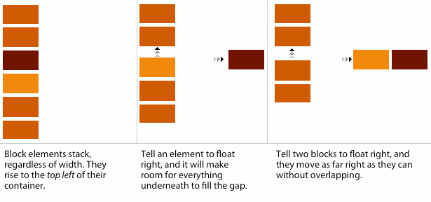
Columns arise when a series of blocks float adjacent to each other.
3. Clearing: Enabling designers to organize a page both horizontally and vertically
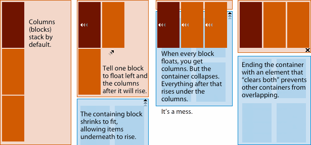
An unfortunate side-effect of floating is its impact on the container. A container will grow vertically to fit its contents — except those that float. If everything floats, then the box has no height. Anything underneath rises under the floating items. Chaos ensues.
Clearing resumes blocks’ natural tendency to stack. In effect, it reminds a container that it has something to contain. Without clearing, designers cannot organize a page both horizontally and vertically.
4. Nesting
Nesting is simple: Every block must completely reside in another block. No block may ever extend outside of its bounds without serious consequences, and no two blocks may partially overlap.
Columns must fit, or else
This is where designers must perform a little math. To fit columns properly, the sum of their total widths must be less than the width of their container.
Columns are a series of block elements that pushes left or, on rarer occasion, right. If these columns are too wide for their container, without special techniques the last column will fall below the others.
A simple layout might use three <div> elements to create a two-column layout:
<div id="container">
 <div id="main-content">
 …
 </div>
 <div id="sidebar">
 …
 </div>
</div>
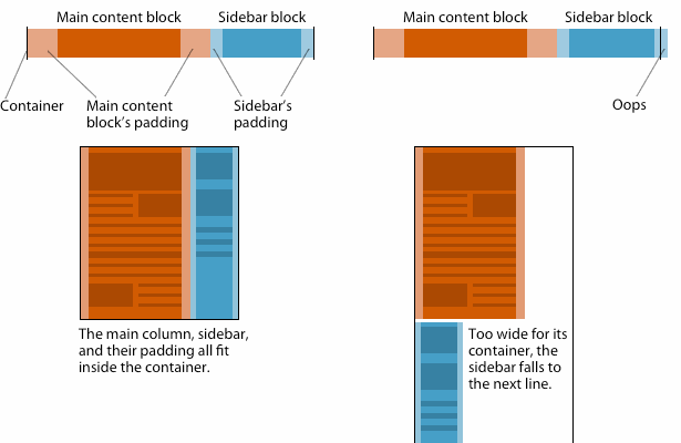
Above, the left example uses this CSS:
#container { width: 1000px; }
#main-content { width: 600px; padding: 20px; }
#sidebar { width: 340px; padding: 10px; }
The container measures 1000 pixels wide. The main-content block is 640 pixels wide — 600 width + 20 pixels of padding on each side. The sidebar block is 360 pixels wide — 340 width + 10 pixels of padding on each side. (600 + 20 + 20) + (340 + 10 + 10) = 1000. A perfect fit.
In the right-hand example, however, something’s too wide. It could be either column’s padding, or the column widths themselves. Maybe the container is too narrow. Changing any of those factors to make the container wider than the columns would solve the problem.
Exceptions require more code; uniformity requires less
Unlike more traditional visual media — say, sculpting or graphic design — writing code requires a strong mental picture of what the code will do.
Some aspects of designing by code are obvious. Simple designs often use less code than complex designs. If the solution to a design problem requires every widget, column, and piece of text to have its own background color, so be it. It just requires more code.
- If one piece of text is larger than others, then it needs its own entry in the CSS file.
- If two columns have different widths, then the CSS file should specify widths for each.
- If a design requires three types of bullet points, the CSS requires three definitions.
A less obvious fact of design-by-code is that it’s… less obvious. Imagination and experience are especially necessary in programming page layout, where changing a column’s margin will impact its neighbors. In the transition from print to web design, failing to imagine the outcome trips up new developers.
Not that color:blue is hard to grasp. But it’s one thing to write div { background: url(photo.jpg) top left no-repeat; } and another to see a photo in context of the page.
Luckily, some analogies ease the learning curve.
- Think of CSS as working entirely with paragraph styles. Altering one item on the fly is cumbersome. CSS works best when applied to a whole classification of images or words (hence the “class” attribute in HTML).
- Imagine viewing one quarter of a page at a time. At any given time, users see only part of a web page because most web pages are larger than the average browser window. End users only see a piece at a time. The “fold” occurs on all four sides of the browser.
- Ask yourself “what if every element doubled in quantity?” Good designs present content well at launch. Great web designs continue to do so. Article templates must accomodate articles of varying length. Content managers will remove old text or add new photos that do not conform to planned proportions. Clients decide they want their five most recent tweets on the home page. No one knows how a site may change, but planning for different amounts of everything is a good precaution.
Moving forward
The benefits of understanding web layout are knowing what’s possible, preventing common pitfalls, and faster development times. But learning to design with HTML/CSS in mind requires a change in thinking. CSS systems like the 960 Grid System minimize the technical work required, easing the transition from pure pixel work to code. But like learning any language, the best tool may be persistence.
What gives you the most trouble turning mockups into working HTML and CSS? Share your experiences and solutions in the comments below.
Thumbnail via Shutterstock


