 ‘Responsive’ is the latest movement in web-development – and one that’s needed pretty badly. Every day, the number of devices, platforms and browsers that are used to access the internet grows. And while the majority of users still access the web from traditional platforms, the demand for fluid and adaptive websites is stronger than ever.
Many designers are taking this change to heart and creating some spectacular pieces that thrive in mobile, tablet and desktop environments.
The following sites fuse beauty with responsive web design techniques and really showcase what can be achieved with a little innovation. So grab some popcorn and a notepad, you’re going to want to pay attention.
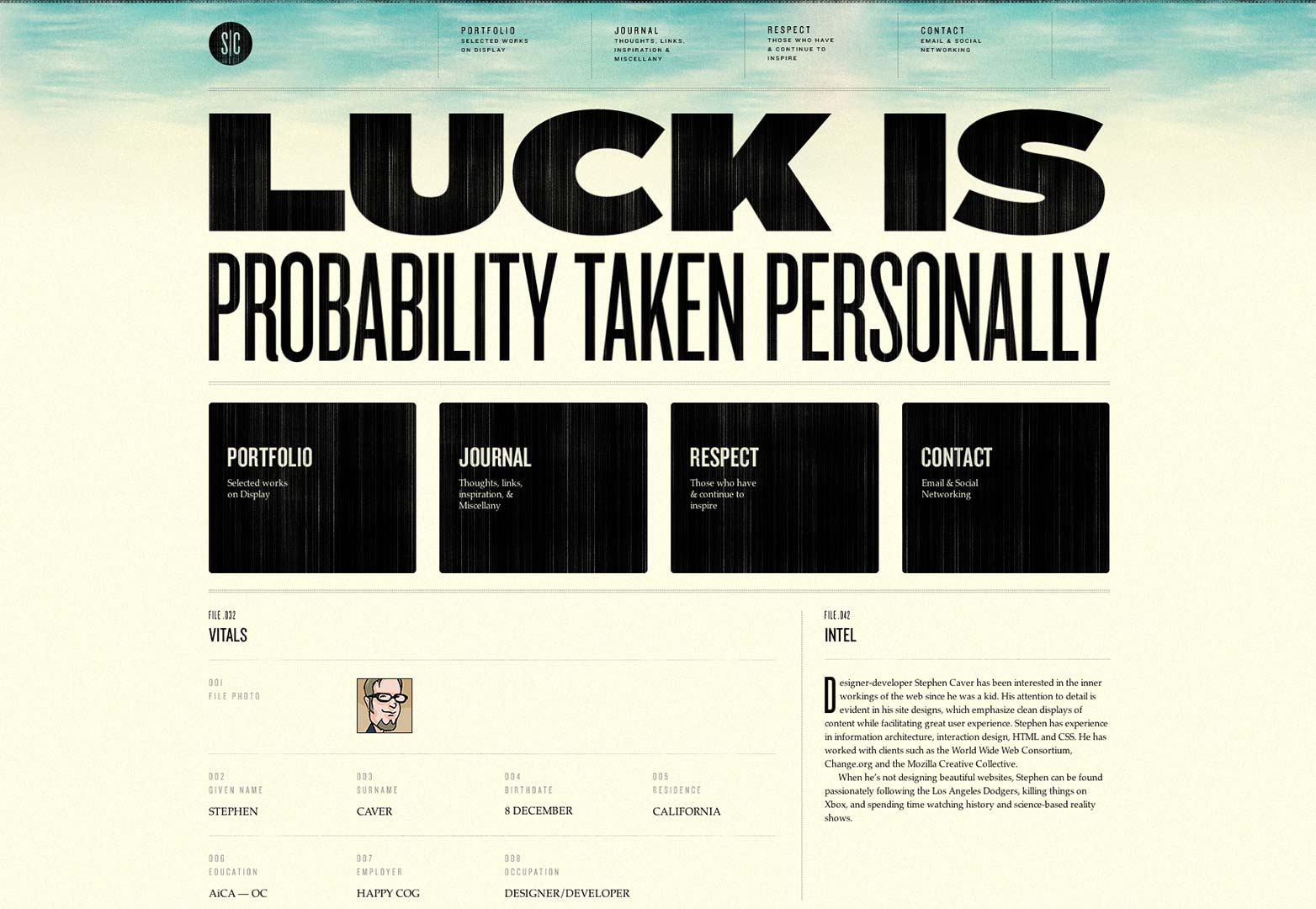
StephenCaver.com
When you open this site on your desktop, it’s immediately captivating. The bold, black, justified heading contrasts beautifully with the almost watercolor-like quality of the Mojave Desert background. When this site adapts to mobile size, the change is significant, and the site still looks great.
FoodSense.is
With its wide layout, the clean lines and simple structure this site is a fantastic example of minimalist web design. When viewed on a tablet or mobile it adjusts without compromising on composition or flow.
Warface.co.uk
The use of color is striking and the innovative placement of the 3D figurines in the foreground of the site really engages the viewer. The site is unique and exciting, and none of the impact is lost on mobile.
DanielVane.com
Again here the designer lets his work speak for itself. The landing page is beautiful in its full-sized simplicity and this carries through perfectly onto mobile, leaving one particularly arresting illustration which includes a subtle logo.
SasquatchFestival.com
This site is fun and playful and unique amongst the other sites on this list. They forego clean simplicity in order to have fun with color, imagery and icons in a way that still manages to deliver on style. This can be difficult to do in a small space, but the designers of Sasquatch manage effortlessly.
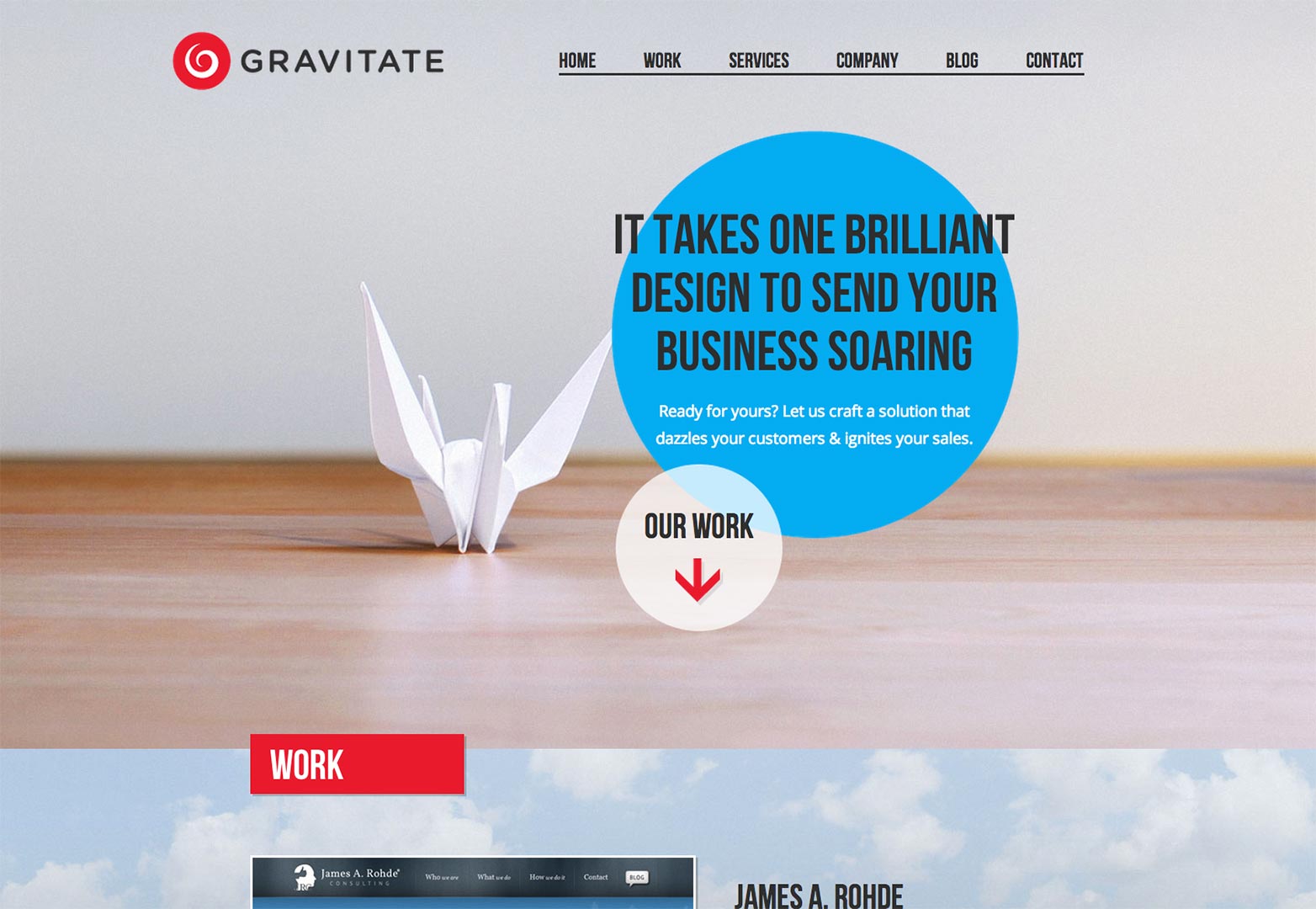
GravitateDesign.com
The use of shape in this site stands out immediately. By avoiding the use of borders and content boxes, they have managed to create a site that showcases their work at its best.
VisualSupply.co
Similarly to Warspace, it’s the imagery that really works for this website. It’s perfectly structured, and looks beautiful on every device.
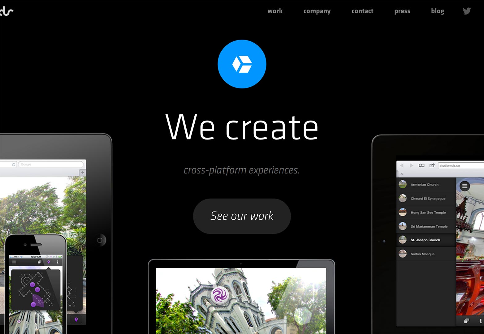
StudioMds.co
Dark colors can sometimes be overlooked in web design, but Studio Mds enhance their content with their bold decision. The layout adjusts to fit a smaller screen size losing nothing but superfluous links.
ForefathersGroup.com
This site has a great, vintage feel and utilizes texture, imagery and font to create that. It slims down beautifully (but it’s a shame to lose that monkey).
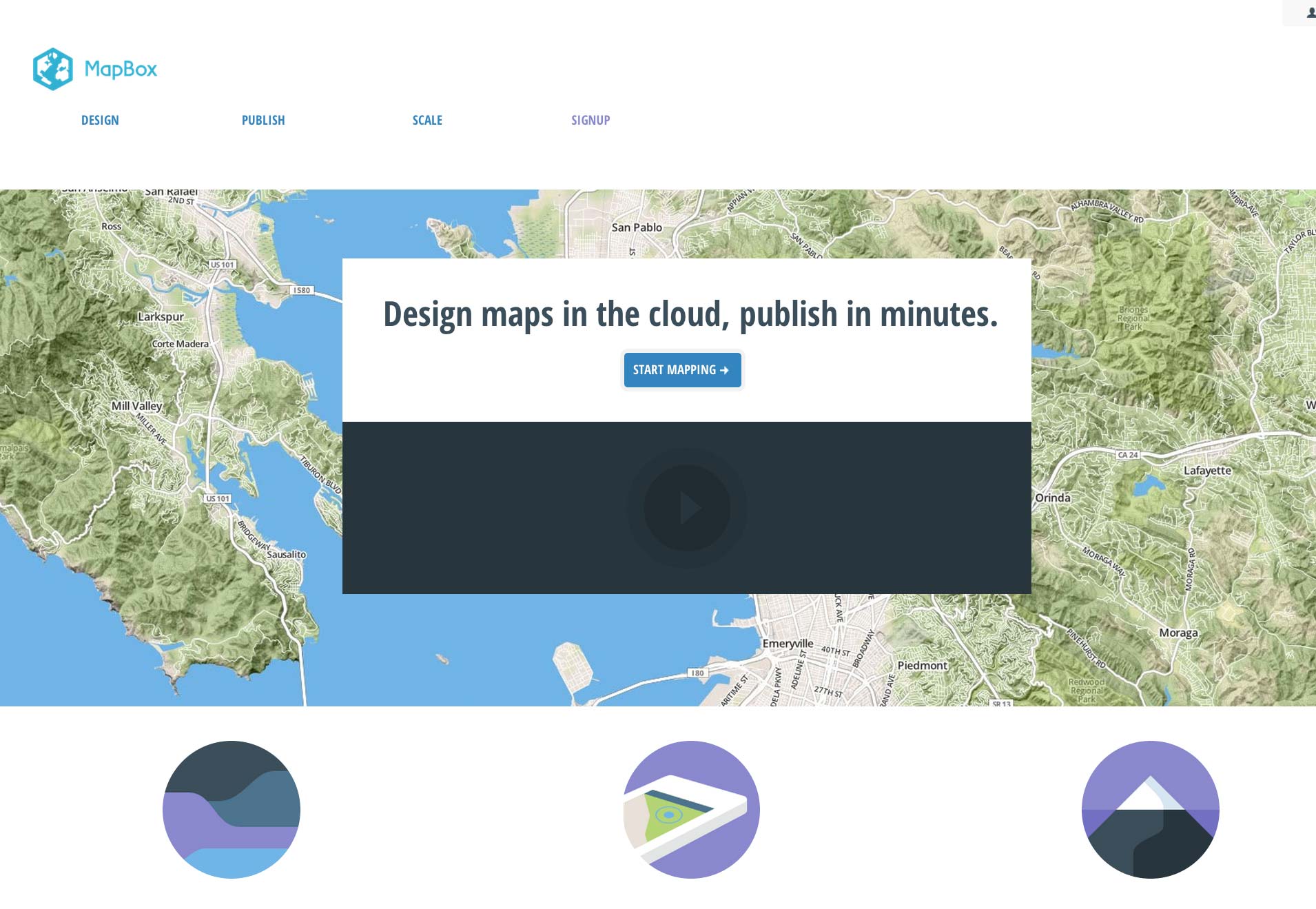
MapBox.com
The color scheme and use of photos give Mapbox a clean space in which to showcase their product. Again simplicity wins out over complex or fussy design, and that’s precisely why it works well on a smaller screen.
Things to bear in mind as you design
So, now that you’ve looked at some stellar responsive sites you’re probably itching to start designing your own. But before you run off, here are a few things to remember.
Photos
One obstacle for responsive design is how devices display photos. A MacBook Pro with a retina display is going to render an image at a much higher resolution than a mobile phone, which can often create problems. One way to side step this issue is to upload both high and low resolution copies of your photos. Using CSS you can then determine which image is loaded based on the device’s screen resolution. If you're using stock photos make sure that you splurge for the higher rez option.
Determining breakpoints
Oftentimes responsive designs are built around what are known as "break points" — or the resolution at which the layout changes — based primarily on common device screen sizes. The problem with this approach, however, is that it doesn’t take into consideration just how diverse screen sizes really are. There is no “universal” size anymore. So, instead of predetermining breakpoints at 360px (mobile), 768px (tablet), and 1024px (desktop) it’s better to let your design speak for itself. Start with a finished layout and then resize your window until the design breaks – make this one of your breakpoints and then continue on. You’ll find that your site flows a lot smoother.
Have you come across a fantastic responsive landing page? Have you designed one yourself? Let us know in the comments.

