
 What if we lived in a world where the only available typeface was Comic-Sans? That's the idea, or at least must have been what the Russian Belgorod-based designer Oleg Tarasov was thinking when he decided to re-design some of the most well know brands of our time using the usually frowned upon Comic-Sans type.
Oleg posted his designs over on his Behance profile. The comments there ranged from the very common "this looks funny" — well, what would we all expect from a font with the word comic in its name, right? — to the surprising positive response praising some of his versions over the originals.
What!? Ouch, I don't know if I can agree with that, read on to get my views on them, but hey, you be the judge!
Here's a selection with the best, well, I mean least worst of them. Check them out:
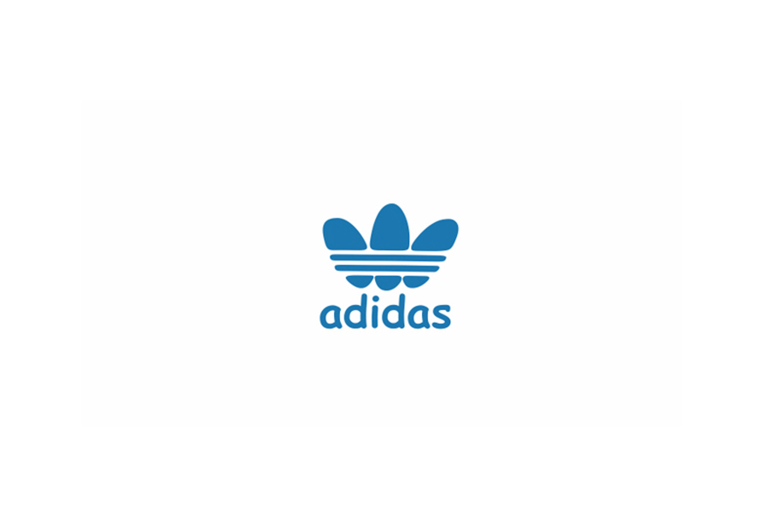
Adidas
The global sports Adidas logo and more friendly-looking mark. The type? Well, you know.
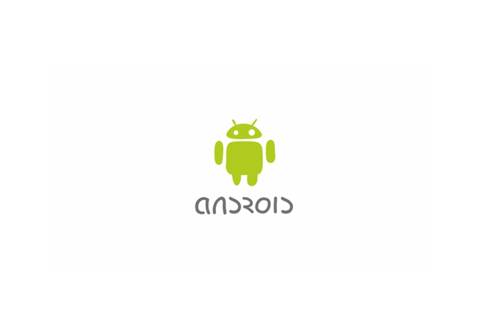
Android
Surprisingly the tiny little green robot, err, I mean android, looks quite cute.
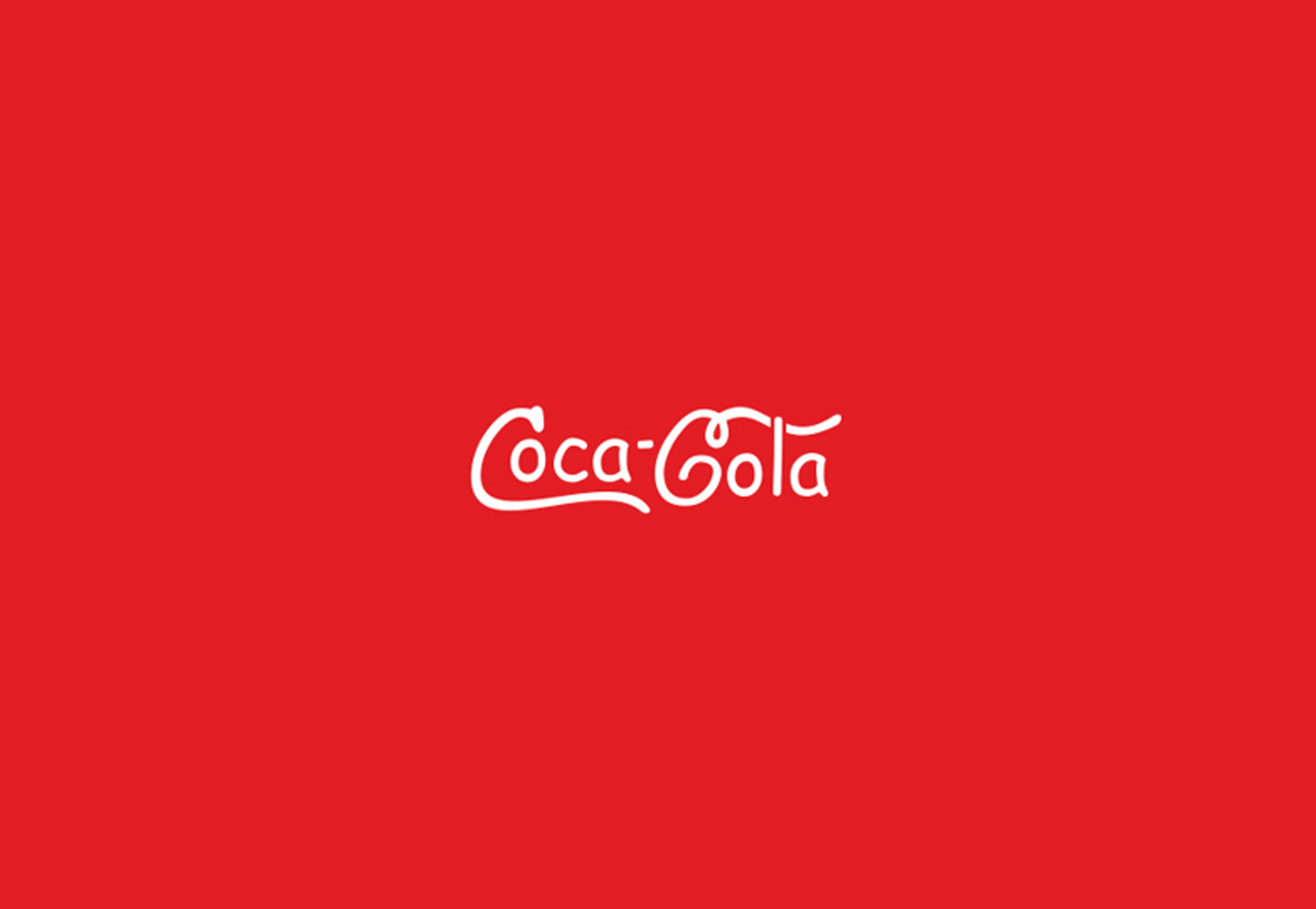
Coca-Cola
Improving Coca-Cola's logo is a huge challenge in itself, who dares? A quick tip, using Comic-Sans to get there is not the right way of doing it.
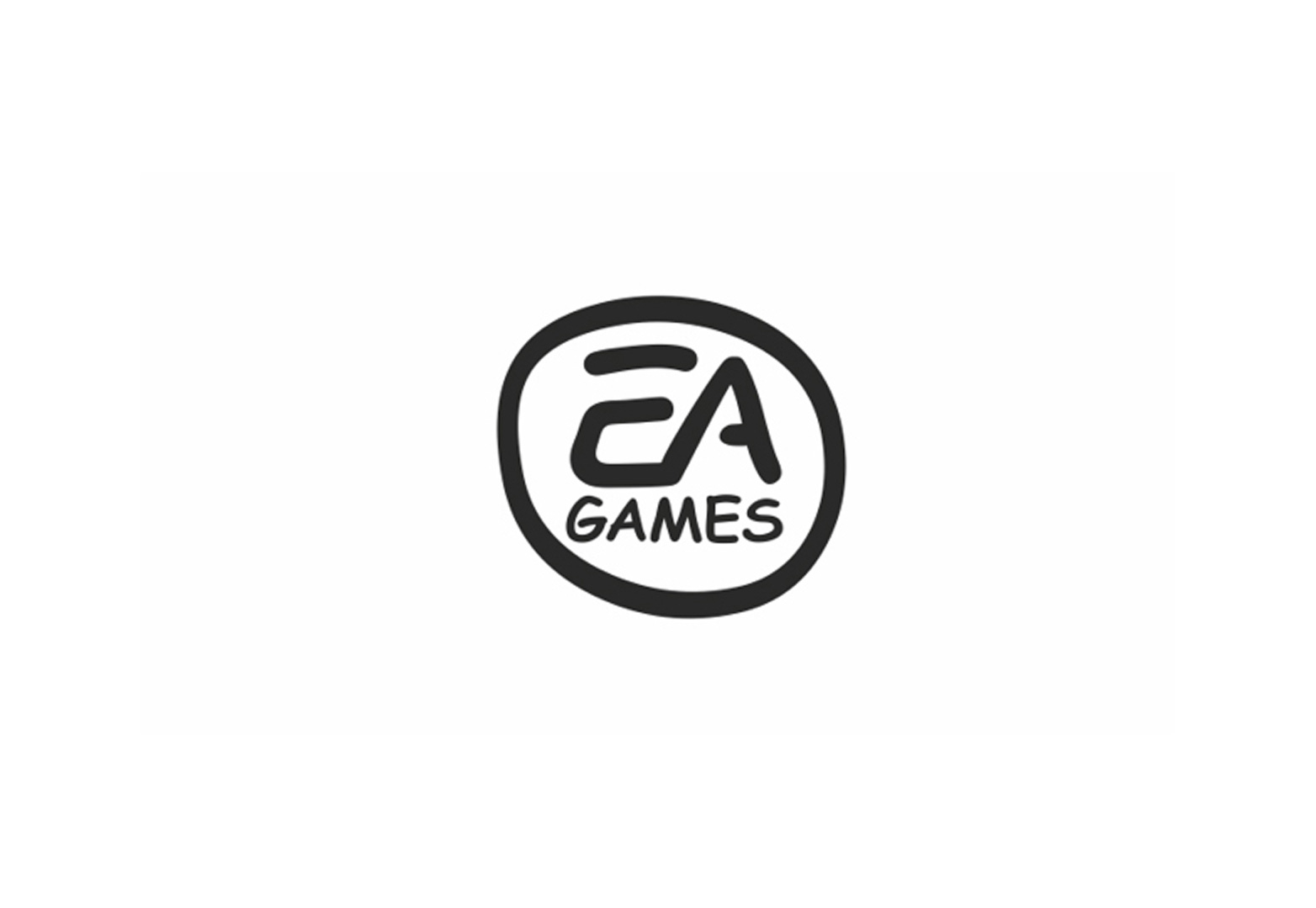
EA Games
I wouldn't be surprised if the guys from EA end up using this logo on a real game made for children. Or perhaps they already did, anyone can confirm that?
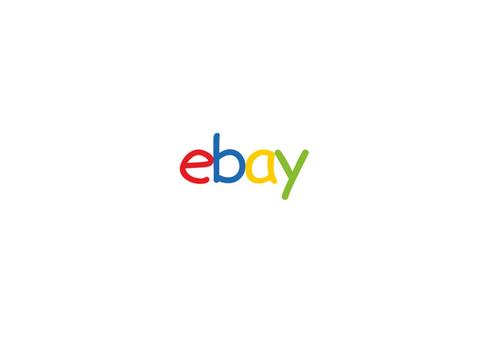
eBay
Here's something funny, as if the above is not a joke already, but I bet some designers are going to say this version looks better than the official new eBay logo.
HTML5
I recall the launch of the HTML5 logo and how people said it didn't make much sense at all. So, a big red shield with the number 5 in it, guess what? It makes even less sense now.

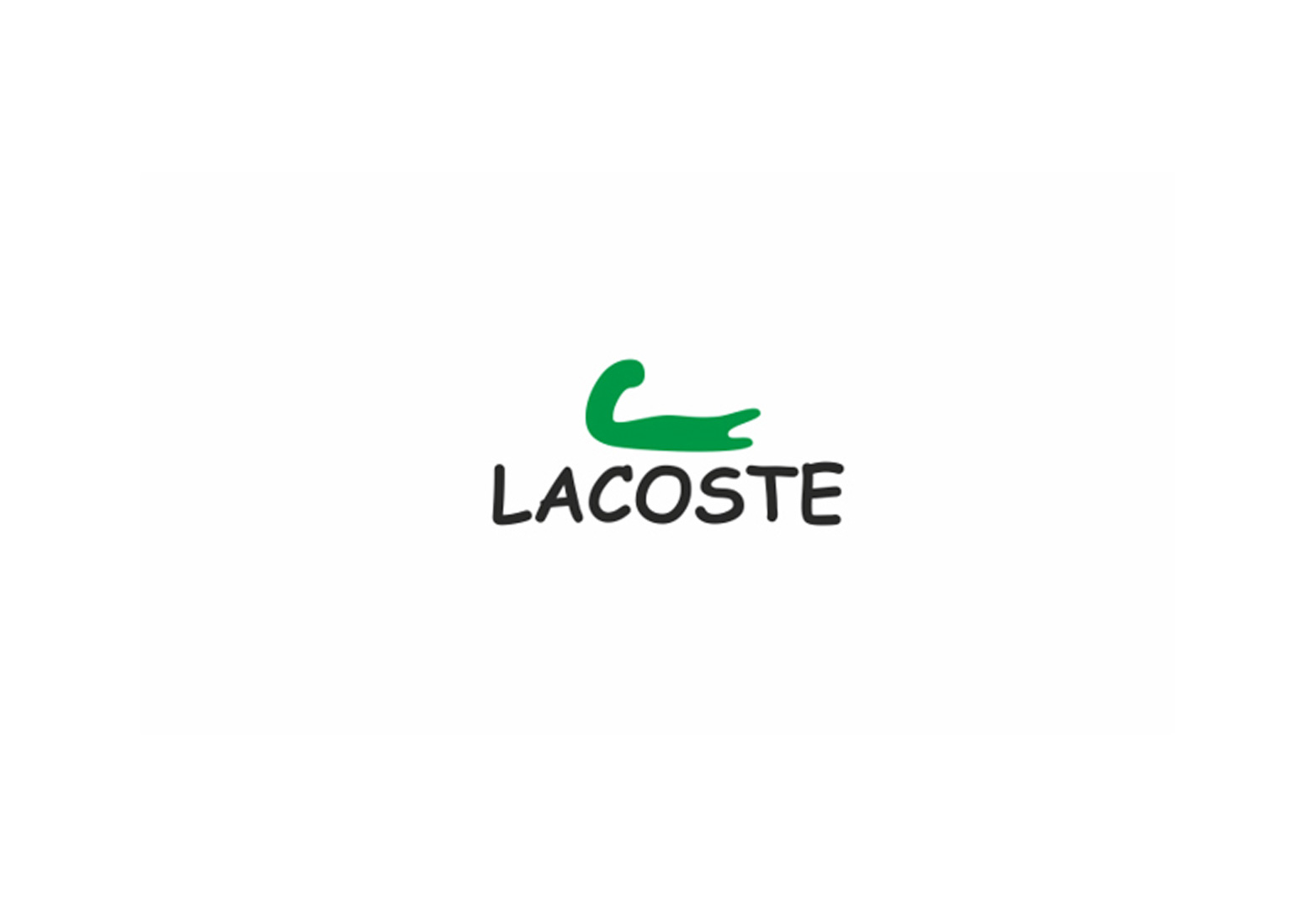
Lacoste
I can't stop seeing a little green arm and a slighted elevated biceps, perhaps an alligator ate the arm of a fairly strong man.
Microsoft
If Microsoft was to launch a tablet made with children in mind, guess how the logo would look? I would go with the logo below; spot on.

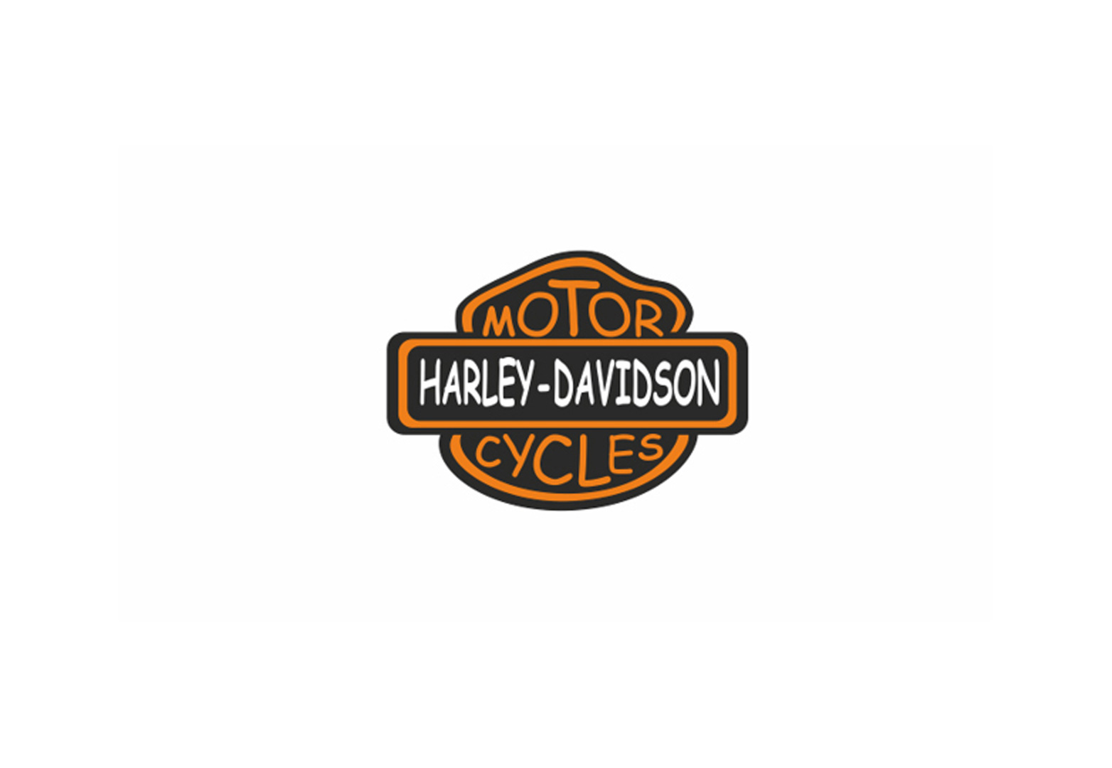
Harley-Davidson Motorcycles
Tiny little motorcycles made for those rebel toddlers who don't want to eat their meals on time.
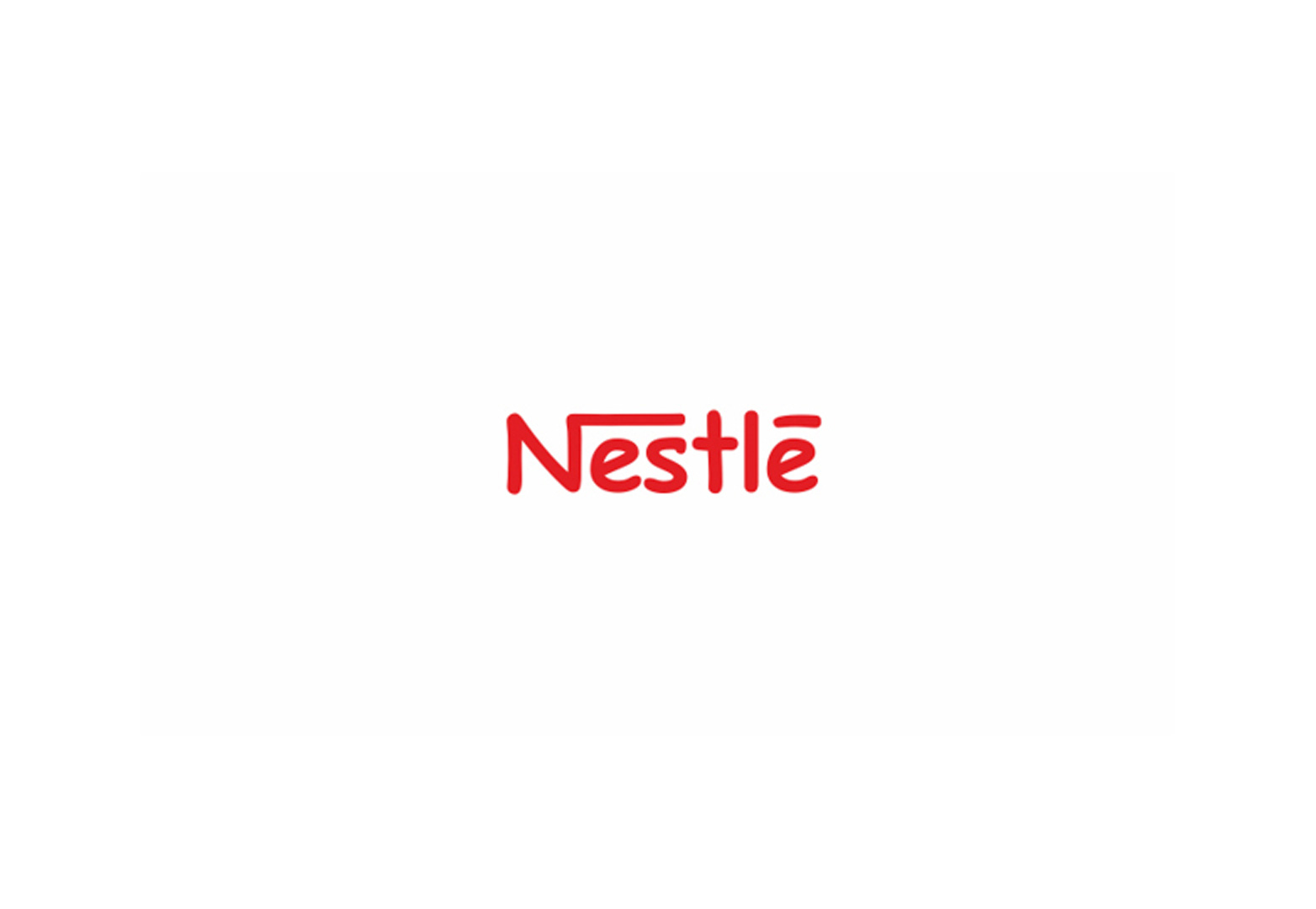
Nestle
This comic-sans logo almost got me. Nestle is such an organic brand that this logo doesn't actually look bad. Ok, I'm not making a case for it, obviously I prefer the original!
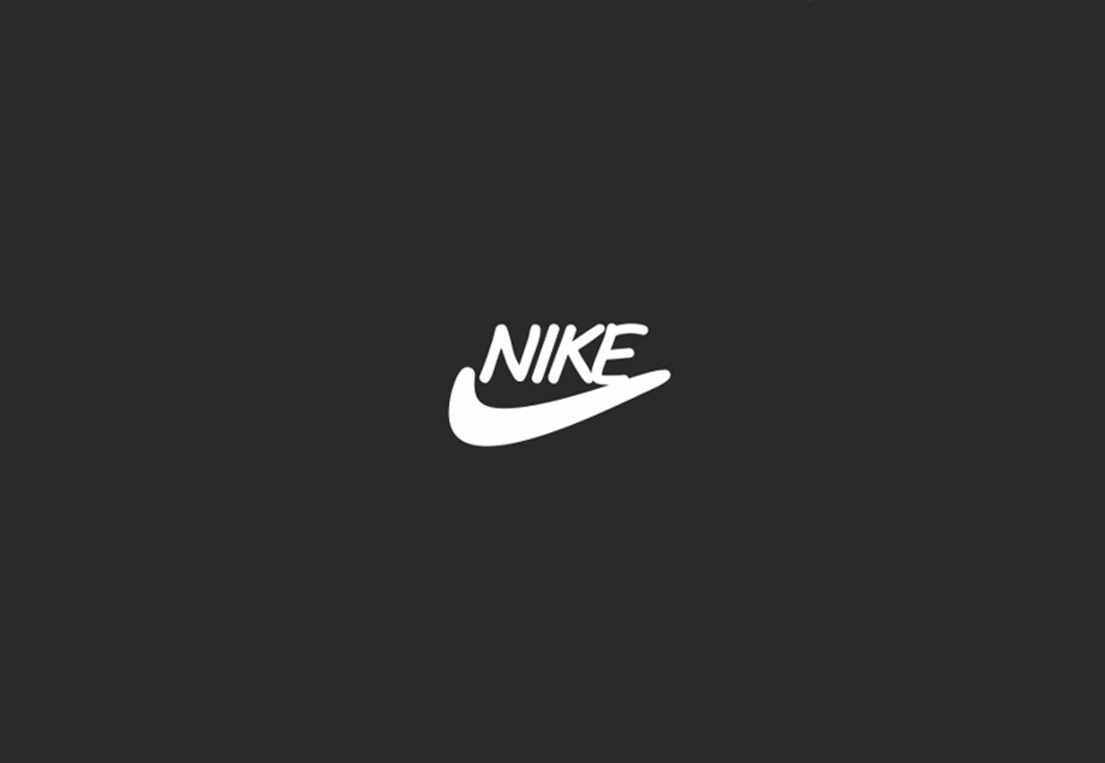
Nike
Remove the sharp edges and Nike is now an Australian boomerang manufacturer.
YouTube
Ahh, this one is easy, a YouTube made for kids, with safe and sound, quality educational videos.

Should we all be in favor of this change and live in a world made of happy-looking brands? If you ask me, certainly not, but many have already pursued the comic-sanstification of world renown brands before, such as the French design studio Cephalization — yes, I know, what a name — who are behind the Comics Sans Project, where they receive submissions of comic-sans-based logos from all over the world. Oh God, the agony!
If you haven't pulled your eyes out yet and want to see a bit more comic-gore, be sure to check more logos over Oleg's page on Behance and the Comics Sans Project. Good luck!
What do you think of multi-billion dollar multinationals adopting Comic-Sans in their logos? Have you ever successfully used Comic-Sans for branding? Let us know in the comments.
Ray Vellest
Ray Vellest is a brand identity specialist based in London and working with organizations and individuals from all over the world. Ray’s approach to identity design position his clients as leaders of their industries while creating a valuable long-term asset for their businesses. Follow @rayvellest on Twitter to keep up with his latest updates.


