 We're all familiar with the parable of the ugly duckling; spurned by its peers for being too ugly, it is miserable throughout the winter, only to discover in the following spring that it is in fact a swan.
The moral of the story being that it's what's on the inside that counts; or perhaps that you shouldn't spurn nerds because they'll go on to make billions in social networking; or perhaps if you stare at anything long enough it starts to look appealing.
I've found this to be true of Typotheque's Karloff Negative. Initially I found it deeply deeply ugly, but the more I look at it, the more it appeals.
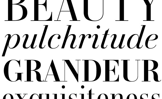
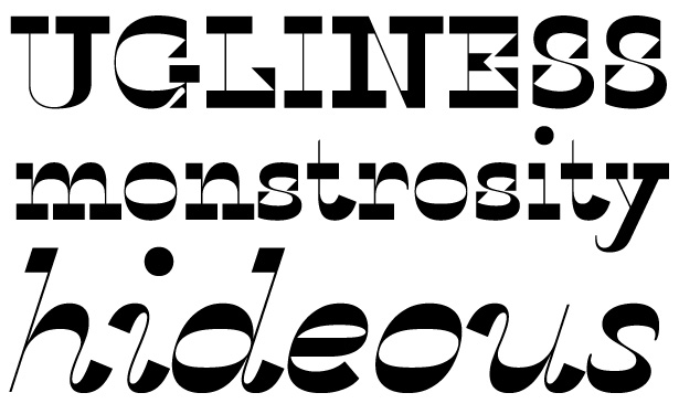
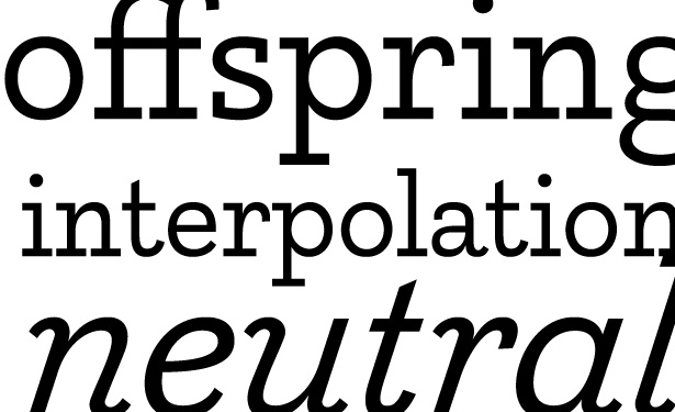
The Karloff family has been developed to explore the relationship between beauty and ugliness. It includes Karloff Positive, a beautifully rendered didot font; Karloff Negative, identical to Karloff Positive except that the thick-thin relationship of the glyphs has been inverted; and Karloff Neutral, an on-the-fence slab-serif.
Karloff Positive, like all didone fonts, is ideal for fashion, beauty and aspirational designs.
Modern and regular it includes some elegant details, the ball serif on the lowercase 'c' and the terminal on the lowercase 't' are particular high points.
Karloff Negative is the same basic design, but with a radical shift; the thick-thin relationships have been inverted so that stems become thin and bars become thick. This creates a jarring, less regular and less legible typeface. The style, which has never been popular, is known as Italian type, and can be found in a lot of early twentieth century American woodblock prints.
Karloff Negative is ideal if you're looking for a memorable typeface full of vintage character; perfect for recreating the UPA style of the 1940s and '50s.
Lastly, there's Karloff Neutral, a simple, modern slab-serif that is surprisingly usable alongside its character-filled siblings.
Karloff Neutral is the ideal font for minimalist design. In fact, if you're designing a site for a photographer, you absolutely must shortlist Karloff Neutral for the branding. It's clean, legible at various sizes and deliciously simple.
Typotheque offer a web-only license for their Webfont service meaning you can insert Karloff fonts straight into your CSS. Prices range from €24 for a web-only license for Karloff Neutral, to €100 for a web-only license for Karloff Positive, Karloff Negative and Karloff Neutral (including bolds and italics).
Have you used Typotheque's web-font service? How did you find it? Do you prefer to stick to 'web-safe' fonts? Let us know in the comments.
Thumbnail includes Frankenstein image via Shutterstock.
Ben Moss
Ben Moss has designed and coded work for award-winning startups, and global names including IBM, UBS, and the FBI. When he’s not in front of a screen he’s probably out trail-running.


