
 Whether as part of a registration form, a payment form, or a contact form, it seems we’re always asking our users to give us information.
Unfortunately, a portion of visitors will see our form and, for whatever reason, decide to hit the back button. This could be because the form seems long and intimidating, they aren’t ready to purchase yet, or a host of other reasons.
Any time one of these forms is abandoned we lose a potential customer, so it’s in our best interests to make sure as many people as possible complete the form. It all starts with four simple questions…
What’s in it for me?
When talking about conversions, designers tend to focus on button colors, label alignment, and text-field size. Sure, some tweaks to those details can make a difference, but there is a much bigger question that we need to tackle first:
Why should I, as your visitor, fill out your form? What’s in it for me?
Your users aren’t going to give you personal information because you asked; you need to give them something for it. Something useful and valuable. Think of the transaction like a trade. Your visitor will give you their name and email address and in trade you will give them X (replace X with something that is worth a lot).
For many companies this is a free trial of their software, a PDF report on a topic useful to the visitor, or a free sample.
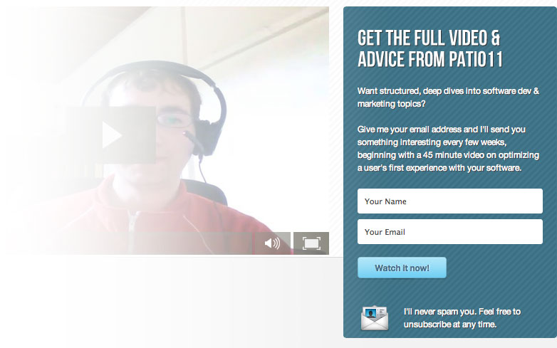
Not only do you have to give them something really useful, you have to tell them why it is useful. Focus on value. If your software solves a painful problem that the visitor has, then a couple of extra form fields aren’t going to prevent them from signing up.
On the flip side, you could have the shortest signup form ever, just an email address, and I still won’t sign up if you don’t give me a reason to.
Focus on what the visitor gets and your conversions will increase.
Why should I trust you?
Most websites don’t provide such extreme value that I am going to sign up on the spot. There is usually a little bit of convincing that needs to be done, especially since, if it is my first time visiting your site, I probably don’t have any reason to trust you. So as the site owner you need to provide social proof. This could be logos from the news sources that have covered your company, testimonials (with photos) of your happy customers, and any statistics that will encourage me to think positively about your company or product.
Caleb Wojcik of Pocket Changed wants you to sign up for his email list, but he does it by giving you something and providing social proof. First he says that he will give you his eBook, The Get Paid Manifesto, right after you sign up. So we’ve got the “what’s-in-it-for-me” part covered. But he also provides social proof by saying that 7,807 people have already downloaded it. If that many people have filled out the form already then it must be worthwhile.
Caleb could take this further by providing testimonials from people who have learned from the Manifesto.
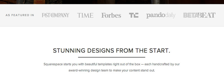
For software startups this social proof often includes logos from The New York Times, The Wall Street Journal, TechCrunch, and other prominent places they have been featured. These logos, which the visitor is likely to recognize, add instant credibility.
What are you going to do with my information?
To increase conversions we need to overcome potential objections. A major concern for many people is what you are going to do with their information. No one wants more spam or junk email. It may be assumed that you run a credible company that would never sell my information or send me spam, but it never hurts to directly say so.
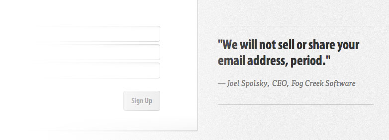
On the signup form for FogBugz Joel Spolsky, a credible source to the FogBugz audience, directly says, "We will not sell or share your email address, period."
Patrick Mackenzie says, “I'll never spam you. Feel free to unsubscribe at any time,” on the signup form for his training website. These simple statements further their credibility.
How long is this going to take?
Wow, so many objections! I said earlier that form length wasn’t the most important thing, and that’s true. We should be focusing on delivering and showing value long before worrying about how long our form is. But once we’ve optimized the offer, we do need to shorten the form.
I’ll bet many of the form fields you think are mandatory really aren’t. For example, I always thought you needed a name in order to process a credit card. Turns out that assumption just isn’t true.
Gumroad cuts down all the fields normally seen on a payment form to just email address, credit card number, and expiration date. That’s it. If they can do that when dealing with payment, I’m sure you can cut some fields for signing up for a free trial of your software.
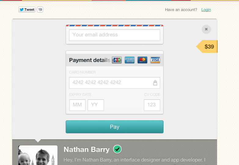
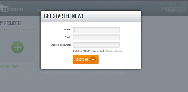
Once the fields are down to their minimum, you can try some design tricks to make the form even more likely to be filled out. My favorite is from the prototyping tool InVision. Their create-account page looks like it is in an overlay on top of the application. As a user I assume that I just need to fill out these four fields and the overlay will close and let me access the software. This makes it very clear that there aren’t additional steps to complete after the form.
Find the objections
Take a look at your forms and try to think through all the objections a user might have. Respond to them at each stage. That could be by adding credibility, improving the offer, being transparent about their personal information, or shortening the form.
Each form will have unique objections, so it’s important that you try to think through each one from a visitor’s perspective.
What do you object to when filling in forms? What tricks do you use to increase conversion? Let us know in the comments below.
Featured image/thumbnail, contact image via Shutterstock.


