 Not every designer gets the chance to work on a high-profile redesign. In fact, the vast majority will never have that chance. At least not officially.
But that doesn't mean they don't have some amazing ideas about how sites like Facebook, Twitter, CNN, and other big-name sites should look.
That's why a lot of designers take on conceptual redesigns of high-profile sites as personal projects. Designers aren't constrained by a client spec when working on solo projects like this, meaning they're free to innovate and take risks.
Here I've rounded up more than two dozen awesome redesign concepts for sites like Amazon, IMDb, Facebook, Twitter, Groupon, and more, to inspire you to tackle your own concept designs.
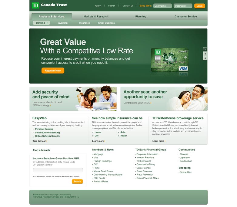
TD Bank
TD Bank's current website is probably among the worst bank websites out there. It's bland, boring, and not particularly easy to navigate. This concept, from John Kumahara, is a huge improvement over their current design. It's clean, easy to navigate, and well-laid-out.
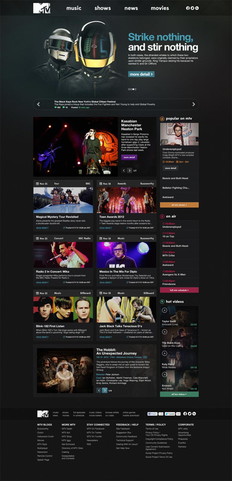
MTV.com
MTV.com has a great website to begin with, but this darker, slightly grungier design is an interesting take on the brand. It's a bit more sophisticated and understated than their current website.
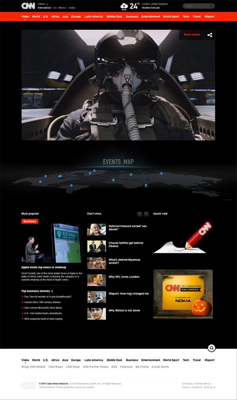
CNN
This redesign of the video section of CNN's website works really well with the black background, placing the emphasis squarely on the videos themselves. The events map is a nice touch, especially with the 3D perspective.
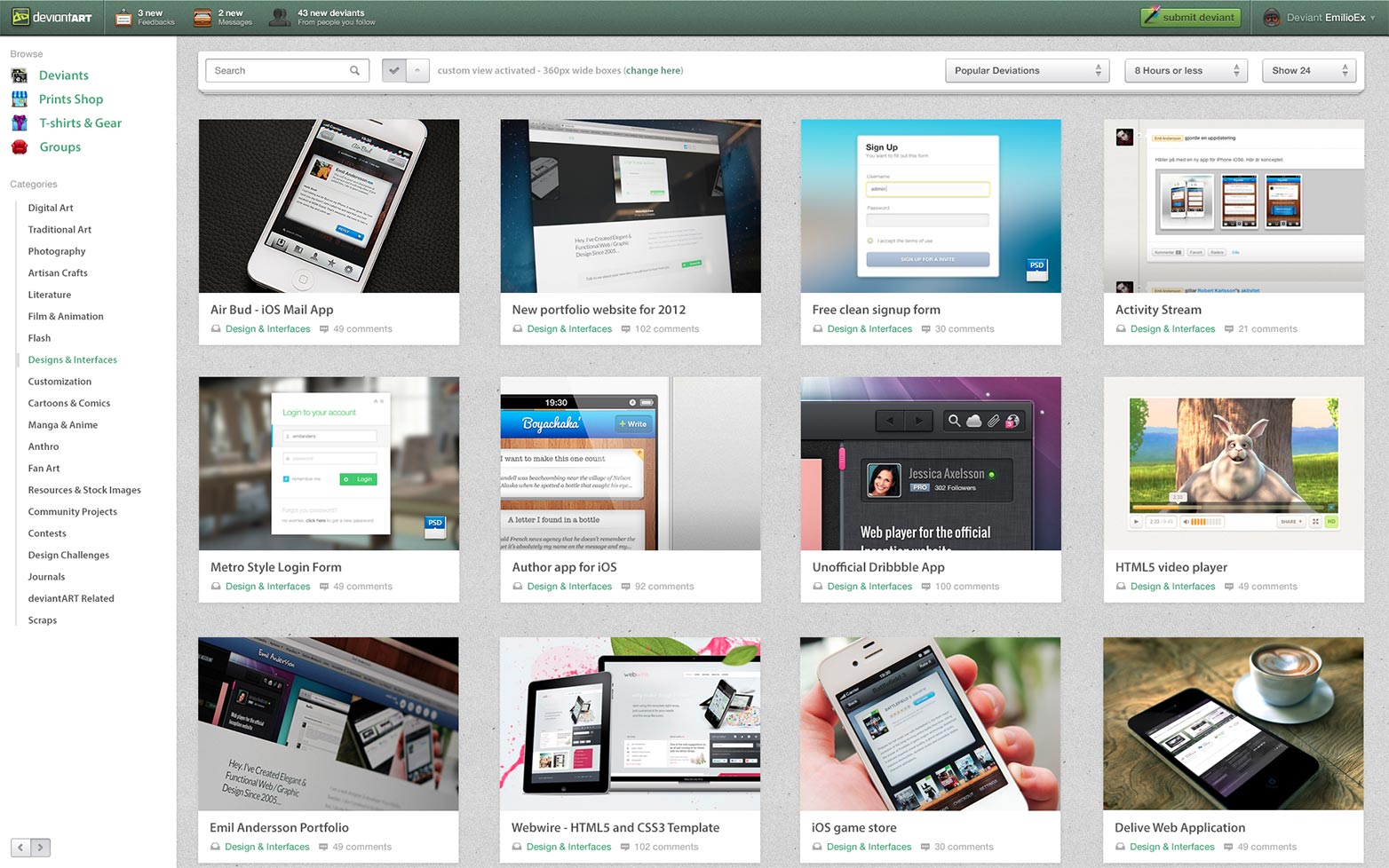
DeviantArt
DeviantArt's website has looked the same for quite some time, and while the current design is definitely functional, it could use some updating. This particular concept keeps the spirit of the current site while updating it and giving it a slicker, more modern interface.
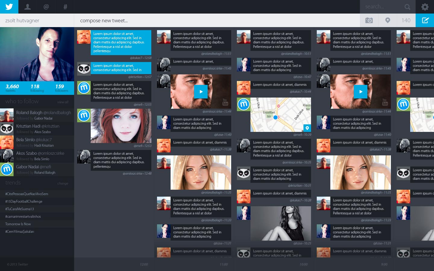
This Twitter redesign concept is slick and polished, with a multi-column, timeline-based layout. The timeline aspect is very interesting, while the overall layout makes a much better use of screen space.
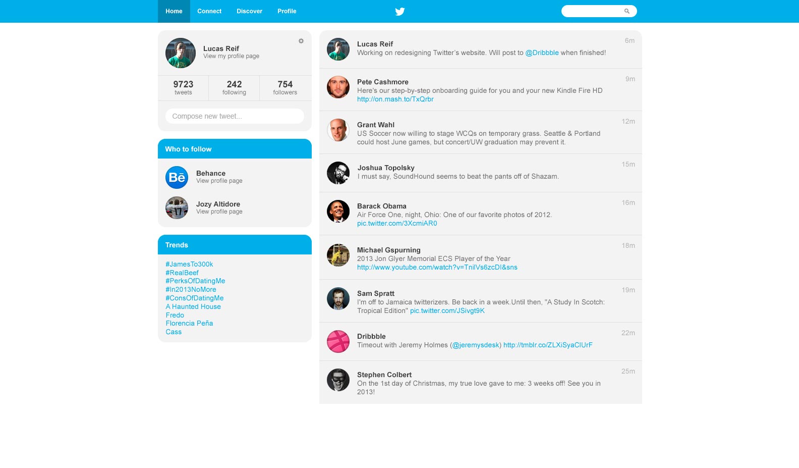
Lucas Reif has created another Twitter redesign concept, except this one takes a more minimalist, lighter approach. The design features rounded corners, and a layout similar to the existing Twitter layout.
Groupon
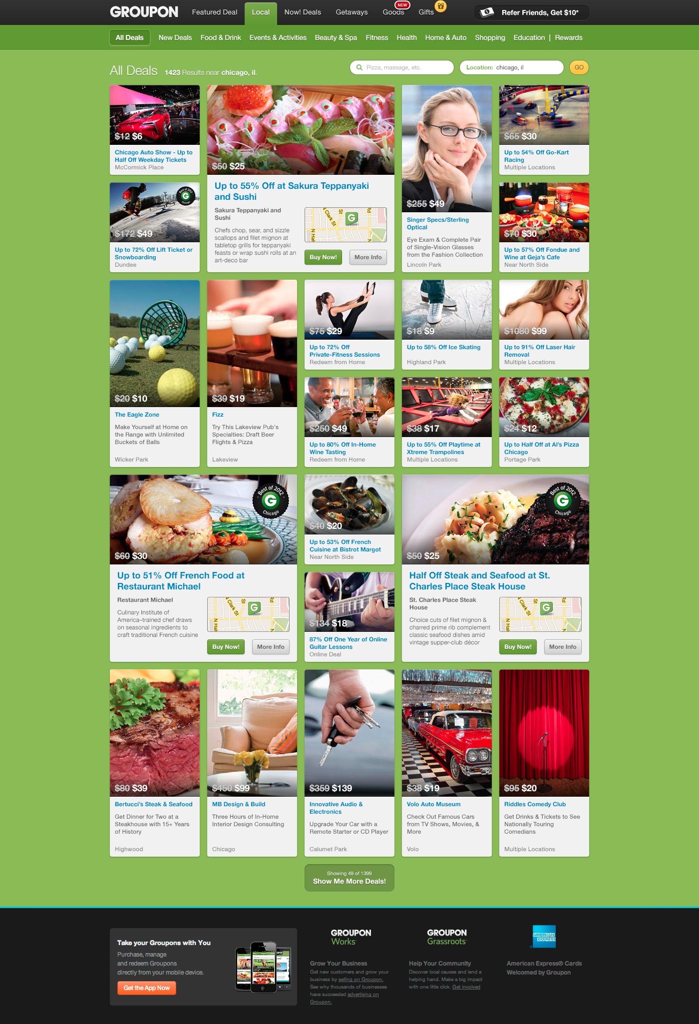
Chris Allen created this great Groupon flow concept for a redesign of the "All Deals" page. It's heavily influenced by 500px's Flow layout, and would allow Groupon to fit more deals on screen than their current design.
Amazon
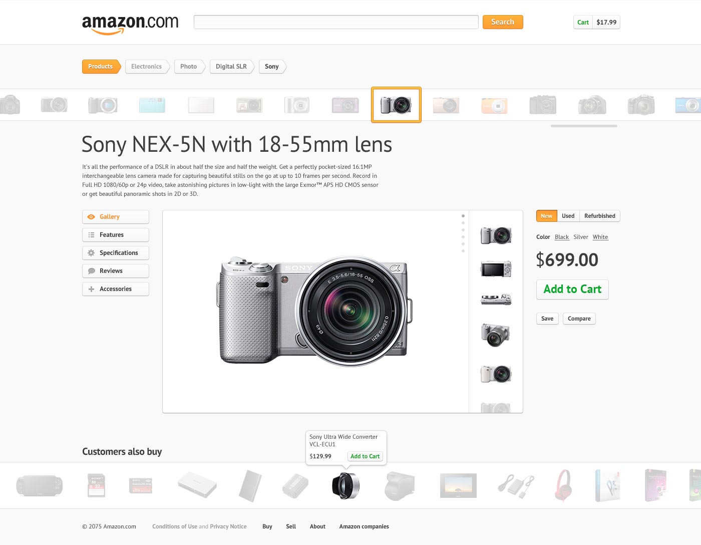
This Amazon.com redesign, by Yanis Markin, is incredibly slick and clean, especially when compared with Amazon's current website. It's a gorgeous modern design, with plenty of white space, something the current design is sorely lacking.
This Facebook Facelift, from Barton Smith, is a more minimalist, modern take on the popular social network. The gray and white design, with blue accents, is much cleaner than the current design, and takes better advantage of available screen real estate.
Subaru
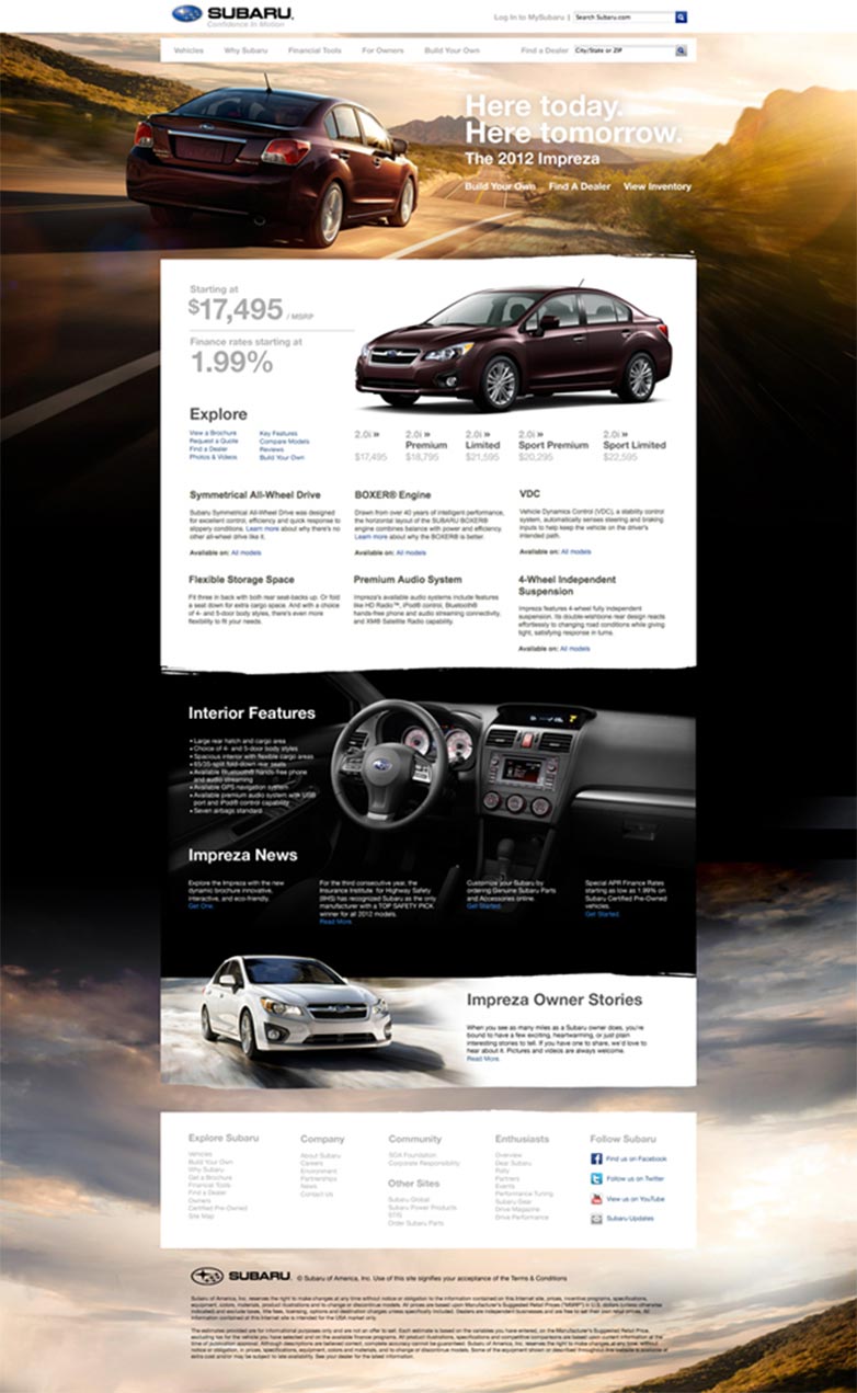
This Subaru concept site, from Dennis Ventrello, has a cleaner, more modern design than the current Subaru site. The large photo background is really eye-catching, while the white background behind the main content is simple and well-done.
IMDb
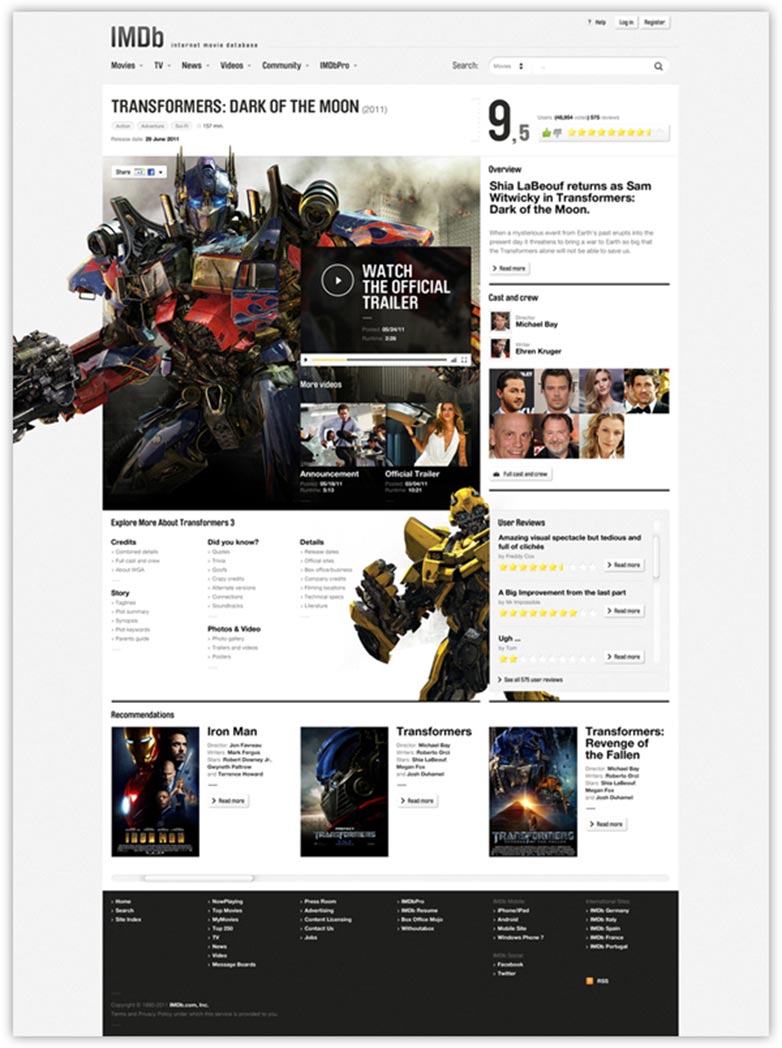
This IMDb redesign concept is absolutely stunning, and completely different from the original site design. The design allows for individual film pages to be customized, which adds a lot of visual interest to the site. Big budget films, in particular, would likely welcome the change.
Mint
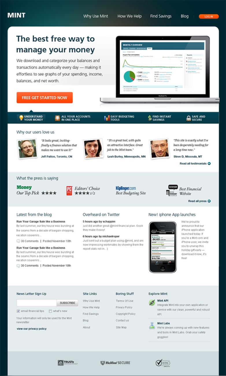
This Mint Redesign concept is a big deviation from their current site. The most notable change is that they've done away with the classic green color scheme, instead opting for a dark blue. The redesign is more visually striking, with less negative space.
Tommy Hilfiger
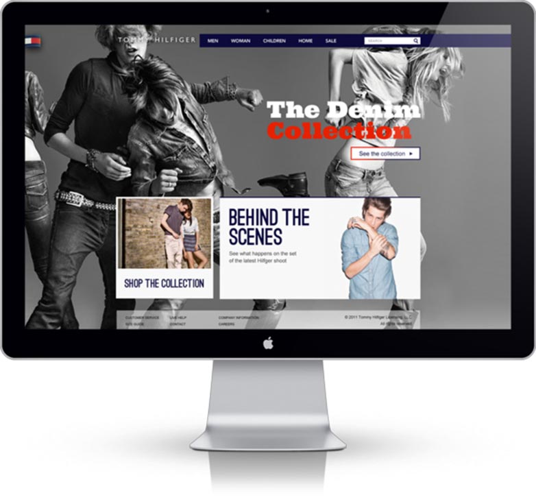
The current Tommy Hilfiger website is perfectly sufficient, though it's rather predictable for an ecommerce site. This Tommy Hilfiger Concept, designed by Perry Gerard, is bolder and much more unique than the original design. The large photo background, in particular, is very striking.
Amazon
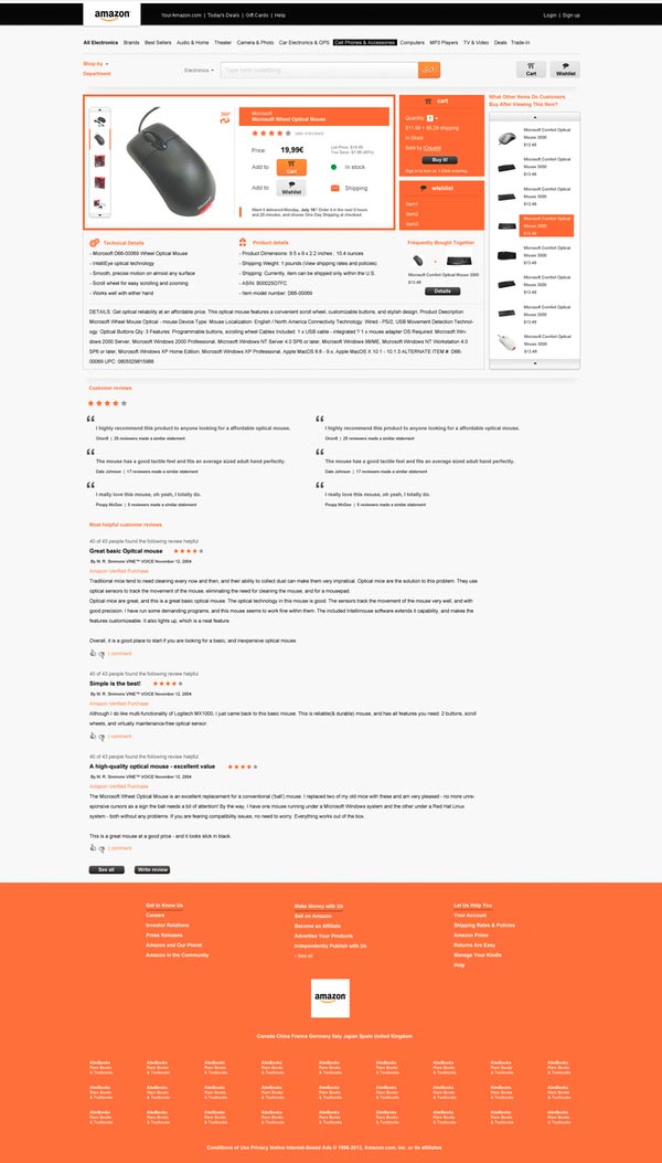
This is a really interesting Amazon concept, designed by Pavol Kyselica, is a very different take on the Amazon site. It uses a bold black, white, and orange color scheme, with more negative space.
YouTube
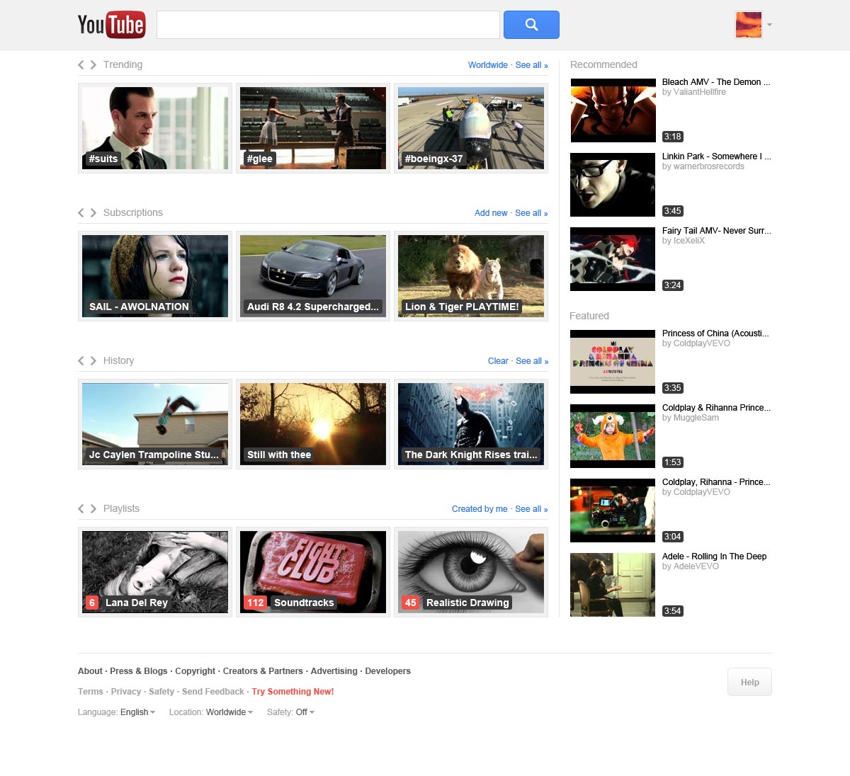
This YouTube Concept Redesign is a cleaner, grid-based layout. It adds a trending section, inspired by Twitter, that lets you see what's hot right now. There are also larger video thumbnails and typographical improvements.
LivingSocial
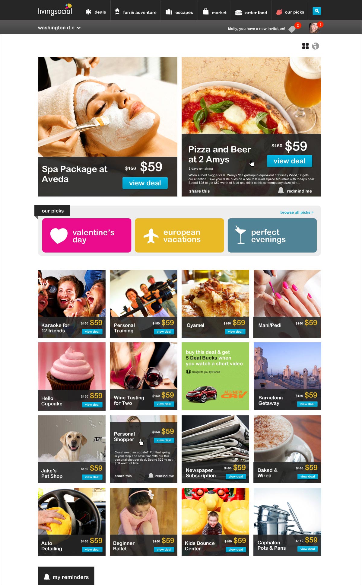
This LivingSocial redesign is a simpler version of the site, with smaller deal thumbnails, allowing for more deals to fit on each page. It also has a featured deal section, which the current site is lacking. The background has been changed to a clean white, giving it a more modern feel.
Amazon.com
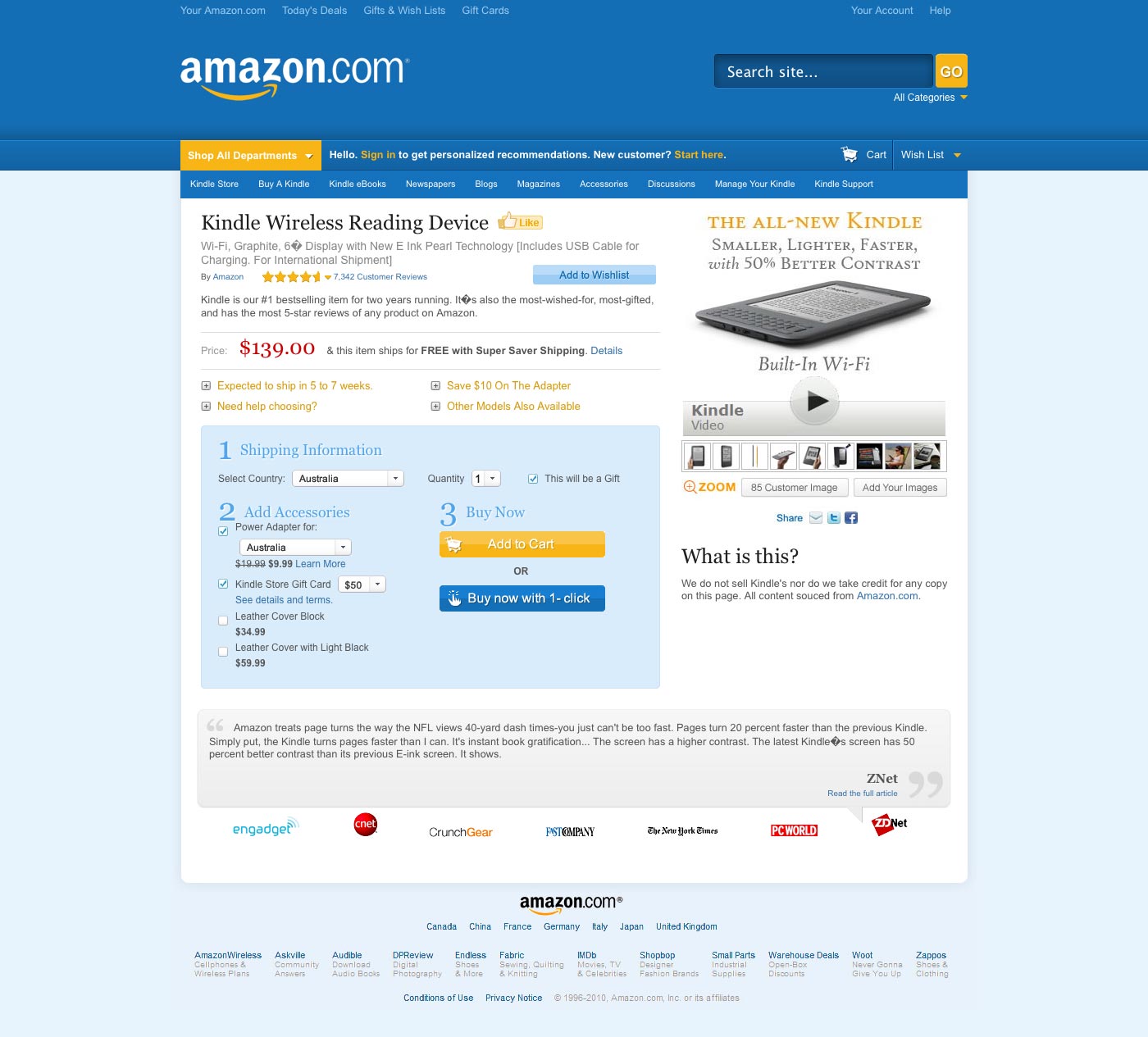
Redesigning Amazon takes a closer look at a redesign created by Maurice Kindermann. The bold blue header and dark yellow accents are fantastic, while the review slider is a really nice touch. The article itself explains a lot of the reasoning behind the design choices made.
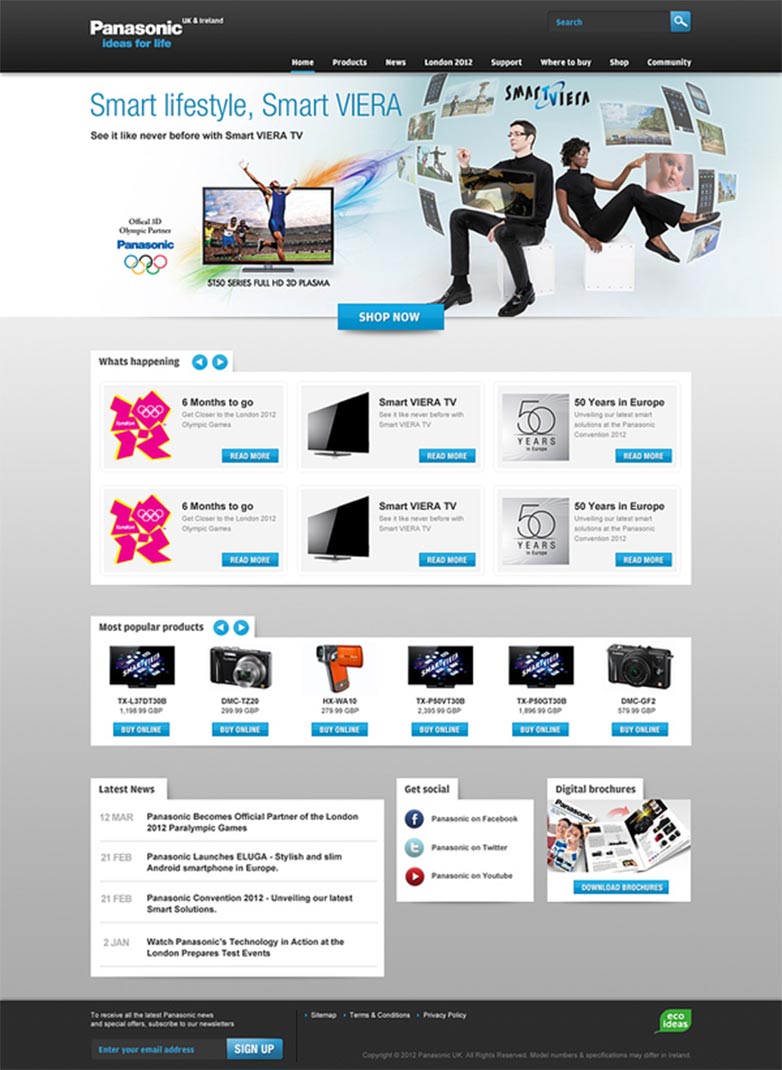
Panasonic.co.uk
This Panasonic.co.uk site redesign concept is a huge improvement over their existing design, which is dated and expected. The subtle shadow details and simple color scheme are modern, while the graphic header is a welcome change.
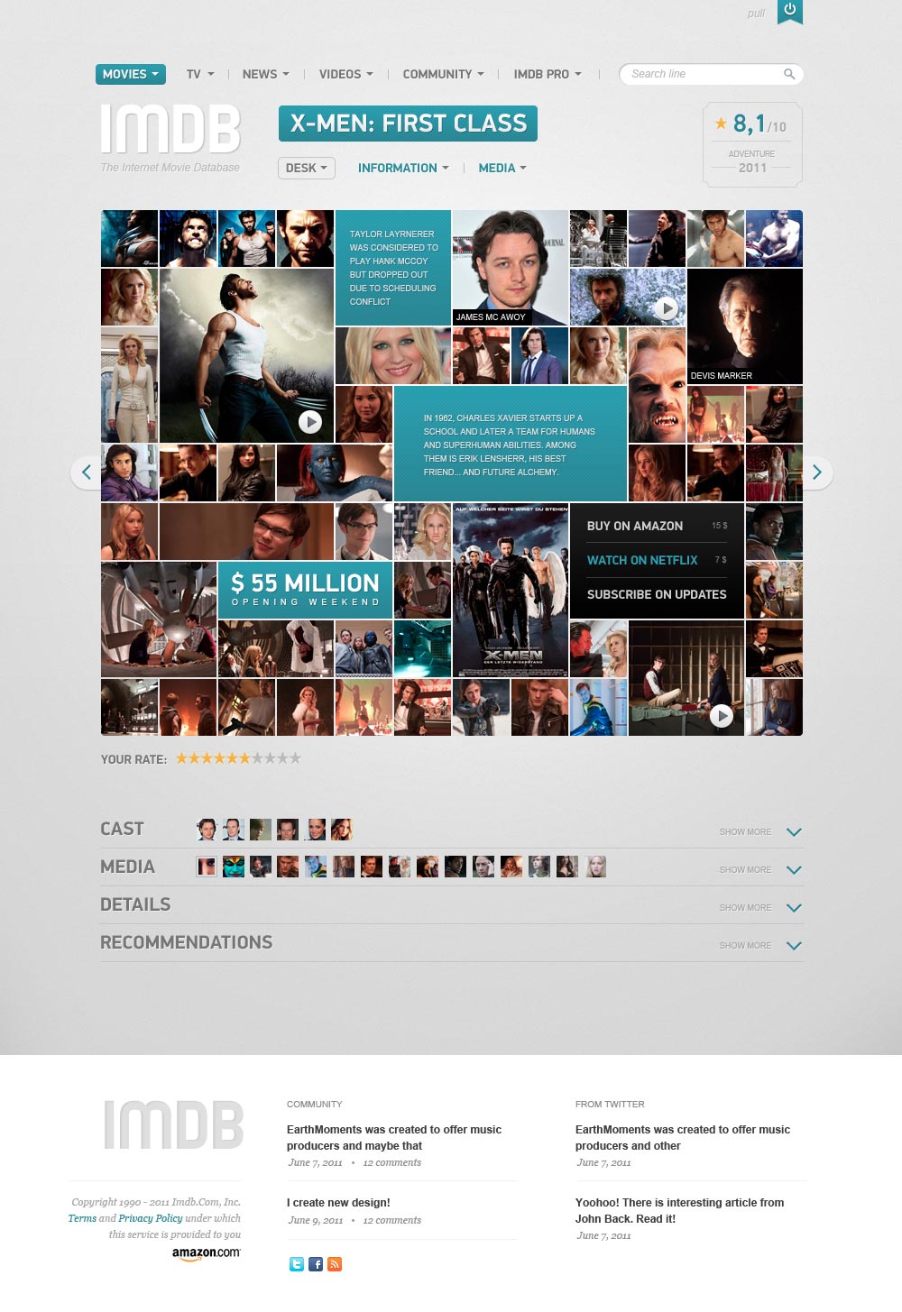
IMDb
This IMDb Filmpage Concept from Vladimir Kudinov is a really nice take on the standard film page. It's much more visual than the current site's design, with a grid of photo and video thumbnails, as well as links to purchase the films or watch online. The gray and blue color scheme is also a welcome change.
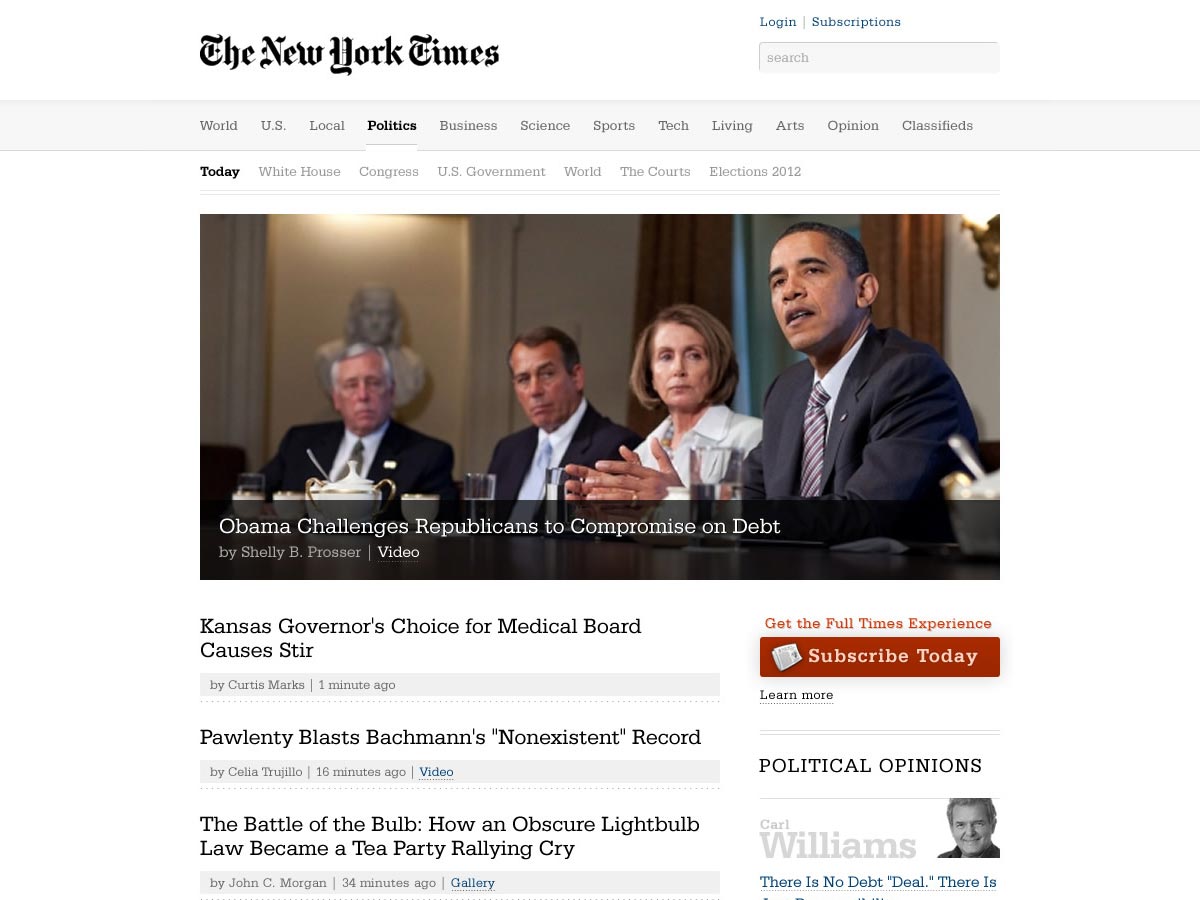
The New York Times
This redesign of The New York Times website is a huge improvement on the current design, which is crowded and has very little white space. The redesign has better typography, more negative space, and a bolder featured story and image, while still being consistent with the overall brand.
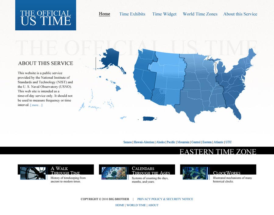
Time.gov
To say that the current Time.gov site is dated would be the biggest understatement of the century. This awesome redesign of the site is a tremendous improvement, and brings the site firmly into the present. It's got an understated color scheme, attractive map, and greatly improved typography.
HP
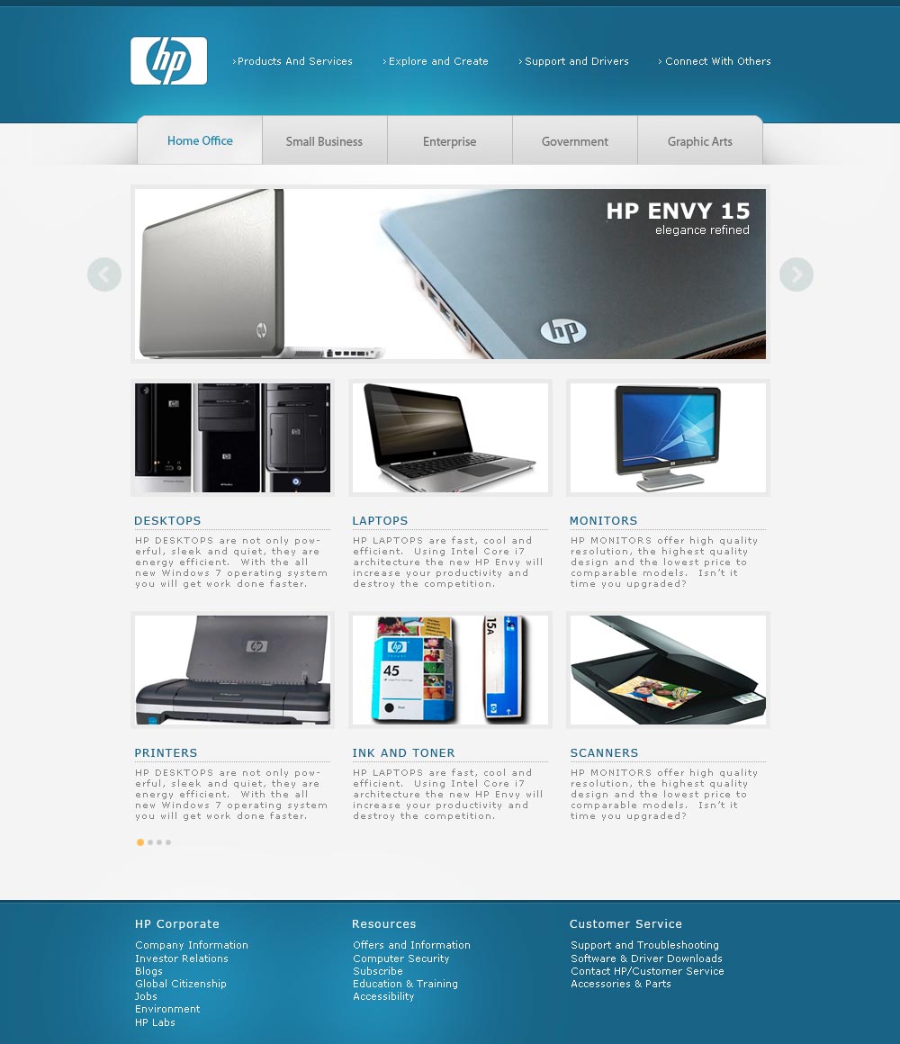
This HP Concept Website has a clean design that's more sophisticated than the current site, with sections split up based on industry and business size. The gray and blue color scheme fits with the brand, and the content slider showcases their products better than the current site does.
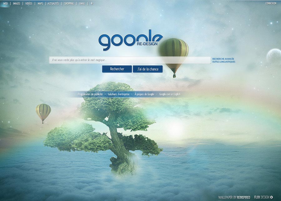
This striking Google Redesign keeps the basic page layout, but goes in a completely different direction graphically than the current Google homepage. Would Google ever go for a redesign like this? Probably not. Should they? I think so!
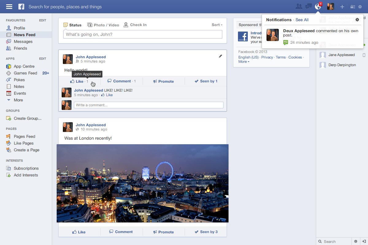
This simple redesign of the Facebook Newsfeed makes great use of available screen space. The simplified logo and rearrangement of the notifications area is a big improvement, as are the changes to the left-hand sidebar (after all, do you really need your own name and profile pic to appear on your newsfeed?).
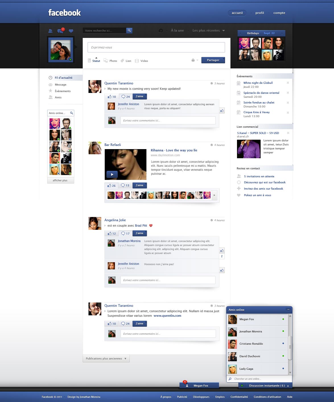
Here's another Facebook Redesign, this time with a much bolder black, blue, and white color scheme. The birthdays widget is especially nicely done, as is the tabbed comment and like feature.
Adobe
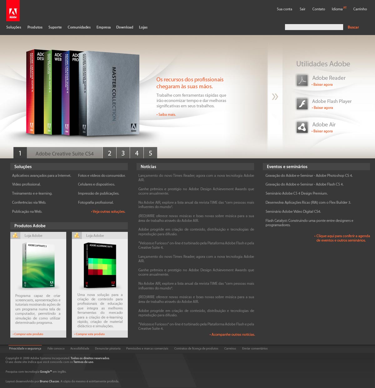
The Adobe site is already well-designed, but this concept Adobe Layout would be a great update. The header redesign is the most striking part of this, with an understated content slider and space for the most common downloads (Adobe Reader, Flash Player, and Air).
Conclusion
There are two things you might notice in the majority of the redesign concepts here. First, most of them have modern, clean designs, usually a significant improvement over the current designs they would replace. The second is that the designs are often much bolder than the current sites. When designers don't have to please decision-makers (who may be significantly more conservative than the designers), they can take risks and innovate in ways they otherwise wouldn't be permitted.
Which redesign concept is your favorite? What site would you love to redesign? Let us know in the comments.

