
 I got my professional start in the world of design at a specialty magazine publisher. Magazine layout and design is, therefore, very close to my heart.
A lot of principles of magazine design and layout are easily transferred to the world of web design. Some of these are pretty obvious, while you may have overlooked others. But really, it's all about good design transcending medium.
Here I've covered some of my favorite lessons from magazine design, and how they can apply to web design. But the most important thing I hope you can take away from this article is that you can take design ideas and conventions from one form of media and apply it to others.
So if your background is in something like interior design or graphic design or even something like industrial design, you can take those principles you already know and apply them to your web design projects.
Simple background = better readability
If you open 90% of magazines, the main background color behind the body copy is white. While tradition is the main reason for this, that tradition started for good reason (besides printing technology). Even in cases where a white background is not used, a simple, solid-colored or subtly-patterned background. This makes the body copy very readable, and helps prevent eye-strain.
In some cases, you'll find body copy typeset over an image, but in those cases, you'll often find that the type size has been increased and special attention is paid to ensuring sufficient contrast between text and image. And it's rare to find an entire article typeset over images. The same should be applied to any website design.
Maintain consistency throughout
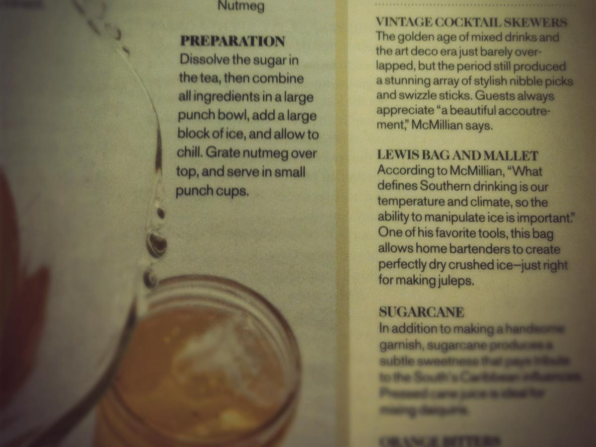
Flip through any magazine and you'll likely notice that there is a lot of consistency from one page to the next. Fonts are the same. Headings are the same. Basic page layouts are the same. Sure, articles might have some deviations in how they're laid out, but things like page numbers will be found in roughly the same place and images will likely be shown in the same style, among other consistencies.
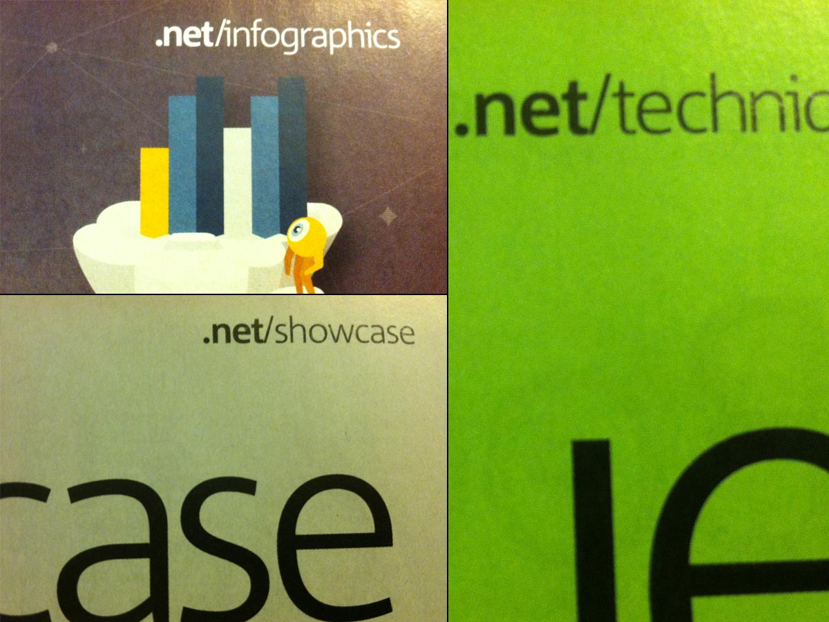
This consistency is reassuring to the reader. They flip from one page to the next and they know what to expect. The same goes from one issue of the magazine to the next.
This kind of consistency can easily be transferred to the world of web design. Make sure that things like your header, navigation, and other key elements of your layout are the same throughout the site. Along the same lines, make sure your fonts are consistent throughout the site, not only the font face, but also the size and styles used.
Any deviation draws attention
Because magazine layouts are so consistent, any deviation from the standard layout draws attention. It stands out among the other pages. This is why, so often, we find that the main featured article in a magazine has at least the title page formatted differently.
The same principle can be applied to your website. If you have a particular page that you want to stand out, make changes from the standard layout. This is often done with two particular types of pages: landing pages and art-directed blog posts. In either case, the point is to make the page special in the eye of your visitors.
Advertising is clearly marked and not intrusive
Advertising in magazines is always clearly delineated from the magazine's content. Either it's visually distinct from the editorial content, or it's marked specifically as advertising.
This has to do with trust. If your readers aren't sure what's editorial and what's advertising, then they're less likely to trust your content. This is particularly true with things like sponsored blog posts. If it's not clear that it's sponsored, your readers may feel duped if they initially believe it's editorial only to find out differently later.
Big images are better images
Magazines tend to use larger images. In fact, you'll see a lot of images that cover a full page or even a two-page spread.

The same can definitely be adopted by websites. Use images that take up your user's entire screen. They'll grab the visitor's attention, while also being more visually appealing. Incorporating large images into your design is a bold move, and one that can really set apart the design of a site.
Ditch big blocks of text
This one might not seem quite as apparent at first. After all, most magazines have huge blocks of text. Entire pages, in fact.
But those big blocks of text are generally broken up by things like pull quotes or images. You rarely have page after page after page of text in consumer magazines (trade or scientific publications can be a different story).
So rather than layout your site's main text in big chunks, break it up with typographical elements, images, and even advertising. Even things as simple as keeping your paragraphs short and breaking up your content into sections with headers can make a huge difference in readability and holding your visitors' interest.
Use the grid, but don't be afraid to break it
Magazines are laid out pretty strictly along a grid. But at the same time, you'll often see layouts that purposely break the grid. Elements like images or pull quotes will straddle columns, adding visual interest to the layout's design.
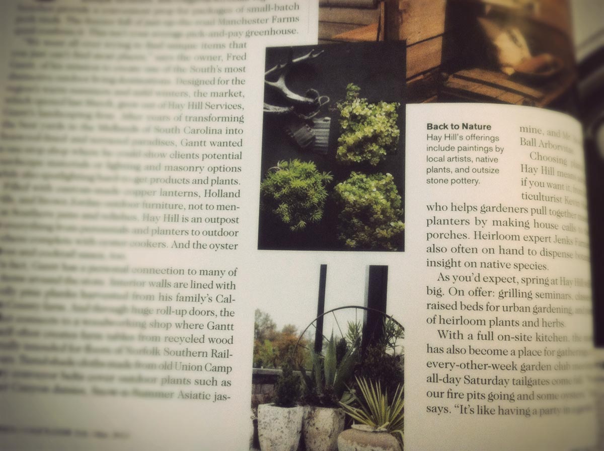
While breaking outside the grid can be slightly more technically challenging to the web designer than the print designer, it's still something that translates well from print to digital design.
You need a strong teaser
A magazine's cover serves as its teaser. When a consumer is browsing a newsstand, the cover of a magazine serves to attract their attention. It's the only chance most magazines get to attract a new reader, or to entice an existing reader to check out the new issue.
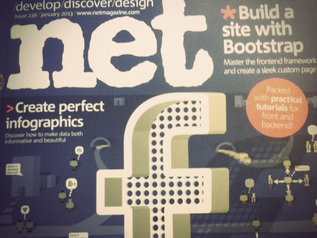
Websites don't really have "covers" (I'm certainly not advocating you use animated intros or splash pages to draw visitors in), but they do have teasers. This is what a visitor sees when they first appear on your site. It's the header, the headline, the navigation, the visual style, and the ease of use. Basically, the initial user experience.
Without a great teaser, a visitor is likely to click their browser's back button, just like they would overlook a magazine with an uninteresting cover on the newsstand. Look at the impression your site gives initially with a critical eye, and ask yourself if you'd honestly stick around to actually read more of the site.
Conclusion
While many of the principles of magazine layout and design can easily be applied to web design, remember that it's not really about applying principles directly from one medium to another. Instead, it's about exploring other types of design, and the particulars of a certain format, and figuring out what can be carried over from one discipline to another. Thinking about your designs in those terms will almost certainly lead you to try new things, and to experiment with ideas from other formats. Some might work and some might not, but good design is good design.
Page examples taken from .net Magazine and Garden & Gun.


