
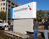
 There was a time, not so long ago, when flying was considered a glamorous experience, something people aspire to do, a rite of passage, something you had to do before you die.
The American Airlines brand has taken an active role in helping to shape this image since the company's formation back in 1930, when it was know as American Airways. Popular belief had it, that in those golden days, working for the company was a privilege of a very few, having the American Airlines logo stamped on your uniform would make you feel on top of the world, especially for pilots, whom above all, were treated by the public as celebrities of the sky.
But not anymore.
In fact, some would argue, especially considering the recent quality of the airline customer service, that American Airlines is now purposely working hard to create the exact opposite image.
You only need an Internet connection, a search engine, some imagination, and a few keywords to find endless stories of dissatisfied customers complaining that flying AA has become synonymous with an unhappy experience, with filthy planes, loose seats, disgusting meals, and poor customer service, which is all pretty much expected, considering the morale of those who work for the company have never been so low.
Things are just not going well for American Airlines these days.

Previous American Airlines logos that helped build a glamorous image for air travel.
Actually, I also remember reading a story about a web designer whom was fired from the company, simply because he was trying to improve the company website user experience. Certainly, this is the sort of attitude of an old fashion and disconnected management team. Oh, and if you think that is not already bad enough PR, they have been voted as the most hated air travel company by social media users over the measurement website Amplicate.
It seems things can’t get worse, but wait, there’s more...
I can’t avoid mentioning that American Airlines has been in financial dire straits for a while, they filed for bankruptcy back in 2011 and they still haven't found their way out of it. They had a loss of $1.9 billion in 2012 topping a pile of already $2 billion losses from previous years. US Airways, their biggest creditor, is strongly pushing for a merger, and it seems it's about to happen soon. I wonder, will the brand even survive this mess?
Ok. That’s it. The big picture has been painted, and happily, the bashing is over.
With all of that in mind, the reasoning behind the rebranding of American Airlines becomes very obvious. To put it simply: they need to do it.
Truth is that the big majority of corporate rebranding exercises are motivated by a plethora of problems that are entirely unrelated to the actual discipline of design. On most occasions, corporations are more interested in showing some sort of change to their customer base, their shareholders and/or anyone who might have vested interests in the company.
In short, American Airlines is giving itself a chance to start afresh, with a new American.
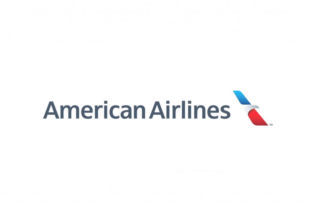
The new American Airlines logo.
The new identity, created by FutureBrand, one of the most renowned brand agencies in the world, brings the airline brand to a whole new paradigm, adopting what is a somewhat current trending aesthetic in logo design: the use of negative space to create the eagle head; and another not so current: the use of gradients and shadows to add a sense of depth.
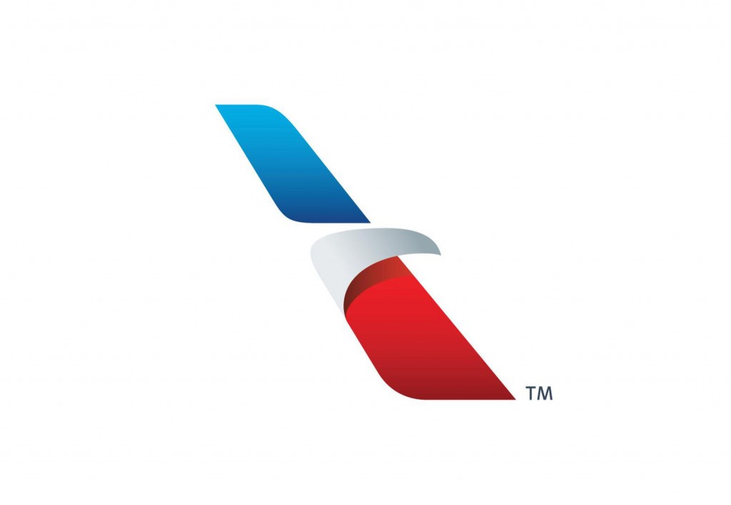
The new American Airlines mark, entitled the Flight Symbol.
Here's what FutureBrand has to say about the new logo:
Recognizing that it was time for a new look to better reflect the progress it had made in the ongoing modernization of the airline, American engaged FutureBrand to partner on the modernization of the logo, livery and overall look and feel of the customer experience.
Our work is inspired by the company’s heritage and incorporates colors and symbols universally associated with the American brand. A reimagined logo — called the Flight Symbol — evokes the star, “A”, and iconic eagle of American’s past, all brought to life in refreshed shades of red, white and blue. Together, they reflect a more modern, vibrant and welcoming spirit.
The logo debuts along with a boldly reimagined livery. With proud stripes and a timeless silver body, the livery expresses American’s origins but also the spirit of modern America: innovative, progressive and open to the world.
The Flight Symbol looks great. I can easily see a modernized version of the American eagle, but I need to squint my eyes to be able to make a star, and the "A", out it. These last elements seem great on a conceptual level, which are also extremely important from the historical point-of-view, but I wouldn't particularly bother publicizing those to the general public, chances are, it will only create confusion.
What really surprise me though, is the complete omission that the flight symbol looks just like the tail of an airplane. That's actually the first thing I saw in it.
The best part of this rebranding exercise, at least from my point of view, comes out of the changes in the airplanes' exterior look-and-feel. The abstracted American flag over the tail of the new American fleet is a brilliantly graphical way to connect with those customers that chose American Airlines motivated by some sort of nationalistic rationale.
The tail flag would look cheap on any other airline, but fits American Airlines perfectly.
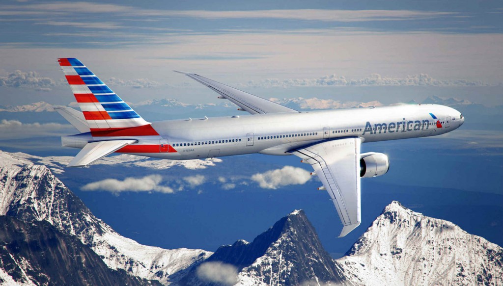
The new American livery.
Considering the current paradigm American Airlines is facing, this is in fact, a very welcome move, as it's going to help the company reset its relationship with its customers, even if only on a superficial level. Perhaps this change will bring just enough breathing space for the company to recuperate from its current situation.
Breaking away from the old identity, was not only a design exercise, but also a PR stunt in itself, as it actually provides an outrageously amount of coverage from the media and an excellent opportunity to reconnect with dissatisfied customers that otherwise would never bother, even to consider, flying with American Airlines anymore.
Watch the video below, it's not only about a new brand, it's a PR campaign, it's a marketing campaign, it's an opportunity the company creates for itself, all because of a new identity.
It's quite obvious, isn't it? The whole shebang is about giving American Airlines another chance with its customers. It's all about reconnecting and regaining confidence.
With that in mind, this is surely a great rebrand, definitively a win. The new brand bares no resemblance with the previous look-and-feel, which is exactly what the brand needs right now, and the new look reflects the current trend in design, the exact sort of approach that will help reinforce the idea that the new American is nothing like the old one.
What the heck, even the copy has been meticulous chosen, they are the "new American".
As expected, and as you can see in the above commercial, the "new" is going to be all over American Airlines' communications. Reinforcing the idea of new is essential in reinforcing the idea of resetting their relationship with customers.
Overall, I like the new brand, it's a job well done and delivers exact what the company needs at the moment. On the other hand, I'm still blessed, or perhaps cursed, with designer eyes, so I can't avoid looking at it from a pure design perspective as well.
The argument against the new brand
If we only take design into consideration, then, well… it's an entirely different story.
Exchanging the iconicity of the previous design, created by Massimo Vignelli, for what is a much more ephemeral aesthetic, is surely a big mistake.
Vignelli himself thinks exactly the same, he said in a recent interview for Business Week that he's not going to be here to make a bet — as he is 82 years old — but he believes the new logo won’t last another 25 years. If you ask me, I wouldn't bet on that either.
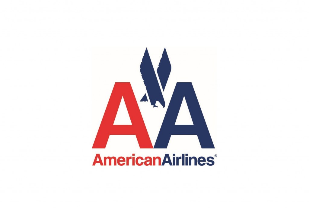
The iconic American Airlines logo design by Massimo Vignelli.
The previous American Airlines logo is, as far as my opinion goes, spot on; there was no need to change it. It works, doesn't it? Why change? Maybe, and simply because I'm a huge fan of minimalism, I would drop off the eagle, which actually, was Vignelli's original idea. Either way, from a design perspective, this was a brand that didn't require an update.
Composed of two letters, in Helvetica, one red and one blue, accompanied by the company name, in the same typography; is really hard to get any more iconic than that, and iconic logos, are the ones that are always on trend, no matter what. From a branding perspective, iconic logos are the best types of brand, because the investment you make in the brand today, is going to stay current for years to come. The Vignelli design survived 45 years, do you think the new design will do the same?
It's a real shame the bad customer service ruined a somewhat already perfect identity.
Conclusion
Since the advent of budget airlines — otherwise known as bus-in-the-sky airways — flying has become as ordinary as taking the subway, and actually, perhaps for some of the more seasoned travelers, flying has actually become as pedestrian as hopping on a bus.
If you ask me, the golden age of air travel is truly gone, unless you only fly first class of course, but that’s for a privileged few, and I’m certainly not one.
Many will argue that updating the company's identity is not the way to solve management challenges, but the new American brand will help to kickstart a process of change, by reinvigorating the morale of their employees, and by creating many marketing opportunities to reshape the perception of the company in people’s minds.
But ultimately it's the quality of service that will define the future of the new American.
Should American Airlines change their brand to solve problems that aren't design related? What about the new logo, do you like it, can you see the "A" and the star? Let us know your thoughts in the comments.
Ray Vellest
Ray Vellest is a brand identity specialist based in London and working with organizations and individuals from all over the world. Ray’s approach to identity design position his clients as leaders of their industries while creating a valuable long-term asset for their businesses. Follow @rayvellest on Twitter to keep up with his latest updates.


