
 Given the rise in mobile web usage year on year, there is now an increased focus on making websites more responsive, adaptive and user-friendly for visitors on small screens. One key area that is often overlooked and that could easily lead to a heap of frustration is the contact form. Whether a user is logging into a website, part way through a sign-up process or in the final stages of completing an online order, good usability and a high-quality experience on mobile are key to a successful outcome.
Many simple HTML and CSS practices will make your contact forms more user-friendly and elegant for visitors on mobile devices.
Style form inputs for easier touch control
Applying touch-friendly CSS styling to form elements will make inputs, buttons and controls a much nicer experience for touchscreen users.
Form input fields will benefit from large touch target areas:
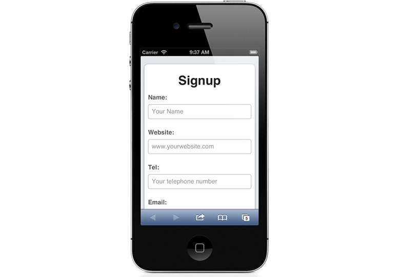
input[type=text], input[type=url], input[type=email], input[type=password], input[type=tel] {-webkit-appearance: none; -moz-appearance: none;
display: block;
margin: 0;
width: 100%; height: 40px;
line-height: 40px; font-size: 17px;
border: 1px solid #bbb;
}
Other forms of input control would also easily benefit from custom CSS styling:
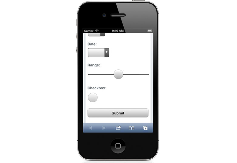
Checkboxes benefit from being made easier to tap:
input[type=checkbox] {
 width: 44px; height: 44px;
 -webkit-border-radius: 22px; -moz-border-radius: 22px; border-radius: 22px;
 border: 1px solid #bbb;
}
Likewise, button elements can be styled and given special treatment:
button[type=submit] {
 -webkit-appearance: none; -moz-appearance: none;
 display: block;
 margin: 1.5em 0;
 font-size: 1em; line-height: 2.5em;
 color: #333;
 font-weight: bold;
 height: 2.5em; width: 100%;
 background: #fdfdfd; background: -moz-linear-gradient(top, #fdfdfd 0%, #bebebe 100%); background: -webkit-gradient(linear, left top, left bottom, color-stop(0%,#fdfdfd), color-stop(100%,#bebebe)); background: -webkit-linear-gradient(top, #fdfdfd 0%,#bebebe 100%); background: -o-linear-gradient(top, #fdfdfd 0%,#bebebe 100%); background: -ms-linear-gradient(top, #fdfdfd 0%,#bebebe 100%); background: linear-gradient(to bottom, #fdfdfd 0%,#bebebe 100%);
 border: 1px solid #bbb;
 -webkit-border-radius: 10px; -moz-border-radius: 10px; border-radius: 10px;
}
Even less common input types, such as range sliders, would benefit from additional CSS styling:
input[type=range] {input[type=range]::-webkit-slider-thumb {
width: 100%;
}
-webkit-appearance: none;
width: 44px; height: 44px;
background: #fdfdfd; background: -moz-linear-gradient(top, #fdfdfd 0%, #bebebe 100%); background: -webkit-gradient(linear, left top, left bottom, color-stop(0%,#fdfdfd), color-stop(100%,#bebebe)); background: -webkit-linear-gradient(top, #fdfdfd 0%,#bebebe 100%); background: -o-linear-gradient(top, #fdfdfd 0%,#bebebe 100%); background: -ms-linear-gradient(top, #fdfdfd 0%,#bebebe 100%); background: linear-gradient(to bottom, #fdfdfd 0%,#bebebe 100%);
border: 1px solid #bbb;
-webkit-border-radius: 22px; -moz-border-radius: 22px; border-radius: 22px;
}
Use HTML5 input types to trigger the appropriate keyboard
HTML5 offers a range of input types to aid the user experience. Some web browsers now offer multiple native controls, depending on the input type selected. This is especially useful for mobile browsers, some of which have different on-screen keyboards for different forms of data.
Here’s how the various soft keyboards appear on the iPhone (iOS 6), depending on the input type specified:
<label for="website">Website:</label> <input type="url" name="website" placeholder="www.yourwebsite.com" /> 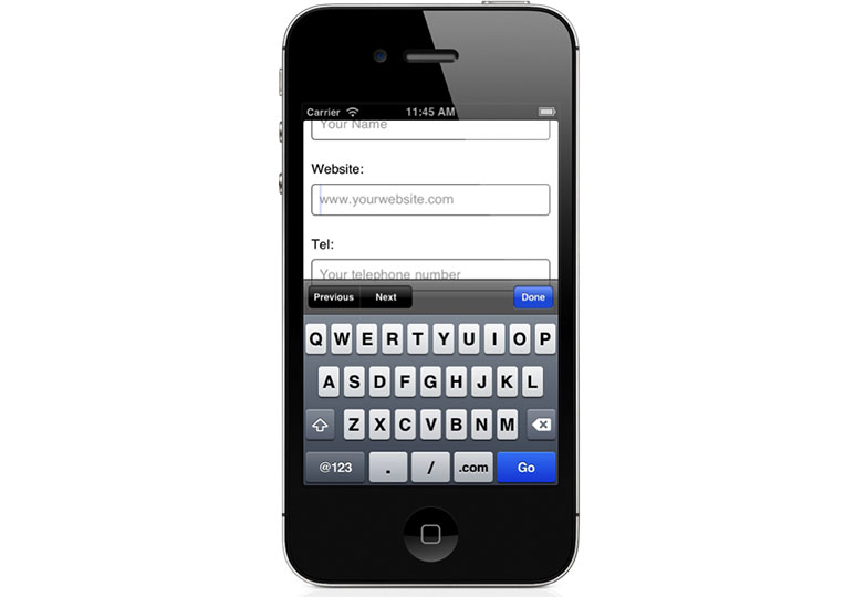
<label for="tel">Tel:</label> <input type="tel" name="tel" placeholder="Your telephone number" /> 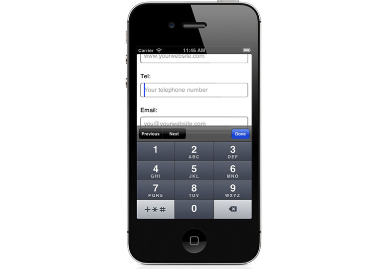
<label for="email">Email:</label> <input type="email" name="email" placeholder="[email protected]" /> 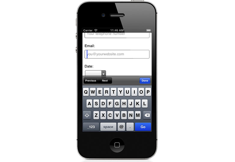
<label for="time">Time:</label> <input type="time" name="time" placeholder="9:00 AM" /> 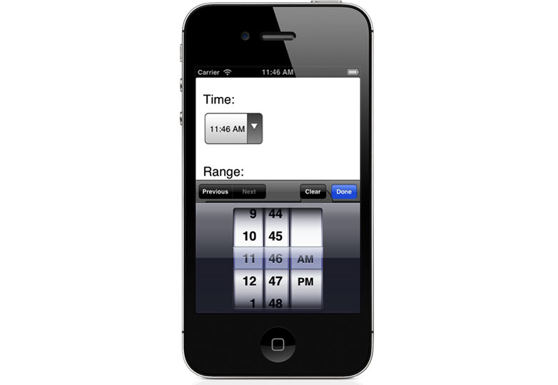
<label for="date">Date:</label> <input type="date" name="date" placeholder="DD/MM/YYYY" /> 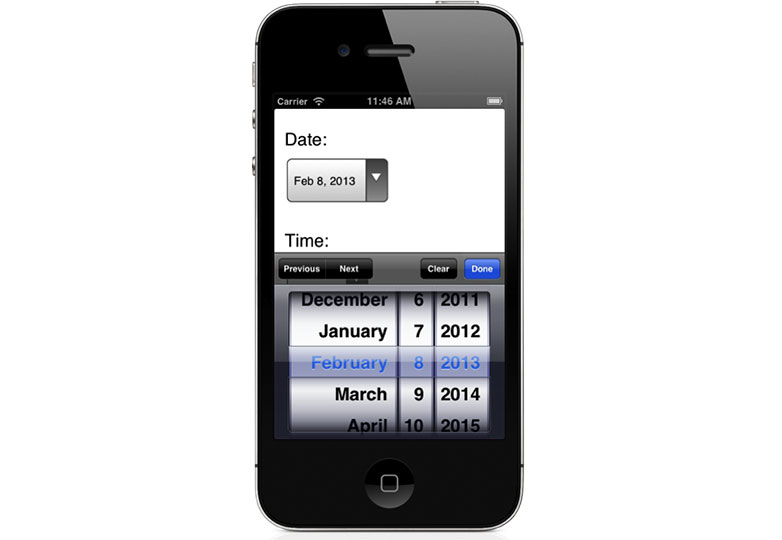
Note in these examples that we are also specifying placeholder text, using the placeholder attribute. This enables us to show the user an example of the type of data they are expected to enter in a particular field.
Style tap-to-call telephone links
Some mobile browsers try to detect telephone numbers on web pages and convert them automatically to tappable links. This behavior is useful for visitors, but unfortunately auto-detection is not always reliable, and browsers will accidentally target digits that are not actually phone numbers. The links can also be difficult to tap, depending on the styling applied to them.
Fortunately, this auto-detect behavior can be disabled on both iOS and Android devices by inserting the following element in the <head> element of the web page:
<meta name="format-detection" content="telephone=no" /> This enables you to manually specify telephone links on your web pages, giving you much greater control over where they appear and how they look:
Tel: <a href="tel:14085555555">1 408 555 5555</a> You can style a telephone link using the following CSS selector:
a[href^='tel:']:link, a[href^='tel:']:visited {a[href^='tel:']:hover, a[href^='tel:']:active {
color: #333;
font-weight: bold;
text-decoration: underline;
}
text-decoration: none;
}
The only downside to this manual approach is that desktop visitors will also be able to see these telephone links but won’t be able to activate them. One way around this is to apply tel link styling only to small viewports, using a CSS media query:
/* unstyled tel links as default */text-decoration: none;
a[href^='tel:']:link, a[href^='tel:']:visited {
color: #6f757c;
font-weight: normal;
}
a[href^='tel:']:hover, a[href^='tel:']:active {
color: #6f757c;
text-decoration: none;
}
/* styled tel links for small viewports */
@media screen and (max-width: 600px) {
a[href^='tel:']:link, a[href^='tel:']:visited {
color: #333;
font-weight: bold;
text-decoration: underline;
}
a[href^='tel:']:hover, a[href^='tel:']:active {
color: #333;
text-decoration: none;
}
}
Control auto-correct and capitalization
iOS in particular has a habit of auto-correcting and capitalizing form input data. For some field types, this is very useful, but for others it can quickly cause frustration. For example, user names often mix letters and numbers. Fortunately, iOS allows you to control this behavior using the autocorrect and autocapitalize attributes:
<input type="text" name="username" autocorrect="off" autocapitalize="off" />There are more configurable options for autocapitalize. You can also set the value to words, characters or sentences, but think carefully about where you apply these attributes.
<input type="text" name="first-name" autocapitalize="words" />
<input type="text" name="last-name" autocapitalize="words" />
<input type="text" name="state" autocapitalize="characters" />
<textarea name="comment" autocapitalize="sentences"></textarea>
A note on browser support
While many of the examples in this article highlight features on iOS Safari, some of the tips also apply to Android (depending on the browser version), as well as other mobile browsers. The good thing about HTML5 form features is that they progressively enhance. Browsers that support a feature will take advantage of it, while non-supporting browsers will generally just ignore it.
Do mobile sites demand mobile-friendly forms? What other tips would you add? Let us know in the comments.
Featured image/thumbnail, contact image via Shutterstock.


