

 As so much of the content available on the web is text it's essential for web designers to understand the basic principles of good typography. Having such knowledge allows designers to communicate more effectively, enabling them to create better designs and websites that are easier to use.
For more experienced designers setting text may come naturally but for those who are just starting out I've decided to put together a list of the basic do's and don'ts. Not only will this list teach you the fundamentals but you can also use it as a check list to work through on future projects. Here goes:
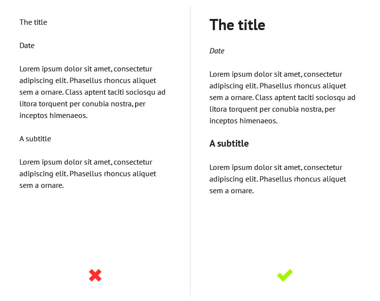
DO establish a typographic hierarchy
A typographic hierarchy can be established by using a variety of methods such as size, weight, color, and contrast. Its purpose is to give pages structure and guide the user through the content. Without a clear hierarchy the text becomes much harder to scan and therefore generally harder to read. Just take a look at the examples below. On the left the text is one size and one weight so it's hard to differentiate between headings and body text. Meanwhile, on the right, we have the same content but with a clear typographic hierarchy, so it's much easier to distinguish between the different elements.
Here I've only used size and weight to establish my hierarchy but for even better results you can try to experiment with color and contrast as well.
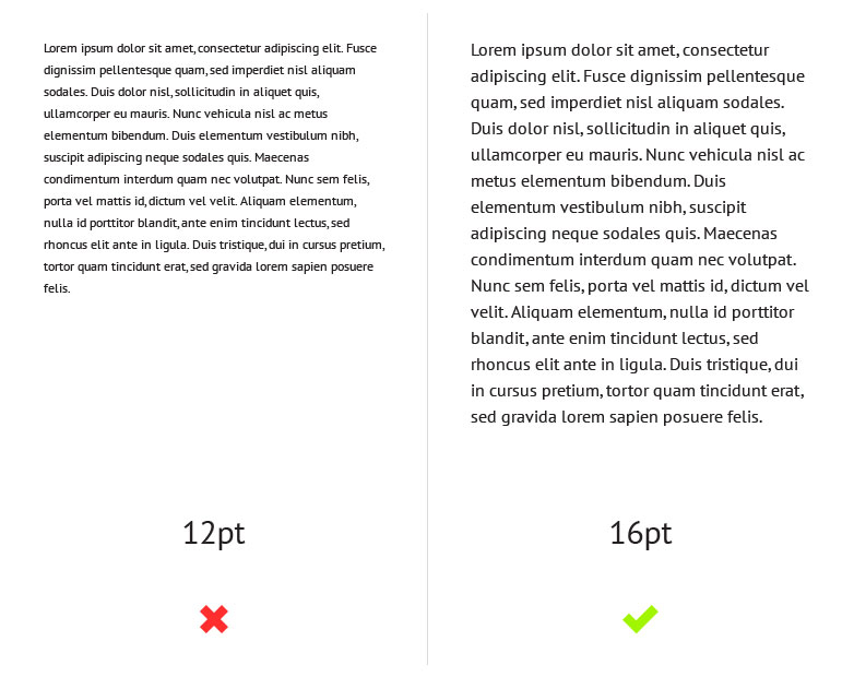
DON'T make the text too small
Not everybody has 20-20 vision so it's important to make sure that your body text is big enough for people to read comfortably. Personally I would recommend no smaller than a size of 14pt.
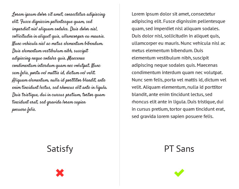
DO choose an appropriate font for the body text
Another important factor when it comes to your body text is legibility. Although a typeface like Satisfy might suit a design with a hand-made aesthetic, using a typeface such as this for your body text will have a negative impact on your users. This is because it's much harder to read than your average serif or sans-serif. Look at the examples below and you will notice how much harder your brain has to work in order to make out the words on the left compared to those on the right.
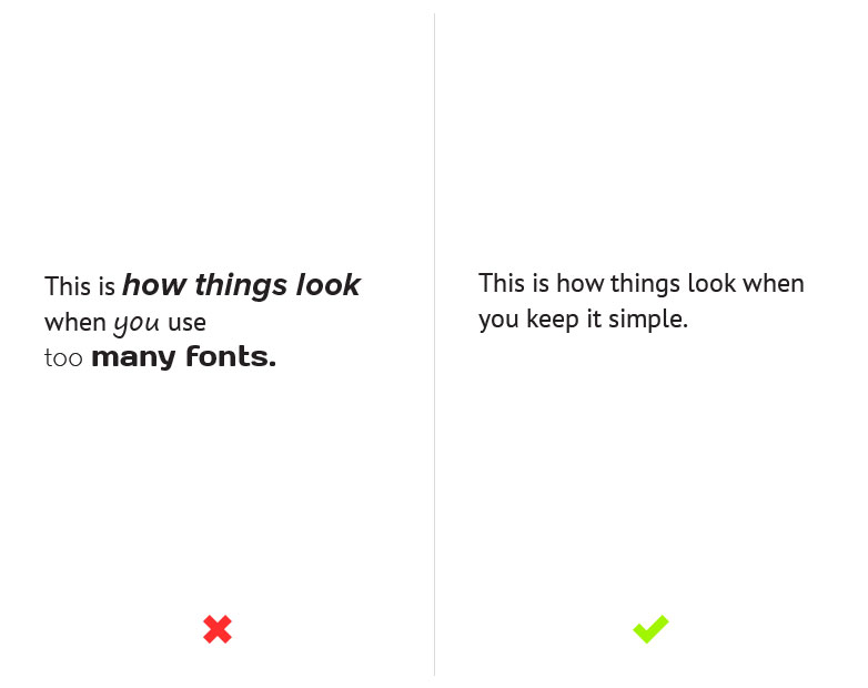
DON'T use too many different fonts on one page
Services like Typekit and Google Fonts may give you access to thousands of fonts but it doesn't mean that you have to use them all. As you can see from the example below, unless it's done really well, using multiple fonts can be very distracting. This is why I usually recommend using no more than 2 or 3.
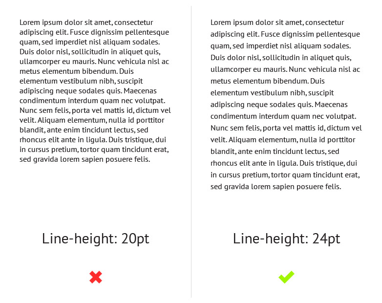
DO give your text room to breathe
A lack of white space between each line can affect readability because it makes it difficult for the eye to track from one line to the next. However, this problem can easily be solved by increasing your line-heights, but be careful not to overdo it, too much space can also affect readability in a negative way.
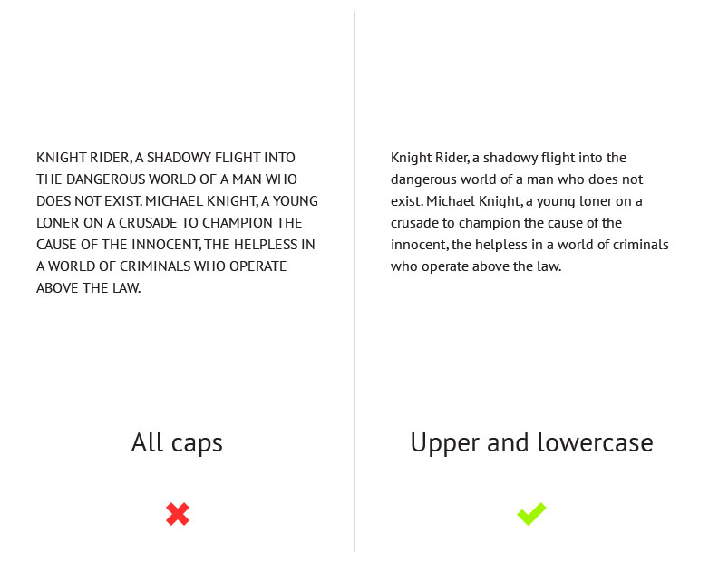
DON'T make continuous use of all caps
People aren't used to reading large chunks of text set in all caps and because of this it's actually harder for people to read. Not only that but people often associate all caps with shouting or aggression and when it comes to marketing copy it can come across quite spammy. Due to this it's important to think about how and when you're going to use all caps and to make sure that you use it in moderation.
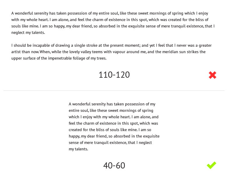
DO try and limit paragraphs to 40-60 characters per line
If a line is too long the reader gradually begins to lose focus and can often have trouble reading from one line to the next. If a line is too short it causes the reader's eye to travel back too often, which disrupts their rhythm. This can also make them start reading the next line too soon, causing them to miss words from the previous line. This is why the optimal line length for body text is said to be around 40-60 characters per line.
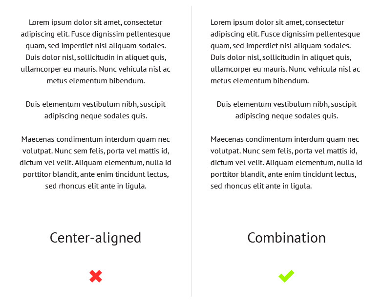
DON'T use large amounts of centered text
Centered text is difficult to read because the edges of the text block are uneven which makes it harder to scan because each line has a different starting point. Centered text blocks are also difficult to align to other objects on the page and are often considered to look quite amateurish. This is why, like all caps, it's best to use centered text in moderation, opting for left aligned text as standard instead.
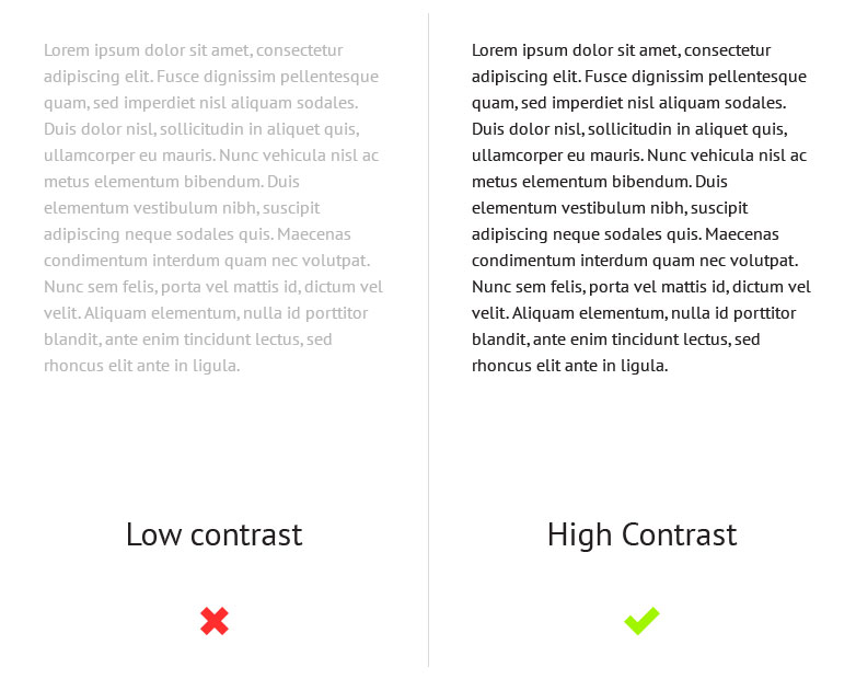
DO make sure there is enough contrast between your text and the background
Contrast is another aspect of typography that can affect readability. If there's not enough contrast between the text and the background, the content can become illegible.
Do you have anything to add? What tips would you give new designers just starting out? Let us know in the comments.


Read Next

15 Best New Fonts, July 2024

20 Best New Websites, July 2024

Top 7 WordPress Plugins for 2024: Enhance Your Site's Performance

Exciting New Tools for Designers, July 2024

3 Essential Design Trends, July 2024

15 Best New Fonts, June 2024

20 Best New Websites, June 2024

Exciting New Tools for Designers, June 2024

3 Essential Design Trends, June 2024

15 Best New Fonts, May 2024

How to Reduce The Carbon Footprint of Your Website
