

 It’s fascinating to watch the evolution of a brand. Companies large and small inevitably change their identity over time. Those branding changes can be inspired by changes of personnel, changes in the cultural landscape, evolution of competitors, and most commonly a change in the company’s focus.
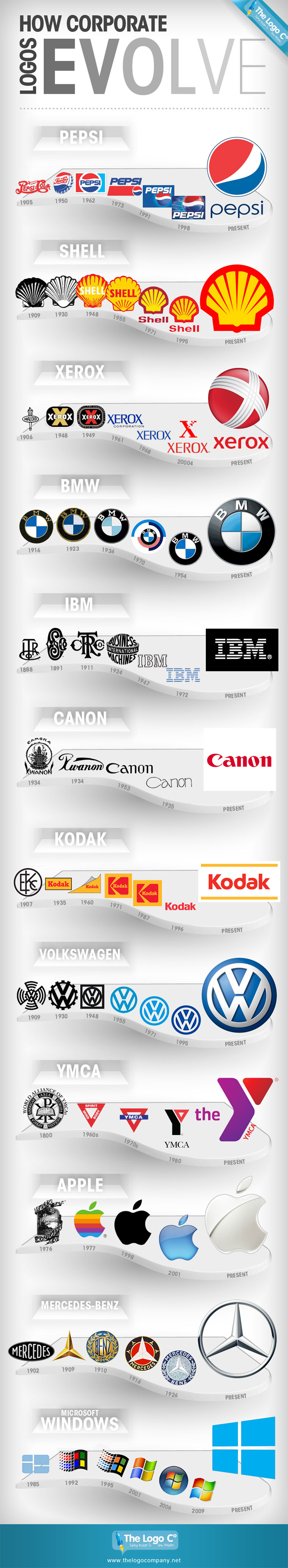
This great infographic from the thelogocompany.net illustrates the evolution of some huge corporate logos from the past century. What’s really interesting is that the identities haven’t always been an improvement: both the 1955 and 1971 VW logos are preferable to the 3D rendered version of today; the classic 70s and 80s YMCA signs have been replaced with a gastly purple and red blob; Xerox’s ‘x’ wrapping a globe doesn’t speak of digitized data in the same way as the 2004 iteration.
Conversely, some brands will be happy to leave the past alone: Apple’s first logo is ghastly (fortunately it only lasted a year); Pepsi’s first logo looks awfully similar to a well known competitor; and Canon’s first logo looks like it belongs on a Thai restaurant.
What’s intriguing, is that tiny shifts in how a shape is drawn produce radically different ideas, something to bear in mind next time you’re sketching out ideas for branding.
Which of these brands has improved the most over the years? Which one should have stuck with what they had? Let us know your thoughts in the comments.
Featured image/thumbnail, VW logo image via Steve Mann / Shutterstock.com
Ben Moss
Ben Moss has designed and coded work for award-winning startups, and global names including IBM, UBS, and the FBI. When he’s not in front of a screen he’s probably out trail-running.


Read Next

15 Best New Fonts, July 2024

20 Best New Websites, July 2024

Top 7 WordPress Plugins for 2024: Enhance Your Site's Performance

Exciting New Tools for Designers, July 2024

3 Essential Design Trends, July 2024

15 Best New Fonts, June 2024

20 Best New Websites, June 2024

Exciting New Tools for Designers, June 2024

3 Essential Design Trends, June 2024

15 Best New Fonts, May 2024

How to Reduce The Carbon Footprint of Your Website
