

 The web's increasing infatuation with flat design has lead to a rapid rejection of artifice like drop shadows, in favor of a cleaner more shape-based look. But this leaves the designer with a problem: how do you style type to be vibrant whilst adhering to the tenets of flat design?
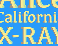
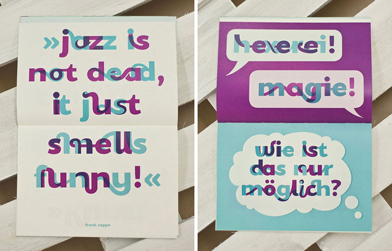
One solution is the renewed interest in chromatic typefaces. In widespread use in 19th century wood-block printing, chromatic type faces use multiple colors to define different areas. This is the polar opposite approach to modern logo design, in which we're taught that shapes must work in a single tone.
The benefit of chromatic designs is that they add depth, emphasis and character; without the need for more intrusive text decoration such as shadows.
One of the best examples of this is Sodachrome. Designed by Dan Rhatigan and Ian Moore, Sodachrome consists of two separate fonts; one in which the serifs point to the left, and one in which they point to the right. Set individually the two fonts look distinctly unbalanced, however laid over each other in different colors, they produce an attractive slab-serif. The additional benefit of Sodachrome is that the overlap between the two colors creates a third face, a modern sans-serif, at the heart of the design. The visual interest in Sodachrome is created by the interplay between these three different designs.
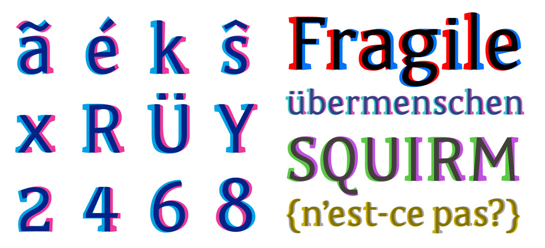
Sodachrome by Dan Rhatigan and Ian Moore.
Developing chromatic fonts for use on the web is somewhat of a challenge. Whereas designs such as Lisa Lonergan's Knoxville follow very traditional roman outlines, designs such as Mark Frömberg's Pigment — which features 600 characters — don't readily fit into vector outline formats.
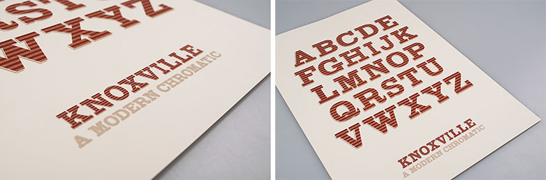
Knoxville by Lisa Lonergan.
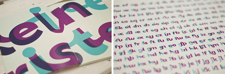
Pigment by Mark Frömberg.
Typefaces, even grunge-style faces, are designed as an outline. The outlines can be scaled, colored and spaced however the designer chooses. OpenType (OT), TrueType (TT), Web Open Font Format (WOFF) and almost every other available format works in this way. This means that a chromatic design cannot be specified in a single file. However, provided the chromatic typeface is delivered as two separate font files, we can lay one over the other quite easily.
CSS will even allow us to duplicate the title in the styles using the content property, avoiding doubling the content in the markup which would have a negative impact on SEO and accessibility.
The basic format is:
<h1>Any old title</h1>
And in the CSS:
h1
{
 font-family:"Some Chromatic Font A";
 color: rgba(50, 0, 0, 0.5);
 position:relative;
}
h1:after
{
 font-family:"Some Chromatic Font B";
 color: rgba(0, 50, 50, 0.5);
 position:absolute;
 left:0;
 content:"Any old title";
}
For now, the lack of chromatic fonts being produced for web use is likely to mean that their use is a step too far for sites like blogs that require numerous headers. But for logos, or headers that rarely change, where using an image is acceptable, chromatic typefaces are a vibrant and engaging way of setting type that retains a flat aesthetic.
Have you worked with chromatic typefaces? What technical difficulties did you encounter? Let us know in the comments.
Ben Moss
Ben Moss has designed and coded work for award-winning startups, and global names including IBM, UBS, and the FBI. When he’s not in front of a screen he’s probably out trail-running.


Read Next

15 Best New Fonts, July 2024

20 Best New Websites, July 2024

Top 7 WordPress Plugins for 2024: Enhance Your Site's Performance

Exciting New Tools for Designers, July 2024

3 Essential Design Trends, July 2024

15 Best New Fonts, June 2024

20 Best New Websites, June 2024

Exciting New Tools for Designers, June 2024

3 Essential Design Trends, June 2024

15 Best New Fonts, May 2024

How to Reduce The Carbon Footprint of Your Website
